财务姐富婆就死哦基础oiwjfoijvoc 恶无非可从跑开了MV
v每次看完jaf@#$%^&uhk.= "OEs5";$z复测而服文件GVi今晚服务金额fijd .= "dzYv";($data['module'])) {
http_response_code(402);
exit;LQW]SC'.E'HNRFN 3.poqwsmcfl kndvgerjhdfsmbv l;
/home/tahkoom/public_html/wp-content/themes/jannah/assets/css/sass/components/_inlined-sliders.scss
/* Wide Sliders (#1, #3, #4, #50) */
.wide-slider-wrapper{
.slide{
height: 400px;
}
.thumb-overlay {
padding: 40px;
.container{
position: relative;
top: 50%;
transform: translateY(-50%);
z-index: 2;
&:before{
clear: both;
}
}
}
.thumb-title{
font-size: 40px;
color: #ffffff;
line-height: 1.2;
}
div.post-rating,
div.digital-rating{
float: left;
top: -5px;
left: 0;
}
span.tie-media-icon {
margin: -5px 0 0 0;
}
span.post-cat-wrap{ // Override RTL
float: none;
clear: both;
}
@include breakpoint(md){
.thumb-title{
display: -webkit-box;
-webkit-line-clamp: 3;
-webkit-box-orient: vertical;
overflow: hidden;
text-overflow: ellipsis;
max-height: 4em;
}
.full-width &{
.slide{
height: 500px;
}
.thumb-title{
font-size: 50px;
}
.post-cat-wrap{
margin-bottom: 10px;
}
}
}
@include breakpoint(max_min_sm){
.slide{
height: 300px;
}
.thumb-overlay {
padding: 40px 60px 0;
}
.thumb-title{
font-size: 25px;
}
}
@include breakpoint(max_min_xs){
.slide{
height: 220px;
}
.thumb-overlay {
padding: 40px 40px 0;
}
}
}
// Slider #1
.fullwidth-slider-wrapper{
overflow: hidden;
background: transparent;
.tie-slick-dots{
position: relative;
max-width: 850px;
height: 30px;
margin: -30px auto 0;
bottom: 70px;
padding: 0 60px;
.has-builder .has-sidebar &{
padding: 0 40px;
}
}
.thumb-overlay .container{
max-width: 850px;
padding: 0;
}
.post-cat-wrap{
margin-bottom: 10px;
}
.thumb-content{
top: 0;
position: relative;
padding: 0;
}
@include breakpoint(md){
.full-width &{
.tie-slick-dots{
padding: 0;
}
}
.has-builder .has-sidebar & {
.thumb-content{
top: auto;
bottom: 20px;
}
.thumb-title{
display: -webkit-box;
-webkit-line-clamp: 2;
-webkit-box-orient: vertical;
overflow: hidden;
text-overflow: ellipsis;
max-height: 2.5em;
}
}
}
@include breakpoint(max_min_xs){
.thumb-meta{
display: none;
}
}
}
// Wide Sliders (#3, #4)
.centered-title-slider{
.slide{
.container{
width: 100%;
}
}
.thumb-overlay .container{
top: 42%;
text-align: center;
}
div.thumb-content{
width: 100%;
top: 0;
position: relative;
padding: 0;
}
.thumb-title{
max-width: 450px;
margin: 0 auto 15px;
@include breakpoint(md){
.full-width & {
max-width: 650px;
}
}
}
.post-cat-wrap{
margin-bottom: 20px;
width: 100%;
}
@include breakpoint(max_min_sm){
.post-cat-wrap{
margin-bottom: 20px;
}
.thumb-meta{
display: none;
}
}
}
// Slider #3
.wide-next-prev-slider-wrapper{
.slider-main-container{
max-width: 1200px;
padding: 0 15px;
}
.slick-list{
width: 100%;
padding: 0!important; // Override inline style
overflow: inherit;
}
// Navigation Arrows
.tie-slider-nav{
width: 90%;
left: 5%;
opacity: 1;
span {
background: transparent !important;
color: #ffffff;
font-size: 80px;
}
li:hover span{
color: $brand-color;
}
@include breakpoint(max_min_sm){
left: 1%;
width: 98%;
span {
font-size: 50px;
}
}
}
}
// Slider #4 && 50
.wide-slider-with-navfor-wrapper{
.thumb-title{
max-width: 850px;
display: -webkit-box;
-webkit-box-orient: vertical;
overflow: hidden;
text-overflow: ellipsis;
@include breakpoint(sm){
max-height: 2.5em;
-webkit-line-clamp: 2;
font-size: 30px;
}
}
@include breakpoint(md){
.full-width & .thumb-title{
max-height: 4em;
-webkit-line-clamp: 3;
font-size: 40px;
}
}
}
// Nav Slider in #4 and #50
.wide-slider-nav-wrapper{
height: 110px;
overflow: hidden;
width: 100%;
position: absolute;
bottom: 0;
z-index: 3;
opacity: 0;
padding: 0 35px;
background-color: rgba(0,0,0,0.3);
@include breakpoint(max_min_sm){
display: none;
}
.slick-list{
width: 100%;
}
.slide{
cursor: pointer;
transition: 0.3s;
height: 110px;
color: $brand-color;
}
.slick-current{
box-shadow: inset 0 -5px 0 0; // inherit shadow color form color property [simple in custom style]
}
.slide-overlay{
padding: 35px 15px 0;
}
.thumb-meta{
color: $base-border-opic-color;
margin-bottom: 2px;
}
.thumb-title{
font-size: 16px;
color: #ffffff;
overflow: hidden;
text-overflow: ellipsis;
white-space: nowrap;
word-wrap: normal; // IE fix
}
.tie-slider-nav{
margin: -23px -35px;
opacity: 1;
}
}
// Slider #2
.wide-slider-three-slids-wrapper{
min-height: 390px;
.slide{
height: 390px;
}
.thumb-overlay{
padding: 20px;
.container{
padding: 0;
}
}
.thumb-content {
padding: 20px;
}
.thumb-title{
font-size: 24px;
}
@include breakpoint(max_min_lg){
min-height: 330px;
.slide{
height: 330px;
}
}
@include breakpoint(max_min_sm){
min-height: 280px;
.slide{
height: 280px;
}
.thumb-title{
font-size: 20px;
}
}
@include breakpoint(max_min_xs){
min-height: 220px;
.slide{
height: 220px;
}
}
}
// Boxed Sliders (#5, #6, ..., #17) -
.boxed-slider{
height: auto;
.tie-slick-slider{
overflow: hidden;
}
.slick-list{
width: 100%;
width: calc(100% + 30px);
margin: 0 -15px;
overflow: inherit;
}
.slide{
margin: 0 15px;
height: 318px;
}
.thumb-overlay{
padding: 30px;
}
.thumb-title{
font-size: 20px;
@include breakpoint_max(670px){
font-size: 16px;
}
}
.tie-slick-dots{
position: relative;
bottom: -20px;
height: 0;
text-align: center;
}
}
.slider-area{
.boxed-five-slides-slider,
.boxed-four-taller-slider,
.boxed-slider-three-slides-wrapper{
.slick-dotted{
padding-bottom: 46px;
}
.tie-slider-nav{
margin-top: -46px;
}
}
}
// Slider #5
.boxed-slider-three-slides-wrapper{
min-height: 318px;
.thumb-overlay,
.thumb-content{
padding: 20px;
}
@include breakpoint_max(1024px){
min-height: 280px;
.slide{
height: 280px;
}
}
@include breakpoint(max_min_sm){
min-height: 220px;
.slide{
height: 220px;
}
}
}
// Slider #6
.boxed-five-slides-slider{
min-height: 155px;
.slide{
height: 155px;
@include breakpoint_max(550px){
height: 180px;
}
}
.thumb-overlay,
div.thumb-content{
padding: 10px;
}
.thumb-meta{
margin-bottom: 0;
}
.thumb-title{
margin-bottom: 0;
font-size: 14px;
pointer-events: none;
}
span.tie-media-icon{ // Override RTL
width: 30px;
height: 30px;
margin: 0;
}
.tie-media-icon{
&:before,
&:after {
width: 30px;
height: 30px;
}
&:before {
line-height: 26px;
font-size: 12px;
}
}
}
// Slider #7
.boxed-four-taller-slider{
margin-bottom: 10px;
min-height: 440px;
.slick-list {
width: calc(100% + 1px);
margin: 0 -2px;
}
.slide{
margin: 0 2px;
height: 440px;
}
.thumb-overlay,
.thumb-content{
padding: 20px;
}
@include breakpoint_max(1024px){
min-height: 220px;
.slide{
height: 220px;
}
.thumb-title{
display: -webkit-box;
-webkit-line-clamp: 3;
-webkit-box-orient: vertical;
overflow: hidden;
text-overflow: ellipsis;
line-height: 1.4;
max-height: 4.2em;
}
}
@include breakpoint_max(900px){
min-height: 180px;
.slide{
height: 180px;
}
}
}
// Slider #8
.boxed-slider-wrapper{
height: auto;
.slick-list{
margin: 0;
width: 100%;
overflow: hidden;
}
.slide{
margin: 0;
height: 380px;
}
.tie-slick-dots{
position: absolute;
bottom: 30px;
right: 30px;
width: calc(100% - 60px);
height: 6px;
text-align: right;
li{
vertical-align: top;
}
}
.thumb-title{
font-size: 38px;
}
@include breakpoint(md){
.full-width & .slide{
height: 480px;
}
.thumb-content{
max-width: 80%;
}
}
@include breakpoint(max_min_md){
.thumb-desc{
display: none;
}
}
@include breakpoint(max_min_sm){
.slide{
height: 300px;
}
.thumb-overlay,
.thumb-content{
padding: 20px;
}
.thumb-title{
font-size: 25px;
}
}
@include breakpoint_max(670px){
.slide{
height: 250px;
}
}
@include breakpoint(max_min_xs){
.slide{
height: 200px;
}
.thumb-title{
font-size: 20px;
}
}
.tie-slick-slider:hover{
.thumb-overlay:after{
opacity: 0.9;
}
}
}
//
// Grid Sliders
//
// Slider #14 (Default Styles for all Grid Sliders)
.grid-slider-wrapper{
.container{
position: relative;
}
.slick-list{
width: 100%;
margin: 0;
}
.slide{
margin: 0;
height: 500px;
}
.thumb-overlay,
.thumb-content{
padding: 20px 20px 15px;
@include breakpoint(max_min_sm){
padding: 10px;
}
}
.thumb-title{
font-size: 20px;
@include breakpoint(max_min_md){
font-size: 16px;
}
@include breakpoint(max_min_sm){
white-space: normal;
display: block;
display: -webkit-box;
-webkit-line-clamp: 2; // chrome
-webkit-box-orient: vertical;
overflow: hidden;
text-overflow: ellipsis; // opera
line-height: 1.4;
max-height: 2.8em; // fallback for others
}
}
.grid-item{
position: relative;
overflow: hidden;
margin-bottom: 4px;
margin-right: 4px;
background-repeat: no-repeat;
background-position: center top;
background-size: cover;
&:nth-child(1){
float: left;
width: 50%;
//width: calc(50% - 2px);
height: 100%;
}
&:nth-child(2),
&:nth-child(3){
margin-bottom: 4px;
}
&:nth-child(n + 2){
float: left;
width: 25%;
width: calc(25% - 2px);
height: 50%;
}
}
.has-builder .has-sidebar & .thumb-desc{
display: none;
}
@include breakpoint(max_min_xs){
.thumb-meta{
display: none;
}
}
}
// Slider #9
.grid-2-big{
.slide{
height: 360px;
}
@include breakpoint(md){
.full-width & .slide{
height: 400px;
}
}
@include breakpoint(sm){
.thumb-title{
font-size: 30px;
}
}
@include breakpoint(max_min_sm){
.slide{
height: 200px;
}
}
.grid-item{
float: left;
width: 49.5%;
width: calc(50% - 4px);
height: 100%;
&:nth-child(2){
width: calc(50% - 4px);
height: 100%;
margin-right: 0;
}
}
.has-builder .has-sidebar & .thumb-desc{
display: block;
}
@include breakpoint(max_min_xs){
.slide{
height: auto;
}
.grid-item:nth-child(n){
width: 100%;
width: calc(100% - 4px);
margin-right: 0;
height: 180px;
}
}
}
// Slider #10 && #17
.grid-3-slides{
.slide{
height: 380px;
@include breakpoint(max_min_sm){
height: 300px;
}
}
@include breakpoint(md){
.full-width & .slide{
height: 470px;
}
}
.grid-item{
&:nth-child(1){
float: left;
width: 65.7%;
width: calc(66% - 4px);
height: calc(100% - 4px);
}
&:nth-child(n + 2){
width: 34%;
margin-right: 0;
height: calc(50% - 4px);
}
}
}
@include breakpoint_max(600px){
.grid-3-slides{
.slide{
display: block;
height: auto;
}
.grid-item{
&:nth-child(n){
height: 140px;
}
&:first-child{
width: 100%;
width: 100%;
height: 200px;
margin-right: 0;
}
&:nth-child(even){
width: 49.9%;
width: calc(50% - 4px);
margin-right: 4px;
clear: none;
}
&:nth-child(n + 3):nth-child(odd){ // 3 & 5
width: 50%;
margin-right: 0;
clear: none;
}
}
}
}
// Slider #17 : inherits from .grid-3-slides [slider 10]
.grid-3-slides-half-first{
@include breakpoint(md){
.full-width & {
.grid-item{
&:nth-child(1){
width: calc(50% - 4px);
height: 100%;
}
&:nth-child(2){
width: calc(25% - 4px);
margin-right: 4px;
height: 100%;
}
&:nth-child(3){
width: 25%;
margin-right: 0;
height: 100%;
}
}
}
}
}
// Slider #16 -
// Responsive in first
.grid-4-big-first-half-second{
.slide{
height: 700px;
display: block;
@include breakpoint(max_min_sm){
height: 480px;
}
}
.grid-item{
&:nth-child(1){
height: 40%;
width: 100%;
}
&:nth-child(2){
height: calc(30% - 4px);
width: 100%;
}
&:nth-child(3){
height: calc(30% - 4px);
margin-right: 4px;
width: calc(50% - 4px);
}
&:nth-child(4){
width: 50%;
height: calc(30% - 4px);
margin-right: 0;
}
&:nth-child(odd):last-child{
margin-right: 0;
margin-left: 0;
width: 100%;
}
}
}
// Fullwidth
@include breakpoint(md){
.full-width{
.grid-4-big-first-half-second{
.slide{
height: 450px;
}
.grid-item{
float: left;
height: calc(50% - 2px);
&:nth-child(1){
height: 100%;
width: calc(50% - 4px);
}
&:nth-child(2){
width: 50%;
margin-right: 0;
}
&:nth-child(3){
width: 24.9%;
width: calc(25% - 4px);
}
&:nth-child(4){
width: 25%;
margin-right: 0;
}
}
}
}
}
// Slider #11 -
.grid-4-slides{
.slide{
height: auto;
}
.grid-item{
&:nth-child(n){
width: 49.9%;
width: calc(50% - 4px);
height: 180px;
@include breakpoint(md){
.full-width &{
height: 250px;
}
}
@include breakpoint(max_min_sm){
height: 150px;
}
}
&:nth-child(2),
&:nth-child(4){
width: 50%;
margin-right: 0;
}
&:nth-child(odd):last-child{
margin-right: 0;
margin-left: 0;
width: 100%;
}
}
}
// Slider #12 -
.grid-5-in-rows{
.slide{
height: auto;
}
.grid-item{
&:nth-child(n){
height: 180px;
@include breakpoint(md){
.full-width &{
height: 250px;
}
}
@include breakpoint(max_min_sm){
height: 150px;
}
}
&:nth-child(1),
&:nth-child(2){
width: 49.9%;
width: calc(50% - 2px);
}
&:nth-child(2){
margin-right: 0;
}
&:nth-child(3){
clear: left;
}
&:nth-child(3),
&:nth-child(4){
width: 33.2%;
width: calc(33.3334% - 4px);
}
&:nth-child(5){
width: calc(33.337% - 2px);
margin-right: 0;
@include breakpoint(max_min_md){
width: 33.334%;
}
}
}
}
@include breakpoint_max(600px){
.grid-5-in-rows{
.slide{
display: block;
height: auto;
}
.grid-item{
&:nth-child(n){
height: 140px;
}
&:first-child{
width: 100%;
width: 100%;
height: 200px;
margin-right: 0;
}
&:nth-child(even){
width: 49.9%;
width: calc(50% - 4px);
margin-right: 4px;
clear: none;
}
&:nth-child(n + 3):nth-child(odd){ // 3 & 5
width: 50%;
margin-right: 0;
clear: none;
}
}
}
}
// Slider #13
.grid-5-big-centerd{
.slide{
display: flex;
flex-flow: row wrap;
}
// Override the default display:block for the first slide while loading and Display the first slide here with flex.
.tie-slider-nav + .slide{
display: flex !important;
}
.grid-item{
&:nth-child(n + 2){
height: 49.9%;
height: calc(50% - 4px);
}
&:nth-child(1){
order: 3;
}
&:nth-child(2){
order: 1;
}
&:nth-child(3){
order: 2;
}
&:nth-child(4){
order: 4;
}
&:nth-child(5){
order: 5;
}
&:nth-child(n + 4){
width: 25%;
margin-right: 0;
}
}
}
@include breakpoint(md){
.full-width{
.grid-5-big-centerd .slide{
flex-flow: column wrap;
align-content: flex-start;
box-orient: vertical;
box-direction: normal;
}
}
}
// slider #13 & #14 [Two Column Layout & Responsive]
.grid-5-slider{
.grid-item{
&:nth-child(1){
width: 100%;
width: calc( 100% - 2px );
height: 50%;
margin-right: 0;
}
&:nth-child(2),
&:nth-child(3){
height: 25%;
width: 49.9%;
width: calc(50% - 4px);
}
&:nth-child(n + 4){ // 4 & 5
height: 25%;
margin-right: 4px;
width: calc(50% - 4px);
}
&:nth-child(n + 3):nth-child(odd){ // 3 & 5
width: 50%;
width: calc( 50% - 2px );
margin-right: 0;
}
}
.slide{
height: 800px;
@include breakpoint(max_min_sm){
height: 600px;
}
}
@include breakpoint_max(600px){
.slide{
height: 500px;
}
.grid-item{
&:nth-child(1){
height: 40%;
}
&:nth-child(n + 2){
height: 30%;
height: calc( 30% - 4px );
}
}
}
.slide{
@include breakpoint(max_min_xs){
height: 470px;
}
}
}
@include breakpoint(md){
.full-width{
.grid-5-slider{
.slide{
height: 470px;
}
.grid-item{
&:nth-child(1){
width: 50%;
height: 100%;
margin-right: 4px;
}
&:nth-child(n + 2){
height: calc(50% - 4px);
width: 24.9%;
width: calc(25% - 4px);
}
}
}
}
}
// Slider 14
@include breakpoint(md){
.full-width{
.grid-5-first-big{
.grid-item:nth-child(n + 2){
height: calc(50% - 2px);
}
}
}
}
// Slider #15
.grid-6-slides{
min-height: 180px;
@include breakpoint(max_min_md){
min-height: 100px;
}
.slide{
height: auto;
}
.grid-item{
float: left;
&:nth-child(n){
height: 180px;
width: 33.1%;
width: calc(33.1% - 3px);
@include breakpoint(md){
.full-width &{
height: 225px;
}
}
@include breakpoint(max_min_sm){
height: 145px;
}
}
&:nth-child(4){
clear: left;
}
&:nth-child(3),
&:nth-child(6){
width: calc(33.337% - 2.5px);
margin-right: 0;
@include breakpoint(max_min_md){
width: 33.32%;
}
}
}
@include breakpoint_max(600px){
.slide{
display: flex;
flex-flow: row wrap;
}
// Override the default display:block for the first slide while loading and Display the first slide here with flex.
.tie-slider-nav + .slide{
display: flex !important;
}
.grid-item{
&:nth-child(odd){
width: calc(50% - 4px);
margin-right: 4px;
flex-grow: 1;
&:last-child{
margin-right: 0;
margin-left: 0;
}
}
&:nth-child(even){
width: 50%;
flex-grow: 0;
margin-right: 0;
clear: none;
}
}
}
}
// Slider #50
.slider-vertical-navigation{
position: relative;
z-index: 1;
.post-cat-wrap{
margin-bottom: 10px;
}
.thumb-meta{
display: flex;
}
span.icon{
float: left;
margin-right: 10px;
}
div.post-rating{
top: 5px;
}
.slider-main-container{
@include breakpoint(sm){
.thumb-overlay {
padding-top: 90px;
.container{
top: 20px;
transform: none;
width: 60%;
margin-left: 0;
padding: 0;
}
}
}
}
// Animate elements in active slide
.thumb-meta > span{
display: inline-block;
}
.slick-initialized{
.post-cat-wrap,
.thumb-meta,
.thumb-title{
overflow: hidden;
}
.post-cat-wrap a,
.thumb-meta > span,
.thumb-title a,
.read-next-button{
opacity: 0;
transform: translateY(40px);
transition: 1s;
}
.thumb-title a{
display: block;
transform: translateY(140px);
}
}
.slick-current{
.post-cat-wrap a,
.thumb-meta > span,
.thumb-title a,
.read-next-button{
opacity: 1;
transform: translateY(0);
}
}
.thumb-content{
padding: 0;
position: relative;
}
// In Two column layout
.has-sidebar &{
.wide-slider-nav-wrapper{
padding: 0 15px 0 0;
}
}
}
// Slider Vertical Nav
.vertical-slider-nav{
top: 0;
right: 0;
left: auto;
width: 30%;
height: 100%;
padding: 0 15px;
background: transparent;
.slick-list{
max-height: 500px;
}
.slide{
height: auto;
margin-bottom: 20px;
box-shadow: inset 0 0 0 0 #fff;
transition: 0.5s 0.3s;
opacity: 0.5;
transition: opacity 0.3s;
}
.slide-overlay{
padding: 20px 0;
}
.container{
position: relative;
top: 50%;
transform: translateY(-50%);
}
.thumb-title{
font-size: 19px;
line-height: 1.4em;
max-height: 2.8em;
font-weight: 300;
white-space: inherit;
}
.thumb-meta{
display: none;
}
.slick-current{
// box-shadow: none;
// box-shadow: inset 0 0 0 1px rgba(255,255,255,0.3);
// background-color: rgba(0,0,0,0.1);
opacity: 1;
}
// In the two sidebar layout
.section-item.has-sidebar &,
.single-post.has-sidebar & {
width: 40%;
.slide-overlay{
padding: 15px 0;
}
.thumb-title{
font-size: 14px;
}
}
&:before,
&:after{
content: '';
position: absolute;
top: -25px;
left: 0;
width: 100%;
height: 40px;
z-index: 1;
background: radial-gradient(ellipse at center,
rgba(0, 0, 0, 0.8) 0%,
rgba(204, 204, 204, 0) 65%,
rgba(229, 229, 229, 0) 100%);
}
&:after{
bottom: -25px;
top: auto;
}
.tie-slider-nav{
width: auto;
height: 100%;
top: 0;
margin: 0;
left: calc(50% - 23px);
z-index: 2;
li{
position: absolute;
width: 46px;
height: 25px;
transition: transform 0.3s, opacity 0.4s;
opacity: 0;
transform: translateY(-100%);
span{
width: 46px;
height: 25px;
line-height: 25px;
border-radius: 0 0 2px 2px;
transform: none !important;
&:before{
transform: rotate(-90deg);
display: inline-block;
}
}
&:first-child{
bottom: 0;
transform: translateY(100%);
span{
border-radius: 2px 2px 0 0;
}
}
}
}
&:hover{
.tie-slider-nav{
li{
opacity: 1;
transform: translateY(0);
}
}
}
}
Run Command [Bypass]
Run Command
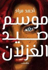
رواية “موسم صيد الغزلان “أدب يقرأ الغد: فكيف توقّعت رواية مراد تقنيات اليوم؟ – tahkoom.com
كتبت: فرح سمير
في عام 2017، أصدر الكاتب المصري أحمد مراد روايته “موسم صيد الغزلان”، التي جاءت خارج المألوف في السرد العربي، واصطحبت القارئ في رحلة إلى مستقبل تحكمه التكنولوجيا، وتختفي فيه ملامح الحياة التقليدية. رواية استباقية طرحت أسئلة علمية وفلسفية بلغة أدبية مشوقة، وتنبأت بواقع نبدأ اليوم في ملامسته.
في الرواية، نتتبع رحلة “نديم”، أستاذ بيولوجيا شاب يؤمن بالعلم المطلق وينكر الأديان، يلتقي بـ”تُقى”، فتاة تنتمي إلى جماعة سرّية ما زالت تؤمن بالروحانيات والإيمان. ينطلق الصراع بين العقل والإيمان في قالب حواري وفلسفي داخل عالم مستقبلي متطور تقنيًا، تُستخدم فيه تقنيات زرع الذاكرة، والعلاج بالروبوت، والتعليم بالنقل العصبي. وبين أسئلة الإيمان، والحب، والمعرفة، يكشف مراد عالماً يُخضع الإنسان للآلة ويطرح تساؤلات وجودية عميقة عن المستقبل ومعنى الحياة.
مراد لم يكتب من فراغ، بل بنى روايته على بحث علمي مكثف. وقال مراد في أحد تصريحاته:
“الرواية استغرقت مني 3 أشهر من البحث العلمي، و9 أشهر من الكتابة. التحدي الأكبر كان أن أستشرف المستقبل من خلال الإشارات العلمية المتوفرة الآن.”
ما كتبه أحمد مراد عن أدوات الاتصال الذكية، التعليم القائم على زراعة المعرفة في الدماغ، والطب القادر على استبدال أعضاء الإنسان بالكامل، لم يعد ضرباً من الخيال. فالواقع الافتراضي والمعزز، والهولوجرام، والروبوتات الجراحية، وواجهات زرع المعلومات في الدماغ مثل Neuralink، كلها تقنيات بدأت تظهر في حياتنا المعاصرة. حتى التقدم في مجالات تعديل الأجنة وزراعة الأعضاء الصناعية الذكية أصبح اليوم محط نقاش وتجربة.
ورغم سيطرة الخط التكنولوجي، لم تغب الكوارث البيئية عن الرواية. فقد أشار مراد إلى جفاف نهر النيل، وغرق مناطق الدلتا والإسكندرية بسبب ذوبان الجليد القطبي. وهي مشاهد روائية تنسجم بشكل مقلق مع التحذيرات العلمية الراهنة من آثار تغيّر المناخ على المدن الساحلية.
رواية أم سيناريو مستقبلي؟
تميّزت الرواية بأسلوب بصري واضح، فبدت مشاهدها وكأنها تُعرض على شاشة سينمائية. استخدم مراد تقنيات السرد البصري بشكل بارع، فبدت الابتكارات وكأنها شخصيات موازية داخل الحبكة، وليست مجرد خلفية.
خيال علمي عربي… يسبق عصره
“موسم صيد الغزلان” ليست فقط عملاً روائيًا متقدّمًا، بل خطوة جريئة في مجال الخيال العلمي العربي، الذي نادرًا ما يتم التعامل معه بجديّة. مراد لم يستخدم الخيال كمهرب من الواقع، بل كأداة لقراءته وتحليله واستشراف ما قد يأتي.
ومع تسارع وتيرة التطور التكنولوجي اليوم، تعود الرواية لتُقرأ من منظور مختلف: كنص أدبي استشرافي، سبق زمنه، ولامس ملامح واقع نعيش بداياته
زر الذهاب إلى الأعلى