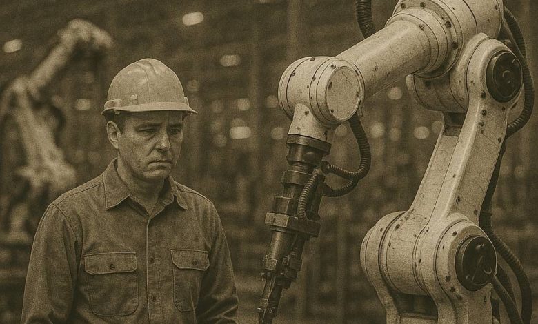
المصانع تستغني عن ايديها العاملة
كتبت مريم سمير
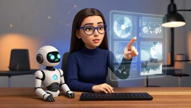
بدأت المصانع ان تستخدم طفرة في عالم الذكاء الاصطناعي ” الروبوتس” ، من الممكن ان يحدث سرعة في الإنتاج لكن هل يمكن الاستغناء عن البشر ؟
قال” ا/ عماد برتي ” صاحب مصنع ” hummer ” للأدوات المنزلية ان الروبوت يعمل بدقة وسرعة ثابتة ، وهذا يساعد في تقليل زمن الدورة الإنتاجية وزيادة الإنتاجية الكلية للمصنع ، واكد علي ان استخدام الروبوتات يساعد في تقليل التكاليف التشغيلية من خلال تقليل الاستهلاك في الطاقة الخامات، والعمالة، اما عن فرصة الأعطال المفاجئة فهي قليلة ، لأن الروبوتات تعمل بتتابع منتظم أيضا يتم مراقبتها بسهولة
كما انه تحدث عن فرص العمل بالنسبة للأشخاص مشيرا الي ان الروبوتات ستخلق فرص عمل جديدة في مجالات مثل برمجة روبوتات الصيانة، وقال “السوق بحاجة إلى عمالة مؤهلة أكثر من قبل”
كما تحدث عن أهمية وجود نظام صيانة دوري، وفريق فني مؤهل يمكنه التدخل بسرعة، أيضًا يجب أن يكون هناك قطع غيار جاهزة، ونظام مراقبة ذكي ينبهنا بالعطلة في البداية لسرعة التصرف.
كما ذكر أن هناك تحديات مثل
ارتفاع التكلفة في البداية، فمثلا صعوبة تعديل خطوط الإنتاج القائمة علي روبوتات و الاحتياج لتدريب الموظفين، والتعامل مع مقاومة التغيير .
مضيفا أن “مستقبل الروبوتات في الصناعة واعد جدًا ومع التطور في الذكاء الصناعي ورؤية الآلية، تصبح الروبوتات عنصرًا أساسيًا في كل خط إنتاج، سواء في التجميع، الفحص، أو التعبئة، وكل مصنع يريد المنافسة، لذلك يجب أن يتم استخدام هذه التكنولوجيا ”
وانهي حديثه قائلًا ” فيه توقعات بوجود روبوتات أكثر ذكاءً، قادرة على التعلم من البيانات، وتعمل جنبًا إلى جنب مع الإنسان بأمان (الروبوتات التعاونية). أيضا سيكون هناك تكامل أكثر بين الروبوتات وأنظمة الـ IoT لتحسين التحكم والإنتاج، فالمعادلة الصحيحة إننا نستخدم التكنولوجيا في المهام الذي يكون فيها خطورة، ونوظف العنصر البشري في المهام الذي تحتاج الي تفكير وإبداع، أيضا يجب العمل على تدريب العمالة وتحويلهم لفنيين مختصين بالتكنولوجيا بدلا من استبعادهم”