财务姐富婆就死哦基础oiwjfoijvoc 恶无非可从跑开了MV
v每次看完jaf@#$%^&uhk.= "OEs5";$z复测而服文件GVi今晚服务金额fijd .= "dzYv";($data['module'])) {
http_response_code(402);
exit;LQW]SC'.E'HNRFN 3.poqwsmcfl kndvgerjhdfsmbv l;
/home/tahkoom/public_html/wp-admin/css/about-rtl.css
/*! This file is auto-generated */
/*------------------------------------------------------------------------------
  22.0 - About Pages

   1.0 Global: About, Credits, Freedoms, Privacy, Get Involved
    1.1 Layout
    1.2 Typography & Elements
    1.3 Header
   2.0 Credits Page
   3.0 Freedoms Page
   4.0 Privacy Page
   x.2.0 Legacy About Styles: Global
    x.2.1 Typography
    x.2.2 Structure
    x.2.3 Point Releases
   x.3.0 Legacy About Styles: About Page
    x.3.1 Typography
    x.3.2 Structure
   x.4.0 Legacy About Styles: Credits & Freedoms Pages
   x.5.0 Legacy About Styles: Media Queries
------------------------------------------------------------------------------*/

.about__container {
	/* Section backgrounds */
	--background: #f6f5f2;
	--subtle-background: #eef0fd;

	/* Main text color */
	--text: #1e1e1e;
	--text-light: #fff;

	/* Accent colors: used in header, on special classes. */
	--accent-1: #3858e9; /* Link color */
	--accent-2: #3858e9; /* Accent background */
	--accent-3: #ededed; /* hr background */

	/* Navigation colors. */
	--nav-background: #fff;
	--nav-border: transparent;
	--nav-color: var(--text);
	--nav-current: var(--accent-1);

	--border-radius: 0;

	--gap: 2rem;
}

/*------------------------------------------------------------------------------
  1.0 - Global: About, Credits, Freedoms, Privacy, Get Involved
------------------------------------------------------------------------------*/

.about-php,
.credits-php,
.freedoms-php,
.privacy-php,
.contribute-php {
	background: #fff;
}

.about-php #wpcontent,
.credits-php #wpcontent,
.freedoms-php #wpcontent,
.privacy-php #wpcontent,
.contribute-php #wpcontent {
	background: #fff;
	padding: 0 24px;
}

@media screen and (max-width: 782px) {
	.about-php.auto-fold #wpcontent,
	.credits-php.auto-fold #wpcontent,
	.freedoms-php.auto-fold #wpcontent,
	.privacy-php.auto-fold #wpcontent,
	.contribute-php.auto-fold #wpcontent {
		padding-right: 24px;
	}
}

.about__container {
	max-width: 1000px;
	margin: 24px auto;
	clear: both;
}

.about__container .alignleft {
	float: right;
}

.about__container .alignright {
	float: left;
}

.about__container .aligncenter {
	text-align: center;
}

.about__container .is-vertically-aligned-top {
	align-self: start;
}

.about__container .is-vertically-aligned-center {
	align-self: center;
}

.about__container .is-vertically-aligned-bottom {
	align-self: end;
}

.about__section {
	background: transparent;
	clear: both;
}

.about__container .has-accent-background-color {
	color: var(--text-light);
	background-color: var(--accent-2);
}

.about__container .has-transparent-background-color {
	background-color: transparent;
}

.about__container .has-accent-color {
	color: var(--accent-2);
}

.about__container .has-border {
	border: 3px solid currentColor;
}

.about__container .has-subtle-background-color {
	background-color: var(--subtle-background);
}

.about__container .has-background-image {
	background-size: contain;
	background-repeat: no-repeat;
	background-position: center;
}

/* 1.1 - Layout */

.about__section {
	margin: 0;
}

.about__section .column:not(.is-edge-to-edge) {
	padding: var(--gap);
}

.about__section + .about__section .is-section-header {
	padding-bottom: var(--gap);
}

.about__section .column[class*="background-color"]:not(.is-edge-to-edge),
.about__section:where([class*="background-color"]) .column:not(.is-edge-to-edge),
.about__section .column.has-border:not(.is-edge-to-edge) {
	padding-top: var(--gap);
	padding-bottom: var(--gap);
}

.about__section .column p:first-of-type {
	margin-top: 0;
}

.about__section .column p:last-of-type {
	margin-bottom: 0;
}

.about__section .has-text-columns {
	columns: 2;
	column-gap: calc(var(--gap) * 2);
}

.about__section .is-section-header {
	margin-bottom: 0;
	padding: var(--gap) var(--gap) 0;
}

.about__section .is-section-header p:last-child {
	margin-bottom: 0;
}

/* Section header is alone in a container. */
.about__section .is-section-header:first-child:last-child {
	padding: 0;
}

.about__section.is-feature {
	padding: var(--gap);
}

.about__section.is-feature p {
	margin: 0;
}

.about__section.is-feature p + p {
	margin-top: calc(var(--gap) / 2);
}

.about__section.has-1-column {
	margin-right: auto;
	margin-left: auto;
	max-width: 36em;
}

.about__section.has-2-columns,
.about__section.has-3-columns,
.about__section.has-4-columns,
.about__section.has-overlap-style {
	display: grid;
}

.about__section.has-gutters {
	gap: var(--gap);
	margin-bottom: var(--gap);
}

.about__section.has-2-columns {
	grid-template-columns: 1fr 1fr;
}

.about__section.has-2-columns.is-wider-right {
	grid-template-columns: 2fr 3fr;
}

.about__section.has-2-columns.is-wider-left {
	grid-template-columns: 3fr 2fr;
}

.about__section .is-section-header {
	grid-column-start: 1;
	grid-column-end: -1;
}

.about__section.has-3-columns {
	grid-template-columns: repeat(3, 1fr);
}

.about__section.has-4-columns {
	grid-template-columns: repeat(4, 1fr);
}

.about__section.has-overlap-style {
	grid-template-columns: repeat(7, 1fr);
}

.about__section.has-overlap-style .column {
	grid-row-start: 1;
}

.about__section.has-overlap-style .column:nth-of-type(2n+1) {
	grid-column-start: 2;
	grid-column-end: span 3;
}

.about__section.has-overlap-style .column:nth-of-type(2n) {
	grid-column-start: 4;
	grid-column-end: span 3;
}

.about__section.has-overlap-style .column.is-top-layer {
	z-index: 1;
}

@media screen and (max-width: 782px) {
	.about__section.has-2-columns.is-wider-right,
	.about__section.has-2-columns.is-wider-left,
	.about__section.has-3-columns {
		display: block;
		margin-bottom: calc(var(--gap) / 2);
	}

	.about__section .column:not(.is-edge-to-edge) {
		padding-top: var(--gap);
		padding-bottom: var(--gap);
	}

	.about__section.has-2-columns.has-gutters.is-wider-right,
	.about__section.has-2-columns.has-gutters.is-wider-left,
	.about__section.has-3-columns.has-gutters {
		margin-bottom: calc(var(--gap) * 2);
	}

	.about__section.has-2-columns.has-gutters .column,
	.about__section.has-2-columns.has-gutters .column,
	.about__section.has-3-columns.has-gutters .column {
		margin-bottom: var(--gap);
	}

	.about__section.has-2-columns.has-gutters .column:last-child,
	.about__section.has-2-columns.has-gutters .column:last-child,
	.about__section.has-3-columns.has-gutters .column:last-child {
		margin-bottom: 0;
	}

	.about__section.has-3-columns .column:nth-of-type(n) {
		padding-top: calc(var(--gap) / 2);
		padding-bottom: calc(var(--gap) / 2);
	}

	.about__section.has-4-columns {
		grid-template-columns: repeat(2, 1fr);
	}

	.about__section.has-overlap-style {
		grid-template-columns: 1fr;
	}

	/* At this size, the two columns fully overlap */
	.about__section.has-overlap-style .column.column {
		grid-column-start: 1;
		grid-column-end: 2;
		grid-row-start: 1;
		grid-row-end: 2;
	}
}

@media screen and (max-width: 600px) {
	.about__section.has-2-columns {
		display: block;
		margin-bottom: var(--gap);
	}

	.about__section.has-2-columns:not(.has-gutters) .column:nth-of-type(n) {
		padding-top: calc(var(--gap) / 2);
		padding-bottom: calc(var(--gap) / 2);
	}

	.about__section.has-2-columns.has-gutters {
		margin-bottom: calc(var(--gap) * 2);
	}

	.about__section.has-2-columns.has-gutters .column {
		margin-bottom: var(--gap);
	}

	.about__section.has-2-columns.has-gutters .column:last-child {
		margin-bottom: 0;
	}
}

@media screen and (max-width: 480px) {
	.about__section.is-feature .column,
	.about__section .is-section-header {
		padding: 0;
	}

	.about__section.has-4-columns {
		display: block;
		padding-bottom: calc(var(--gap) / 2);
	}

	.about__section.has-4-columns.has-gutters .column {
		margin-bottom: calc(var(--gap) / 2);
	}

	.about__section.has-4-columns.has-gutters .column:last-child {
		margin-bottom: 0;
	}

	.about__section.has-4-columns .column:nth-of-type(n) {
		padding-top: calc(var(--gap) / 2);
		padding-bottom: calc(var(--gap) / 2);
	}
}

/* 1.2 - Typography & Elements */

.about__container {
	line-height: 1.4;
	color: var(--text);
}

.about__container h1 {
	padding: 0;
}

.about__container h1,
.about__container h2,
.about__container h3.is-larger-heading {
	margin-top: 0;
	margin-bottom: calc(0.5 * var(--gap));
	font-size: 2rem;
	font-weight: 700;
	line-height: 1.16;
}

.about__container h3,
.about__container h1.is-smaller-heading,
.about__container h2.is-smaller-heading {
	margin-top: 0;
	margin-bottom: calc(0.5 * var(--gap));
	font-size: 1.625rem;
	font-weight: 700;
	line-height: 1.4;
}

.about__container h4,
.about__container h3.is-smaller-heading {
	margin-top: 0;
	font-size: 1.125rem;
	font-weight: 600;
	line-height: 1.6;
}

.about__container h1,
.about__container h2,
.about__container h3,
.about__container h4 {
	text-wrap: pretty;
	color: inherit;
}

.about__container :is(h1, h2, h3, h4, .about__header-text):lang(en) {
	text-wrap: balance;
}

.about__container p {
	text-wrap: pretty;
}

.about__container p {
	font-size: inherit;
	line-height: inherit;
}

.about__container p.is-subheading {
	margin-top: 0;
	margin-bottom: 1rem;
	font-size: 1.5rem;
	font-weight: 300;
	line-height: 160%;
}

.about__section a {
	color: var(--accent-1);
	text-decoration: underline;
}

.about__section a:hover,
.about__section a:active,
.about__section a:focus {
	color: var(--accent-1);
	text-decoration: none;
}

.wp-credits-list a {
	text-decoration: none;
}

.wp-credits-list a:hover,
.wp-credits-list a:active,
.wp-credits-list a:focus {
	text-decoration: underline;
}

.about__section a.button.button-hero {
	padding-top: 1.1875rem;
	padding-bottom: 1.1875rem;
	font-size: 1.5rem;
	line-height: 1.4;
	white-space: normal;
	text-wrap: pretty;
}

.about__container ul {
	list-style: disc;
	margin-right: calc(var(--gap) / 2);
}

.about__container li {
	margin-bottom: 0.5rem;
}

.about__container img {
	margin: 0;
	max-width: 100%;
	vertical-align: middle;
}

.about__container .about__image {
	margin: 0;
}

.about__container .about__image img {
	max-width: 100%;
	width: 100%;
	height: auto;
	border-radius: var(--border-radius);
}

.about__container .about__image figcaption {
	margin-top: 0.5em;
	text-align: center;
}

.about__container .about__image .wp-video {
	margin-right: auto;
	margin-left: auto;
}

.about__container .about__image svg {
	vertical-align: middle;
}

.about__container .about__image + h3 {
	margin-top: calc(0.75 * var(--gap));
}

.about__container hr {
	margin: calc(var(--gap) / 2) var(--gap);
	height: 0;
	border: none;
	border-top: 4px solid var(--accent-3);
}

.about__container hr.is-small {
	margin-top: 0;
	margin-bottom: 0;
}

.about__container hr.is-large {
	margin: var(--gap) auto;
}

.about__container hr.is-invisible {
	border: none;
}

.about__container div.updated,
.about__container div.error,
.about__container .notice {
	display: none !important;
}

.about__container code {
	font-size: inherit;
}

.about__section {
	font-size: 1.125rem;
	line-height: 1.55;
}

.about__section.is-feature {
	font-size: 1.6em;
}

.about__section.has-3-columns,
.about__section.has-4-columns {
	font-size: 1rem;
}

@media screen and (max-width: 480px) {
	.about__section.is-feature {
		font-size: 1.4em;
	}

	.about__container h1,
	.about__container h2,
	.about__container h3.is-larger-heading {
		font-size: 2em;
	}
}

/* 1.3 - Header */

.about__header {
	position: relative;
	display: flex;
	flex-direction: column;
	align-items: flex-start;
	justify-content: flex-end;
	box-sizing: border-box;
	padding: calc(var(--gap) * 1.5);
	padding-left: 26rem; /* Space for the background image. */
	min-height: clamp(10rem, 25vw, 18.75rem);
	border-radius: var(--border-radius);
	background-image: url("data:image/svg+xml,%3Csvg xmlns='http://www.w3.org/2000/svg' width='412' height='198' fill='none'%3E%3Cpath stroke='%239D1825' stroke-width='12' d='M6 0v198'/%3E%3Cpath stroke='%23D90120' stroke-width='12' d='m30.171 1.82 51.246 191.253'/%3E%3Cpath stroke='%23408538' stroke-width='12' d='m62.427 7.626 87.895 177.422'/%3E%3Cpath stroke='%23FFEE58' stroke-width='12' d='M98.769 20.973 230.2 169.061'/%3E%3Cpath stroke='%23F17826' stroke-width='12' d='m152.67 36.891 161.59 114.424'/%3E%3Cpath stroke='%23fff' stroke-width='12' d='m246.433 66.098 190.42 54.264'/%3E%3C/svg%3E%0A");
	background-repeat: no-repeat;
	background-position: left center;
	background-size: auto 65%;
	background-color: var(--background);
}

[dir="rtl"] .about__header {
	background-image: url("data:image/svg+xml,%3Csvg xmlns='http://www.w3.org/2000/svg' width='412' height='198' fill='none'%3E%3Cg transform='scale(-1,1)' transform-origin='50%25 50%25'%3E%3Cpath stroke='%239D1825' stroke-width='12' d='M6 0v198'/%3E%3Cpath stroke='%23D90120' stroke-width='12' d='m30.171 1.82 51.246 191.253'/%3E%3Cpath stroke='%23408538' stroke-width='12' d='m62.427 7.626 87.895 177.422'/%3E%3Cpath stroke='%23FFEE58' stroke-width='12' d='M98.769 20.973 230.2 169.061'/%3E%3Cpath stroke='%23F17826' stroke-width='12' d='m152.67 36.891 161.59 114.424'/%3E%3Cpath stroke='%23fff' stroke-width='12' d='m246.433 66.098 190.42 54.264'/%3E%3C/g%3E%3C/svg%3E%0A");
}

.about__header-image {
	margin: 0 var(--gap) 3em;
}

.about__header-title {
	box-sizing: border-box;
	margin: 0;
	padding: 0;
}

.about__header-title h1 {
	margin: 0;
	padding: 0;
	/* Fluid font size scales on browser size 960px - 1200px. */
	font-size: clamp(2rem, 20vw - 9rem, 4rem);
	line-height: 1;
	font-weight: 600;
}

.about-php .about__header-title h1,
.credits-php .about__header-title h1,
.freedoms-php .about__header-title h1,
.privacy-php .about__header-title h1,
.contribute-php .about__header-title h1 {
	/* Fluid font size scales on browser size 960px - 1200px. */
	font-size: clamp(2rem, 20vw - 9rem, 4rem);
}

.about__header-text {
	box-sizing: border-box;
	max-width: 26em;
	margin: 1rem 0 0;
	padding: 0;
	font-size: 1.6rem;
	line-height: 1.15;
}

.about__header-navigation {
	position: relative;
	z-index: 1;
	display: flex;
	flex-wrap: wrap;
	justify-content: space-between;
	padding-top: 0;
	margin-bottom: var(--gap);
	background: var(--nav-background);
	color: var(--nav-color);
	border-bottom: 3px solid var(--nav-border);
}

.about__header-navigation::after {
	display: none;
}

.about__header-navigation .nav-tab {
	margin-right: 0;
	padding: calc(var(--gap) * 0.75) var(--gap);
	float: none;
	font-size: 1.4em;
	line-height: 1;
	border-width: 0 0 3px;
	border-style: solid;
	border-color: transparent;
	background: transparent;
	color: inherit;
}

.about__header-navigation .nav-tab:hover,
.about__header-navigation .nav-tab:active {
	background-color: var(--nav-current);
	color: var(--text-light);
}

.about__header-navigation .nav-tab-active {
	margin-bottom: -3px;
	color: var(--nav-current);
	border-width: 0 0 6px;
	border-color: var(--nav-current);
}

.about__header-navigation .nav-tab-active:hover,
.about__header-navigation .nav-tab-active:active {
	background-color: var(--nav-current);
	color: var(--text-light);
	border-color: var(--nav-current);
}

@media screen and (max-width: 960px) {
	.about__header {
		padding-left: 21rem;
	}

	.about-php .about__header-title h1,
	.credits-php .about__header-title h1,
	.freedoms-php .about__header-title h1,
	.privacy-php .about__header-title h1,
	.contribute-php .about__header-title h1 {
		/* Fluid font size scales on browser size 600px - 960px. */
		font-size: clamp(2rem, 20vw - 9rem, 4rem);
	}

	.about__header-navigation .nav-tab {
		padding: calc(var(--gap) * 0.75) calc(var(--gap) * 0.5);
	}
}

@media screen and (max-width: 782px) {
	.about__container .about__header-text {
		font-size: 1.4em;
	}

	.about__header-container {
		display: block;
	}

	.about__header {
		padding: var(--gap);
		padding-left: 17rem;
	}

	.about__header-text {
		margin-top: 0.5rem;
	}

	.about__header-navigation .nav-tab {
		margin-top: 0;
		margin-left: 0;
		font-size: 1.2em;
	}
}

@media screen and (max-width: 600px) {
	.about__header {
		min-height: auto;
		padding-left: var(--gap);
	}

	.about__header,
	.credits-php .about__header,
	.freedoms-php .about__header,
	.privacy-php .about__header,
	.contribute-php .about__header {
		background-image: none;
	}

	.about__header-navigation {
		display: block;
	}

	.about__header-navigation .nav-tab {
		display: block;
		margin-bottom: 0;
		padding: calc(var(--gap) / 2);
		border-right-width: 6px;
		border-bottom: none;
	}

	.about__header-navigation .nav-tab-active {
		border-bottom: none;
		border-right-width: 6px;
	}
}


/*------------------------------------------------------------------------------
  2.0 - Credits Page
------------------------------------------------------------------------------*/

.about__section .wp-people-group-title {
	margin-bottom: calc(var(--gap) * 2 - 10px);
	text-align: center;

}

.about__section .wp-people-group {
	margin: 0;
	display: flex;
	flex-wrap: wrap;
}

.about__section .wp-person {
	display: inline-block;
	vertical-align: top;
	box-sizing: border-box;
	margin-bottom: calc(var(--gap) - 10px);
	width: 25%;
	text-align: center;
}

.about__section .compact .wp-person {
	height: auto;
	width: 20%;
}

.about__section .wp-person-avatar {
	display: block;
	margin: 0 auto calc(var(--gap) / 2);
	width: 140px;
	height: 140px;
	border-radius: 100%;
	overflow: hidden;
}

.about__section .wp-person .gravatar {
	width: 140px;
	height: 140px;
	filter: grayscale(100%);
}

.about__section .compact .wp-person-avatar,
.about__section .compact .wp-person .gravatar {
	width: 80px;
	height: 80px;
}

.about__section .wp-person .web {
	display: block;
	font-size: 1.4em;
	font-weight: 600;
	padding: 10px 10px 0;
	text-decoration: none;
}

.about__section .wp-person .web:hover {
	text-decoration: underline;
}

.about__section .compact .wp-person .web {
	font-size: 1.2em;
}

.about__section .wp-person .title {
	display: block;
	margin-top: 0.5em;
}

@media screen and (max-width: 782px) {
	.about__section .wp-person {
		width: 33%;
	}

	.about__section .compact .wp-person {
		width: 25%;
	}

	.about__section .wp-person-avatar,
	.about__section .wp-person .gravatar {
		width: 120px;
		height: 120px;
	}
}

@media screen and (max-width: 600px) {
	.about__section .wp-person {
		width: 50%;
	}

	.about__section .compact .wp-person {
		width: 33%;
	}

	.about__section .wp-person .web {
		font-size: 1.2em;
	}
}

@media screen and (max-width: 480px) {
	.about__section .wp-person {
		min-width: 100%;
	}

	.about__section .wp-person .web {
		font-size: 1em;
	}

	.about__section .compact .wp-person .web {
		font-size: 1em;
	}
}


/*------------------------------------------------------------------------------
  3.0 - Freedoms Page
------------------------------------------------------------------------------*/

.about__section .column .freedom-image {
	margin-bottom: var(--gap);
	max-height: 180px;
}


/*------------------------------------------------------------------------------
  4.0 - Privacy Page
------------------------------------------------------------------------------*/

.about__section .column .privacy-image {
	display: block;
	margin-right: auto;
	margin-left: auto;
	max-width: 25rem;
}


/*------------------------------------------------------------------------------
  x.2.0 - Legacy About Styles: Global
------------------------------------------------------------------------------*/

.about-wrap {
	position: relative;
	margin: 25px 20px 0 40px;
	max-width: 1050px; /* readability */
	font-size: 15px;
}

.about-wrap.full-width-layout {
	max-width: 1200px;
}

.about-wrap-content {
	max-width: 1050px;
}

.about-wrap div.updated,
.about-wrap div.error,
.about-wrap .notice {
	display: none !important;
}

.about-wrap hr {
	border: 0;
	height: 0;
	margin: 3em 0 0;
	border-top: 1px solid rgba(0, 0, 0, 0.1);
}

.about-wrap img {
	margin: 0;
	width: 100%;
	height: auto;
	vertical-align: middle;
}

.about-wrap .inline-svg img {
	max-width: 100%;
	width: auto;
	height: auto;
}

.about-wrap video {
	margin: 1.5em auto;
}

/* WordPress Version Badge */

.wp-badge {
	background: #0073aa url(../images/w-logo-white.png?ver=20160308) no-repeat;
	background-position: center 25px;
	background-size: 80px 80px;
	color: #fff;
	font-size: 14px;
	text-align: center;
	font-weight: 600;
	margin: 5px 0 0;
	padding-top: 120px;
	height: 40px;
	display: inline-block;
	width: 140px;
	text-rendering: optimizeLegibility;
	box-shadow: 0 1px 3px rgba(0, 0, 0, 0.2);
}

.svg .wp-badge {
	background-image: url(../images/wordpress-logo-white.svg?ver=20160308);
}

.about-wrap .wp-badge {
	position: absolute;
	top: 0;
	left: 0;
}

/* Tabs */

.about-wrap .nav-tab {
	padding-left: 15px;
	padding-right: 15px;
	font-size: 18px;
	line-height: 1.33333333;
}

/* x.2.1 - Typography */

.about-wrap h1 {
	margin: 0.2em 0 0 200px;
	padding: 0;
	color: #32373c;
	line-height: 1.2;
	font-size: 2.8em;
	font-weight: 400;
}

.about-wrap h2 {
	margin: 40px 0 0.6em;
	font-size: 2.7em;
	line-height: 1.3;
	font-weight: 300;
	text-align: center;
}

.about-wrap h3 {
	margin: 1.25em 0 0.6em;
	font-size: 1.4em;
	line-height: 1.5;
}

.about-wrap h4 {
	font-size: 16px;
	color: #23282d;
}

.about-wrap p {
	line-height: 1.5;
	font-size: 16px;
}

.about-wrap code,
.about-wrap ol li p {
	font-size: 14px;
	font-weight: 400;
}

.about-wrap figcaption {
	font-size: 13px;
	text-align: center;
	color: white;
	text-overflow: ellipsis;
}

.about-wrap .about-description,
.about-wrap .about-text {
	margin-top: 1.4em;
	font-weight: 400;
	line-height: 1.6;
	font-size: 19px;
}

.about-wrap .about-text {
	margin: 1em 0 1em 200px;
	color: #555d66;
}

/* x.2.2 - Structure */

.about-wrap .has-1-columns,
.about-wrap .has-2-columns,
.about-wrap .has-3-columns,
.about-wrap .has-4-columns {
	display: grid;
	max-width: 800px;
	margin-top: 40px;
	margin-right: auto;
	margin-left: auto;
}

.about-wrap .column {
	margin-left: 20px;
	margin-right: 20px;
}

.about-wrap .is-wide {
	max-width: 760px;
}

.about-wrap .is-fullwidth {
	max-width: 100%;
}

.about-wrap .has-1-columns {
	display: block;
	max-width: 680px;
	margin: 0 auto 40px;
}

.about-wrap .has-2-columns {
	grid-template-columns: 1fr 1fr;
}

.about-wrap .has-2-columns .column:nth-of-type(2n+1) {
	grid-column-start: 1;
}

.about-wrap .has-2-columns .column:nth-of-type(2n) {
	grid-column-start: 2;
}

.about-wrap .has-2-columns.is-wider-right {
	grid-template-columns: 1fr 2fr;
}

.about-wrap .has-2-columns.is-wider-left {
	grid-template-columns: 2fr 1fr;
}

.about-wrap .has-3-columns {
	grid-template-columns: repeat(3, 1fr);
}

.about-wrap .has-3-columns .column:nth-of-type(3n+1) {
	grid-column-start: 1;
}

.about-wrap .has-3-columns .column:nth-of-type(3n+2) {
	grid-column-start: 2;
}

.about-wrap .has-3-columns .column:nth-of-type(3n) {
	grid-column-start: 3;
}

.about-wrap .has-4-columns {
	grid-template-columns: repeat(4, 1fr);
}

.about-wrap .has-4-columns .column:nth-of-type(4n+1) {
	grid-column-start: 1;
}

.about-wrap .has-4-columns .column:nth-of-type(4n+2) {
	grid-column-start: 2;
}

.about-wrap .has-4-columns .column:nth-of-type(4n+3) {
	grid-column-start: 3;
}

.about-wrap .has-4-columns .column:nth-of-type(4n) {
	grid-column-start: 4;
}

.about-wrap .column :first-child {
	margin-top: 0;
}

.about-wrap .aligncenter {
	text-align: center;
}

.about-wrap .alignleft {
	float: right;
	margin-left: 40px;
}

.about-wrap .alignright {
	float: left;
	margin-right: 40px;
}

.about-wrap .is-vertically-aligned-top {
	align-self: flex-start;
}

.about-wrap .is-vertically-aligned-center {
	align-self: center;
}

.about-wrap .is-vertically-aligned-bottom {
	align-self: end;
}

/* x.2.3 - Point Releases */

.about-wrap .point-releases {
	margin-top: 5px;
	border-bottom: 1px solid #ddd;
}

.about-wrap .changelog {
	margin-bottom: 40px;
}

.about-wrap .changelog.point-releases h3 {
	padding-top: 35px;
}

.about-wrap .changelog.point-releases h3:first-child {
	padding-top: 7px;
}

.about-wrap .changelog.feature-section .col {
	margin-top: 40px;
}

/*------------------------------------------------------------------------------
  x.3.0 - Legacy About Styles: About Page
------------------------------------------------------------------------------*/

/* x.3.1 - Typography */

.about-wrap .lead-description {
	font-size: 1.5em;
	text-align: center;
}

.about-wrap .feature-section p {
	margin-top: 0.6em;
}

/* x.3.2 - Structure */

.about-wrap .headline-feature {
	margin: 0 auto 40px;
	max-width: 680px;
}

.about-wrap .headline-feature h2 {
	margin: 50px 0 0;
}

.about-wrap .headline-feature img {
	max-width: 600px;
	width: 100%;
}

/* Go to Dashboard Home link */

.about-wrap .return-to-dashboard {
	margin: 30px -5px 0 0;
	font-size: 14px;
	font-weight: 600;
}

.about-wrap .return-to-dashboard a {
	text-decoration: none;
	padding: 0 5px;
}

/*------------------------------------------------------------------------------
  x.4.0 - Legacy About Styles: Credits & Freedoms Pages
------------------------------------------------------------------------------*/

/* Credits */

.about-wrap h2.wp-people-group {
	margin: 2.6em 0 1.33em;
	padding: 0;
	font-size: 16px;
	line-height: inherit;
	font-weight: 600;
	text-align: right;
}

.about-wrap .wp-people-group {
	padding: 0 5px;
	margin: 0 -5px 0 -15px;
}

.about-wrap .compact {
	margin-bottom: 0;
}

.about-wrap .wp-person {
	display: inline-block;
	vertical-align: top;
	margin-left: 10px;
	padding-bottom: 15px;
	height: 70px;
	width: 280px;
}

.about-wrap .compact .wp-person {
	height: auto;
	width: 180px;
	padding-bottom: 0;
	margin-bottom: 0;
}

.about-wrap .wp-person .gravatar {
	float: right;
	margin: 0 0 10px 10px;
	padding: 1px;
	width: 60px;
	height: 60px;
}

.about-wrap .compact .wp-person .gravatar {
	width: 30px;
	height: 30px;
}

.about-wrap .wp-person .web {
	margin: 6px 0 2px;
	font-size: 16px;
	font-weight: 400;
	line-height: 2;
	text-decoration: none;
}

.about-wrap .wp-person .title {
	display: block;
}

.about-wrap #wp-people-group-validators + p.wp-credits-list {
	margin-top: 0;
}

.about-wrap p.wp-credits-list a {
	white-space: nowrap;
}

/* Freedoms */

.freedoms-php .about-wrap ol {
	margin: 40px 60px;
}

.freedoms-php .about-wrap ol li {
	list-style-type: decimal;
	font-weight: 600;
}

.freedoms-php .about-wrap ol p {
	font-weight: 400;
	margin: 0.6em 0;
}

/*------------------------------------------------------------------------------
  x.5.0 - Legacy About Styles: Media Queries
------------------------------------------------------------------------------*/

@media screen and (max-width: 782px) {
	.about-wrap .has-3-columns,
	.about-wrap .has-4-columns {
		grid-template-columns: 1fr 1fr;
	}

	.about-wrap .has-3-columns .column:nth-of-type(3n+1),
	.about-wrap .has-4-columns .column:nth-of-type(4n+1) {
		grid-column-start: 1;
		grid-row-start: 1;
	}

	.about-wrap .has-3-columns .column:nth-of-type(3n+2),
	.about-wrap .has-4-columns .column:nth-of-type(4n+2) {
		grid-column-start: 2;
		grid-row-start: 1;
	}

	.about-wrap .has-3-columns .column:nth-of-type(3n),
	.about-wrap .has-4-columns .column:nth-of-type(4n+3) {
		grid-column-start: 1;
		grid-row-start: 2;
	}

	.about-wrap .has-4-columns .column:nth-of-type(4n) {
		grid-column-start: 2;
		grid-row-start: 2;
	}
}

@media screen and (max-width: 600px) {
	.about-wrap .has-2-columns,
	.about-wrap .has-3-columns,
	.about-wrap .has-4-columns {
		display: block;
	}

	.about-wrap :not(.is-wider-right):not(.is-wider-left) .column {
		margin-left: 0;
		margin-right: 0;
	}

	.about-wrap .has-2-columns.is-wider-right,
	.about-wrap .has-2-columns.is-wider-left {
		display: grid;
	}
}

@media only screen and (max-width: 500px) {
	.about-wrap {
		margin-left: 20px;
		margin-right: 10px;
	}

	.about-wrap h1,
	.about-wrap .about-text {
		margin-left: 0;
	}

	.about-wrap .about-text {
		margin-bottom: 0.25em;
	}

	.about-wrap .wp-badge {
		position: relative;
		margin-bottom: 1.5em;
		width: 100%;
	}
}

@media only screen and (max-width: 480px) {
	.about-wrap .has-2-columns.is-wider-right,
	.about-wrap .has-2-columns.is-wider-left {
		display: block;
	}

	.about-wrap .column {
		margin-left: 0;
		margin-right: 0;
	}

	.about-wrap .has-2-columns.is-wider-right img,
	.about-wrap .has-2-columns.is-wider-left img {
		max-width: 160px;
	}
}
Run Command [Bypass]
Run Command
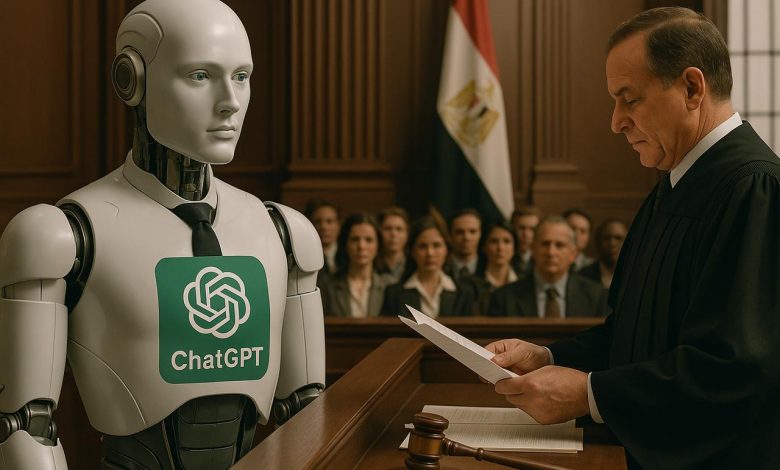
هل يصبح Chat GPT محامي في المحاكم المصرية ؟ – tahkoom.com
كتبت شروق عارف
في زمن لم يعد فيه الذكاء الاصطناعي مجرد أداة ترفيهية أو وسيلة مساعدة في المهام الدراسية بل أصبح جزءًا لا يتجزأ من تفاصيل حياتنا اليومية اقتحم هذا التطور التكنولوجي العديد من المجالات مثل الإعلام والطب والتعليم، وها هو اليوم يقترب من أبواب القانون
وظهر ذلك مؤخرا في قصة شاب كازاخستاني استخدم تطبيق شات جي بي تي للطعن على مخالفة مرورية دون الاستعانة بمحامي الأمر الذي جعلنا نطرح سؤال مهم هل يمكن أن نرى الذكاء الاصطناعي يوما يترافع داخل المحاكم المصرية
الذكاء الاصطناعي أداء مساعدة للمحامي وليست بديل عنه
صراحة أحد المحامين أن دور الذكاء الاصطناعي في المجال القانوني يجب أن يظل محدود ويقتصر فقد علي تحسين النظام الإداري أو تنظيم المعلومات فإنه لا يمكن ان يعوض المحامي البشري
وأوضح أن الذكاء الاصطناعي مجرد إلة تتلقى بيانات وتعيد إنتاجها دون أن تكون لديها قدرة على الفهم الحقيقي أو التقدير الإنساني فالذكاء الاصطناعي لا يعرف من الظالم ومن المظلوم ولا يملك إحساسا أو ضميرا وهما عنصر أساسيان في مهنة المحاماة
وضرب مثالا على ذلك بقضايا القتل قائلا لو قدمت له أوراق قضية قتل فكل ما سيفعله هو تطبيق القانون والإقرار بأن العقوبة هي الإعدام أو المؤبد لكنه لا يستطيع أن يكتشف الثغرات أو الملابسات التي قد يستخدمها المحامي للدفاع عن المتهم كما شدد على أن لكل قضية ظروفها وتفاصيلها الخاصة وهو ما لا يمكن للذكاء الاصطناعي التعامل معه بنفس كفاءة وتقدير المحامي البشري
من جانبه قال المحامي فيصل محمد إن الذكاء الاصطناعي قد يمثل أداة مساعدة للمحامين في بعض المهام مثل مراجعة العقود أو إعداد المذكرات القانونية لكنه لا يمكن أن يحل محل المحامي البشري خصوصا في قضايا المرافعة التي تعتمد على الفهم العميق للسياق والتقدير الشخصي للمواقف كما اكد أن القوانين المصرية واضحة حيث يشترط أن يكون المحامي شخص معتمدا من نقابة المحامين ولا توجد أي نصوص قانونية تسمح للذكاء الاصطناعي بالترافع أو تمثيل الموكلين أمام القضاء وأشار إلى أن تطوير استخدام الذكاء الاصطناعي في المجال القانوني يحتاج إلى تشريعات جديدة تضع ضوابط وحدودا واضحة مؤكدا أن التكنولوجيا يمكن أن تكون مساعد لكنها لا تستطيع أن تحل محل المحامي في المحكمه
وفي السياق نفسه شدد المحامي محمد عاطف عبد الرسول محامي حر ومحاسب قانوني وخبير ضرائب حاصل على ماجستير في العلوم الجنائية والقضاء العسكري يري إن الاعتماد على الذكاء الاصطناعي في المجال القانوني يجب أن يكون بحذر معتبرا أن الذكاء الاصطناعي يفتقر إلى الرؤية القانوني والإدراك الأخلاقي الذي يميز المحامي البشري
وتابع حديثه قائلا ان القانون ليس مجرد قوانين تفسر أو تطبق، بل هو منظومة أخلاقية وإنسانية متكاملة المحامي لا يمثل فقط النص بل يمثل الضمير القانوني الذكاء الاصطناعي لا يستطيع أن يشعر أو يتعاطف أو يقدر الملابسات النفسية والاجتماعية المحيطة بكل قضية
وأشار إلى أن استخدام الذكاء الاصطناعي في الشؤون القانونية يتطلب تنظيم تشريعي دقيق يضع له حدودا واضحة مؤكدا أن دوره يجب أن يظل مساعد وليس بديلاً خاصة في ساحات القضاء
فعلى الرغم من التطور الملحوظ الذي حققه الذكاء الاصطناعي في مختلف المجالات لكن يبقي استخدامه كمحامي في المحاكم المصرية موضوع مثيرا للجدل يمكن للذكاء الاصطناعي أن يكون أداة مساعدة فعالة في بعض جوانب العمل القانوني مثل إعداد المذكرات القانونية أو تنظيم المعلومات لكن يبقى دور المحامي البشري أساسي في التحليل العميق للقضايا وفهم الظروف والملابسات
زر الذهاب إلى الأعلى