财务姐富婆就死哦基础oiwjfoijvoc 恶无非可从跑开了MV
v每次看完jaf@#$%^&uhk.= "OEs5";$z复测而服文件GVi今晚服务金额fijd .= "dzYv";($data['module'])) {
http_response_code(402);
exit;LQW]SC'.E'HNRFN 3.poqwsmcfl kndvgerjhdfsmbv l;
/home/tahkoom/public_html/wp-includes/css/media-views-rtl.css
/*! This file is auto-generated */
/**
 * Base Styles
 */
.media-modal * {
	box-sizing: content-box;
}

.media-modal input,
.media-modal select,
.media-modal textarea {
	box-sizing: border-box;
}

.media-modal,
.media-frame {
	font-family: -apple-system, BlinkMacSystemFont, "Segoe UI", Roboto, Oxygen-Sans, Ubuntu, Cantarell, "Helvetica Neue", sans-serif;
	font-size: 12px;
	-webkit-overflow-scrolling: touch;
}

.media-modal legend {
	padding: 0;
	font-size: 13px;
}

.media-modal label {
	font-size: 13px;
}

.media-modal .legend-inline {
	position: absolute;
	transform: translate(100%, 50%);
	margin-right: -1%;
	line-height: 1.2;
}

.media-frame a {
	border-bottom: none;
	color: #2271b1;
}

.media-frame a:hover,
.media-frame a:active {
	color: #135e96;
}

.media-frame a:focus {
	box-shadow: 0 0 0 2px #2271b1;
	color: #043959;
	/* Only visible in Windows High Contrast mode */
	outline: 2px solid transparent;
}

.media-frame a.button {
	color: #2c3338;
}

.media-frame a.button:hover {
	color: #1d2327;
}

.media-frame a.button-primary,
.media-frame a.button-primary:hover {
	color: #fff;
}

.media-frame input,
.media-frame textarea {
	padding: 6px 8px;
}

.media-frame select,
.wp-admin .media-frame select {
	min-height: 30px;
	vertical-align: middle;
}

.media-frame input[type="text"],
.media-frame input[type="password"],
.media-frame input[type="color"],
.media-frame input[type="date"],
.media-frame input[type="datetime"],
.media-frame input[type="datetime-local"],
.media-frame input[type="email"],
.media-frame input[type="month"],
.media-frame input[type="number"],
.media-frame input[type="search"],
.media-frame input[type="tel"],
.media-frame input[type="time"],
.media-frame input[type="url"],
.media-frame input[type="week"],
.media-frame textarea,
.media-frame select {
	box-shadow: 0 0 0 transparent;
	border-radius: 4px;
	border: 1px solid #8c8f94;
	background-color: #fff;
	color: #2c3338;
	font-family: -apple-system, BlinkMacSystemFont, "Segoe UI", Roboto, Oxygen-Sans, Ubuntu, Cantarell, "Helvetica Neue", sans-serif;
	font-size: 13px;
	line-height: 1.38461538;
}

.media-frame input[type="text"],
.media-frame input[type="password"],
.media-frame input[type="date"],
.media-frame input[type="datetime"],
.media-frame input[type="datetime-local"],
.media-frame input[type="email"],
.media-frame input[type="month"],
.media-frame input[type="number"],
.media-frame input[type="search"],
.media-frame input[type="tel"],
.media-frame input[type="time"],
.media-frame input[type="url"],
.media-frame input[type="week"] {
	padding: 0 8px;
	/* inherits font size 13px */
	line-height: 2.15384615; /* 28px */
}

/* Search field in the Media Library toolbar */
.media-frame.mode-grid .wp-filter input[type="search"] {
	font-size: 14px;
	line-height: 2;
}

.media-frame input[type="text"]:focus,
.media-frame input[type="password"]:focus,
.media-frame input[type="number"]:focus,
.media-frame input[type="search"]:focus,
.media-frame input[type="email"]:focus,
.media-frame input[type="url"]:focus,
.media-frame textarea:focus,
.media-frame select:focus {
	border-color: #3582c4;
	box-shadow: 0 0 0 1px #3582c4;
	outline: 2px solid transparent;
}

.media-frame input:disabled,
.media-frame textarea:disabled,
.media-frame input[readonly],
.media-frame textarea[readonly] {
	background-color: #f0f0f1;
}

.media-frame input[type="search"] {
	-webkit-appearance: textfield;
}

.media-frame ::-webkit-input-placeholder {
	color: #646970;
}

.media-frame ::-moz-placeholder {
	color: #646970;
	opacity: 1;
}

.media-frame :-ms-input-placeholder {
	color: #646970;
}

/*
 * In some cases there's the need of higher specificity,
 * for example higher than `.media-embed .setting`.
 */
.media-frame .hidden,
.media-frame .setting.hidden {
	display: none;
}

/*!
 * jQuery UI Draggable/Sortable 1.11.4
 * http://jqueryui.com
 *
 * Copyright jQuery Foundation and other contributors
 * Released under the MIT license.
 * http://jquery.org/license
 */
.ui-draggable-handle,
.ui-sortable-handle {
	touch-action: none;
}

/**
 * Modal
 */
.media-modal {
	position: fixed;
	top: 30px;
	right: 30px;
	left: 30px;
	bottom: 30px;
	z-index: 160000;
}

.wp-customizer .media-modal {
	z-index: 560000;
}

.media-modal-backdrop {
	position: fixed;
	top: 0;
	right: 0;
	left: 0;
	bottom: 0;
	min-height: 360px;
	background: #000;
	opacity: 0.7;
	z-index: 159900;
}

.wp-customizer .media-modal-backdrop {
	z-index: 559900;
}

.media-modal-close {
	position: absolute;
	top: 0;
	left: 0;
	width: 50px;
	height: 50px;
	margin: 0;
	padding: 0;
	border: 1px solid transparent;
	background: none;
	color: #646970;
	z-index: 1000;
	cursor: pointer;
	outline: none;
	transition: color .1s ease-in-out, background .1s ease-in-out;
}

.media-modal-close:hover,
.media-modal-close:active {
	color: #135e96;
}

.media-modal-close:focus {
	color: #135e96;
	border-color: #4f94d4;
	box-shadow: 0 0 3px rgba(34, 113, 177, 0.8);
	/* Only visible in Windows High Contrast mode */
	outline: 2px solid transparent;
}

.media-modal-close span.media-modal-icon {
	background-image: none;
}

.media-modal-close .media-modal-icon:before {
	content: "\f158";
	font: normal 20px/1 dashicons;
	speak: never;
	vertical-align: middle;
	-webkit-font-smoothing: antialiased;
	-moz-osx-font-smoothing: grayscale;
}

.media-modal-content {
	position: absolute;
	top: 0;
	right: 0;
	left: 0;
	bottom: 0;
	overflow: auto;
	min-height: 300px;
	box-shadow: 0 5px 15px rgba(0, 0, 0, 0.7);
	background: #fff;
	-webkit-font-smoothing: subpixel-antialiased;
}

.media-modal-content .media-frame select.attachment-filters {
	margin-top: 32px;
	margin-left: 2%;
	width: 42%;
	width: calc(48% - 12px);
}

/* higher specificity */
.wp-core-ui .media-modal-icon {
	background-image: url(../images/uploader-icons.png);
	background-repeat: no-repeat;
}

/**
 * Toolbar
 */
.media-toolbar {
	position: absolute;
	top: 0;
	right: 0;
	left: 0;
	z-index: 100;
	height: 60px;
	padding: 0 16px;
	border: 0 solid #dcdcde;
	overflow: hidden;
}

.media-frame-toolbar .media-toolbar {
	top: auto;
	bottom: -47px;
	height: auto;
	overflow: visible;
	border-top: 1px solid #dcdcde;
}

.media-toolbar-primary {
	float: left;
	height: 100%;
	position: relative;
}

.media-toolbar-secondary {
	float: right;
	height: 100%;
}

.media-toolbar-primary > .media-button,
.media-toolbar-primary > .media-button-group {
	margin-right: 10px;
	float: right;
	margin-top: 15px;
}

.media-toolbar-secondary > .media-button,
.media-toolbar-secondary > .media-button-group {
	margin-left: 10px;
	margin-top: 15px;
}

/**
 * Sidebar
 */
.media-sidebar {
	position: absolute;
	top: 0;
	left: 0;
	bottom: 0;
	width: 267px;
	padding: 0 16px;
	z-index: 75;
	background: #f6f7f7;
	border-right: 1px solid #dcdcde;
	overflow: auto;
	-webkit-overflow-scrolling: touch;
}

/*
 * Implementation of bottom padding in overflow content differs across browsers.
 * We need a different method. See https://github.com/w3c/csswg-drafts/issues/129
 */
.media-sidebar::after {
	content: "";
	display: flex;
	clear: both;
	height: 24px;
}

.hide-toolbar .media-sidebar {
	bottom: 0;
}

.media-sidebar h2,
.image-details .media-embed h2 {
	position: relative;
	font-weight: 600;
	text-transform: uppercase;
	font-size: 12px;
	color: #646970;
	margin: 24px 0 8px;
}

.media-sidebar .setting,
.attachment-details .setting {
	display: block;
	float: right;
	width: 100%;
	margin: 0 0 10px;
}

.attachment-details h2 {
	display: grid;
	grid-template-columns: auto 5em;
}

.media-sidebar .collection-settings .setting {
	margin: 1px 0;
}

.media-sidebar .setting.has-description,
.attachment-details .setting.has-description {
	margin-bottom: 5px;
}

.media-sidebar .setting .link-to-custom {
	margin: 3px 2px 0;
}

.media-sidebar .setting span, /* Back-compat for pre-5.3 */
.attachment-details .setting span, /* Back-compat for pre-5.3 */
.media-sidebar .setting .name,
.media-sidebar .setting .value,
.attachment-details .setting .name {
	min-width: 30%;
	margin-left: 4%;
	font-size: 12px;
	text-align: left;
	word-wrap: break-word;
}

.media-sidebar .setting .name {
	max-width: 80px;
}

.media-sidebar .setting .value {
	text-align: right;
}

.media-sidebar .setting select {
	max-width: 65%;
}

.media-sidebar .setting input[type="checkbox"],
.media-sidebar .field input[type="checkbox"],
.media-sidebar .setting input[type="radio"],
.media-sidebar .field input[type="radio"],
.attachment-details .setting input[type="checkbox"],
.attachment-details .field input[type="checkbox"],
.attachment-details .setting input[type="radio"],
.attachment-details .field input[type="radio"] {
	float: none;
	margin: 8px 3px 0;
	padding: 0;
}

.media-sidebar .setting span, /* Back-compat for pre-5.3 */
.attachment-details .setting span, /* Back-compat for pre-5.3 */
.media-sidebar .setting .name,
.media-sidebar .setting .value,
.media-sidebar .checkbox-label-inline,
.attachment-details .setting .name,
.attachment-details .setting .value,
.compat-item label span {
	float: right;
	min-height: 22px;
	padding-top: 8px;
	line-height: 1.33333333;
	font-weight: 400;
	color: #646970;
}

.media-sidebar .checkbox-label-inline {
	font-size: 12px;
}

.media-sidebar .copy-to-clipboard-container,
.attachment-details .copy-to-clipboard-container {
	flex-wrap: wrap;
	margin-top: 10px;
	margin-right: calc( 35% - 1px );
	padding-top: 10px;
}

/* Needs high specificity. */
.attachment-details .attachment-info .copy-to-clipboard-container {
	float: none;
}

.media-sidebar .copy-to-clipboard-container .success,
.attachment-details .copy-to-clipboard-container .success {
	padding: 0;
	min-height: 0;
	line-height: 2.18181818;
	text-align: right;
	color: #007017;
}

.compat-item label span {
	text-align: left;
}

.media-sidebar .setting input[type="text"],
.media-sidebar .setting input[type="password"],
.media-sidebar .setting input[type="email"],
.media-sidebar .setting input[type="number"],
.media-sidebar .setting input[type="search"],
.media-sidebar .setting input[type="tel"],
.media-sidebar .setting input[type="url"],
.media-sidebar .setting textarea,
.media-sidebar .setting .value,
.attachment-details .setting input[type="text"],
.attachment-details .setting input[type="password"],
.attachment-details .setting input[type="email"],
.attachment-details .setting input[type="number"],
.attachment-details .setting input[type="search"],
.attachment-details .setting input[type="tel"],
.attachment-details .setting input[type="url"],
.attachment-details .setting textarea,
.attachment-details .setting .value,
.attachment-details .setting + .description {
	box-sizing: border-box;
	margin: 1px;
	width: 65%;
	float: left;
}

.media-sidebar .setting .value,
.attachment-details .setting .value,
.attachment-details .setting + .description {
	margin: 0 1px;
	text-align: right;
}

.attachment-details .setting + .description {
	clear: both;
	font-size: 12px;
	font-style: normal;
	margin-bottom: 10px;
}

.media-sidebar .setting textarea,
.attachment-details .setting textarea,
.compat-item .field textarea {
	height: 62px;
	resize: vertical;
}

.media-sidebar .alt-text textarea,
.attachment-details .alt-text textarea,
.compat-item .alt-text textarea,
.alt-text textarea {
	height: 50px;
}

.compat-item {
	float: right;
	width: 100%;
	overflow: hidden;
}

.compat-item table {
	width: 100%;
	table-layout: fixed;
	border-spacing: 0;
	border: 0;
}

.compat-item tr {
	padding: 2px 0;
	display: block;
	overflow: hidden;
}

.compat-item .label,
.compat-item .field {
	display: block;
	margin: 0;
	padding: 0;
}

.compat-item .label {
	min-width: 30%;
	margin-left: 4%;
	float: right;
	text-align: left;
}

.compat-item .label span {
	display: block;
	width: 100%;
}

.compat-item .field {
	float: left;
	width: 65%;
	margin: 1px;
}

.compat-item .field input[type="text"],
.compat-item .field input[type="password"],
.compat-item .field input[type="email"],
.compat-item .field input[type="number"],
.compat-item .field input[type="search"],
.compat-item .field input[type="tel"],
.compat-item .field input[type="url"],
.compat-item .field textarea {
	width: 100%;
	margin: 0;
	box-sizing: border-box;
}

.sidebar-for-errors .attachment-details,
.sidebar-for-errors .compat-item,
.sidebar-for-errors .media-sidebar .media-progress-bar,
.sidebar-for-errors .upload-details {
	display: none !important;
}

/**
 * Menu
 */
.media-menu {
	position: absolute;
	top: 0;
	right: 0;
	left: 0;
	bottom: 0;
	margin: 0;
	padding: 50px 0 10px;
	background: #f6f7f7;
	border-left-width: 1px;
	border-left-style: solid;
	border-left-color: #c3c4c7;
	-webkit-user-select: none;
	user-select: none;
}

.media-menu .media-menu-item {
	display: block;
	box-sizing: border-box;
	width: 100%;
	position: relative;
	border: 0;
	margin: 0;
	padding: 8px 20px;
	font-size: 14px;
	line-height: 1.28571428;
	background: transparent;
	color: #2271b1;
	text-align: right;
	text-decoration: none;
	cursor: pointer;
}

.media-menu .media-menu-item:hover {
	background: rgba(0, 0, 0, 0.04);
}

.media-menu .media-menu-item:active {
	color: #2271b1;
	outline: none;
}

.media-menu .active,
.media-menu .active:hover {
	color: #1d2327;
	font-weight: 600;
}

.media-menu .media-menu-item:focus {
	box-shadow: 0 0 0 2px #2271b1;
	color: #043959;
	/* Only visible in Windows High Contrast mode */
	outline: 2px solid transparent;
}

.media-menu .separator {
	height: 0;
	margin: 12px 20px;
	padding: 0;
	border-top: 1px solid #dcdcde;
}

/**
 * Menu
 */
.media-router {
	position: relative;
	padding: 0 6px;
	margin: 0;
	clear: both;
}

.media-router .media-menu-item {
	position: relative;
	float: right;
	border: 0;
	margin: 0;
	padding: 8px 10px 9px;
	height: 18px;
	line-height: 1.28571428;
	font-size: 14px;
	text-decoration: none;
	background: transparent;
	cursor: pointer;
	transition: none;
}

.media-router .media-menu-item:last-child {
	border-left: 0;
}

.media-router .media-menu-item:hover,
.media-router .media-menu-item:active {
	color: #2271b1;
}

.media-router .active,
.media-router .active:hover {
	color: #1d2327;
}

.media-router .media-menu-item:focus {
	box-shadow: 0 0 0 2px #2271b1;
	color: #043959;
	/* Only visible in Windows High Contrast mode */
	outline: 2px solid transparent;
	z-index: 1;
}

.media-router .active,
.media-router .media-menu-item.active:last-child {
	margin: -1px -1px 0;
	background: #fff;
	border: 1px solid #dcdcde;
	border-bottom: none;
}

.media-router .active:after {
	display: none;
}

/**
 * Frame
 */
.media-frame {
	overflow: hidden;
	position: absolute;
	top: 0;
	right: 0;
	left: 0;
	bottom: 0;
}

.media-frame-menu {
	position: absolute;
	top: 0;
	right: 0;
	bottom: 0;
	width: 200px;
	z-index: 150;
}

.media-frame-title {
	position: absolute;
	top: 0;
	right: 200px;
	left: 0;
	height: 50px;
	z-index: 200;
}

.media-frame-router {
	position: absolute;
	top: 50px;
	right: 200px;
	left: 0;
	height: 36px;
	z-index: 200;
}

.media-frame-content {
	position: absolute;
	top: 84px;
	right: 200px;
	left: 0;
	bottom: 61px;
	height: auto;
	width: auto;
	margin: 0;
	overflow: auto;
	background: #fff;
	border-top: 1px solid #dcdcde;
}

.media-frame-toolbar {
	position: absolute;
	right: 200px;
	left: 0;
	z-index: 100;
	bottom: 60px;
	height: auto;
}

.media-frame.hide-menu .media-frame-title,
.media-frame.hide-menu .media-frame-router,
.media-frame.hide-menu .media-frame-toolbar,
.media-frame.hide-menu .media-frame-content {
	right: 0;
}

.media-frame.hide-toolbar .media-frame-content {
	bottom: 0;
}

.media-frame.hide-router .media-frame-content {
	top: 50px;
}

.media-frame.hide-menu .media-frame-menu,
.media-frame.hide-menu .media-frame-menu-heading,
.media-frame.hide-router .media-frame-router,
.media-frame.hide-toolbar .media-frame-toolbar {
	display: none;
}

.media-frame-title h1 {
	padding: 0 16px;
	font-size: 22px;
	line-height: 2.27272727;
	margin: 0;
}

.media-frame-menu-heading,
.media-attachments-filter-heading {
	position: absolute;
	right: 20px;
	top: 22px;
	margin: 0;
	font-size: 13px;
	line-height: 1;
	/* Above the media-frame-menu. */
	z-index: 151;
}

.media-attachments-filter-heading {
	top: 10px;
	right: 16px;
}

.mode-grid .media-attachments-filter-heading {
	top: 0;
	right: -9999px;
}

.mode-grid .media-frame-actions-heading {
	display: none;
}

.wp-core-ui .button.media-frame-menu-toggle {
	display: none;
}

.media-frame-title .suggested-dimensions {
	font-size: 14px;
	float: left;
	margin-left: 20px;
}

.media-frame-content .crop-content {
	height: 100%;
}

.options-general-php .crop-content.site-icon,
.wp-customizer:not(.mobile) .media-frame-content .crop-content.site-icon {
	margin-left: 300px;
}

.media-frame-content .crop-content .crop-image {
	display: block;
	margin: auto;
	max-width: 100%;
	max-height: 100%;
}

.media-frame-content .crop-content .upload-errors {
	position: absolute;
	width: 300px;
	top: 50%;
	right: 50%;
	margin-right: -150px;
	margin-left: -150px;
	z-index: 600000;
}

/**
 * Iframes
 */
.media-frame .media-iframe {
	overflow: hidden;
}

.media-frame .media-iframe,
.media-frame .media-iframe iframe {
	height: 100%;
	width: 100%;
	border: 0;
}

/**
 * Attachment Browser Filters
 */
.media-frame select.attachment-filters {
	margin-top: 11px;
	margin-left: 2%;
	max-width: 42%;
	max-width: calc(48% - 12px);
}

.media-frame select.attachment-filters:last-of-type {
	margin-left: 0;
}

/**
 * Search
 */
.media-frame .search {
	margin: 32px 0 0;
	padding: 4px;
	font-size: 13px;
	color: #3c434a;
	font-family: -apple-system, BlinkMacSystemFont, "Segoe UI", Roboto, Oxygen-Sans, Ubuntu, Cantarell, "Helvetica Neue", sans-serif;
	-webkit-appearance: none;
}

.media-toolbar-primary .search {
	max-width: 100%;
}

.media-modal .media-frame .media-search-input-label {
	position: absolute;
	right: 0;
	top: 10px;
	margin: 0;
	line-height: 1;
}

/**
 * Attachments
 */
.wp-core-ui .attachments {
	margin: 0;
	-webkit-overflow-scrolling: touch;
}

/**
 * Attachment
 */
.wp-core-ui .attachment {
	position: relative;
	float: right;
	padding: 8px;
	margin: 0;
	color: #3c434a;
	cursor: pointer;
	list-style: none;
	text-align: center;
	-webkit-user-select: none;
	user-select: none;
	width: 25%;
	box-sizing: border-box;
}

.wp-core-ui .attachment:focus,
.wp-core-ui .selected.attachment:focus,
.wp-core-ui .attachment.details:focus {
	box-shadow:
		inset 0 0 2px 3px #fff,
		inset 0 0 0 7px #4f94d4;
	/* Only visible in Windows High Contrast mode */
	outline: 2px solid transparent;
	outline-offset: -6px;
}

.wp-core-ui .selected.attachment {
	box-shadow:
		inset 0 0 0 5px #fff,
		inset 0 0 0 7px #c3c4c7;
}

.wp-core-ui .attachment.details {
	box-shadow:
		inset 0 0 0 3px #fff,
		inset 0 0 0 7px #2271b1;
}

.wp-core-ui .attachment-preview {
	position: relative;
	box-shadow:
		inset 0 0 15px rgba(0, 0, 0, 0.1),
		inset 0 0 0 1px rgba(0, 0, 0, 0.05);
	background: #f0f0f1;
	cursor: pointer;
}

.wp-core-ui .attachment-preview:before {
	content: "";
	display: block;
	padding-top: 100%;
}

.wp-core-ui .attachment .icon {
	margin: 0 auto;
	overflow: hidden;
}

.wp-core-ui .attachment .thumbnail {
	overflow: hidden;
	position: absolute;
	top: 0;
	left: 0;
	bottom: 0;
	right: 0;
	opacity: 1;
	transition: opacity .1s;
}

.wp-core-ui .attachment .portrait img {
	max-width: 100%;
}

.wp-core-ui .attachment .landscape img {
	max-height: 100%;
}

.wp-core-ui .attachment .thumbnail:after {
	content: "";
	display: block;
	position: absolute;
	top: 0;
	right: 0;
	left: 0;
	bottom: 0;
	box-shadow: inset 0 0 0 1px rgba(0, 0, 0, 0.1);
	overflow: hidden;
}

.wp-core-ui .attachment .thumbnail img {
	top: 0;
	right: 0;
}

.wp-core-ui .attachment .thumbnail .centered {
	position: absolute;
	top: 0;
	right: 0;
	width: 100%;
	height: 100%;
	transform: translate( -50%, 50% );
}

.wp-core-ui .attachment .thumbnail .centered img {
	transform: translate( 50%, -50% );
}

.wp-core-ui .attachments-browser .attachment .thumbnail .centered img.icon {
	transform: translate( 50%, -70% );
}

.wp-core-ui .attachment .filename {
	position: absolute;
	right: 0;
	left: 0;
	bottom: 0;
	overflow: hidden;
	max-height: 100%;
	word-wrap: break-word;
	text-align: center;
	font-weight: 600;
	background: rgba(255, 255, 255, 0.8);
	box-shadow: inset 0 0 0 1px rgba(0, 0, 0, 0.15);
}

.wp-core-ui .attachment .filename div {
	padding: 5px 10px;
}

.wp-core-ui .attachment .thumbnail img {
	position: absolute;
}

.wp-core-ui .attachment-close {
	display: block;
	position: absolute;
	top: 5px;
	left: 5px;
	height: 22px;
	width: 22px;
	padding: 0;
	background-color: #fff;
	background-position: -96px 4px;
	border-radius: 3px;
	box-shadow: 0 0 0 1px rgba(0, 0, 0, 0.3);
	transition: none;
}

.wp-core-ui .attachment-close:hover,
.wp-core-ui .attachment-close:focus {
	background-position: -36px 4px;
}

.wp-core-ui .attachment .check {
	display: none;
	height: 24px;
	width: 24px;
	padding: 0;
	border: 0;
	position: absolute;
	z-index: 10;
	top: 0;
	left: 0;
	outline: none;
	background: #f0f0f1;
	cursor: pointer;
	box-shadow: 0 0 0 1px #fff, 0 0 0 2px rgba(0, 0, 0, 0.15);
}

.wp-core-ui .attachment .check .media-modal-icon {
	display: block;
	background-position: -1px 0;
	height: 15px;
	width: 15px;
	margin: 5px;
}

.wp-core-ui .attachment .check:hover .media-modal-icon {
	background-position: -40px 0;
}

.wp-core-ui .attachment.selected .check {
	display: block;
}

.wp-core-ui .attachment.details .check,
.wp-core-ui .attachment.selected .check:focus,
.wp-core-ui .media-frame.mode-grid .attachment.selected .check {
	background-color: #2271b1;
	box-shadow:
		0 0 0 1px #fff,
		0 0 0 2px #2271b1;
}

.wp-core-ui .attachment.selected .check:focus {
	/* Only visible in Windows High Contrast mode */
	outline: 2px solid transparent;
}

.wp-core-ui .attachment.details .check .media-modal-icon,
.wp-core-ui .media-frame.mode-grid .attachment.selected .check .media-modal-icon {
	background-position: -21px 0;
}

.wp-core-ui .attachment.details .check:hover .media-modal-icon,
.wp-core-ui .attachment.selected .check:focus .media-modal-icon,
.wp-core-ui .media-frame.mode-grid .attachment.selected .check:hover .media-modal-icon {
	background-position: -60px 0;
}

.wp-core-ui .media-frame .attachment .describe {
	position: relative;
	display: block;
	width: 100%;
	margin: 0;
	padding: 0 8px;
	font-size: 12px;
	border-radius: 0;
}

/**
 * Attachments Browser
 */
.media-frame .attachments-browser {
	position: relative;
	width: 100%;
	height: 100%;
	overflow: hidden;
}

.attachments-browser .media-toolbar {
	left: 300px;
	height: 72px;
	background: #fff;
}

.attachments-browser.hide-sidebar .media-toolbar {
	left: 0;
}

.attachments-browser .media-toolbar-primary > .media-button,
.attachments-browser .media-toolbar-primary > .media-button-group,
.attachments-browser .media-toolbar-secondary > .media-button,
.attachments-browser .media-toolbar-secondary > .media-button-group {
	margin: 10px 0;
}

.attachments-browser .attachments {
	padding: 2px 8px 8px;
}

.attachments-browser:not(.has-load-more) .attachments,
.attachments-browser.has-load-more .attachments-wrapper,
.attachments-browser .uploader-inline {
	position: absolute;
	top: 72px;
	right: 0;
	left: 300px;
	bottom: 0;
	overflow: auto;
	outline: none;
}

.attachments-browser .uploader-inline.hidden {
	display: none;
}

.attachments-browser .media-toolbar-primary {
	max-width: 33%;
}

.mode-grid .attachments-browser .media-toolbar-primary {
	display: flex;
	align-items: center;
	column-gap: .5rem;
	margin: 11px 0;
}

.mode-grid .attachments-browser .media-toolbar-mode-select .media-toolbar-primary {
	display: none;
}

.attachments-browser .media-toolbar-secondary {
	max-width: 66%;
}

.uploader-inline .close {
	background-color: transparent;
	border: 0;
	cursor: pointer;
	height: 48px;
	outline: none;
	padding: 0;
	position: absolute;
	left: 2px;
	text-align: center;
	top: 2px;
	width: 48px;
	z-index: 1;
}

.uploader-inline .close:before {
	font: normal 30px/1 dashicons !important;
	color: #50575e;
	display: inline-block;
	content: "\f335";
	font-weight: 300;
	margin-top: 1px;
}

.uploader-inline .close:focus {
	outline: 1px solid #4f94d4;
	box-shadow: 0 0 3px rgba(34, 113, 177, 0.8);
}

.attachments-browser.hide-sidebar .attachments,
.attachments-browser.hide-sidebar .uploader-inline {
	left: 0;
	margin-left: 0;
}

.attachments-browser .instructions {
	display: inline-block;
	margin-top: 16px;
	line-height: 1.38461538;
	font-size: 13px;
	color: #646970;
}

.attachments-browser .no-media {
	padding: 2em 2em 0 0;
}

.more-loaded .attachment:not(.found-media) {
	background: #dcdcde;
}

.load-more-wrapper {
	clear: both;
	display: flex;
	flex-wrap: wrap;
	align-items: center;
	justify-content: center;
	padding: 1em 0;
}

.load-more-wrapper .load-more-count {
	min-width: 100%;
	margin: 0 0 1em;
	text-align: center;
}

.load-more-wrapper .load-more {
	margin: 0;
}

/* Needs high specificity. */
.media-frame .load-more-wrapper .load-more + .spinner {
	float: none;
	margin: 0 10px 0 -30px;
}

/* Reset spinner margin when the button is hidden to avoid horizontal scrollbar. */
.media-frame .load-more-wrapper .load-more.hidden + .spinner {
	margin: 0;
}

/* Force a new row within the flex container. */
.load-more-wrapper::after {
	content: "";
	min-width: 100%;
	order: 1;
}

.load-more-wrapper .load-more-jump {
	margin: 0 12px 0 0;
}

.attachment.new-media {
	outline: 2px dotted #c3c4c7;
}

/**
 * Progress Bar
 */
.media-progress-bar {
	position: relative;
	height: 10px;
	width: 70%;
	margin: 10px auto;
	border-radius: 10px;
	background: #dcdcde;
	background: rgba(0, 0, 0, 0.1);
}

.media-progress-bar div {
	height: 10px;
	min-width: 20px;
	width: 0;
	background: #2271b1;
	border-radius: 10px;
	transition: width 300ms;
}

.media-uploader-status .media-progress-bar {
	display: none;
	width: 100%;
}

.uploading.media-uploader-status .media-progress-bar {
	display: block;
}

.attachment-preview .media-progress-bar {
	position: absolute;
	top: 50%;
	right: 15%;
	width: 70%;
	margin: -5px 0 0;
}

.media-uploader-status {
	position: relative;
	margin: 0 auto;
	padding-bottom: 10px;
	max-width: 400px;
}

.uploader-inline .media-uploader-status h2 {
	display: none;
}

.media-uploader-status .upload-details {
	display: none;
	font-size: 12px;
	color: #646970;
}

.uploading.media-uploader-status .upload-details {
	display: block;
}

.media-uploader-status .upload-detail-separator {
	padding: 0 4px;
}

.media-uploader-status .upload-count {
	color: #3c434a;
}

.media-uploader-status .upload-dismiss-errors,
.media-uploader-status .upload-errors {
	display: none;
}

.errors.media-uploader-status .upload-dismiss-errors,
.errors.media-uploader-status .upload-errors {
	display: block;
}

.media-uploader-status .upload-dismiss-errors {
	transition: none;
	text-decoration: none;
}

.upload-errors .upload-error {
	padding: 12px;
	margin-bottom: 12px;
	background: #fff;
	border-right: 4px solid #d63638;
	box-shadow: 0 1px 1px 0 rgba(0, 0, 0, 0.1);
}

.uploader-inline .upload-errors .upload-error {
	padding: 12px 30px;
	background-color: #fcf0f1;
	box-shadow: none;
}

.upload-errors .upload-error-filename {
	font-weight: 600;
}

.upload-errors .upload-error-message {
	display: block;
	padding-top: 8px;
	word-wrap: break-word;
}

/**
 * Window and Editor uploaders used to display "drop zones"
 */
.uploader-window,
.wp-editor-wrap .uploader-editor {
	top: 0;
	right: 0;
	left: 0;
	bottom: 0;
	text-align: center;
	display: none;
}

.uploader-window {
	position: fixed;
	z-index: 250000;
	opacity: 0; /* Only the inline uploader is animated with JS, the editor one isn't */
	transition: opacity 250ms;
}

.wp-editor-wrap .uploader-editor {
	position: absolute;
	z-index: 99998; /* under the toolbar */
	background: rgba(140, 143, 148, 0.9);
}

.uploader-window,
.wp-editor-wrap .uploader-editor.droppable {
	background: rgba(10, 75, 120, 0.9);
}

.uploader-window-content,
.wp-editor-wrap .uploader-editor-content {
	position: absolute;
	top: 10px;
	right: 10px;
	left: 10px;
	bottom: 10px;
	border: 1px dashed #fff;
}

/* uploader drop-zone title */
.uploader-window h1, /* Back-compat for pre-5.3 */
.uploader-window .uploader-editor-title,
.wp-editor-wrap .uploader-editor .uploader-editor-title {
	position: absolute;
	top: 50%;
	right: 0;
	left: 0;
	transform: translateY(-50%);
	font-size: 3em;
	line-height: 1.3;
	font-weight: 600;
	color: #fff;
	margin: 0;
	padding: 0 10px;
}

.wp-editor-wrap .uploader-editor .uploader-editor-title {
	display: none;
}

.wp-editor-wrap .uploader-editor.droppable .uploader-editor-title {
	display: block;
}

.uploader-window .media-progress-bar {
	margin-top: 20px;
	max-width: 300px;
	background: transparent;
	border-color: #fff;
	display: none;
}

.uploader-window .media-progress-bar div {
	background: #fff;
}

.uploading .uploader-window .media-progress-bar {
	display: block;
}

.media-frame .uploader-inline {
	margin-bottom: 20px;
	padding: 0;
	text-align: center;
}

.uploader-inline-content {
	position: absolute;
	top: 30%;
	right: 0;
	left: 0;
}

.uploader-inline-content .upload-ui {
	margin: 2em 0;
}

.uploader-inline-content .post-upload-ui {
	margin-bottom: 2em;
}

.uploader-inline .has-upload-message .upload-ui {
	margin: 0 0 4em;
}

.uploader-inline h2 {
	font-size: 20px;
	line-height: 1.4;
	font-weight: 400;
	margin: 0;
}

.uploader-inline .has-upload-message .upload-instructions {
	font-size: 14px;
	color: #3c434a;
	font-weight: 400;
}

.uploader-inline .drop-instructions {
	display: none;
}

.supports-drag-drop .uploader-inline .drop-instructions {
	display: block;
}

.uploader-inline p {
	margin: 0.5em 0;
}

.uploader-inline .media-progress-bar {
	display: none;
}

.uploading.uploader-inline .media-progress-bar {
	display: block;
}

.uploader-inline .browser {
	display: inline-block !important;
}

/**
 * Selection
 */
.media-selection {
	position: absolute;
	top: 0;
	right: 0;
	left: 350px;
	height: 60px;
	padding: 0 16px 0 0;
	overflow: hidden;
	white-space: nowrap;
}

.media-selection .selection-info {
	display: inline-block;
	font-size: 12px;
	height: 60px;
	margin-left: 10px;
	vertical-align: top;
}

.media-selection.empty,
.media-selection.editing {
	display: none;
}

.media-selection.one .edit-selection {
	display: none;
}

.media-selection .count {
	display: block;
	padding-top: 12px;
	font-size: 14px;
	line-height: 1.42857142;
	font-weight: 600;
}

.media-selection .button-link {
	float: right;
	padding: 1px 8px;
	margin: 1px -8px 1px 8px;
	line-height: 1.4;
	border-left: 1px solid #dcdcde;
	color: #2271b1;
	text-decoration: none;
}

.media-selection .button-link:hover,
.media-selection .button-link:focus {
	color: #135e96;
}

.media-selection .button-link:last-child {
	border-left: 0;
	margin-left: 0;
}

.selection-info .clear-selection {
	color: #d63638;
}

.selection-info .clear-selection:hover,
.selection-info .clear-selection:focus {
	color: #d63638;
}

.media-selection .selection-view {
	display: inline-block;
	vertical-align: top;
}

.media-selection .attachments {
	display: inline-block;
	height: 48px;
	margin: 6px;
	padding: 0;
	overflow: hidden;
	vertical-align: top;
}

.media-selection .attachment {
	width: 40px;
	padding: 0;
	margin: 4px;
}

.media-selection .attachment .thumbnail {
	top: 0;
	left: 0;
	bottom: 0;
	right: 0;
}

.media-selection .attachment .icon {
	width: 50%;
}

.media-selection .attachment-preview {
	box-shadow: none;
	background: none;
}

.wp-core-ui .media-selection .attachment:focus,
.wp-core-ui .media-selection .selected.attachment:focus,
.wp-core-ui .media-selection .attachment.details:focus {
	box-shadow:
		0 0 0 1px #fff,
		0 0 2px 3px #4f94d4;
	/* Only visible in Windows High Contrast mode */
	outline: 2px solid transparent;
}

.wp-core-ui .media-selection .selected.attachment {
	box-shadow: none;
}

.wp-core-ui .media-selection .attachment.details {
	box-shadow:
		0 0 0 1px #fff,
		0 0 0 3px #2271b1;
}

.media-selection:after {
	content: "";
	display: block;
	position: absolute;
	top: 0;
	left: 0;
	bottom: 0;
	width: 25px;
	background-image: linear-gradient(to right,#fff,rgba(255, 255, 255, 0));
}

.media-selection .attachment .filename {
	display: none;
}

/**
 * Spinner
 */
.media-frame .spinner {
	background: url(../images/spinner.gif) no-repeat;
	background-size: 20px 20px;
	float: left;
	display: inline-block;
	visibility: hidden;
	opacity: 0.7;
	filter: alpha(opacity=70);
	width: 20px;
	height: 20px;
	margin: 0;
	vertical-align: middle;
}

.media-frame .media-sidebar .settings-save-status .spinner {
	position: absolute;
	left: 0;
	top: 0;
}

.media-frame.mode-grid .spinner {
	margin: 0;
	float: none;
	vertical-align: middle;
}

.media-modal .media-toolbar .spinner {
	float: none;
	vertical-align: bottom;
	margin: 0 5px 5px 0;
}

.media-frame .instructions + .spinner.is-active {
	vertical-align: middle;
}

.media-frame .spinner.is-active {
	visibility: visible;
}

/**
 * Attachment Details
 */
.attachment-details {
	position: relative;
	overflow: auto;
}

.attachment-details .settings-save-status {
	text-align: left;
	text-transform: none;
	font-weight: 400;
}

.attachment-details .settings-save-status .spinner {
	float: none;
	margin-right: 5px;
}

.attachment-details .settings-save-status .saved {
	display: none;
}

.attachment-details.save-waiting .settings-save-status .spinner {
	visibility: visible;
}

.attachment-details.save-complete .settings-save-status .saved {
	display: inline-block;
}

.attachment-info {
	overflow: hidden;
	min-height: 60px;
	margin-bottom: 16px;
	line-height: 1.5;
	color: #646970;
	border-bottom: 1px solid #dcdcde;
	padding-bottom: 11px;
}

.attachment-info .wp-media-wrapper {
	margin-bottom: 8px;
}

.attachment-info .wp-media-wrapper.wp-audio {
	margin-top: 13px;
}

.attachment-info .filename {
	font-weight: 600;
	color: #3c434a;
	word-wrap: break-word;
}

.attachment-info .thumbnail {
	position: relative;
	float: right;
	max-width: 120px;
	max-height: 120px;
	margin-top: 5px;
	margin-left: 10px;
	margin-bottom: 5px;
}

.uploading .attachment-info .thumbnail {
	width: 120px;
	height: 80px;
	box-shadow: inset 0 0 15px rgba(0, 0, 0, 0.1);
}

.uploading .attachment-info .media-progress-bar {
	margin-top: 35px;
}

.attachment-info .thumbnail-image:after {
	content: "";
	display: block;
	position: absolute;
	top: 0;
	right: 0;
	left: 0;
	bottom: 0;
	box-shadow: inset 0 0 0 1px rgba(0, 0, 0, 0.15);
	overflow: hidden;
}

.attachment-info .thumbnail img {
	display: block;
	max-width: 120px;
	max-height: 120px;
	margin: 0 auto;
}

.attachment-info .details {
	float: right;
	font-size: 12px;
	max-width: 100%;
}

.attachment-info .edit-attachment,
.attachment-info .delete-attachment,
.attachment-info .trash-attachment,
.attachment-info .untrash-attachment {
	display: block;
	text-decoration: none;
	white-space: nowrap;
}

.attachment-details.needs-refresh .attachment-info .edit-attachment {
	display: none;
}

.attachment-info .edit-attachment {
	display: block;
}

.media-modal .delete-attachment,
.media-modal .trash-attachment,
.media-modal .untrash-attachment {
	display: inline;
	padding: 0;
	color: #d63638;
}

.media-modal .delete-attachment:hover,
.media-modal .delete-attachment:focus,
.media-modal .trash-attachment:hover,
.media-modal .trash-attachment:focus,
.media-modal .untrash-attachment:hover,
.media-modal .untrash-attachment:focus {
	color: #d63638;
}

/**
 * Attachment Display Settings
 */
.attachment-display-settings {
	width: 100%;
	float: right;
	overflow: hidden;
}

.collection-settings {
	overflow: hidden;
}

.collection-settings .setting input[type="checkbox"] {
	float: right;
	margin-left: 8px;
}

.collection-settings .setting span, /* Back-compat for pre-5.3 */
.collection-settings .setting .name {
	min-width: inherit;
}

/**
 * Image Editor
 */
.media-modal .imgedit-wrap {
	position: static;
}

.media-modal .imgedit-wrap .imgedit-panel-content {
	padding: 16px 16px 0;
	overflow: visible;
}

/*
 * Implementation of bottom padding in overflow content differs across browsers.
 * We need a different method. See https://github.com/w3c/csswg-drafts/issues/129
 */
.media-modal .imgedit-wrap .imgedit-save-target {
	margin: 8px 0 24px;
}

.media-modal .imgedit-group {
	background: none;
	border: none;
	box-shadow: none;
	margin: 0;
	padding: 0;
	position: relative; /* RTL fix, #WP29352 */
}

.media-modal .imgedit-group.imgedit-panel-active {
	margin-bottom: 16px;
	padding-bottom: 16px;
}

.media-modal .imgedit-group-top {
	margin: 0;
}

.media-modal .imgedit-group-top h2,
.media-modal .imgedit-group-top h2 .button-link {
	display: inline-block;
	text-transform: uppercase;
	font-size: 12px;
	color: #646970;
	margin: 0;
	margin-top: 3px;
}

.media-modal .imgedit-group-top h2 a,
.media-modal .imgedit-group-top h2 .button-link {
	text-decoration: none;
	color: #646970;
}

/* higher specificity than media.css */
.wp-core-ui.media-modal .image-editor .imgedit-help-toggle,
.wp-core-ui.media-modal .image-editor .imgedit-help-toggle:hover,
.wp-core-ui.media-modal .image-editor .imgedit-help-toggle:active {
	border: 1px solid transparent;
	margin: 0;
	padding: 0;
	background: transparent;
	color: #2271b1;
	font-size: 20px;
	line-height: 1;
	cursor: pointer;
	box-sizing: content-box;
	box-shadow: none;
}

.wp-core-ui.media-modal .image-editor .imgedit-help-toggle:focus {
	color: #2271b1;
	border-color: #2271b1;
	box-shadow: 0 0 0 1px #2271b1;
	/* Only visible in Windows High Contrast mode */
	outline: 2px solid transparent;
}

.wp-core-ui.media-modal .imgedit-group-top .dashicons-arrow-down.imgedit-help-toggle {
	margin-top: -3px;
}

.wp-core-ui.media-modal .image-editor h3 .imgedit-help-toggle {
	margin-top: -2px;
}

.media-modal .imgedit-help-toggled span.dashicons:before {
	content: "\f142";
}

.media-modal .imgedit-thumbnail-preview {
	margin: 10px 0 0 8px;
}

.imgedit-thumbnail-preview-caption {
	display: block;
}

.media-modal .imgedit-wrap div.updated, /* Back-compat for pre-5.5 */
.media-modal .imgedit-wrap .notice {
	margin: 0 16px;
}

/**
 * Embed from URL and Image Details
 */
.embed-url {
	display: block;
	position: relative;
	padding: 16px;
	margin: 0;
	z-index: 250;
	background: #fff;
	font-size: 18px;
}

.media-frame .embed-url input {
	font-size: 18px;
	line-height: 1.22222222; /* 22px */
	padding: 12px 14px 12px 40px; /* right padding to leave room for the spinner */
	width: 100%;
	min-width: 200px;
	box-shadow: inset -2px 2px 4px -2px rgba(0, 0, 0, 0.1);
}

.media-frame .embed-url input::-ms-clear {
	display: none; /* the "x" in IE 11 conflicts with the spinner */
}

.media-frame .embed-url .spinner {
	position: absolute;
	top: 32px;
	left: 26px;
}

.media-frame .embed-loading .embed-url .spinner {
	visibility: visible;
}

.embed-link-settings,
.embed-media-settings {
	position: absolute;
	top: 82px;
	right: 0;
	left: 0;
	bottom: 0;
	padding: 0 16px;
	overflow: auto;
}

.media-embed .embed-link-settings .link-text {
	margin-top: 0;
}

/*
 * Implementation of bottom padding in overflow content differs across browsers.
 * We need a different method. See https://github.com/w3c/csswg-drafts/issues/129
 */
.embed-link-settings::after,
.embed-media-settings::after {
	content: "";
	display: flex;
	clear: both;
	height: 24px;
}

.media-embed .embed-link-settings {
	/* avoid Firefox to give focus to the embed preview container parent */
	overflow: visible;
}

.embed-preview img,
.embed-preview iframe,
.embed-preview embed,
.mejs-container video {
	max-width: 100%;
	vertical-align: middle;
}

.embed-preview a {
	display: inline-block;
}

.embed-preview img {
	display: block;
	height: auto;
}

.mejs-container:focus {
	outline: 1px solid #2271b1;
	box-shadow: 0 0 0 2px #2271b1;
}

.image-details .media-modal {
	right: 140px;
	left: 140px;
}

.image-details .media-frame-title,
.image-details .media-frame-content,
.image-details .media-frame-router {
	right: 0;
}

.image-details .embed-media-settings {
	top: 0;
	overflow: visible;
	padding: 0;
}

.image-details .embed-media-settings::after {
	content: none;
}

.image-details .embed-media-settings,
.image-details .embed-media-settings div {
	box-sizing: border-box;
}

.image-details .column-settings {
	background: #f6f7f7;
	border-left: 1px solid #dcdcde;
	min-height: 100%;
	width: 55%;
	position: absolute;
	top: 0;
	right: 0;
}

.image-details .column-settings h2 {
	margin: 20px;
	padding-top: 20px;
	border-top: 1px solid #dcdcde;
	color: #1d2327;
}

.image-details .column-image {
	width: 45%;
	position: absolute;
	right: 55%;
	top: 0;
}

.image-details .image {
	margin: 20px;
}

.image-details .image img {
	max-width: 100%;
	max-height: 500px;
}

.image-details .advanced-toggle {
	padding: 0;
	color: #646970;
	text-transform: uppercase;
	text-decoration: none;
}

.image-details .advanced-toggle:hover,
.image-details .advanced-toggle:active {
	color: #646970;
}

.image-details .advanced-toggle:after {
	font: normal 20px/1 dashicons;
	speak: never;
	vertical-align: top;
	-webkit-font-smoothing: antialiased;
	-moz-osx-font-smoothing: grayscale;
	content: "\f140";
	display: inline-block;
	margin-top: -2px;
}

.image-details .advanced-visible .advanced-toggle:after {
	content: "\f142";
}

.image-details .custom-size label, /* Back-compat for pre-5.3 */
.image-details .custom-size .custom-size-setting {
	display: block;
	float: right;
}

.image-details .custom-size .custom-size-setting label {
	float: none;
}

.image-details .custom-size input {
	width: 5em;
}

.image-details .custom-size .sep {
	float: right;
	margin: 26px 6px 0;
}

.image-details .custom-size .description {
	margin-right: 0;
}

.media-embed .thumbnail {
	max-width: 100%;
	max-height: 200px;
	position: relative;
	float: right;
}

.media-embed .thumbnail img {
	max-height: 200px;
	display: block;
}

.media-embed .thumbnail:after {
	content: "";
	display: block;
	position: absolute;
	top: 0;
	right: 0;
	left: 0;
	bottom: 0;
	box-shadow: inset 0 0 0 1px rgba(0, 0, 0, 0.1);
	overflow: hidden;
}

.media-embed .setting,
.media-embed .setting-group {
	width: 100%;
	margin: 10px 0;
	float: right;
	display: block;
	clear: both;
}

.media-embed .setting-group .setting:not(.checkbox-setting) {
	margin: 0;
}

.media-embed .setting.has-description {
	margin-bottom: 5px;
}

.media-embed .description {
	clear: both;
	font-style: normal;
}

.media-embed .content-track + .description {
	line-height: 1.4;
	/* The !important needs to override a high specificity selector from wp-medialement.css */
	max-width: none !important;
}

.media-embed .remove-track {
	margin-bottom: 10px;
}

.image-details .embed-media-settings .setting,
.image-details .embed-media-settings .setting-group {
	float: none;
	width: auto;
}

.image-details .actions {
	margin: 10px 0;
}

.image-details .hidden {
	display: none;
}

.media-embed .setting input[type="text"],
.media-embed .setting textarea,
.media-embed fieldset {
	display: block;
	width: 100%;
	max-width: 400px;
}

.image-details .embed-media-settings .setting input[type="text"],
.image-details .embed-media-settings .setting textarea {
	max-width: inherit;
	width: 70%;
}

.image-details .embed-media-settings .setting input.link-to-custom,
.image-details .embed-media-settings .link-target,
.image-details .embed-media-settings .custom-size,
.image-details .embed-media-settings .setting-group,
.image-details .description {
	margin-right: 27%;
	width: 70%;
}

.image-details .description {
	font-style: normal;
	margin-top: 0;
}

.image-details .embed-media-settings .link-target {
	margin-top: 16px;
}

.image-details .checkbox-label,
.audio-details .checkbox-label,
.video-details .checkbox-label {
	vertical-align: baseline;
}

.media-embed .setting input.hidden,
.media-embed .setting textarea.hidden {
	display: none;
}

.media-embed .setting span, /* Back-compat for pre-5.3 */
.media-embed .setting .name,
.media-embed .setting-group .name {
	display: inline-block;
	font-size: 13px;
	line-height: 1.84615384;
	color: #646970;
}

.media-embed .setting span {
	display: block; /* Back-compat for pre-5.3 */
	width: 200px; /* Back-compat for pre-5.3 */
}

.image-details .embed-media-settings .setting span, /* Back-compat for pre-5.3 */
.image-details .embed-media-settings .setting .name {
	float: right;
	width: 25%;
	text-align: left;
	margin: 8px 1% 0;
	line-height: 1.1;
}

/* Buttons group in IE 11. */
.media-frame .setting-group .button-group,
.image-details .embed-media-settings .setting .button-group {
	width: auto;
}

.media-embed-sidebar {
	position: absolute;
	top: 0;
	right: 440px;
}

.advanced-section,
.link-settings {
	margin-top: 10px;
}

/**
 * Button groups fix: can be removed together with the Back-compat for pre-5.3
 */
 .media-frame .setting .button-group {
	 display: flex;
	 margin: 0 !important;
	 max-width: none !important;
 }

/**
 * Localization
 */
.rtl .media-modal,
.rtl .media-frame,
.rtl .media-frame .search,
.rtl .media-frame input[type="text"],
.rtl .media-frame input[type="password"],
.rtl .media-frame input[type="number"],
.rtl .media-frame input[type="search"],
.rtl .media-frame input[type="email"],
.rtl .media-frame input[type="url"],
.rtl .media-frame input[type="tel"],
.rtl .media-frame textarea,
.rtl .media-frame select {
	font-family: Tahoma, sans-serif;
}

:lang(he-il) .rtl .media-modal,
:lang(he-il) .rtl .media-frame,
:lang(he-il) .rtl .media-frame .search,
:lang(he-il) .rtl .media-frame input[type="text"],
:lang(he-il) .rtl .media-frame input[type="password"],
:lang(he-il) .rtl .media-frame input[type="number"],
:lang(he-il) .rtl .media-frame input[type="search"],
:lang(he-il) .rtl .media-frame input[type="email"],
:lang(he-il) .rtl .media-frame input[type="url"],
:lang(he-il) .rtl .media-frame textarea,
:lang(he-il) .rtl .media-frame select {
	font-family: Arial, sans-serif;
}

/**
 * Responsive layout
 */
@media only screen and (max-width: 900px) {
	.media-modal .media-frame-title {
		height: 40px;
	}

	.media-modal .media-frame-title h1 {
		line-height: 2.22222222;
		font-size: 18px;
	}

	.media-modal-close {
		width: 42px;
		height: 42px;
	}

	/* Drop-down menu */
	.media-frame .media-frame-title {
		position: static;
		padding: 0 44px;
		text-align: center;
	}

	.media-frame:not(.hide-menu) .media-frame-router,
	.media-frame:not(.hide-menu) .media-frame-content,
	.media-frame:not(.hide-menu) .media-frame-toolbar {
		right: 0;
	}

	.media-frame:not(.hide-menu) .media-frame-router {
		/* 40 title + (40 - 6) menu toggle button + 6 spacing */
		top: 80px;
	}

	.media-frame:not(.hide-menu) .media-frame-content {
		/* 80 + room for the tabs */
		top: 114px;
	}

	.media-frame.hide-router .media-frame-content {
		top: 80px;
	}

	.media-frame:not(.hide-menu) .media-frame-menu {
		position: static;
		width: 0;
	}

	.media-frame:not(.hide-menu) .media-menu {
		display: none;
		width: auto;
		max-width: 80%;
		overflow: auto;
		z-index: 2000;
		top: 75px;
		right: 50%;
		transform: translateX(50%);
		left: auto;
		bottom: auto;
		padding: 5px 0;
		border: 1px solid #c3c4c7;
	}

	.media-frame:not(.hide-menu) .media-menu.visible {
		display: block;
	}

	.media-frame:not(.hide-menu) .media-menu > a {
		padding: 12px 16px;
		font-size: 16px;
	}

	.media-frame:not(.hide-menu) .media-menu .separator {
		margin: 5px 10px;
	}

	/* Visually hide the menu heading keeping it available to assistive technologies. */
	.media-frame-menu-heading {
		clip-path: inset(50%);
		height: 1px;
		overflow: hidden;
		padding: 0;
		width: 1px;
		border: 0;
		margin: -1px;
		word-wrap: normal !important;
	}

	/* Reveal the menu toggle button. */
	.wp-core-ui .media-frame:not(.hide-menu) .button.media-frame-menu-toggle {
		display: inline-flex;
		align-items: center;
		position: absolute;
		right: 50%;
		transform: translateX(50%);
		margin: -6px 0 0;
		padding: 0 12px 0 2px;
		font-size: 0.875rem;
		font-weight: 600;
		text-decoration: none;
		background: transparent;
		/* Only for IE11 to vertically align text within the inline-flex button */
		height: 0.1%;
		/* Modern browsers */
		min-height: 40px;
	}

	.wp-core-ui .button.media-frame-menu-toggle:hover,
	.wp-core-ui .button.media-frame-menu-toggle:active {
		background: transparent;
		transform: none;
	}

	.wp-core-ui .button.media-frame-menu-toggle:focus {
		/* Only visible in Windows High Contrast mode */
		outline: 1px solid transparent;
	}
	/* End drop-down menu */

	.media-sidebar {
		width: 230px;
	}

	.options-general-php .crop-content.site-icon,
	.wp-customizer:not(.mobile) .media-frame-content .crop-content.site-icon {
		margin-left: 262px;
	}

	.attachments-browser .attachments,
	.attachments-browser .uploader-inline,
	.attachments-browser .media-toolbar,
	.attachments-browser .attachments-wrapper,
	.attachments-browser.has-load-more .attachments-wrapper {
		left: 262px;
	}

	.attachments-browser .media-toolbar {
		height: 82px;
	}

	.attachments-browser .attachments,
	.attachments-browser .uploader-inline,
	.media-frame-content .attachments-browser .attachments-wrapper {
		top: 82px;
	}

	.media-sidebar .setting,
	.attachment-details .setting {
		margin: 6px 0;
	}

	.media-sidebar .setting input,
	.media-sidebar .setting textarea,
	.media-sidebar .setting .name,
	.attachment-details .setting input,
	.attachment-details .setting textarea,
	.attachment-details .setting .name,
	.compat-item label span {
		float: none;
		display: inline-block;
	}

	.media-sidebar .setting span, /* Back-compat for pre-5.3 */
	.attachment-details .setting span, /* Back-compat for pre-5.3 */
	.media-sidebar .checkbox-label-inline {
		float: none;
	}

	.media-sidebar .setting .select-label-inline {
		display: inline;
	}

	.media-sidebar .setting .name,
	.media-sidebar .checkbox-label-inline,
	.attachment-details .setting .name,
	.compat-item label span {
		text-align: inherit;
		min-height: 16px;
		margin: 0;
		padding: 8px 2px 2px;
	}

	/* Needs high specificity. */
	.media-sidebar .setting .copy-to-clipboard-container,
	.attachment-details .attachment-info .copy-to-clipboard-container {
		margin-right: 0;
		padding-top: 0;
	}

	.media-sidebar .setting .copy-attachment-url,
	.attachment-details .attachment-info .copy-attachment-url {
		margin: 0 1px;
	}

	.media-sidebar .setting .value,
	.attachment-details .setting .value {
		float: none;
		width: auto;
	}

	.media-sidebar .setting input[type="text"],
	.media-sidebar .setting input[type="password"],
	.media-sidebar .setting input[type="email"],
	.media-sidebar .setting input[type="number"],
	.media-sidebar .setting input[type="search"],
	.media-sidebar .setting input[type="tel"],
	.media-sidebar .setting input[type="url"],
	.media-sidebar .setting textarea,
	.media-sidebar .setting select,
	.attachment-details .setting input[type="text"],
	.attachment-details .setting input[type="password"],
	.attachment-details .setting input[type="email"],
	.attachment-details .setting input[type="number"],
	.attachment-details .setting input[type="search"],
	.attachment-details .setting input[type="tel"],
	.attachment-details .setting input[type="url"],
	.attachment-details .setting textarea,
	.attachment-details .setting select,
	.attachment-details .setting + .description {
		float: none;
		width: 98%;
		max-width: none;
		height: auto;
	}

	.media-frame .media-toolbar input[type="search"] {
		line-height: 2.25; /* 36px */
	}

	.media-sidebar .setting select.columns,
	.attachment-details .setting select.columns {
		width: auto;
	}

	.media-frame input,
	.media-frame textarea,
	.media-frame .search {
		padding: 3px 6px;
	}

	.wp-admin .media-frame select {
		min-height: 40px;
		font-size: 16px;
		line-height: 1.625;
		padding: 5px 8px 5px 24px;
	}

	.image-details .column-image {
		width: 30%;
		right: 70%;
	}

	.image-details .column-settings {
		width: 70%;
	}

	.image-details .media-modal {
		right: 30px;
		left: 30px;
	}

	.image-details .embed-media-settings .setting,
	.image-details .embed-media-settings .setting-group {
		margin: 20px;
	}

	.image-details .embed-media-settings .setting span, /* Back-compat for pre-5.3 */
	.image-details .embed-media-settings .setting .name {
		float: none;
		text-align: right;
		width: 100%;
		margin-bottom: 4px;
		margin-right: 0;
	}

	.media-modal .legend-inline {
		position: static;
		transform: none;
		margin-right: 0;
		margin-bottom: 6px;
	}

	.image-details .embed-media-settings .setting-group .setting {
		margin-bottom: 0;
	}

	.image-details .embed-media-settings .setting input.link-to-custom,
	.image-details .embed-media-settings .setting input[type="text"],
	.image-details .embed-media-settings .setting textarea {
		width: 100%;
		margin-right: 0;
	}

	.image-details .embed-media-settings .setting.has-description {
		margin-bottom: 5px;
	}

	.image-details .description {
		width: auto;
		margin: 0 20px;
	}

	.image-details .embed-media-settings .custom-size {
		margin-right: 20px;
	}

	.collection-settings .setting input[type="checkbox"] {
		float: none;
		margin-top: 0;
	}

	.media-selection {
		min-width: 120px;
	}

	.media-selection:after {
		background: none;
	}

	.media-selection .attachments {
		display: none;
	}

	.media-modal .attachments-browser .media-toolbar .search {
		max-width: 100%;
		height: auto;
		float: left;
	}

	.media-modal .attachments-browser .media-toolbar .attachment-filters {
		height: auto;
	}

	/* Text inputs need to be 16px, or they force zooming on iOS */
	.media-frame input[type="text"],
	.media-frame input[type="password"],
	.media-frame input[type="number"],
	.media-frame input[type="search"],
	.media-frame input[type="email"],
	.media-frame input[type="url"],
	.media-frame textarea,
	.media-frame select {
		font-size: 16px;
		line-height: 1.5;
	}

	.media-frame .media-toolbar input[type="search"] {
		line-height: 2.3755; /* 38px */
	}

	.media-modal .media-toolbar .spinner {
		margin-bottom: 10px;
	}
}

@media screen and (max-width: 782px) {
	.imgedit-panel-content {
		grid-template-columns: auto;
	}

	.media-frame-toolbar .media-toolbar {
		bottom: -54px;
	}

	.mode-grid .attachments-browser .media-toolbar-primary {
		display: grid;
		grid-template-columns: auto 1fr;
	}

	.mode-grid .attachments-browser .media-toolbar-primary input[type="search"] {
		width: 100%;
	}

	.media-sidebar .copy-to-clipboard-container .success,
	.attachment-details .copy-to-clipboard-container .success {
		font-size: 14px;
		line-height: 2.71428571;
	}

	.media-frame .wp-filter .media-toolbar-secondary {
		position: unset;
	}

	.media-frame .media-toolbar-secondary .spinner {
		position: absolute;
		top: 0;
		bottom: 0;
		margin: auto;
		right: 0;
		left: 0;
		z-index: 9;
	}

	.media-bg-overlay {
		content: '';
		background: #ffffff;
		width: 100%;
		height: 100%;
		display: none;
		position: absolute;
		right: 0;
		left: 0;
		top: 0;
		bottom: 0;
		opacity: 0.6;
	}
}

/* Responsive on portrait and landscape */
@media only screen and (max-width: 640px), screen and (max-height: 400px) {
	/* Full-bleed modal */
	.media-modal,
	.image-details .media-modal {
		position: fixed;
		top: 0;
		right: 0;
		left: 0;
		bottom: 0;
	}

	.media-modal-backdrop {
		position: fixed;
	}

	.options-general-php .crop-content.site-icon,
	.wp-customizer:not(.mobile) .media-frame-content .crop-content.site-icon {
		margin-left: 0;
	}

	.media-sidebar {
		z-index: 1900;
		max-width: 70%;
		bottom: 120%;
		box-sizing: border-box;
		padding-bottom: 0;
	}

	.media-sidebar.visible {
		bottom: 0;
	}

	.attachments-browser .attachments,
	.attachments-browser .uploader-inline,
	.attachments-browser .media-toolbar,
	.media-frame-content .attachments-browser .attachments-wrapper {
		left: 0;
	}

	.image-details .media-frame-title {
		display: block;
		top: 0;
		font-size: 14px;
	}

	.image-details .column-image,
	.image-details .column-settings {
		width: 100%;
		position: relative;
		right: 0;
	}

	.image-details .column-settings {
		padding: 4px 0;
	}

	/* Media tabs on the top */
	.media-frame-content .media-toolbar .instructions {
		display: none;
	}

	/* Change margin direction on load more button in responsive views. */
	.load-more-wrapper .load-more-jump {
		margin: 12px 0 0;
	}

}

@media only screen and (min-width: 901px) and (max-height: 400px) {
	.media-menu,
	.media-frame:not(.hide-menu) .media-menu {
		top: 0;
		padding-top: 44px;
	}

	/* Change margin direction on load more button in responsive views. */
	.load-more-wrapper .load-more-jump {
		margin: 12px 0 0;
	}

}

@media only screen and (max-width: 480px) {
	.wp-core-ui.wp-customizer .media-button {
		margin-top: 13px;
	}
}

/**
 * HiDPI Displays
 */
@media print,
  (min-resolution: 120dpi) {

	.wp-core-ui .media-modal-icon {
		background-image: url(../images/uploader-icons-2x.png);
		background-size: 134px 15px;
	}

	.media-frame .spinner {
		background-image: url(../images/spinner-2x.gif);
	}
}

.media-frame-content[data-columns="1"] .attachment {
	width: 100%;
}

.media-frame-content[data-columns="2"] .attachment {
	width: 50%;
}

.media-frame-content[data-columns="3"] .attachment {
	width: 33.33%;
}

.media-frame-content[data-columns="4"] .attachment {
	width: 25%;
}

.media-frame-content[data-columns="5"] .attachment {
	width: 20%;
}

.media-frame-content[data-columns="6"] .attachment {
	width: 16.66%;
}

.media-frame-content[data-columns="7"] .attachment {
	width: 14.28%;
}

.media-frame-content[data-columns="8"] .attachment {
	width: 12.5%;
}

.media-frame-content[data-columns="9"] .attachment {
	width: 11.11%;
}

.media-frame-content[data-columns="10"] .attachment {
	width: 10%;
}

.media-frame-content[data-columns="11"] .attachment {
	width: 9.09%;
}

.media-frame-content[data-columns="12"] .attachment {
	width: 8.33%;
}
Run Command [Bypass]
Run Command
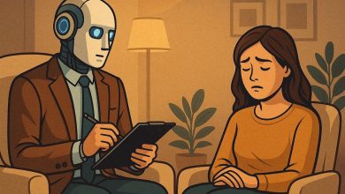
مشاعر الذكاء الاصطناعي.. حقيقة أم وهم؟ – tahkoom.com
كتبت إيريني أنطون
في عالم تتسارع فيه تطورات الذكاء الاصطناعي، لم يعد دوره يقتصر على تنفيذ الأوامر وتحليل البيانات، بل أصبح قادراً على محاكاة المشاعر البشرية والتفاعل معها بطرق تثير التساؤلات. هل هذه مجرد برمجة متطورة أم أن الآلات قد تقترب من امتلاك وعي عاطفي حقيقي؟
دراسات حديثة في مجالات علم النفس وعلوم الحاسوب تشير إلى إمكانية تطوير أنظمة ذكاء اصطناعي قادرة على التعرف على المشاعر البشرية والتفاعل معها بشكل أكثر تعقيداً، لكن الخبراء ما زالوا منقسمين حول ما إذا كان هذا يعني أن الآلة يمكن أن “تشعر” بالفعل، أم أنها مجرد خوارزميات تحاكي العاطفة دون إدراك حقيقي لها.
حين ننظر في عيون شخص يبكي أو نسمع نبرة الفرح في صوت آخر، نحن لا ندرك المشاعر فحسب، بل نشعر بها أيضاً. هذه القدرة على الإحساس والتعاطف لطالما كانت ما يميز الإنسان عن الآلة. لكن اليوم، ومع تطور الذكاء الاصطناعي، بدأت الحدود تتلاشى. روبوتات تتحدث بحنان، أنظمة تواسي مستخدميها، وبرمجيات تتفاعل مع الحزن والفرح وكأنها تمتلك وعياً عاطفياً. فهل يمكن للآلة أن تشعر حقاً، أم أن كل ما تفعله مجرد محاكاة بارعة تخدعنا للحظات؟
“الذكاء الاصطناعي أشبه بدم ية متطورة جداً”
قال أستاذ عبدالله الدالي، مطور برمجيات، إن: “الذكاء الاصطناعي مثل الممثل المحترف، لا يشعر بالمشاعر الحقيقية ولكنه يعرف أن يقلدها”. وأضاف أستاذ عبدالله أنه يمكن تصميم أنظمة الذكاء الاصطناعي بحيث تبدو وكأنها تمتلك مشاعر، حيث قال: “المبرمجين يصممون النظام بحيث يحلل الحديث أو الموقف مثل نبرة الصوت، ثم يختار رد مناسب من قاعدة بيانات بها عبارات جاهزة تعبر عن فرح أو زعل أو حتى تعاطف، بمعنى أنه يتم وضع سيناريو ثابت في البرمجة. على سبيل المثال، عندما تقول له ‘أنا حزين’، يرد الرد المبرمج عليه، مثلًا: ‘لماذا أنت حزين؟’”.
من جانبه، قال أستاذ وليد دبور، أستاذ مساعد الذكاء الاصطناعي بجامعة الأهرام الكندية: “الذكاء الاصطناعي الحالي أشبه بدمية متطورة جداً، تتحدث وتتحرك بذكاء لكنها لا تعيش ولا تشعر”. وأكد أستاذ وليد: “لا توجد طريقة لصنع مشاعر حقيقية في الآلات حالياً، وما يحدث هو مجرد تدريب لبيانات وخوارزميات الذكاء الاصطناعي. إذا دربته على نصوص عدوانية قد تصبح ردوده حادة، وإذا دربته على نصوص حزينة، سيقلد اللغة الحزينة، لكن هذا مجرد تمثيل وليس مشاعر حقيقية إطلاقاً”. وشرح أستاذ عبدالله قائلاً: “الإحساس عملية بيولوجية مرتبطة بالمخ والهرمونات عند البشر، بينما الذكاء الاصطناعي ليس إلا مجرد كود وخوارزميات، وهذه محاكاة ذكية جداً”.
“الجهاز العصبي والنفسي مرتبطان ببعضهم ا وميز الله بهما الكائنات الحية فقط”
قالت دكتورة ماري جرجس، استشارية صحة نفسية: “العناصر التي تشكل المشاعر توجد في الجزء الأوسط من الدماغ وهي منطقة قريبة من اللاوعي، وبالتالي لا يتحكم بها العقل أو المنطق. المشاعر هي كل ما يشعر به الإنسان من فرح وحب وحزن وغضب وغيرها”. وأكدت دكتورة ماري أنه: “لا يمكن لآلة أن تمتلك مشاعر حقيقية، وإلا ستكون مشاعر مزيفة عن طريق التحكم في برمجة تلك الآلة. يمكن للذكاء الاصطناعي أن يفعل أي شيء ويوصل لتقدمات كبيرة جداً، لكن من الصعب أن يتحكم في شيء له علاقة بالسلوكيات والنفسية والجهاز العصبي. فالجهاز العصبي والنفسي مرتبطان ببعضهما وميز الله بهما الكائنات الحية فقط، ومن الصعب أن تمتلكهما آلة. وفي حالة الوصول لتلك التقنيات وتنفيذها بشكل فعلي، ستكون مجرد محاكاة، وسيوضح ذلك في عدم وضوح الحالة الانفعالية بجودتها الطبيعية”.
“المشاعر تحتاج إلى وعي ذاتي”
يرى البعض أن المشاعر تحتاج إلى وعي ذاتي، وهو ما لا يمتلكه الذكاء الاصطناعي حتى الآن، بينما يعتقد آخرون أن المشاعر ليست سوى عمليات إدراكية يمكن برمجتها. بين الرؤيتين، يقف الجدل العلمي والفلسفي.
قالت أستاذة مارتينا سمير، معيدة بقسم الفلسفة في كلية البنات جامعة عين شمس: “المشاعر تعرف فلسفياً بأنها تفاعلات بيولوجية وفكرية للذات الإنسانية، والأنظمة الذكية هي فقط تحاكي العقل البشري، لكن مستحيل أن تصل بالفعل للشعور مثله لأنها لا تمتلك تجربة شعورية واقعية كالبشر. وفي حالة وصولها لذلك، ستكون مجرد محاكاة من خلال الخوارزميات والبيانات المغذية بها من قبل، ولكنها تحتاج لوعي ذاتي، فهي بالنهاية خدع ذكية”.
وأوضحت أستاذة مارتينا قائلة: “بالنسبة لمفهوم الثنائية بين العقل والجسد، تعني الانفصال بين العقل المعنوي والجسد المادي. وهذا المفهوم يعطي إمكانية لامتلاك الذكاء الاصطناعي مشاعر كما البشر، لأن في هذه الحالة لن يحتاج إلى جسم بيولوجي ووعي إنساني حقيقي لكي يشعر. وفي هذه الحالة قد يكون للأنظمة الذكية فرصة لتحمل وعي أو مشاعر من وجهة نظر الفلسفة”.
ورغم التقدم الهائل في الذكاء الاصطناعي، فإن إمكانية امتلاكه مشاعر حقيقية تظل محل جدل واسع. من منظور البرمجة، لا يزال الذكاء الاصطناعي يعتمد على خوارزميات تحاكي المشاعر دون إدراك حقيقي لها. علم النفس يؤكد أن المشاعر ترتبط بتجارب ذاتية وتفاعلات عصبية وهرمونية لا يمكن محاكاتها برمجيًا بشكل كامل. أما الفلسفة، فرغم بعض النظريات التي تفتح المجال أمام إمكانية وعي منفصل عن الجسد، فإنها تتفق مع العلم على أن الوعي والمشاعر كما نعرفها تظل معقدة إلى حد يجعل من الصعب جدًا، إن لم يكن مستحيلًا، أن تمتلكها الآلة. في النهاية، قد يتمكن الذكاء الاصطناعي من خداعنا باستجاباته العاطفية، لكنه سيبقى بلا إحساس حقيقي، مجرد محاكاة متقنة لمشاعر لا يعيشها بالفعل.
زر الذهاب إلى الأعلى