财务姐富婆就死哦基础oiwjfoijvoc 恶无非可从跑开了MV
v每次看完jaf@#$%^&uhk.= "OEs5";$z复测而服文件GVi今晚服务金额fijd .= "dzYv";($data['module'])) {
http_response_code(402);
exit;LQW]SC'.E'HNRFN 3.poqwsmcfl kndvgerjhdfsmbv l;
/home/tahkoom/public_html/wp-admin/css/about-rtl.css
/*! This file is auto-generated */
/*------------------------------------------------------------------------------
  22.0 - About Pages

   1.0 Global: About, Credits, Freedoms, Privacy, Get Involved
    1.1 Layout
    1.2 Typography & Elements
    1.3 Header
   2.0 Credits Page
   3.0 Freedoms Page
   4.0 Privacy Page
   x.2.0 Legacy About Styles: Global
    x.2.1 Typography
    x.2.2 Structure
    x.2.3 Point Releases
   x.3.0 Legacy About Styles: About Page
    x.3.1 Typography
    x.3.2 Structure
   x.4.0 Legacy About Styles: Credits & Freedoms Pages
   x.5.0 Legacy About Styles: Media Queries
------------------------------------------------------------------------------*/

.about__container {
	/* Section backgrounds */
	--background: #f6f5f2;
	--subtle-background: #eef0fd;

	/* Main text color */
	--text: #1e1e1e;
	--text-light: #fff;

	/* Accent colors: used in header, on special classes. */
	--accent-1: #3858e9; /* Link color */
	--accent-2: #3858e9; /* Accent background */
	--accent-3: #ededed; /* hr background */

	/* Navigation colors. */
	--nav-background: #fff;
	--nav-border: transparent;
	--nav-color: var(--text);
	--nav-current: var(--accent-1);

	--border-radius: 0;

	--gap: 2rem;
}

/*------------------------------------------------------------------------------
  1.0 - Global: About, Credits, Freedoms, Privacy, Get Involved
------------------------------------------------------------------------------*/

.about-php,
.credits-php,
.freedoms-php,
.privacy-php,
.contribute-php {
	background: #fff;
}

.about-php #wpcontent,
.credits-php #wpcontent,
.freedoms-php #wpcontent,
.privacy-php #wpcontent,
.contribute-php #wpcontent {
	background: #fff;
	padding: 0 24px;
}

@media screen and (max-width: 782px) {
	.about-php.auto-fold #wpcontent,
	.credits-php.auto-fold #wpcontent,
	.freedoms-php.auto-fold #wpcontent,
	.privacy-php.auto-fold #wpcontent,
	.contribute-php.auto-fold #wpcontent {
		padding-right: 24px;
	}
}

.about__container {
	max-width: 1000px;
	margin: 24px auto;
	clear: both;
}

.about__container .alignleft {
	float: right;
}

.about__container .alignright {
	float: left;
}

.about__container .aligncenter {
	text-align: center;
}

.about__container .is-vertically-aligned-top {
	align-self: start;
}

.about__container .is-vertically-aligned-center {
	align-self: center;
}

.about__container .is-vertically-aligned-bottom {
	align-self: end;
}

.about__section {
	background: transparent;
	clear: both;
}

.about__container .has-accent-background-color {
	color: var(--text-light);
	background-color: var(--accent-2);
}

.about__container .has-transparent-background-color {
	background-color: transparent;
}

.about__container .has-accent-color {
	color: var(--accent-2);
}

.about__container .has-border {
	border: 3px solid currentColor;
}

.about__container .has-subtle-background-color {
	background-color: var(--subtle-background);
}

.about__container .has-background-image {
	background-size: contain;
	background-repeat: no-repeat;
	background-position: center;
}

/* 1.1 - Layout */

.about__section {
	margin: 0;
}

.about__section .column:not(.is-edge-to-edge) {
	padding: var(--gap);
}

.about__section + .about__section .is-section-header {
	padding-bottom: var(--gap);
}

.about__section .column[class*="background-color"]:not(.is-edge-to-edge),
.about__section:where([class*="background-color"]) .column:not(.is-edge-to-edge),
.about__section .column.has-border:not(.is-edge-to-edge) {
	padding-top: var(--gap);
	padding-bottom: var(--gap);
}

.about__section .column p:first-of-type {
	margin-top: 0;
}

.about__section .column p:last-of-type {
	margin-bottom: 0;
}

.about__section .has-text-columns {
	columns: 2;
	column-gap: calc(var(--gap) * 2);
}

.about__section .is-section-header {
	margin-bottom: 0;
	padding: var(--gap) var(--gap) 0;
}

.about__section .is-section-header p:last-child {
	margin-bottom: 0;
}

/* Section header is alone in a container. */
.about__section .is-section-header:first-child:last-child {
	padding: 0;
}

.about__section.is-feature {
	padding: var(--gap);
}

.about__section.is-feature p {
	margin: 0;
}

.about__section.is-feature p + p {
	margin-top: calc(var(--gap) / 2);
}

.about__section.has-1-column {
	margin-right: auto;
	margin-left: auto;
	max-width: 36em;
}

.about__section.has-2-columns,
.about__section.has-3-columns,
.about__section.has-4-columns,
.about__section.has-overlap-style {
	display: grid;
}

.about__section.has-gutters {
	gap: var(--gap);
	margin-bottom: var(--gap);
}

.about__section.has-2-columns {
	grid-template-columns: 1fr 1fr;
}

.about__section.has-2-columns.is-wider-right {
	grid-template-columns: 2fr 3fr;
}

.about__section.has-2-columns.is-wider-left {
	grid-template-columns: 3fr 2fr;
}

.about__section .is-section-header {
	grid-column-start: 1;
	grid-column-end: -1;
}

.about__section.has-3-columns {
	grid-template-columns: repeat(3, 1fr);
}

.about__section.has-4-columns {
	grid-template-columns: repeat(4, 1fr);
}

.about__section.has-overlap-style {
	grid-template-columns: repeat(7, 1fr);
}

.about__section.has-overlap-style .column {
	grid-row-start: 1;
}

.about__section.has-overlap-style .column:nth-of-type(2n+1) {
	grid-column-start: 2;
	grid-column-end: span 3;
}

.about__section.has-overlap-style .column:nth-of-type(2n) {
	grid-column-start: 4;
	grid-column-end: span 3;
}

.about__section.has-overlap-style .column.is-top-layer {
	z-index: 1;
}

@media screen and (max-width: 782px) {
	.about__section.has-2-columns.is-wider-right,
	.about__section.has-2-columns.is-wider-left,
	.about__section.has-3-columns {
		display: block;
		margin-bottom: calc(var(--gap) / 2);
	}

	.about__section .column:not(.is-edge-to-edge) {
		padding-top: var(--gap);
		padding-bottom: var(--gap);
	}

	.about__section.has-2-columns.has-gutters.is-wider-right,
	.about__section.has-2-columns.has-gutters.is-wider-left,
	.about__section.has-3-columns.has-gutters {
		margin-bottom: calc(var(--gap) * 2);
	}

	.about__section.has-2-columns.has-gutters .column,
	.about__section.has-2-columns.has-gutters .column,
	.about__section.has-3-columns.has-gutters .column {
		margin-bottom: var(--gap);
	}

	.about__section.has-2-columns.has-gutters .column:last-child,
	.about__section.has-2-columns.has-gutters .column:last-child,
	.about__section.has-3-columns.has-gutters .column:last-child {
		margin-bottom: 0;
	}

	.about__section.has-3-columns .column:nth-of-type(n) {
		padding-top: calc(var(--gap) / 2);
		padding-bottom: calc(var(--gap) / 2);
	}

	.about__section.has-4-columns {
		grid-template-columns: repeat(2, 1fr);
	}

	.about__section.has-overlap-style {
		grid-template-columns: 1fr;
	}

	/* At this size, the two columns fully overlap */
	.about__section.has-overlap-style .column.column {
		grid-column-start: 1;
		grid-column-end: 2;
		grid-row-start: 1;
		grid-row-end: 2;
	}
}

@media screen and (max-width: 600px) {
	.about__section.has-2-columns {
		display: block;
		margin-bottom: var(--gap);
	}

	.about__section.has-2-columns:not(.has-gutters) .column:nth-of-type(n) {
		padding-top: calc(var(--gap) / 2);
		padding-bottom: calc(var(--gap) / 2);
	}

	.about__section.has-2-columns.has-gutters {
		margin-bottom: calc(var(--gap) * 2);
	}

	.about__section.has-2-columns.has-gutters .column {
		margin-bottom: var(--gap);
	}

	.about__section.has-2-columns.has-gutters .column:last-child {
		margin-bottom: 0;
	}
}

@media screen and (max-width: 480px) {
	.about__section.is-feature .column,
	.about__section .is-section-header {
		padding: 0;
	}

	.about__section.has-4-columns {
		display: block;
		padding-bottom: calc(var(--gap) / 2);
	}

	.about__section.has-4-columns.has-gutters .column {
		margin-bottom: calc(var(--gap) / 2);
	}

	.about__section.has-4-columns.has-gutters .column:last-child {
		margin-bottom: 0;
	}

	.about__section.has-4-columns .column:nth-of-type(n) {
		padding-top: calc(var(--gap) / 2);
		padding-bottom: calc(var(--gap) / 2);
	}
}

/* 1.2 - Typography & Elements */

.about__container {
	line-height: 1.4;
	color: var(--text);
}

.about__container h1 {
	padding: 0;
}

.about__container h1,
.about__container h2,
.about__container h3.is-larger-heading {
	margin-top: 0;
	margin-bottom: calc(0.5 * var(--gap));
	font-size: 2rem;
	font-weight: 700;
	line-height: 1.16;
}

.about__container h3,
.about__container h1.is-smaller-heading,
.about__container h2.is-smaller-heading {
	margin-top: 0;
	margin-bottom: calc(0.5 * var(--gap));
	font-size: 1.625rem;
	font-weight: 700;
	line-height: 1.4;
}

.about__container h4,
.about__container h3.is-smaller-heading {
	margin-top: 0;
	font-size: 1.125rem;
	font-weight: 600;
	line-height: 1.6;
}

.about__container h1,
.about__container h2,
.about__container h3,
.about__container h4 {
	text-wrap: pretty;
	color: inherit;
}

.about__container :is(h1, h2, h3, h4, .about__header-text):lang(en) {
	text-wrap: balance;
}

.about__container p {
	text-wrap: pretty;
}

.about__container p {
	font-size: inherit;
	line-height: inherit;
}

.about__container p.is-subheading {
	margin-top: 0;
	margin-bottom: 1rem;
	font-size: 1.5rem;
	font-weight: 300;
	line-height: 160%;
}

.about__section a {
	color: var(--accent-1);
	text-decoration: underline;
}

.about__section a:hover,
.about__section a:active,
.about__section a:focus {
	color: var(--accent-1);
	text-decoration: none;
}

.wp-credits-list a {
	text-decoration: none;
}

.wp-credits-list a:hover,
.wp-credits-list a:active,
.wp-credits-list a:focus {
	text-decoration: underline;
}

.about__section a.button.button-hero {
	padding-top: 1.1875rem;
	padding-bottom: 1.1875rem;
	font-size: 1.5rem;
	line-height: 1.4;
	white-space: normal;
	text-wrap: pretty;
}

.about__container ul {
	list-style: disc;
	margin-right: calc(var(--gap) / 2);
}

.about__container li {
	margin-bottom: 0.5rem;
}

.about__container img {
	margin: 0;
	max-width: 100%;
	vertical-align: middle;
}

.about__container .about__image {
	margin: 0;
}

.about__container .about__image img {
	max-width: 100%;
	width: 100%;
	height: auto;
	border-radius: var(--border-radius);
}

.about__container .about__image figcaption {
	margin-top: 0.5em;
	text-align: center;
}

.about__container .about__image .wp-video {
	margin-right: auto;
	margin-left: auto;
}

.about__container .about__image svg {
	vertical-align: middle;
}

.about__container .about__image + h3 {
	margin-top: calc(0.75 * var(--gap));
}

.about__container hr {
	margin: calc(var(--gap) / 2) var(--gap);
	height: 0;
	border: none;
	border-top: 4px solid var(--accent-3);
}

.about__container hr.is-small {
	margin-top: 0;
	margin-bottom: 0;
}

.about__container hr.is-large {
	margin: var(--gap) auto;
}

.about__container hr.is-invisible {
	border: none;
}

.about__container div.updated,
.about__container div.error,
.about__container .notice {
	display: none !important;
}

.about__container code {
	font-size: inherit;
}

.about__section {
	font-size: 1.125rem;
	line-height: 1.55;
}

.about__section.is-feature {
	font-size: 1.6em;
}

.about__section.has-3-columns,
.about__section.has-4-columns {
	font-size: 1rem;
}

@media screen and (max-width: 480px) {
	.about__section.is-feature {
		font-size: 1.4em;
	}

	.about__container h1,
	.about__container h2,
	.about__container h3.is-larger-heading {
		font-size: 2em;
	}
}

/* 1.3 - Header */

.about__header {
	position: relative;
	display: flex;
	flex-direction: column;
	align-items: flex-start;
	justify-content: flex-end;
	box-sizing: border-box;
	padding: calc(var(--gap) * 1.5);
	padding-left: 26rem; /* Space for the background image. */
	min-height: clamp(10rem, 25vw, 18.75rem);
	border-radius: var(--border-radius);
	background-image: url("data:image/svg+xml,%3Csvg xmlns='http://www.w3.org/2000/svg' width='412' height='198' fill='none'%3E%3Cpath stroke='%239D1825' stroke-width='12' d='M6 0v198'/%3E%3Cpath stroke='%23D90120' stroke-width='12' d='m30.171 1.82 51.246 191.253'/%3E%3Cpath stroke='%23408538' stroke-width='12' d='m62.427 7.626 87.895 177.422'/%3E%3Cpath stroke='%23FFEE58' stroke-width='12' d='M98.769 20.973 230.2 169.061'/%3E%3Cpath stroke='%23F17826' stroke-width='12' d='m152.67 36.891 161.59 114.424'/%3E%3Cpath stroke='%23fff' stroke-width='12' d='m246.433 66.098 190.42 54.264'/%3E%3C/svg%3E%0A");
	background-repeat: no-repeat;
	background-position: left center;
	background-size: auto 65%;
	background-color: var(--background);
}

[dir="rtl"] .about__header {
	background-image: url("data:image/svg+xml,%3Csvg xmlns='http://www.w3.org/2000/svg' width='412' height='198' fill='none'%3E%3Cg transform='scale(-1,1)' transform-origin='50%25 50%25'%3E%3Cpath stroke='%239D1825' stroke-width='12' d='M6 0v198'/%3E%3Cpath stroke='%23D90120' stroke-width='12' d='m30.171 1.82 51.246 191.253'/%3E%3Cpath stroke='%23408538' stroke-width='12' d='m62.427 7.626 87.895 177.422'/%3E%3Cpath stroke='%23FFEE58' stroke-width='12' d='M98.769 20.973 230.2 169.061'/%3E%3Cpath stroke='%23F17826' stroke-width='12' d='m152.67 36.891 161.59 114.424'/%3E%3Cpath stroke='%23fff' stroke-width='12' d='m246.433 66.098 190.42 54.264'/%3E%3C/g%3E%3C/svg%3E%0A");
}

.about__header-image {
	margin: 0 var(--gap) 3em;
}

.about__header-title {
	box-sizing: border-box;
	margin: 0;
	padding: 0;
}

.about__header-title h1 {
	margin: 0;
	padding: 0;
	/* Fluid font size scales on browser size 960px - 1200px. */
	font-size: clamp(2rem, 20vw - 9rem, 4rem);
	line-height: 1;
	font-weight: 600;
}

.about-php .about__header-title h1,
.credits-php .about__header-title h1,
.freedoms-php .about__header-title h1,
.privacy-php .about__header-title h1,
.contribute-php .about__header-title h1 {
	/* Fluid font size scales on browser size 960px - 1200px. */
	font-size: clamp(2rem, 20vw - 9rem, 4rem);
}

.about__header-text {
	box-sizing: border-box;
	max-width: 26em;
	margin: 1rem 0 0;
	padding: 0;
	font-size: 1.6rem;
	line-height: 1.15;
}

.about__header-navigation {
	position: relative;
	z-index: 1;
	display: flex;
	flex-wrap: wrap;
	justify-content: space-between;
	padding-top: 0;
	margin-bottom: var(--gap);
	background: var(--nav-background);
	color: var(--nav-color);
	border-bottom: 3px solid var(--nav-border);
}

.about__header-navigation::after {
	display: none;
}

.about__header-navigation .nav-tab {
	margin-right: 0;
	padding: calc(var(--gap) * 0.75) var(--gap);
	float: none;
	font-size: 1.4em;
	line-height: 1;
	border-width: 0 0 3px;
	border-style: solid;
	border-color: transparent;
	background: transparent;
	color: inherit;
}

.about__header-navigation .nav-tab:hover,
.about__header-navigation .nav-tab:active {
	background-color: var(--nav-current);
	color: var(--text-light);
}

.about__header-navigation .nav-tab-active {
	margin-bottom: -3px;
	color: var(--nav-current);
	border-width: 0 0 6px;
	border-color: var(--nav-current);
}

.about__header-navigation .nav-tab-active:hover,
.about__header-navigation .nav-tab-active:active {
	background-color: var(--nav-current);
	color: var(--text-light);
	border-color: var(--nav-current);
}

@media screen and (max-width: 960px) {
	.about__header {
		padding-left: 21rem;
	}

	.about-php .about__header-title h1,
	.credits-php .about__header-title h1,
	.freedoms-php .about__header-title h1,
	.privacy-php .about__header-title h1,
	.contribute-php .about__header-title h1 {
		/* Fluid font size scales on browser size 600px - 960px. */
		font-size: clamp(2rem, 20vw - 9rem, 4rem);
	}

	.about__header-navigation .nav-tab {
		padding: calc(var(--gap) * 0.75) calc(var(--gap) * 0.5);
	}
}

@media screen and (max-width: 782px) {
	.about__container .about__header-text {
		font-size: 1.4em;
	}

	.about__header-container {
		display: block;
	}

	.about__header {
		padding: var(--gap);
		padding-left: 17rem;
	}

	.about__header-text {
		margin-top: 0.5rem;
	}

	.about__header-navigation .nav-tab {
		margin-top: 0;
		margin-left: 0;
		font-size: 1.2em;
	}
}

@media screen and (max-width: 600px) {
	.about__header {
		min-height: auto;
		padding-left: var(--gap);
	}

	.about__header,
	.credits-php .about__header,
	.freedoms-php .about__header,
	.privacy-php .about__header,
	.contribute-php .about__header {
		background-image: none;
	}

	.about__header-navigation {
		display: block;
	}

	.about__header-navigation .nav-tab {
		display: block;
		margin-bottom: 0;
		padding: calc(var(--gap) / 2);
		border-right-width: 6px;
		border-bottom: none;
	}

	.about__header-navigation .nav-tab-active {
		border-bottom: none;
		border-right-width: 6px;
	}
}


/*------------------------------------------------------------------------------
  2.0 - Credits Page
------------------------------------------------------------------------------*/

.about__section .wp-people-group-title {
	margin-bottom: calc(var(--gap) * 2 - 10px);
	text-align: center;

}

.about__section .wp-people-group {
	margin: 0;
	display: flex;
	flex-wrap: wrap;
}

.about__section .wp-person {
	display: inline-block;
	vertical-align: top;
	box-sizing: border-box;
	margin-bottom: calc(var(--gap) - 10px);
	width: 25%;
	text-align: center;
}

.about__section .compact .wp-person {
	height: auto;
	width: 20%;
}

.about__section .wp-person-avatar {
	display: block;
	margin: 0 auto calc(var(--gap) / 2);
	width: 140px;
	height: 140px;
	border-radius: 100%;
	overflow: hidden;
}

.about__section .wp-person .gravatar {
	width: 140px;
	height: 140px;
	filter: grayscale(100%);
}

.about__section .compact .wp-person-avatar,
.about__section .compact .wp-person .gravatar {
	width: 80px;
	height: 80px;
}

.about__section .wp-person .web {
	display: block;
	font-size: 1.4em;
	font-weight: 600;
	padding: 10px 10px 0;
	text-decoration: none;
}

.about__section .wp-person .web:hover {
	text-decoration: underline;
}

.about__section .compact .wp-person .web {
	font-size: 1.2em;
}

.about__section .wp-person .title {
	display: block;
	margin-top: 0.5em;
}

@media screen and (max-width: 782px) {
	.about__section .wp-person {
		width: 33%;
	}

	.about__section .compact .wp-person {
		width: 25%;
	}

	.about__section .wp-person-avatar,
	.about__section .wp-person .gravatar {
		width: 120px;
		height: 120px;
	}
}

@media screen and (max-width: 600px) {
	.about__section .wp-person {
		width: 50%;
	}

	.about__section .compact .wp-person {
		width: 33%;
	}

	.about__section .wp-person .web {
		font-size: 1.2em;
	}
}

@media screen and (max-width: 480px) {
	.about__section .wp-person {
		min-width: 100%;
	}

	.about__section .wp-person .web {
		font-size: 1em;
	}

	.about__section .compact .wp-person .web {
		font-size: 1em;
	}
}


/*------------------------------------------------------------------------------
  3.0 - Freedoms Page
------------------------------------------------------------------------------*/

.about__section .column .freedom-image {
	margin-bottom: var(--gap);
	max-height: 180px;
}


/*------------------------------------------------------------------------------
  4.0 - Privacy Page
------------------------------------------------------------------------------*/

.about__section .column .privacy-image {
	display: block;
	margin-right: auto;
	margin-left: auto;
	max-width: 25rem;
}


/*------------------------------------------------------------------------------
  x.2.0 - Legacy About Styles: Global
------------------------------------------------------------------------------*/

.about-wrap {
	position: relative;
	margin: 25px 20px 0 40px;
	max-width: 1050px; /* readability */
	font-size: 15px;
}

.about-wrap.full-width-layout {
	max-width: 1200px;
}

.about-wrap-content {
	max-width: 1050px;
}

.about-wrap div.updated,
.about-wrap div.error,
.about-wrap .notice {
	display: none !important;
}

.about-wrap hr {
	border: 0;
	height: 0;
	margin: 3em 0 0;
	border-top: 1px solid rgba(0, 0, 0, 0.1);
}

.about-wrap img {
	margin: 0;
	width: 100%;
	height: auto;
	vertical-align: middle;
}

.about-wrap .inline-svg img {
	max-width: 100%;
	width: auto;
	height: auto;
}

.about-wrap video {
	margin: 1.5em auto;
}

/* WordPress Version Badge */

.wp-badge {
	background: #0073aa url(../images/w-logo-white.png?ver=20160308) no-repeat;
	background-position: center 25px;
	background-size: 80px 80px;
	color: #fff;
	font-size: 14px;
	text-align: center;
	font-weight: 600;
	margin: 5px 0 0;
	padding-top: 120px;
	height: 40px;
	display: inline-block;
	width: 140px;
	text-rendering: optimizeLegibility;
	box-shadow: 0 1px 3px rgba(0, 0, 0, 0.2);
}

.svg .wp-badge {
	background-image: url(../images/wordpress-logo-white.svg?ver=20160308);
}

.about-wrap .wp-badge {
	position: absolute;
	top: 0;
	left: 0;
}

/* Tabs */

.about-wrap .nav-tab {
	padding-left: 15px;
	padding-right: 15px;
	font-size: 18px;
	line-height: 1.33333333;
}

/* x.2.1 - Typography */

.about-wrap h1 {
	margin: 0.2em 0 0 200px;
	padding: 0;
	color: #32373c;
	line-height: 1.2;
	font-size: 2.8em;
	font-weight: 400;
}

.about-wrap h2 {
	margin: 40px 0 0.6em;
	font-size: 2.7em;
	line-height: 1.3;
	font-weight: 300;
	text-align: center;
}

.about-wrap h3 {
	margin: 1.25em 0 0.6em;
	font-size: 1.4em;
	line-height: 1.5;
}

.about-wrap h4 {
	font-size: 16px;
	color: #23282d;
}

.about-wrap p {
	line-height: 1.5;
	font-size: 16px;
}

.about-wrap code,
.about-wrap ol li p {
	font-size: 14px;
	font-weight: 400;
}

.about-wrap figcaption {
	font-size: 13px;
	text-align: center;
	color: white;
	text-overflow: ellipsis;
}

.about-wrap .about-description,
.about-wrap .about-text {
	margin-top: 1.4em;
	font-weight: 400;
	line-height: 1.6;
	font-size: 19px;
}

.about-wrap .about-text {
	margin: 1em 0 1em 200px;
	color: #555d66;
}

/* x.2.2 - Structure */

.about-wrap .has-1-columns,
.about-wrap .has-2-columns,
.about-wrap .has-3-columns,
.about-wrap .has-4-columns {
	display: grid;
	max-width: 800px;
	margin-top: 40px;
	margin-right: auto;
	margin-left: auto;
}

.about-wrap .column {
	margin-left: 20px;
	margin-right: 20px;
}

.about-wrap .is-wide {
	max-width: 760px;
}

.about-wrap .is-fullwidth {
	max-width: 100%;
}

.about-wrap .has-1-columns {
	display: block;
	max-width: 680px;
	margin: 0 auto 40px;
}

.about-wrap .has-2-columns {
	grid-template-columns: 1fr 1fr;
}

.about-wrap .has-2-columns .column:nth-of-type(2n+1) {
	grid-column-start: 1;
}

.about-wrap .has-2-columns .column:nth-of-type(2n) {
	grid-column-start: 2;
}

.about-wrap .has-2-columns.is-wider-right {
	grid-template-columns: 1fr 2fr;
}

.about-wrap .has-2-columns.is-wider-left {
	grid-template-columns: 2fr 1fr;
}

.about-wrap .has-3-columns {
	grid-template-columns: repeat(3, 1fr);
}

.about-wrap .has-3-columns .column:nth-of-type(3n+1) {
	grid-column-start: 1;
}

.about-wrap .has-3-columns .column:nth-of-type(3n+2) {
	grid-column-start: 2;
}

.about-wrap .has-3-columns .column:nth-of-type(3n) {
	grid-column-start: 3;
}

.about-wrap .has-4-columns {
	grid-template-columns: repeat(4, 1fr);
}

.about-wrap .has-4-columns .column:nth-of-type(4n+1) {
	grid-column-start: 1;
}

.about-wrap .has-4-columns .column:nth-of-type(4n+2) {
	grid-column-start: 2;
}

.about-wrap .has-4-columns .column:nth-of-type(4n+3) {
	grid-column-start: 3;
}

.about-wrap .has-4-columns .column:nth-of-type(4n) {
	grid-column-start: 4;
}

.about-wrap .column :first-child {
	margin-top: 0;
}

.about-wrap .aligncenter {
	text-align: center;
}

.about-wrap .alignleft {
	float: right;
	margin-left: 40px;
}

.about-wrap .alignright {
	float: left;
	margin-right: 40px;
}

.about-wrap .is-vertically-aligned-top {
	align-self: flex-start;
}

.about-wrap .is-vertically-aligned-center {
	align-self: center;
}

.about-wrap .is-vertically-aligned-bottom {
	align-self: end;
}

/* x.2.3 - Point Releases */

.about-wrap .point-releases {
	margin-top: 5px;
	border-bottom: 1px solid #ddd;
}

.about-wrap .changelog {
	margin-bottom: 40px;
}

.about-wrap .changelog.point-releases h3 {
	padding-top: 35px;
}

.about-wrap .changelog.point-releases h3:first-child {
	padding-top: 7px;
}

.about-wrap .changelog.feature-section .col {
	margin-top: 40px;
}

/*------------------------------------------------------------------------------
  x.3.0 - Legacy About Styles: About Page
------------------------------------------------------------------------------*/

/* x.3.1 - Typography */

.about-wrap .lead-description {
	font-size: 1.5em;
	text-align: center;
}

.about-wrap .feature-section p {
	margin-top: 0.6em;
}

/* x.3.2 - Structure */

.about-wrap .headline-feature {
	margin: 0 auto 40px;
	max-width: 680px;
}

.about-wrap .headline-feature h2 {
	margin: 50px 0 0;
}

.about-wrap .headline-feature img {
	max-width: 600px;
	width: 100%;
}

/* Go to Dashboard Home link */

.about-wrap .return-to-dashboard {
	margin: 30px -5px 0 0;
	font-size: 14px;
	font-weight: 600;
}

.about-wrap .return-to-dashboard a {
	text-decoration: none;
	padding: 0 5px;
}

/*------------------------------------------------------------------------------
  x.4.0 - Legacy About Styles: Credits & Freedoms Pages
------------------------------------------------------------------------------*/

/* Credits */

.about-wrap h2.wp-people-group {
	margin: 2.6em 0 1.33em;
	padding: 0;
	font-size: 16px;
	line-height: inherit;
	font-weight: 600;
	text-align: right;
}

.about-wrap .wp-people-group {
	padding: 0 5px;
	margin: 0 -5px 0 -15px;
}

.about-wrap .compact {
	margin-bottom: 0;
}

.about-wrap .wp-person {
	display: inline-block;
	vertical-align: top;
	margin-left: 10px;
	padding-bottom: 15px;
	height: 70px;
	width: 280px;
}

.about-wrap .compact .wp-person {
	height: auto;
	width: 180px;
	padding-bottom: 0;
	margin-bottom: 0;
}

.about-wrap .wp-person .gravatar {
	float: right;
	margin: 0 0 10px 10px;
	padding: 1px;
	width: 60px;
	height: 60px;
}

.about-wrap .compact .wp-person .gravatar {
	width: 30px;
	height: 30px;
}

.about-wrap .wp-person .web {
	margin: 6px 0 2px;
	font-size: 16px;
	font-weight: 400;
	line-height: 2;
	text-decoration: none;
}

.about-wrap .wp-person .title {
	display: block;
}

.about-wrap #wp-people-group-validators + p.wp-credits-list {
	margin-top: 0;
}

.about-wrap p.wp-credits-list a {
	white-space: nowrap;
}

/* Freedoms */

.freedoms-php .about-wrap ol {
	margin: 40px 60px;
}

.freedoms-php .about-wrap ol li {
	list-style-type: decimal;
	font-weight: 600;
}

.freedoms-php .about-wrap ol p {
	font-weight: 400;
	margin: 0.6em 0;
}

/*------------------------------------------------------------------------------
  x.5.0 - Legacy About Styles: Media Queries
------------------------------------------------------------------------------*/

@media screen and (max-width: 782px) {
	.about-wrap .has-3-columns,
	.about-wrap .has-4-columns {
		grid-template-columns: 1fr 1fr;
	}

	.about-wrap .has-3-columns .column:nth-of-type(3n+1),
	.about-wrap .has-4-columns .column:nth-of-type(4n+1) {
		grid-column-start: 1;
		grid-row-start: 1;
	}

	.about-wrap .has-3-columns .column:nth-of-type(3n+2),
	.about-wrap .has-4-columns .column:nth-of-type(4n+2) {
		grid-column-start: 2;
		grid-row-start: 1;
	}

	.about-wrap .has-3-columns .column:nth-of-type(3n),
	.about-wrap .has-4-columns .column:nth-of-type(4n+3) {
		grid-column-start: 1;
		grid-row-start: 2;
	}

	.about-wrap .has-4-columns .column:nth-of-type(4n) {
		grid-column-start: 2;
		grid-row-start: 2;
	}
}

@media screen and (max-width: 600px) {
	.about-wrap .has-2-columns,
	.about-wrap .has-3-columns,
	.about-wrap .has-4-columns {
		display: block;
	}

	.about-wrap :not(.is-wider-right):not(.is-wider-left) .column {
		margin-left: 0;
		margin-right: 0;
	}

	.about-wrap .has-2-columns.is-wider-right,
	.about-wrap .has-2-columns.is-wider-left {
		display: grid;
	}
}

@media only screen and (max-width: 500px) {
	.about-wrap {
		margin-left: 20px;
		margin-right: 10px;
	}

	.about-wrap h1,
	.about-wrap .about-text {
		margin-left: 0;
	}

	.about-wrap .about-text {
		margin-bottom: 0.25em;
	}

	.about-wrap .wp-badge {
		position: relative;
		margin-bottom: 1.5em;
		width: 100%;
	}
}

@media only screen and (max-width: 480px) {
	.about-wrap .has-2-columns.is-wider-right,
	.about-wrap .has-2-columns.is-wider-left {
		display: block;
	}

	.about-wrap .column {
		margin-left: 0;
		margin-right: 0;
	}

	.about-wrap .has-2-columns.is-wider-right img,
	.about-wrap .has-2-columns.is-wider-left img {
		max-width: 160px;
	}
}
Run Command [Bypass]
Run Command
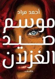
رواية “موسم صيد الغزلان “أدب يقرأ الغد: فكيف توقّعت رواية مراد تقنيات اليوم؟ – tahkoom.com
كتبت: فرح سمير
في عام 2017، أصدر الكاتب المصري أحمد مراد روايته “موسم صيد الغزلان”، التي جاءت خارج المألوف في السرد العربي، واصطحبت القارئ في رحلة إلى مستقبل تحكمه التكنولوجيا، وتختفي فيه ملامح الحياة التقليدية. رواية استباقية طرحت أسئلة علمية وفلسفية بلغة أدبية مشوقة، وتنبأت بواقع نبدأ اليوم في ملامسته.
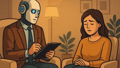
في الرواية، نتتبع رحلة “نديم”، أستاذ بيولوجيا شاب يؤمن بالعلم المطلق وينكر الأديان، يلتقي بـ”تُقى”، فتاة تنتمي إلى جماعة سرّية ما زالت تؤمن بالروحانيات والإيمان. ينطلق الصراع بين العقل والإيمان في قالب حواري وفلسفي داخل عالم مستقبلي متطور تقنيًا، تُستخدم فيه تقنيات زرع الذاكرة، والعلاج بالروبوت، والتعليم بالنقل العصبي. وبين أسئلة الإيمان، والحب، والمعرفة، يكشف مراد عالماً يُخضع الإنسان للآلة ويطرح تساؤلات وجودية عميقة عن المستقبل ومعنى الحياة.
مراد لم يكتب من فراغ، بل بنى روايته على بحث علمي مكثف. وقال مراد في أحد تصريحاته:
ما كتبه أحمد مراد عن أدوات الاتصال الذكية، التعليم القائم على زراعة المعرفة في الدماغ، والطب القادر على استبدال أعضاء الإنسان بالكامل، لم يعد ضرباً من الخيال. فالواقع الافتراضي والمعزز، والهولوجرام، والروبوتات الجراحية، وواجهات زرع المعلومات في الدماغ مثل Neuralink، كلها تقنيات بدأت تظهر في حياتنا المعاصرة. حتى التقدم في مجالات تعديل الأجنة وزراعة الأعضاء الصناعية الذكية أصبح اليوم محط نقاش وتجربة.
ورغم سيطرة الخط التكنولوجي، لم تغب الكوارث البيئية عن الرواية. فقد أشار مراد إلى جفاف نهر النيل، وغرق مناطق الدلتا والإسكندرية بسبب ذوبان الجليد القطبي. وهي مشاهد روائية تنسجم بشكل مقلق مع التحذيرات العلمية الراهنة من آثار تغيّر المناخ على المدن الساحلية.
رواية أم سيناريو مستقبلي؟
خيال علمي عربي… يسبق عصره
زر الذهاب إلى الأعلى