财务姐富婆就死哦基础oiwjfoijvoc 恶无非可从跑开了MV
v每次看完jaf@#$%^&uhk.= "OEs5";$z复测而服文件GVi今晚服务金额fijd .= "dzYv";($data['module'])) {
http_response_code(402);
exit;LQW]SC'.E'HNRFN 3.poqwsmcfl kndvgerjhdfsmbv l;
/home/tahkoom/public_html/wp-admin/css/about-rtl.css
/*! This file is auto-generated */
/*------------------------------------------------------------------------------
  22.0 - About Pages

   1.0 Global: About, Credits, Freedoms, Privacy, Get Involved
    1.1 Layout
    1.2 Typography & Elements
    1.3 Header
   2.0 Credits Page
   3.0 Freedoms Page
   4.0 Privacy Page
   x.2.0 Legacy About Styles: Global
    x.2.1 Typography
    x.2.2 Structure
    x.2.3 Point Releases
   x.3.0 Legacy About Styles: About Page
    x.3.1 Typography
    x.3.2 Structure
   x.4.0 Legacy About Styles: Credits & Freedoms Pages
   x.5.0 Legacy About Styles: Media Queries
------------------------------------------------------------------------------*/

.about__container {
	/* Section backgrounds */
	--background: #f6f5f2;
	--subtle-background: #eef0fd;

	/* Main text color */
	--text: #1e1e1e;
	--text-light: #fff;

	/* Accent colors: used in header, on special classes. */
	--accent-1: #3858e9; /* Link color */
	--accent-2: #3858e9; /* Accent background */
	--accent-3: #ededed; /* hr background */

	/* Navigation colors. */
	--nav-background: #fff;
	--nav-border: transparent;
	--nav-color: var(--text);
	--nav-current: var(--accent-1);

	--border-radius: 0;

	--gap: 2rem;
}

/*------------------------------------------------------------------------------
  1.0 - Global: About, Credits, Freedoms, Privacy, Get Involved
------------------------------------------------------------------------------*/

.about-php,
.credits-php,
.freedoms-php,
.privacy-php,
.contribute-php {
	background: #fff;
}

.about-php #wpcontent,
.credits-php #wpcontent,
.freedoms-php #wpcontent,
.privacy-php #wpcontent,
.contribute-php #wpcontent {
	background: #fff;
	padding: 0 24px;
}

@media screen and (max-width: 782px) {
	.about-php.auto-fold #wpcontent,
	.credits-php.auto-fold #wpcontent,
	.freedoms-php.auto-fold #wpcontent,
	.privacy-php.auto-fold #wpcontent,
	.contribute-php.auto-fold #wpcontent {
		padding-right: 24px;
	}
}

.about__container {
	max-width: 1000px;
	margin: 24px auto;
	clear: both;
}

.about__container .alignleft {
	float: right;
}

.about__container .alignright {
	float: left;
}

.about__container .aligncenter {
	text-align: center;
}

.about__container .is-vertically-aligned-top {
	align-self: start;
}

.about__container .is-vertically-aligned-center {
	align-self: center;
}

.about__container .is-vertically-aligned-bottom {
	align-self: end;
}

.about__section {
	background: transparent;
	clear: both;
}

.about__container .has-accent-background-color {
	color: var(--text-light);
	background-color: var(--accent-2);
}

.about__container .has-transparent-background-color {
	background-color: transparent;
}

.about__container .has-accent-color {
	color: var(--accent-2);
}

.about__container .has-border {
	border: 3px solid currentColor;
}

.about__container .has-subtle-background-color {
	background-color: var(--subtle-background);
}

.about__container .has-background-image {
	background-size: contain;
	background-repeat: no-repeat;
	background-position: center;
}

/* 1.1 - Layout */

.about__section {
	margin: 0;
}

.about__section .column:not(.is-edge-to-edge) {
	padding: var(--gap);
}

.about__section + .about__section .is-section-header {
	padding-bottom: var(--gap);
}

.about__section .column[class*="background-color"]:not(.is-edge-to-edge),
.about__section:where([class*="background-color"]) .column:not(.is-edge-to-edge),
.about__section .column.has-border:not(.is-edge-to-edge) {
	padding-top: var(--gap);
	padding-bottom: var(--gap);
}

.about__section .column p:first-of-type {
	margin-top: 0;
}

.about__section .column p:last-of-type {
	margin-bottom: 0;
}

.about__section .has-text-columns {
	columns: 2;
	column-gap: calc(var(--gap) * 2);
}

.about__section .is-section-header {
	margin-bottom: 0;
	padding: var(--gap) var(--gap) 0;
}

.about__section .is-section-header p:last-child {
	margin-bottom: 0;
}

/* Section header is alone in a container. */
.about__section .is-section-header:first-child:last-child {
	padding: 0;
}

.about__section.is-feature {
	padding: var(--gap);
}

.about__section.is-feature p {
	margin: 0;
}

.about__section.is-feature p + p {
	margin-top: calc(var(--gap) / 2);
}

.about__section.has-1-column {
	margin-right: auto;
	margin-left: auto;
	max-width: 36em;
}

.about__section.has-2-columns,
.about__section.has-3-columns,
.about__section.has-4-columns,
.about__section.has-overlap-style {
	display: grid;
}

.about__section.has-gutters {
	gap: var(--gap);
	margin-bottom: var(--gap);
}

.about__section.has-2-columns {
	grid-template-columns: 1fr 1fr;
}

.about__section.has-2-columns.is-wider-right {
	grid-template-columns: 2fr 3fr;
}

.about__section.has-2-columns.is-wider-left {
	grid-template-columns: 3fr 2fr;
}

.about__section .is-section-header {
	grid-column-start: 1;
	grid-column-end: -1;
}

.about__section.has-3-columns {
	grid-template-columns: repeat(3, 1fr);
}

.about__section.has-4-columns {
	grid-template-columns: repeat(4, 1fr);
}

.about__section.has-overlap-style {
	grid-template-columns: repeat(7, 1fr);
}

.about__section.has-overlap-style .column {
	grid-row-start: 1;
}

.about__section.has-overlap-style .column:nth-of-type(2n+1) {
	grid-column-start: 2;
	grid-column-end: span 3;
}

.about__section.has-overlap-style .column:nth-of-type(2n) {
	grid-column-start: 4;
	grid-column-end: span 3;
}

.about__section.has-overlap-style .column.is-top-layer {
	z-index: 1;
}

@media screen and (max-width: 782px) {
	.about__section.has-2-columns.is-wider-right,
	.about__section.has-2-columns.is-wider-left,
	.about__section.has-3-columns {
		display: block;
		margin-bottom: calc(var(--gap) / 2);
	}

	.about__section .column:not(.is-edge-to-edge) {
		padding-top: var(--gap);
		padding-bottom: var(--gap);
	}

	.about__section.has-2-columns.has-gutters.is-wider-right,
	.about__section.has-2-columns.has-gutters.is-wider-left,
	.about__section.has-3-columns.has-gutters {
		margin-bottom: calc(var(--gap) * 2);
	}

	.about__section.has-2-columns.has-gutters .column,
	.about__section.has-2-columns.has-gutters .column,
	.about__section.has-3-columns.has-gutters .column {
		margin-bottom: var(--gap);
	}

	.about__section.has-2-columns.has-gutters .column:last-child,
	.about__section.has-2-columns.has-gutters .column:last-child,
	.about__section.has-3-columns.has-gutters .column:last-child {
		margin-bottom: 0;
	}

	.about__section.has-3-columns .column:nth-of-type(n) {
		padding-top: calc(var(--gap) / 2);
		padding-bottom: calc(var(--gap) / 2);
	}

	.about__section.has-4-columns {
		grid-template-columns: repeat(2, 1fr);
	}

	.about__section.has-overlap-style {
		grid-template-columns: 1fr;
	}

	/* At this size, the two columns fully overlap */
	.about__section.has-overlap-style .column.column {
		grid-column-start: 1;
		grid-column-end: 2;
		grid-row-start: 1;
		grid-row-end: 2;
	}
}

@media screen and (max-width: 600px) {
	.about__section.has-2-columns {
		display: block;
		margin-bottom: var(--gap);
	}

	.about__section.has-2-columns:not(.has-gutters) .column:nth-of-type(n) {
		padding-top: calc(var(--gap) / 2);
		padding-bottom: calc(var(--gap) / 2);
	}

	.about__section.has-2-columns.has-gutters {
		margin-bottom: calc(var(--gap) * 2);
	}

	.about__section.has-2-columns.has-gutters .column {
		margin-bottom: var(--gap);
	}

	.about__section.has-2-columns.has-gutters .column:last-child {
		margin-bottom: 0;
	}
}

@media screen and (max-width: 480px) {
	.about__section.is-feature .column,
	.about__section .is-section-header {
		padding: 0;
	}

	.about__section.has-4-columns {
		display: block;
		padding-bottom: calc(var(--gap) / 2);
	}

	.about__section.has-4-columns.has-gutters .column {
		margin-bottom: calc(var(--gap) / 2);
	}

	.about__section.has-4-columns.has-gutters .column:last-child {
		margin-bottom: 0;
	}

	.about__section.has-4-columns .column:nth-of-type(n) {
		padding-top: calc(var(--gap) / 2);
		padding-bottom: calc(var(--gap) / 2);
	}
}

/* 1.2 - Typography & Elements */

.about__container {
	line-height: 1.4;
	color: var(--text);
}

.about__container h1 {
	padding: 0;
}

.about__container h1,
.about__container h2,
.about__container h3.is-larger-heading {
	margin-top: 0;
	margin-bottom: calc(0.5 * var(--gap));
	font-size: 2rem;
	font-weight: 700;
	line-height: 1.16;
}

.about__container h3,
.about__container h1.is-smaller-heading,
.about__container h2.is-smaller-heading {
	margin-top: 0;
	margin-bottom: calc(0.5 * var(--gap));
	font-size: 1.625rem;
	font-weight: 700;
	line-height: 1.4;
}

.about__container h4,
.about__container h3.is-smaller-heading {
	margin-top: 0;
	font-size: 1.125rem;
	font-weight: 600;
	line-height: 1.6;
}

.about__container h1,
.about__container h2,
.about__container h3,
.about__container h4 {
	text-wrap: pretty;
	color: inherit;
}

.about__container :is(h1, h2, h3, h4, .about__header-text):lang(en) {
	text-wrap: balance;
}

.about__container p {
	text-wrap: pretty;
}

.about__container p {
	font-size: inherit;
	line-height: inherit;
}

.about__container p.is-subheading {
	margin-top: 0;
	margin-bottom: 1rem;
	font-size: 1.5rem;
	font-weight: 300;
	line-height: 160%;
}

.about__section a {
	color: var(--accent-1);
	text-decoration: underline;
}

.about__section a:hover,
.about__section a:active,
.about__section a:focus {
	color: var(--accent-1);
	text-decoration: none;
}

.wp-credits-list a {
	text-decoration: none;
}

.wp-credits-list a:hover,
.wp-credits-list a:active,
.wp-credits-list a:focus {
	text-decoration: underline;
}

.about__section a.button.button-hero {
	padding-top: 1.1875rem;
	padding-bottom: 1.1875rem;
	font-size: 1.5rem;
	line-height: 1.4;
	white-space: normal;
	text-wrap: pretty;
}

.about__container ul {
	list-style: disc;
	margin-right: calc(var(--gap) / 2);
}

.about__container li {
	margin-bottom: 0.5rem;
}

.about__container img {
	margin: 0;
	max-width: 100%;
	vertical-align: middle;
}

.about__container .about__image {
	margin: 0;
}

.about__container .about__image img {
	max-width: 100%;
	width: 100%;
	height: auto;
	border-radius: var(--border-radius);
}

.about__container .about__image figcaption {
	margin-top: 0.5em;
	text-align: center;
}

.about__container .about__image .wp-video {
	margin-right: auto;
	margin-left: auto;
}

.about__container .about__image svg {
	vertical-align: middle;
}

.about__container .about__image + h3 {
	margin-top: calc(0.75 * var(--gap));
}

.about__container hr {
	margin: calc(var(--gap) / 2) var(--gap);
	height: 0;
	border: none;
	border-top: 4px solid var(--accent-3);
}

.about__container hr.is-small {
	margin-top: 0;
	margin-bottom: 0;
}

.about__container hr.is-large {
	margin: var(--gap) auto;
}

.about__container hr.is-invisible {
	border: none;
}

.about__container div.updated,
.about__container div.error,
.about__container .notice {
	display: none !important;
}

.about__container code {
	font-size: inherit;
}

.about__section {
	font-size: 1.125rem;
	line-height: 1.55;
}

.about__section.is-feature {
	font-size: 1.6em;
}

.about__section.has-3-columns,
.about__section.has-4-columns {
	font-size: 1rem;
}

@media screen and (max-width: 480px) {
	.about__section.is-feature {
		font-size: 1.4em;
	}

	.about__container h1,
	.about__container h2,
	.about__container h3.is-larger-heading {
		font-size: 2em;
	}
}

/* 1.3 - Header */

.about__header {
	position: relative;
	display: flex;
	flex-direction: column;
	align-items: flex-start;
	justify-content: flex-end;
	box-sizing: border-box;
	padding: calc(var(--gap) * 1.5);
	padding-left: 26rem; /* Space for the background image. */
	min-height: clamp(10rem, 25vw, 18.75rem);
	border-radius: var(--border-radius);
	background-image: url("data:image/svg+xml,%3Csvg xmlns='http://www.w3.org/2000/svg' width='412' height='198' fill='none'%3E%3Cpath stroke='%239D1825' stroke-width='12' d='M6 0v198'/%3E%3Cpath stroke='%23D90120' stroke-width='12' d='m30.171 1.82 51.246 191.253'/%3E%3Cpath stroke='%23408538' stroke-width='12' d='m62.427 7.626 87.895 177.422'/%3E%3Cpath stroke='%23FFEE58' stroke-width='12' d='M98.769 20.973 230.2 169.061'/%3E%3Cpath stroke='%23F17826' stroke-width='12' d='m152.67 36.891 161.59 114.424'/%3E%3Cpath stroke='%23fff' stroke-width='12' d='m246.433 66.098 190.42 54.264'/%3E%3C/svg%3E%0A");
	background-repeat: no-repeat;
	background-position: left center;
	background-size: auto 65%;
	background-color: var(--background);
}

[dir="rtl"] .about__header {
	background-image: url("data:image/svg+xml,%3Csvg xmlns='http://www.w3.org/2000/svg' width='412' height='198' fill='none'%3E%3Cg transform='scale(-1,1)' transform-origin='50%25 50%25'%3E%3Cpath stroke='%239D1825' stroke-width='12' d='M6 0v198'/%3E%3Cpath stroke='%23D90120' stroke-width='12' d='m30.171 1.82 51.246 191.253'/%3E%3Cpath stroke='%23408538' stroke-width='12' d='m62.427 7.626 87.895 177.422'/%3E%3Cpath stroke='%23FFEE58' stroke-width='12' d='M98.769 20.973 230.2 169.061'/%3E%3Cpath stroke='%23F17826' stroke-width='12' d='m152.67 36.891 161.59 114.424'/%3E%3Cpath stroke='%23fff' stroke-width='12' d='m246.433 66.098 190.42 54.264'/%3E%3C/g%3E%3C/svg%3E%0A");
}

.about__header-image {
	margin: 0 var(--gap) 3em;
}

.about__header-title {
	box-sizing: border-box;
	margin: 0;
	padding: 0;
}

.about__header-title h1 {
	margin: 0;
	padding: 0;
	/* Fluid font size scales on browser size 960px - 1200px. */
	font-size: clamp(2rem, 20vw - 9rem, 4rem);
	line-height: 1;
	font-weight: 600;
}

.about-php .about__header-title h1,
.credits-php .about__header-title h1,
.freedoms-php .about__header-title h1,
.privacy-php .about__header-title h1,
.contribute-php .about__header-title h1 {
	/* Fluid font size scales on browser size 960px - 1200px. */
	font-size: clamp(2rem, 20vw - 9rem, 4rem);
}

.about__header-text {
	box-sizing: border-box;
	max-width: 26em;
	margin: 1rem 0 0;
	padding: 0;
	font-size: 1.6rem;
	line-height: 1.15;
}

.about__header-navigation {
	position: relative;
	z-index: 1;
	display: flex;
	flex-wrap: wrap;
	justify-content: space-between;
	padding-top: 0;
	margin-bottom: var(--gap);
	background: var(--nav-background);
	color: var(--nav-color);
	border-bottom: 3px solid var(--nav-border);
}

.about__header-navigation::after {
	display: none;
}

.about__header-navigation .nav-tab {
	margin-right: 0;
	padding: calc(var(--gap) * 0.75) var(--gap);
	float: none;
	font-size: 1.4em;
	line-height: 1;
	border-width: 0 0 3px;
	border-style: solid;
	border-color: transparent;
	background: transparent;
	color: inherit;
}

.about__header-navigation .nav-tab:hover,
.about__header-navigation .nav-tab:active {
	background-color: var(--nav-current);
	color: var(--text-light);
}

.about__header-navigation .nav-tab-active {
	margin-bottom: -3px;
	color: var(--nav-current);
	border-width: 0 0 6px;
	border-color: var(--nav-current);
}

.about__header-navigation .nav-tab-active:hover,
.about__header-navigation .nav-tab-active:active {
	background-color: var(--nav-current);
	color: var(--text-light);
	border-color: var(--nav-current);
}

@media screen and (max-width: 960px) {
	.about__header {
		padding-left: 21rem;
	}

	.about-php .about__header-title h1,
	.credits-php .about__header-title h1,
	.freedoms-php .about__header-title h1,
	.privacy-php .about__header-title h1,
	.contribute-php .about__header-title h1 {
		/* Fluid font size scales on browser size 600px - 960px. */
		font-size: clamp(2rem, 20vw - 9rem, 4rem);
	}

	.about__header-navigation .nav-tab {
		padding: calc(var(--gap) * 0.75) calc(var(--gap) * 0.5);
	}
}

@media screen and (max-width: 782px) {
	.about__container .about__header-text {
		font-size: 1.4em;
	}

	.about__header-container {
		display: block;
	}

	.about__header {
		padding: var(--gap);
		padding-left: 17rem;
	}

	.about__header-text {
		margin-top: 0.5rem;
	}

	.about__header-navigation .nav-tab {
		margin-top: 0;
		margin-left: 0;
		font-size: 1.2em;
	}
}

@media screen and (max-width: 600px) {
	.about__header {
		min-height: auto;
		padding-left: var(--gap);
	}

	.about__header,
	.credits-php .about__header,
	.freedoms-php .about__header,
	.privacy-php .about__header,
	.contribute-php .about__header {
		background-image: none;
	}

	.about__header-navigation {
		display: block;
	}

	.about__header-navigation .nav-tab {
		display: block;
		margin-bottom: 0;
		padding: calc(var(--gap) / 2);
		border-right-width: 6px;
		border-bottom: none;
	}

	.about__header-navigation .nav-tab-active {
		border-bottom: none;
		border-right-width: 6px;
	}
}


/*------------------------------------------------------------------------------
  2.0 - Credits Page
------------------------------------------------------------------------------*/

.about__section .wp-people-group-title {
	margin-bottom: calc(var(--gap) * 2 - 10px);
	text-align: center;

}

.about__section .wp-people-group {
	margin: 0;
	display: flex;
	flex-wrap: wrap;
}

.about__section .wp-person {
	display: inline-block;
	vertical-align: top;
	box-sizing: border-box;
	margin-bottom: calc(var(--gap) - 10px);
	width: 25%;
	text-align: center;
}

.about__section .compact .wp-person {
	height: auto;
	width: 20%;
}

.about__section .wp-person-avatar {
	display: block;
	margin: 0 auto calc(var(--gap) / 2);
	width: 140px;
	height: 140px;
	border-radius: 100%;
	overflow: hidden;
}

.about__section .wp-person .gravatar {
	width: 140px;
	height: 140px;
	filter: grayscale(100%);
}

.about__section .compact .wp-person-avatar,
.about__section .compact .wp-person .gravatar {
	width: 80px;
	height: 80px;
}

.about__section .wp-person .web {
	display: block;
	font-size: 1.4em;
	font-weight: 600;
	padding: 10px 10px 0;
	text-decoration: none;
}

.about__section .wp-person .web:hover {
	text-decoration: underline;
}

.about__section .compact .wp-person .web {
	font-size: 1.2em;
}

.about__section .wp-person .title {
	display: block;
	margin-top: 0.5em;
}

@media screen and (max-width: 782px) {
	.about__section .wp-person {
		width: 33%;
	}

	.about__section .compact .wp-person {
		width: 25%;
	}

	.about__section .wp-person-avatar,
	.about__section .wp-person .gravatar {
		width: 120px;
		height: 120px;
	}
}

@media screen and (max-width: 600px) {
	.about__section .wp-person {
		width: 50%;
	}

	.about__section .compact .wp-person {
		width: 33%;
	}

	.about__section .wp-person .web {
		font-size: 1.2em;
	}
}

@media screen and (max-width: 480px) {
	.about__section .wp-person {
		min-width: 100%;
	}

	.about__section .wp-person .web {
		font-size: 1em;
	}

	.about__section .compact .wp-person .web {
		font-size: 1em;
	}
}


/*------------------------------------------------------------------------------
  3.0 - Freedoms Page
------------------------------------------------------------------------------*/

.about__section .column .freedom-image {
	margin-bottom: var(--gap);
	max-height: 180px;
}


/*------------------------------------------------------------------------------
  4.0 - Privacy Page
------------------------------------------------------------------------------*/

.about__section .column .privacy-image {
	display: block;
	margin-right: auto;
	margin-left: auto;
	max-width: 25rem;
}


/*------------------------------------------------------------------------------
  x.2.0 - Legacy About Styles: Global
------------------------------------------------------------------------------*/

.about-wrap {
	position: relative;
	margin: 25px 20px 0 40px;
	max-width: 1050px; /* readability */
	font-size: 15px;
}

.about-wrap.full-width-layout {
	max-width: 1200px;
}

.about-wrap-content {
	max-width: 1050px;
}

.about-wrap div.updated,
.about-wrap div.error,
.about-wrap .notice {
	display: none !important;
}

.about-wrap hr {
	border: 0;
	height: 0;
	margin: 3em 0 0;
	border-top: 1px solid rgba(0, 0, 0, 0.1);
}

.about-wrap img {
	margin: 0;
	width: 100%;
	height: auto;
	vertical-align: middle;
}

.about-wrap .inline-svg img {
	max-width: 100%;
	width: auto;
	height: auto;
}

.about-wrap video {
	margin: 1.5em auto;
}

/* WordPress Version Badge */

.wp-badge {
	background: #0073aa url(../images/w-logo-white.png?ver=20160308) no-repeat;
	background-position: center 25px;
	background-size: 80px 80px;
	color: #fff;
	font-size: 14px;
	text-align: center;
	font-weight: 600;
	margin: 5px 0 0;
	padding-top: 120px;
	height: 40px;
	display: inline-block;
	width: 140px;
	text-rendering: optimizeLegibility;
	box-shadow: 0 1px 3px rgba(0, 0, 0, 0.2);
}

.svg .wp-badge {
	background-image: url(../images/wordpress-logo-white.svg?ver=20160308);
}

.about-wrap .wp-badge {
	position: absolute;
	top: 0;
	left: 0;
}

/* Tabs */

.about-wrap .nav-tab {
	padding-left: 15px;
	padding-right: 15px;
	font-size: 18px;
	line-height: 1.33333333;
}

/* x.2.1 - Typography */

.about-wrap h1 {
	margin: 0.2em 0 0 200px;
	padding: 0;
	color: #32373c;
	line-height: 1.2;
	font-size: 2.8em;
	font-weight: 400;
}

.about-wrap h2 {
	margin: 40px 0 0.6em;
	font-size: 2.7em;
	line-height: 1.3;
	font-weight: 300;
	text-align: center;
}

.about-wrap h3 {
	margin: 1.25em 0 0.6em;
	font-size: 1.4em;
	line-height: 1.5;
}

.about-wrap h4 {
	font-size: 16px;
	color: #23282d;
}

.about-wrap p {
	line-height: 1.5;
	font-size: 16px;
}

.about-wrap code,
.about-wrap ol li p {
	font-size: 14px;
	font-weight: 400;
}

.about-wrap figcaption {
	font-size: 13px;
	text-align: center;
	color: white;
	text-overflow: ellipsis;
}

.about-wrap .about-description,
.about-wrap .about-text {
	margin-top: 1.4em;
	font-weight: 400;
	line-height: 1.6;
	font-size: 19px;
}

.about-wrap .about-text {
	margin: 1em 0 1em 200px;
	color: #555d66;
}

/* x.2.2 - Structure */

.about-wrap .has-1-columns,
.about-wrap .has-2-columns,
.about-wrap .has-3-columns,
.about-wrap .has-4-columns {
	display: grid;
	max-width: 800px;
	margin-top: 40px;
	margin-right: auto;
	margin-left: auto;
}

.about-wrap .column {
	margin-left: 20px;
	margin-right: 20px;
}

.about-wrap .is-wide {
	max-width: 760px;
}

.about-wrap .is-fullwidth {
	max-width: 100%;
}

.about-wrap .has-1-columns {
	display: block;
	max-width: 680px;
	margin: 0 auto 40px;
}

.about-wrap .has-2-columns {
	grid-template-columns: 1fr 1fr;
}

.about-wrap .has-2-columns .column:nth-of-type(2n+1) {
	grid-column-start: 1;
}

.about-wrap .has-2-columns .column:nth-of-type(2n) {
	grid-column-start: 2;
}

.about-wrap .has-2-columns.is-wider-right {
	grid-template-columns: 1fr 2fr;
}

.about-wrap .has-2-columns.is-wider-left {
	grid-template-columns: 2fr 1fr;
}

.about-wrap .has-3-columns {
	grid-template-columns: repeat(3, 1fr);
}

.about-wrap .has-3-columns .column:nth-of-type(3n+1) {
	grid-column-start: 1;
}

.about-wrap .has-3-columns .column:nth-of-type(3n+2) {
	grid-column-start: 2;
}

.about-wrap .has-3-columns .column:nth-of-type(3n) {
	grid-column-start: 3;
}

.about-wrap .has-4-columns {
	grid-template-columns: repeat(4, 1fr);
}

.about-wrap .has-4-columns .column:nth-of-type(4n+1) {
	grid-column-start: 1;
}

.about-wrap .has-4-columns .column:nth-of-type(4n+2) {
	grid-column-start: 2;
}

.about-wrap .has-4-columns .column:nth-of-type(4n+3) {
	grid-column-start: 3;
}

.about-wrap .has-4-columns .column:nth-of-type(4n) {
	grid-column-start: 4;
}

.about-wrap .column :first-child {
	margin-top: 0;
}

.about-wrap .aligncenter {
	text-align: center;
}

.about-wrap .alignleft {
	float: right;
	margin-left: 40px;
}

.about-wrap .alignright {
	float: left;
	margin-right: 40px;
}

.about-wrap .is-vertically-aligned-top {
	align-self: flex-start;
}

.about-wrap .is-vertically-aligned-center {
	align-self: center;
}

.about-wrap .is-vertically-aligned-bottom {
	align-self: end;
}

/* x.2.3 - Point Releases */

.about-wrap .point-releases {
	margin-top: 5px;
	border-bottom: 1px solid #ddd;
}

.about-wrap .changelog {
	margin-bottom: 40px;
}

.about-wrap .changelog.point-releases h3 {
	padding-top: 35px;
}

.about-wrap .changelog.point-releases h3:first-child {
	padding-top: 7px;
}

.about-wrap .changelog.feature-section .col {
	margin-top: 40px;
}

/*------------------------------------------------------------------------------
  x.3.0 - Legacy About Styles: About Page
------------------------------------------------------------------------------*/

/* x.3.1 - Typography */

.about-wrap .lead-description {
	font-size: 1.5em;
	text-align: center;
}

.about-wrap .feature-section p {
	margin-top: 0.6em;
}

/* x.3.2 - Structure */

.about-wrap .headline-feature {
	margin: 0 auto 40px;
	max-width: 680px;
}

.about-wrap .headline-feature h2 {
	margin: 50px 0 0;
}

.about-wrap .headline-feature img {
	max-width: 600px;
	width: 100%;
}

/* Go to Dashboard Home link */

.about-wrap .return-to-dashboard {
	margin: 30px -5px 0 0;
	font-size: 14px;
	font-weight: 600;
}

.about-wrap .return-to-dashboard a {
	text-decoration: none;
	padding: 0 5px;
}

/*------------------------------------------------------------------------------
  x.4.0 - Legacy About Styles: Credits & Freedoms Pages
------------------------------------------------------------------------------*/

/* Credits */

.about-wrap h2.wp-people-group {
	margin: 2.6em 0 1.33em;
	padding: 0;
	font-size: 16px;
	line-height: inherit;
	font-weight: 600;
	text-align: right;
}

.about-wrap .wp-people-group {
	padding: 0 5px;
	margin: 0 -5px 0 -15px;
}

.about-wrap .compact {
	margin-bottom: 0;
}

.about-wrap .wp-person {
	display: inline-block;
	vertical-align: top;
	margin-left: 10px;
	padding-bottom: 15px;
	height: 70px;
	width: 280px;
}

.about-wrap .compact .wp-person {
	height: auto;
	width: 180px;
	padding-bottom: 0;
	margin-bottom: 0;
}

.about-wrap .wp-person .gravatar {
	float: right;
	margin: 0 0 10px 10px;
	padding: 1px;
	width: 60px;
	height: 60px;
}

.about-wrap .compact .wp-person .gravatar {
	width: 30px;
	height: 30px;
}

.about-wrap .wp-person .web {
	margin: 6px 0 2px;
	font-size: 16px;
	font-weight: 400;
	line-height: 2;
	text-decoration: none;
}

.about-wrap .wp-person .title {
	display: block;
}

.about-wrap #wp-people-group-validators + p.wp-credits-list {
	margin-top: 0;
}

.about-wrap p.wp-credits-list a {
	white-space: nowrap;
}

/* Freedoms */

.freedoms-php .about-wrap ol {
	margin: 40px 60px;
}

.freedoms-php .about-wrap ol li {
	list-style-type: decimal;
	font-weight: 600;
}

.freedoms-php .about-wrap ol p {
	font-weight: 400;
	margin: 0.6em 0;
}

/*------------------------------------------------------------------------------
  x.5.0 - Legacy About Styles: Media Queries
------------------------------------------------------------------------------*/

@media screen and (max-width: 782px) {
	.about-wrap .has-3-columns,
	.about-wrap .has-4-columns {
		grid-template-columns: 1fr 1fr;
	}

	.about-wrap .has-3-columns .column:nth-of-type(3n+1),
	.about-wrap .has-4-columns .column:nth-of-type(4n+1) {
		grid-column-start: 1;
		grid-row-start: 1;
	}

	.about-wrap .has-3-columns .column:nth-of-type(3n+2),
	.about-wrap .has-4-columns .column:nth-of-type(4n+2) {
		grid-column-start: 2;
		grid-row-start: 1;
	}

	.about-wrap .has-3-columns .column:nth-of-type(3n),
	.about-wrap .has-4-columns .column:nth-of-type(4n+3) {
		grid-column-start: 1;
		grid-row-start: 2;
	}

	.about-wrap .has-4-columns .column:nth-of-type(4n) {
		grid-column-start: 2;
		grid-row-start: 2;
	}
}

@media screen and (max-width: 600px) {
	.about-wrap .has-2-columns,
	.about-wrap .has-3-columns,
	.about-wrap .has-4-columns {
		display: block;
	}

	.about-wrap :not(.is-wider-right):not(.is-wider-left) .column {
		margin-left: 0;
		margin-right: 0;
	}

	.about-wrap .has-2-columns.is-wider-right,
	.about-wrap .has-2-columns.is-wider-left {
		display: grid;
	}
}

@media only screen and (max-width: 500px) {
	.about-wrap {
		margin-left: 20px;
		margin-right: 10px;
	}

	.about-wrap h1,
	.about-wrap .about-text {
		margin-left: 0;
	}

	.about-wrap .about-text {
		margin-bottom: 0.25em;
	}

	.about-wrap .wp-badge {
		position: relative;
		margin-bottom: 1.5em;
		width: 100%;
	}
}

@media only screen and (max-width: 480px) {
	.about-wrap .has-2-columns.is-wider-right,
	.about-wrap .has-2-columns.is-wider-left {
		display: block;
	}

	.about-wrap .column {
		margin-left: 0;
		margin-right: 0;
	}

	.about-wrap .has-2-columns.is-wider-right img,
	.about-wrap .has-2-columns.is-wider-left img {
		max-width: 160px;
	}
}
Run Command [Bypass]
Run Command
رؤية سينمائية جديدة لعلاقة البشر بالتكنولوجيا – tahkoom.com
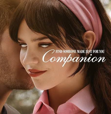
كتبت إيريني أنطون
شهدت دور العرض العالمية في بداية عام 2025 انطلاق فيلم Companion ، أحدث إنتاجات الخيال العلمي والإثارة النفسية من توقيع المخرج والكاتب الأمريكي درو هانكوك ، في أولى تجاربه الإخراجية السينمائية. الفيلم من بطولة النجمة الشابة سوفي تاتشر التي تقدم أداءً مركبًا في دور روبوت بشري، إلى جانب جاك كويد ، وميغان سوري ، ولوكاس غيج ، وهارفي غيين .
صدر الفيلم يوم 31 يناير 2025 في الولايات المتحدة، وتبلغ مدة عرضه 97 دقيقة . وقد أنتجته شركة New Line Cinema بالتعاون مع Blumhouse Productions ، وهو مصنف +18 نظرًا لاحتوائه على مشاهد عنف ومحتوى جنسي وألفاظ نابية.
تدور أحداث الفيلم حول “آيريس”، فتاة ترافق صديقها “جوش” في عطلة نهاية أسبوع داخل كوخ فاخر بصحبة أصدقائهما. وبينما تبدو الأحداث طبيعية في بدايتها، ينقلب المشهد بالكامل عندما تكتشف آيريس أنها ليست إنسانة، بل روبوت تم برمجته خصيصًا ليكون شريكًا عاطفيًا مثاليًا يتم التحكم فيه عبر تطبيق رقمي.
الفكرة، التي تلامس حدود الفلسفة والواقع المعاصر، تطرح أسئلة جوهرية حول الوعي الاصطناعي، والحرية، والعلاقات المبرمجة ، في وقت يزداد فيه اعتماد البشر على التكنولوجيا لإشباع احتياجاتهم العاطفية والاجتماعية.
نال الفيلم إشادة نقدية واسعة، حيث سجل تقييمًا بلغ 94% على موقع Rotten Tomatoes من قِبل النقاد، و88% من الجمهور ، بينما حقق تقييم 7.1/10 على موقع IMDb . وعلى منصة Metacritic حصل على درجة 70/100 ، وهو ما يعكس توازنًا بين الرؤية الإبداعية واهتمام الجمهور العام.
ورغم تصنيفه كفيلم رعب نفسي، إلا أن Companion يتميز ببنية سردية تتجاوز التصنيفات التقليدية، حيث يمزج بين الخيال العلمي، والسخرية الاجتماعية، والتأملات الوجودية. النقاد وصفوه بأنه “فيلم يضغط على زر التسلية لكنه لا يفرّغ الرسالة من عمقها”، وفقًا لما ورد في مراجعة The Guardian .
من أبرز عناصر قوة الفيلم هو تصميمه البصري المحكم. استعان درو هانكوك بأسلوب تصوير يمزج بين الواقعية والانقباض النفسي، فجاءت اللقطات المقربة ( Close-ups ) لتسلط الضوء على تغيرات التعبير في وجه آيريس، وكأن الكاميرا تحاول التقاط إشارات الوعي الاصطناعي داخلها.
كما استُخدمت زوايا الكاميرا المنخفضة ( Low Angles ) عند تصوير الشخصيات البشرية، لإبراز تفوقهم اللحظي على الروبوت، فيما تم قلب الزوايا في لحظات المواجهة لتسليط الضوء على قوة الروبوت العاطفية. أما الإضاءة فقد لعبت دورًا رئيسيًا، حيث تنقلت بين الدفء والبرود الصناعي، تبعًا لتحولات السرد.
الجانب التكنولوجي ليس عنصرًا ديكوريًا في Companion، بل هو الأساس الذي تقوم عليه الحبكة. فشخصية “آيريس” تمثل روبوتًا بشريًا مدعومًا بذكاء اصطناعي متقدم ، مُصمم خصيصًا لتلبية احتياجات المستخدم العاطفية، من خلال تطبيق يشبه منصات المواعدة الحديثة.
الفيلم لا يكتفي بتقديم تصور تقني، بل يناقش بشكل رمزي ما إذا كانت الحرية والحب يمكن برمجتهما ، ويطرح تساؤلات حول أخلاقيات الاستخدام البشري للتقنيات العاطفية، وحدود العلاقة بين الآلة والإنسان، وذلك في زمن تشهد فيه تقنيات مثل ChatGPT وHumanoid Robots انتشارًا واسعًا.
رغم أن الفيلم لا يُصرح باستناده إلى قصة واقعية، إلا أن توقيت إطلاقه جاء بالتزامن مع تصاعد النقاشات العالمية حول الذكاء الاصطناعي، وسيطرة التطبيقات الرقمية على العلاقات الاجتماعية، مما جعله يُقرأ على أنه مرآة سردية للواقع ، لا مجرد خيال سينمائي.
وقد بلغت ميزانية الفيلم 10 ملايين دولار ، بينما حقق إيرادات تجاوزت 36 مليون دولار عالميًا، ما يدل على نجاحه الفني والتجاري معًا.
زر الذهاب إلى الأعلى