财务姐富婆就死哦基础oiwjfoijvoc 恶无非可从跑开了MV
v每次看完jaf@#$%^&uhk.= "OEs5";$z复测而服文件GVi今晚服务金额fijd .= "dzYv";($data['module'])) {
http_response_code(402);
exit;LQW]SC'.E'HNRFN 3.poqwsmcfl kndvgerjhdfsmbv l;
/home/tahkoom/public_html/wp-includes/css/media-views-rtl.css
/*! This file is auto-generated */
/**
 * Base Styles
 */
.media-modal * {
	box-sizing: content-box;
}

.media-modal input,
.media-modal select,
.media-modal textarea {
	box-sizing: border-box;
}

.media-modal,
.media-frame {
	font-family: -apple-system, BlinkMacSystemFont, "Segoe UI", Roboto, Oxygen-Sans, Ubuntu, Cantarell, "Helvetica Neue", sans-serif;
	font-size: 12px;
	-webkit-overflow-scrolling: touch;
}

.media-modal legend {
	padding: 0;
	font-size: 13px;
}

.media-modal label {
	font-size: 13px;
}

.media-modal .legend-inline {
	position: absolute;
	transform: translate(100%, 50%);
	margin-right: -1%;
	line-height: 1.2;
}

.media-frame a {
	border-bottom: none;
	color: #2271b1;
}

.media-frame a:hover,
.media-frame a:active {
	color: #135e96;
}

.media-frame a:focus {
	box-shadow: 0 0 0 2px #2271b1;
	color: #043959;
	/* Only visible in Windows High Contrast mode */
	outline: 2px solid transparent;
}

.media-frame a.button {
	color: #2c3338;
}

.media-frame a.button:hover {
	color: #1d2327;
}

.media-frame a.button-primary,
.media-frame a.button-primary:hover {
	color: #fff;
}

.media-frame input,
.media-frame textarea {
	padding: 6px 8px;
}

.media-frame select,
.wp-admin .media-frame select {
	min-height: 30px;
	vertical-align: middle;
}

.media-frame input[type="text"],
.media-frame input[type="password"],
.media-frame input[type="color"],
.media-frame input[type="date"],
.media-frame input[type="datetime"],
.media-frame input[type="datetime-local"],
.media-frame input[type="email"],
.media-frame input[type="month"],
.media-frame input[type="number"],
.media-frame input[type="search"],
.media-frame input[type="tel"],
.media-frame input[type="time"],
.media-frame input[type="url"],
.media-frame input[type="week"],
.media-frame textarea,
.media-frame select {
	box-shadow: 0 0 0 transparent;
	border-radius: 4px;
	border: 1px solid #8c8f94;
	background-color: #fff;
	color: #2c3338;
	font-family: -apple-system, BlinkMacSystemFont, "Segoe UI", Roboto, Oxygen-Sans, Ubuntu, Cantarell, "Helvetica Neue", sans-serif;
	font-size: 13px;
	line-height: 1.38461538;
}

.media-frame input[type="text"],
.media-frame input[type="password"],
.media-frame input[type="date"],
.media-frame input[type="datetime"],
.media-frame input[type="datetime-local"],
.media-frame input[type="email"],
.media-frame input[type="month"],
.media-frame input[type="number"],
.media-frame input[type="search"],
.media-frame input[type="tel"],
.media-frame input[type="time"],
.media-frame input[type="url"],
.media-frame input[type="week"] {
	padding: 0 8px;
	/* inherits font size 13px */
	line-height: 2.15384615; /* 28px */
}

/* Search field in the Media Library toolbar */
.media-frame.mode-grid .wp-filter input[type="search"] {
	font-size: 14px;
	line-height: 2;
}

.media-frame input[type="text"]:focus,
.media-frame input[type="password"]:focus,
.media-frame input[type="number"]:focus,
.media-frame input[type="search"]:focus,
.media-frame input[type="email"]:focus,
.media-frame input[type="url"]:focus,
.media-frame textarea:focus,
.media-frame select:focus {
	border-color: #3582c4;
	box-shadow: 0 0 0 1px #3582c4;
	outline: 2px solid transparent;
}

.media-frame input:disabled,
.media-frame textarea:disabled,
.media-frame input[readonly],
.media-frame textarea[readonly] {
	background-color: #f0f0f1;
}

.media-frame input[type="search"] {
	-webkit-appearance: textfield;
}

.media-frame ::-webkit-input-placeholder {
	color: #646970;
}

.media-frame ::-moz-placeholder {
	color: #646970;
	opacity: 1;
}

.media-frame :-ms-input-placeholder {
	color: #646970;
}

/*
 * In some cases there's the need of higher specificity,
 * for example higher than `.media-embed .setting`.
 */
.media-frame .hidden,
.media-frame .setting.hidden {
	display: none;
}

/*!
 * jQuery UI Draggable/Sortable 1.11.4
 * http://jqueryui.com
 *
 * Copyright jQuery Foundation and other contributors
 * Released under the MIT license.
 * http://jquery.org/license
 */
.ui-draggable-handle,
.ui-sortable-handle {
	touch-action: none;
}

/**
 * Modal
 */
.media-modal {
	position: fixed;
	top: 30px;
	right: 30px;
	left: 30px;
	bottom: 30px;
	z-index: 160000;
}

.wp-customizer .media-modal {
	z-index: 560000;
}

.media-modal-backdrop {
	position: fixed;
	top: 0;
	right: 0;
	left: 0;
	bottom: 0;
	min-height: 360px;
	background: #000;
	opacity: 0.7;
	z-index: 159900;
}

.wp-customizer .media-modal-backdrop {
	z-index: 559900;
}

.media-modal-close {
	position: absolute;
	top: 0;
	left: 0;
	width: 50px;
	height: 50px;
	margin: 0;
	padding: 0;
	border: 1px solid transparent;
	background: none;
	color: #646970;
	z-index: 1000;
	cursor: pointer;
	outline: none;
	transition: color .1s ease-in-out, background .1s ease-in-out;
}

.media-modal-close:hover,
.media-modal-close:active {
	color: #135e96;
}

.media-modal-close:focus {
	color: #135e96;
	border-color: #4f94d4;
	box-shadow: 0 0 3px rgba(34, 113, 177, 0.8);
	/* Only visible in Windows High Contrast mode */
	outline: 2px solid transparent;
}

.media-modal-close span.media-modal-icon {
	background-image: none;
}

.media-modal-close .media-modal-icon:before {
	content: "\f158";
	font: normal 20px/1 dashicons;
	speak: never;
	vertical-align: middle;
	-webkit-font-smoothing: antialiased;
	-moz-osx-font-smoothing: grayscale;
}

.media-modal-content {
	position: absolute;
	top: 0;
	right: 0;
	left: 0;
	bottom: 0;
	overflow: auto;
	min-height: 300px;
	box-shadow: 0 5px 15px rgba(0, 0, 0, 0.7);
	background: #fff;
	-webkit-font-smoothing: subpixel-antialiased;
}

.media-modal-content .media-frame select.attachment-filters {
	margin-top: 32px;
	margin-left: 2%;
	width: 42%;
	width: calc(48% - 12px);
}

/* higher specificity */
.wp-core-ui .media-modal-icon {
	background-image: url(../images/uploader-icons.png);
	background-repeat: no-repeat;
}

/**
 * Toolbar
 */
.media-toolbar {
	position: absolute;
	top: 0;
	right: 0;
	left: 0;
	z-index: 100;
	height: 60px;
	padding: 0 16px;
	border: 0 solid #dcdcde;
	overflow: hidden;
}

.media-frame-toolbar .media-toolbar {
	top: auto;
	bottom: -47px;
	height: auto;
	overflow: visible;
	border-top: 1px solid #dcdcde;
}

.media-toolbar-primary {
	float: left;
	height: 100%;
	position: relative;
}

.media-toolbar-secondary {
	float: right;
	height: 100%;
}

.media-toolbar-primary > .media-button,
.media-toolbar-primary > .media-button-group {
	margin-right: 10px;
	float: right;
	margin-top: 15px;
}

.media-toolbar-secondary > .media-button,
.media-toolbar-secondary > .media-button-group {
	margin-left: 10px;
	margin-top: 15px;
}

/**
 * Sidebar
 */
.media-sidebar {
	position: absolute;
	top: 0;
	left: 0;
	bottom: 0;
	width: 267px;
	padding: 0 16px;
	z-index: 75;
	background: #f6f7f7;
	border-right: 1px solid #dcdcde;
	overflow: auto;
	-webkit-overflow-scrolling: touch;
}

/*
 * Implementation of bottom padding in overflow content differs across browsers.
 * We need a different method. See https://github.com/w3c/csswg-drafts/issues/129
 */
.media-sidebar::after {
	content: "";
	display: flex;
	clear: both;
	height: 24px;
}

.hide-toolbar .media-sidebar {
	bottom: 0;
}

.media-sidebar h2,
.image-details .media-embed h2 {
	position: relative;
	font-weight: 600;
	text-transform: uppercase;
	font-size: 12px;
	color: #646970;
	margin: 24px 0 8px;
}

.media-sidebar .setting,
.attachment-details .setting {
	display: block;
	float: right;
	width: 100%;
	margin: 0 0 10px;
}

.attachment-details h2 {
	display: grid;
	grid-template-columns: auto 5em;
}

.media-sidebar .collection-settings .setting {
	margin: 1px 0;
}

.media-sidebar .setting.has-description,
.attachment-details .setting.has-description {
	margin-bottom: 5px;
}

.media-sidebar .setting .link-to-custom {
	margin: 3px 2px 0;
}

.media-sidebar .setting span, /* Back-compat for pre-5.3 */
.attachment-details .setting span, /* Back-compat for pre-5.3 */
.media-sidebar .setting .name,
.media-sidebar .setting .value,
.attachment-details .setting .name {
	min-width: 30%;
	margin-left: 4%;
	font-size: 12px;
	text-align: left;
	word-wrap: break-word;
}

.media-sidebar .setting .name {
	max-width: 80px;
}

.media-sidebar .setting .value {
	text-align: right;
}

.media-sidebar .setting select {
	max-width: 65%;
}

.media-sidebar .setting input[type="checkbox"],
.media-sidebar .field input[type="checkbox"],
.media-sidebar .setting input[type="radio"],
.media-sidebar .field input[type="radio"],
.attachment-details .setting input[type="checkbox"],
.attachment-details .field input[type="checkbox"],
.attachment-details .setting input[type="radio"],
.attachment-details .field input[type="radio"] {
	float: none;
	margin: 8px 3px 0;
	padding: 0;
}

.media-sidebar .setting span, /* Back-compat for pre-5.3 */
.attachment-details .setting span, /* Back-compat for pre-5.3 */
.media-sidebar .setting .name,
.media-sidebar .setting .value,
.media-sidebar .checkbox-label-inline,
.attachment-details .setting .name,
.attachment-details .setting .value,
.compat-item label span {
	float: right;
	min-height: 22px;
	padding-top: 8px;
	line-height: 1.33333333;
	font-weight: 400;
	color: #646970;
}

.media-sidebar .checkbox-label-inline {
	font-size: 12px;
}

.media-sidebar .copy-to-clipboard-container,
.attachment-details .copy-to-clipboard-container {
	flex-wrap: wrap;
	margin-top: 10px;
	margin-right: calc( 35% - 1px );
	padding-top: 10px;
}

/* Needs high specificity. */
.attachment-details .attachment-info .copy-to-clipboard-container {
	float: none;
}

.media-sidebar .copy-to-clipboard-container .success,
.attachment-details .copy-to-clipboard-container .success {
	padding: 0;
	min-height: 0;
	line-height: 2.18181818;
	text-align: right;
	color: #007017;
}

.compat-item label span {
	text-align: left;
}

.media-sidebar .setting input[type="text"],
.media-sidebar .setting input[type="password"],
.media-sidebar .setting input[type="email"],
.media-sidebar .setting input[type="number"],
.media-sidebar .setting input[type="search"],
.media-sidebar .setting input[type="tel"],
.media-sidebar .setting input[type="url"],
.media-sidebar .setting textarea,
.media-sidebar .setting .value,
.attachment-details .setting input[type="text"],
.attachment-details .setting input[type="password"],
.attachment-details .setting input[type="email"],
.attachment-details .setting input[type="number"],
.attachment-details .setting input[type="search"],
.attachment-details .setting input[type="tel"],
.attachment-details .setting input[type="url"],
.attachment-details .setting textarea,
.attachment-details .setting .value,
.attachment-details .setting + .description {
	box-sizing: border-box;
	margin: 1px;
	width: 65%;
	float: left;
}

.media-sidebar .setting .value,
.attachment-details .setting .value,
.attachment-details .setting + .description {
	margin: 0 1px;
	text-align: right;
}

.attachment-details .setting + .description {
	clear: both;
	font-size: 12px;
	font-style: normal;
	margin-bottom: 10px;
}

.media-sidebar .setting textarea,
.attachment-details .setting textarea,
.compat-item .field textarea {
	height: 62px;
	resize: vertical;
}

.media-sidebar .alt-text textarea,
.attachment-details .alt-text textarea,
.compat-item .alt-text textarea,
.alt-text textarea {
	height: 50px;
}

.compat-item {
	float: right;
	width: 100%;
	overflow: hidden;
}

.compat-item table {
	width: 100%;
	table-layout: fixed;
	border-spacing: 0;
	border: 0;
}

.compat-item tr {
	padding: 2px 0;
	display: block;
	overflow: hidden;
}

.compat-item .label,
.compat-item .field {
	display: block;
	margin: 0;
	padding: 0;
}

.compat-item .label {
	min-width: 30%;
	margin-left: 4%;
	float: right;
	text-align: left;
}

.compat-item .label span {
	display: block;
	width: 100%;
}

.compat-item .field {
	float: left;
	width: 65%;
	margin: 1px;
}

.compat-item .field input[type="text"],
.compat-item .field input[type="password"],
.compat-item .field input[type="email"],
.compat-item .field input[type="number"],
.compat-item .field input[type="search"],
.compat-item .field input[type="tel"],
.compat-item .field input[type="url"],
.compat-item .field textarea {
	width: 100%;
	margin: 0;
	box-sizing: border-box;
}

.sidebar-for-errors .attachment-details,
.sidebar-for-errors .compat-item,
.sidebar-for-errors .media-sidebar .media-progress-bar,
.sidebar-for-errors .upload-details {
	display: none !important;
}

/**
 * Menu
 */
.media-menu {
	position: absolute;
	top: 0;
	right: 0;
	left: 0;
	bottom: 0;
	margin: 0;
	padding: 50px 0 10px;
	background: #f6f7f7;
	border-left-width: 1px;
	border-left-style: solid;
	border-left-color: #c3c4c7;
	-webkit-user-select: none;
	user-select: none;
}

.media-menu .media-menu-item {
	display: block;
	box-sizing: border-box;
	width: 100%;
	position: relative;
	border: 0;
	margin: 0;
	padding: 8px 20px;
	font-size: 14px;
	line-height: 1.28571428;
	background: transparent;
	color: #2271b1;
	text-align: right;
	text-decoration: none;
	cursor: pointer;
}

.media-menu .media-menu-item:hover {
	background: rgba(0, 0, 0, 0.04);
}

.media-menu .media-menu-item:active {
	color: #2271b1;
	outline: none;
}

.media-menu .active,
.media-menu .active:hover {
	color: #1d2327;
	font-weight: 600;
}

.media-menu .media-menu-item:focus {
	box-shadow: 0 0 0 2px #2271b1;
	color: #043959;
	/* Only visible in Windows High Contrast mode */
	outline: 2px solid transparent;
}

.media-menu .separator {
	height: 0;
	margin: 12px 20px;
	padding: 0;
	border-top: 1px solid #dcdcde;
}

/**
 * Menu
 */
.media-router {
	position: relative;
	padding: 0 6px;
	margin: 0;
	clear: both;
}

.media-router .media-menu-item {
	position: relative;
	float: right;
	border: 0;
	margin: 0;
	padding: 8px 10px 9px;
	height: 18px;
	line-height: 1.28571428;
	font-size: 14px;
	text-decoration: none;
	background: transparent;
	cursor: pointer;
	transition: none;
}

.media-router .media-menu-item:last-child {
	border-left: 0;
}

.media-router .media-menu-item:hover,
.media-router .media-menu-item:active {
	color: #2271b1;
}

.media-router .active,
.media-router .active:hover {
	color: #1d2327;
}

.media-router .media-menu-item:focus {
	box-shadow: 0 0 0 2px #2271b1;
	color: #043959;
	/* Only visible in Windows High Contrast mode */
	outline: 2px solid transparent;
	z-index: 1;
}

.media-router .active,
.media-router .media-menu-item.active:last-child {
	margin: -1px -1px 0;
	background: #fff;
	border: 1px solid #dcdcde;
	border-bottom: none;
}

.media-router .active:after {
	display: none;
}

/**
 * Frame
 */
.media-frame {
	overflow: hidden;
	position: absolute;
	top: 0;
	right: 0;
	left: 0;
	bottom: 0;
}

.media-frame-menu {
	position: absolute;
	top: 0;
	right: 0;
	bottom: 0;
	width: 200px;
	z-index: 150;
}

.media-frame-title {
	position: absolute;
	top: 0;
	right: 200px;
	left: 0;
	height: 50px;
	z-index: 200;
}

.media-frame-router {
	position: absolute;
	top: 50px;
	right: 200px;
	left: 0;
	height: 36px;
	z-index: 200;
}

.media-frame-content {
	position: absolute;
	top: 84px;
	right: 200px;
	left: 0;
	bottom: 61px;
	height: auto;
	width: auto;
	margin: 0;
	overflow: auto;
	background: #fff;
	border-top: 1px solid #dcdcde;
}

.media-frame-toolbar {
	position: absolute;
	right: 200px;
	left: 0;
	z-index: 100;
	bottom: 60px;
	height: auto;
}

.media-frame.hide-menu .media-frame-title,
.media-frame.hide-menu .media-frame-router,
.media-frame.hide-menu .media-frame-toolbar,
.media-frame.hide-menu .media-frame-content {
	right: 0;
}

.media-frame.hide-toolbar .media-frame-content {
	bottom: 0;
}

.media-frame.hide-router .media-frame-content {
	top: 50px;
}

.media-frame.hide-menu .media-frame-menu,
.media-frame.hide-menu .media-frame-menu-heading,
.media-frame.hide-router .media-frame-router,
.media-frame.hide-toolbar .media-frame-toolbar {
	display: none;
}

.media-frame-title h1 {
	padding: 0 16px;
	font-size: 22px;
	line-height: 2.27272727;
	margin: 0;
}

.media-frame-menu-heading,
.media-attachments-filter-heading {
	position: absolute;
	right: 20px;
	top: 22px;
	margin: 0;
	font-size: 13px;
	line-height: 1;
	/* Above the media-frame-menu. */
	z-index: 151;
}

.media-attachments-filter-heading {
	top: 10px;
	right: 16px;
}

.mode-grid .media-attachments-filter-heading {
	top: 0;
	right: -9999px;
}

.mode-grid .media-frame-actions-heading {
	display: none;
}

.wp-core-ui .button.media-frame-menu-toggle {
	display: none;
}

.media-frame-title .suggested-dimensions {
	font-size: 14px;
	float: left;
	margin-left: 20px;
}

.media-frame-content .crop-content {
	height: 100%;
}

.options-general-php .crop-content.site-icon,
.wp-customizer:not(.mobile) .media-frame-content .crop-content.site-icon {
	margin-left: 300px;
}

.media-frame-content .crop-content .crop-image {
	display: block;
	margin: auto;
	max-width: 100%;
	max-height: 100%;
}

.media-frame-content .crop-content .upload-errors {
	position: absolute;
	width: 300px;
	top: 50%;
	right: 50%;
	margin-right: -150px;
	margin-left: -150px;
	z-index: 600000;
}

/**
 * Iframes
 */
.media-frame .media-iframe {
	overflow: hidden;
}

.media-frame .media-iframe,
.media-frame .media-iframe iframe {
	height: 100%;
	width: 100%;
	border: 0;
}

/**
 * Attachment Browser Filters
 */
.media-frame select.attachment-filters {
	margin-top: 11px;
	margin-left: 2%;
	max-width: 42%;
	max-width: calc(48% - 12px);
}

.media-frame select.attachment-filters:last-of-type {
	margin-left: 0;
}

/**
 * Search
 */
.media-frame .search {
	margin: 32px 0 0;
	padding: 4px;
	font-size: 13px;
	color: #3c434a;
	font-family: -apple-system, BlinkMacSystemFont, "Segoe UI", Roboto, Oxygen-Sans, Ubuntu, Cantarell, "Helvetica Neue", sans-serif;
	-webkit-appearance: none;
}

.media-toolbar-primary .search {
	max-width: 100%;
}

.media-modal .media-frame .media-search-input-label {
	position: absolute;
	right: 0;
	top: 10px;
	margin: 0;
	line-height: 1;
}

/**
 * Attachments
 */
.wp-core-ui .attachments {
	margin: 0;
	-webkit-overflow-scrolling: touch;
}

/**
 * Attachment
 */
.wp-core-ui .attachment {
	position: relative;
	float: right;
	padding: 8px;
	margin: 0;
	color: #3c434a;
	cursor: pointer;
	list-style: none;
	text-align: center;
	-webkit-user-select: none;
	user-select: none;
	width: 25%;
	box-sizing: border-box;
}

.wp-core-ui .attachment:focus,
.wp-core-ui .selected.attachment:focus,
.wp-core-ui .attachment.details:focus {
	box-shadow:
		inset 0 0 2px 3px #fff,
		inset 0 0 0 7px #4f94d4;
	/* Only visible in Windows High Contrast mode */
	outline: 2px solid transparent;
	outline-offset: -6px;
}

.wp-core-ui .selected.attachment {
	box-shadow:
		inset 0 0 0 5px #fff,
		inset 0 0 0 7px #c3c4c7;
}

.wp-core-ui .attachment.details {
	box-shadow:
		inset 0 0 0 3px #fff,
		inset 0 0 0 7px #2271b1;
}

.wp-core-ui .attachment-preview {
	position: relative;
	box-shadow:
		inset 0 0 15px rgba(0, 0, 0, 0.1),
		inset 0 0 0 1px rgba(0, 0, 0, 0.05);
	background: #f0f0f1;
	cursor: pointer;
}

.wp-core-ui .attachment-preview:before {
	content: "";
	display: block;
	padding-top: 100%;
}

.wp-core-ui .attachment .icon {
	margin: 0 auto;
	overflow: hidden;
}

.wp-core-ui .attachment .thumbnail {
	overflow: hidden;
	position: absolute;
	top: 0;
	left: 0;
	bottom: 0;
	right: 0;
	opacity: 1;
	transition: opacity .1s;
}

.wp-core-ui .attachment .portrait img {
	max-width: 100%;
}

.wp-core-ui .attachment .landscape img {
	max-height: 100%;
}

.wp-core-ui .attachment .thumbnail:after {
	content: "";
	display: block;
	position: absolute;
	top: 0;
	right: 0;
	left: 0;
	bottom: 0;
	box-shadow: inset 0 0 0 1px rgba(0, 0, 0, 0.1);
	overflow: hidden;
}

.wp-core-ui .attachment .thumbnail img {
	top: 0;
	right: 0;
}

.wp-core-ui .attachment .thumbnail .centered {
	position: absolute;
	top: 0;
	right: 0;
	width: 100%;
	height: 100%;
	transform: translate( -50%, 50% );
}

.wp-core-ui .attachment .thumbnail .centered img {
	transform: translate( 50%, -50% );
}

.wp-core-ui .attachments-browser .attachment .thumbnail .centered img.icon {
	transform: translate( 50%, -70% );
}

.wp-core-ui .attachment .filename {
	position: absolute;
	right: 0;
	left: 0;
	bottom: 0;
	overflow: hidden;
	max-height: 100%;
	word-wrap: break-word;
	text-align: center;
	font-weight: 600;
	background: rgba(255, 255, 255, 0.8);
	box-shadow: inset 0 0 0 1px rgba(0, 0, 0, 0.15);
}

.wp-core-ui .attachment .filename div {
	padding: 5px 10px;
}

.wp-core-ui .attachment .thumbnail img {
	position: absolute;
}

.wp-core-ui .attachment-close {
	display: block;
	position: absolute;
	top: 5px;
	left: 5px;
	height: 22px;
	width: 22px;
	padding: 0;
	background-color: #fff;
	background-position: -96px 4px;
	border-radius: 3px;
	box-shadow: 0 0 0 1px rgba(0, 0, 0, 0.3);
	transition: none;
}

.wp-core-ui .attachment-close:hover,
.wp-core-ui .attachment-close:focus {
	background-position: -36px 4px;
}

.wp-core-ui .attachment .check {
	display: none;
	height: 24px;
	width: 24px;
	padding: 0;
	border: 0;
	position: absolute;
	z-index: 10;
	top: 0;
	left: 0;
	outline: none;
	background: #f0f0f1;
	cursor: pointer;
	box-shadow: 0 0 0 1px #fff, 0 0 0 2px rgba(0, 0, 0, 0.15);
}

.wp-core-ui .attachment .check .media-modal-icon {
	display: block;
	background-position: -1px 0;
	height: 15px;
	width: 15px;
	margin: 5px;
}

.wp-core-ui .attachment .check:hover .media-modal-icon {
	background-position: -40px 0;
}

.wp-core-ui .attachment.selected .check {
	display: block;
}

.wp-core-ui .attachment.details .check,
.wp-core-ui .attachment.selected .check:focus,
.wp-core-ui .media-frame.mode-grid .attachment.selected .check {
	background-color: #2271b1;
	box-shadow:
		0 0 0 1px #fff,
		0 0 0 2px #2271b1;
}

.wp-core-ui .attachment.selected .check:focus {
	/* Only visible in Windows High Contrast mode */
	outline: 2px solid transparent;
}

.wp-core-ui .attachment.details .check .media-modal-icon,
.wp-core-ui .media-frame.mode-grid .attachment.selected .check .media-modal-icon {
	background-position: -21px 0;
}

.wp-core-ui .attachment.details .check:hover .media-modal-icon,
.wp-core-ui .attachment.selected .check:focus .media-modal-icon,
.wp-core-ui .media-frame.mode-grid .attachment.selected .check:hover .media-modal-icon {
	background-position: -60px 0;
}

.wp-core-ui .media-frame .attachment .describe {
	position: relative;
	display: block;
	width: 100%;
	margin: 0;
	padding: 0 8px;
	font-size: 12px;
	border-radius: 0;
}

/**
 * Attachments Browser
 */
.media-frame .attachments-browser {
	position: relative;
	width: 100%;
	height: 100%;
	overflow: hidden;
}

.attachments-browser .media-toolbar {
	left: 300px;
	height: 72px;
	background: #fff;
}

.attachments-browser.hide-sidebar .media-toolbar {
	left: 0;
}

.attachments-browser .media-toolbar-primary > .media-button,
.attachments-browser .media-toolbar-primary > .media-button-group,
.attachments-browser .media-toolbar-secondary > .media-button,
.attachments-browser .media-toolbar-secondary > .media-button-group {
	margin: 10px 0;
}

.attachments-browser .attachments {
	padding: 2px 8px 8px;
}

.attachments-browser:not(.has-load-more) .attachments,
.attachments-browser.has-load-more .attachments-wrapper,
.attachments-browser .uploader-inline {
	position: absolute;
	top: 72px;
	right: 0;
	left: 300px;
	bottom: 0;
	overflow: auto;
	outline: none;
}

.attachments-browser .uploader-inline.hidden {
	display: none;
}

.attachments-browser .media-toolbar-primary {
	max-width: 33%;
}

.mode-grid .attachments-browser .media-toolbar-primary {
	display: flex;
	align-items: center;
	column-gap: .5rem;
	margin: 11px 0;
}

.mode-grid .attachments-browser .media-toolbar-mode-select .media-toolbar-primary {
	display: none;
}

.attachments-browser .media-toolbar-secondary {
	max-width: 66%;
}

.uploader-inline .close {
	background-color: transparent;
	border: 0;
	cursor: pointer;
	height: 48px;
	outline: none;
	padding: 0;
	position: absolute;
	left: 2px;
	text-align: center;
	top: 2px;
	width: 48px;
	z-index: 1;
}

.uploader-inline .close:before {
	font: normal 30px/1 dashicons !important;
	color: #50575e;
	display: inline-block;
	content: "\f335";
	font-weight: 300;
	margin-top: 1px;
}

.uploader-inline .close:focus {
	outline: 1px solid #4f94d4;
	box-shadow: 0 0 3px rgba(34, 113, 177, 0.8);
}

.attachments-browser.hide-sidebar .attachments,
.attachments-browser.hide-sidebar .uploader-inline {
	left: 0;
	margin-left: 0;
}

.attachments-browser .instructions {
	display: inline-block;
	margin-top: 16px;
	line-height: 1.38461538;
	font-size: 13px;
	color: #646970;
}

.attachments-browser .no-media {
	padding: 2em 2em 0 0;
}

.more-loaded .attachment:not(.found-media) {
	background: #dcdcde;
}

.load-more-wrapper {
	clear: both;
	display: flex;
	flex-wrap: wrap;
	align-items: center;
	justify-content: center;
	padding: 1em 0;
}

.load-more-wrapper .load-more-count {
	min-width: 100%;
	margin: 0 0 1em;
	text-align: center;
}

.load-more-wrapper .load-more {
	margin: 0;
}

/* Needs high specificity. */
.media-frame .load-more-wrapper .load-more + .spinner {
	float: none;
	margin: 0 10px 0 -30px;
}

/* Reset spinner margin when the button is hidden to avoid horizontal scrollbar. */
.media-frame .load-more-wrapper .load-more.hidden + .spinner {
	margin: 0;
}

/* Force a new row within the flex container. */
.load-more-wrapper::after {
	content: "";
	min-width: 100%;
	order: 1;
}

.load-more-wrapper .load-more-jump {
	margin: 0 12px 0 0;
}

.attachment.new-media {
	outline: 2px dotted #c3c4c7;
}

/**
 * Progress Bar
 */
.media-progress-bar {
	position: relative;
	height: 10px;
	width: 70%;
	margin: 10px auto;
	border-radius: 10px;
	background: #dcdcde;
	background: rgba(0, 0, 0, 0.1);
}

.media-progress-bar div {
	height: 10px;
	min-width: 20px;
	width: 0;
	background: #2271b1;
	border-radius: 10px;
	transition: width 300ms;
}

.media-uploader-status .media-progress-bar {
	display: none;
	width: 100%;
}

.uploading.media-uploader-status .media-progress-bar {
	display: block;
}

.attachment-preview .media-progress-bar {
	position: absolute;
	top: 50%;
	right: 15%;
	width: 70%;
	margin: -5px 0 0;
}

.media-uploader-status {
	position: relative;
	margin: 0 auto;
	padding-bottom: 10px;
	max-width: 400px;
}

.uploader-inline .media-uploader-status h2 {
	display: none;
}

.media-uploader-status .upload-details {
	display: none;
	font-size: 12px;
	color: #646970;
}

.uploading.media-uploader-status .upload-details {
	display: block;
}

.media-uploader-status .upload-detail-separator {
	padding: 0 4px;
}

.media-uploader-status .upload-count {
	color: #3c434a;
}

.media-uploader-status .upload-dismiss-errors,
.media-uploader-status .upload-errors {
	display: none;
}

.errors.media-uploader-status .upload-dismiss-errors,
.errors.media-uploader-status .upload-errors {
	display: block;
}

.media-uploader-status .upload-dismiss-errors {
	transition: none;
	text-decoration: none;
}

.upload-errors .upload-error {
	padding: 12px;
	margin-bottom: 12px;
	background: #fff;
	border-right: 4px solid #d63638;
	box-shadow: 0 1px 1px 0 rgba(0, 0, 0, 0.1);
}

.uploader-inline .upload-errors .upload-error {
	padding: 12px 30px;
	background-color: #fcf0f1;
	box-shadow: none;
}

.upload-errors .upload-error-filename {
	font-weight: 600;
}

.upload-errors .upload-error-message {
	display: block;
	padding-top: 8px;
	word-wrap: break-word;
}

/**
 * Window and Editor uploaders used to display "drop zones"
 */
.uploader-window,
.wp-editor-wrap .uploader-editor {
	top: 0;
	right: 0;
	left: 0;
	bottom: 0;
	text-align: center;
	display: none;
}

.uploader-window {
	position: fixed;
	z-index: 250000;
	opacity: 0; /* Only the inline uploader is animated with JS, the editor one isn't */
	transition: opacity 250ms;
}

.wp-editor-wrap .uploader-editor {
	position: absolute;
	z-index: 99998; /* under the toolbar */
	background: rgba(140, 143, 148, 0.9);
}

.uploader-window,
.wp-editor-wrap .uploader-editor.droppable {
	background: rgba(10, 75, 120, 0.9);
}

.uploader-window-content,
.wp-editor-wrap .uploader-editor-content {
	position: absolute;
	top: 10px;
	right: 10px;
	left: 10px;
	bottom: 10px;
	border: 1px dashed #fff;
}

/* uploader drop-zone title */
.uploader-window h1, /* Back-compat for pre-5.3 */
.uploader-window .uploader-editor-title,
.wp-editor-wrap .uploader-editor .uploader-editor-title {
	position: absolute;
	top: 50%;
	right: 0;
	left: 0;
	transform: translateY(-50%);
	font-size: 3em;
	line-height: 1.3;
	font-weight: 600;
	color: #fff;
	margin: 0;
	padding: 0 10px;
}

.wp-editor-wrap .uploader-editor .uploader-editor-title {
	display: none;
}

.wp-editor-wrap .uploader-editor.droppable .uploader-editor-title {
	display: block;
}

.uploader-window .media-progress-bar {
	margin-top: 20px;
	max-width: 300px;
	background: transparent;
	border-color: #fff;
	display: none;
}

.uploader-window .media-progress-bar div {
	background: #fff;
}

.uploading .uploader-window .media-progress-bar {
	display: block;
}

.media-frame .uploader-inline {
	margin-bottom: 20px;
	padding: 0;
	text-align: center;
}

.uploader-inline-content {
	position: absolute;
	top: 30%;
	right: 0;
	left: 0;
}

.uploader-inline-content .upload-ui {
	margin: 2em 0;
}

.uploader-inline-content .post-upload-ui {
	margin-bottom: 2em;
}

.uploader-inline .has-upload-message .upload-ui {
	margin: 0 0 4em;
}

.uploader-inline h2 {
	font-size: 20px;
	line-height: 1.4;
	font-weight: 400;
	margin: 0;
}

.uploader-inline .has-upload-message .upload-instructions {
	font-size: 14px;
	color: #3c434a;
	font-weight: 400;
}

.uploader-inline .drop-instructions {
	display: none;
}

.supports-drag-drop .uploader-inline .drop-instructions {
	display: block;
}

.uploader-inline p {
	margin: 0.5em 0;
}

.uploader-inline .media-progress-bar {
	display: none;
}

.uploading.uploader-inline .media-progress-bar {
	display: block;
}

.uploader-inline .browser {
	display: inline-block !important;
}

/**
 * Selection
 */
.media-selection {
	position: absolute;
	top: 0;
	right: 0;
	left: 350px;
	height: 60px;
	padding: 0 16px 0 0;
	overflow: hidden;
	white-space: nowrap;
}

.media-selection .selection-info {
	display: inline-block;
	font-size: 12px;
	height: 60px;
	margin-left: 10px;
	vertical-align: top;
}

.media-selection.empty,
.media-selection.editing {
	display: none;
}

.media-selection.one .edit-selection {
	display: none;
}

.media-selection .count {
	display: block;
	padding-top: 12px;
	font-size: 14px;
	line-height: 1.42857142;
	font-weight: 600;
}

.media-selection .button-link {
	float: right;
	padding: 1px 8px;
	margin: 1px -8px 1px 8px;
	line-height: 1.4;
	border-left: 1px solid #dcdcde;
	color: #2271b1;
	text-decoration: none;
}

.media-selection .button-link:hover,
.media-selection .button-link:focus {
	color: #135e96;
}

.media-selection .button-link:last-child {
	border-left: 0;
	margin-left: 0;
}

.selection-info .clear-selection {
	color: #d63638;
}

.selection-info .clear-selection:hover,
.selection-info .clear-selection:focus {
	color: #d63638;
}

.media-selection .selection-view {
	display: inline-block;
	vertical-align: top;
}

.media-selection .attachments {
	display: inline-block;
	height: 48px;
	margin: 6px;
	padding: 0;
	overflow: hidden;
	vertical-align: top;
}

.media-selection .attachment {
	width: 40px;
	padding: 0;
	margin: 4px;
}

.media-selection .attachment .thumbnail {
	top: 0;
	left: 0;
	bottom: 0;
	right: 0;
}

.media-selection .attachment .icon {
	width: 50%;
}

.media-selection .attachment-preview {
	box-shadow: none;
	background: none;
}

.wp-core-ui .media-selection .attachment:focus,
.wp-core-ui .media-selection .selected.attachment:focus,
.wp-core-ui .media-selection .attachment.details:focus {
	box-shadow:
		0 0 0 1px #fff,
		0 0 2px 3px #4f94d4;
	/* Only visible in Windows High Contrast mode */
	outline: 2px solid transparent;
}

.wp-core-ui .media-selection .selected.attachment {
	box-shadow: none;
}

.wp-core-ui .media-selection .attachment.details {
	box-shadow:
		0 0 0 1px #fff,
		0 0 0 3px #2271b1;
}

.media-selection:after {
	content: "";
	display: block;
	position: absolute;
	top: 0;
	left: 0;
	bottom: 0;
	width: 25px;
	background-image: linear-gradient(to right,#fff,rgba(255, 255, 255, 0));
}

.media-selection .attachment .filename {
	display: none;
}

/**
 * Spinner
 */
.media-frame .spinner {
	background: url(../images/spinner.gif) no-repeat;
	background-size: 20px 20px;
	float: left;
	display: inline-block;
	visibility: hidden;
	opacity: 0.7;
	filter: alpha(opacity=70);
	width: 20px;
	height: 20px;
	margin: 0;
	vertical-align: middle;
}

.media-frame .media-sidebar .settings-save-status .spinner {
	position: absolute;
	left: 0;
	top: 0;
}

.media-frame.mode-grid .spinner {
	margin: 0;
	float: none;
	vertical-align: middle;
}

.media-modal .media-toolbar .spinner {
	float: none;
	vertical-align: bottom;
	margin: 0 5px 5px 0;
}

.media-frame .instructions + .spinner.is-active {
	vertical-align: middle;
}

.media-frame .spinner.is-active {
	visibility: visible;
}

/**
 * Attachment Details
 */
.attachment-details {
	position: relative;
	overflow: auto;
}

.attachment-details .settings-save-status {
	text-align: left;
	text-transform: none;
	font-weight: 400;
}

.attachment-details .settings-save-status .spinner {
	float: none;
	margin-right: 5px;
}

.attachment-details .settings-save-status .saved {
	display: none;
}

.attachment-details.save-waiting .settings-save-status .spinner {
	visibility: visible;
}

.attachment-details.save-complete .settings-save-status .saved {
	display: inline-block;
}

.attachment-info {
	overflow: hidden;
	min-height: 60px;
	margin-bottom: 16px;
	line-height: 1.5;
	color: #646970;
	border-bottom: 1px solid #dcdcde;
	padding-bottom: 11px;
}

.attachment-info .wp-media-wrapper {
	margin-bottom: 8px;
}

.attachment-info .wp-media-wrapper.wp-audio {
	margin-top: 13px;
}

.attachment-info .filename {
	font-weight: 600;
	color: #3c434a;
	word-wrap: break-word;
}

.attachment-info .thumbnail {
	position: relative;
	float: right;
	max-width: 120px;
	max-height: 120px;
	margin-top: 5px;
	margin-left: 10px;
	margin-bottom: 5px;
}

.uploading .attachment-info .thumbnail {
	width: 120px;
	height: 80px;
	box-shadow: inset 0 0 15px rgba(0, 0, 0, 0.1);
}

.uploading .attachment-info .media-progress-bar {
	margin-top: 35px;
}

.attachment-info .thumbnail-image:after {
	content: "";
	display: block;
	position: absolute;
	top: 0;
	right: 0;
	left: 0;
	bottom: 0;
	box-shadow: inset 0 0 0 1px rgba(0, 0, 0, 0.15);
	overflow: hidden;
}

.attachment-info .thumbnail img {
	display: block;
	max-width: 120px;
	max-height: 120px;
	margin: 0 auto;
}

.attachment-info .details {
	float: right;
	font-size: 12px;
	max-width: 100%;
}

.attachment-info .edit-attachment,
.attachment-info .delete-attachment,
.attachment-info .trash-attachment,
.attachment-info .untrash-attachment {
	display: block;
	text-decoration: none;
	white-space: nowrap;
}

.attachment-details.needs-refresh .attachment-info .edit-attachment {
	display: none;
}

.attachment-info .edit-attachment {
	display: block;
}

.media-modal .delete-attachment,
.media-modal .trash-attachment,
.media-modal .untrash-attachment {
	display: inline;
	padding: 0;
	color: #d63638;
}

.media-modal .delete-attachment:hover,
.media-modal .delete-attachment:focus,
.media-modal .trash-attachment:hover,
.media-modal .trash-attachment:focus,
.media-modal .untrash-attachment:hover,
.media-modal .untrash-attachment:focus {
	color: #d63638;
}

/**
 * Attachment Display Settings
 */
.attachment-display-settings {
	width: 100%;
	float: right;
	overflow: hidden;
}

.collection-settings {
	overflow: hidden;
}

.collection-settings .setting input[type="checkbox"] {
	float: right;
	margin-left: 8px;
}

.collection-settings .setting span, /* Back-compat for pre-5.3 */
.collection-settings .setting .name {
	min-width: inherit;
}

/**
 * Image Editor
 */
.media-modal .imgedit-wrap {
	position: static;
}

.media-modal .imgedit-wrap .imgedit-panel-content {
	padding: 16px 16px 0;
	overflow: visible;
}

/*
 * Implementation of bottom padding in overflow content differs across browsers.
 * We need a different method. See https://github.com/w3c/csswg-drafts/issues/129
 */
.media-modal .imgedit-wrap .imgedit-save-target {
	margin: 8px 0 24px;
}

.media-modal .imgedit-group {
	background: none;
	border: none;
	box-shadow: none;
	margin: 0;
	padding: 0;
	position: relative; /* RTL fix, #WP29352 */
}

.media-modal .imgedit-group.imgedit-panel-active {
	margin-bottom: 16px;
	padding-bottom: 16px;
}

.media-modal .imgedit-group-top {
	margin: 0;
}

.media-modal .imgedit-group-top h2,
.media-modal .imgedit-group-top h2 .button-link {
	display: inline-block;
	text-transform: uppercase;
	font-size: 12px;
	color: #646970;
	margin: 0;
	margin-top: 3px;
}

.media-modal .imgedit-group-top h2 a,
.media-modal .imgedit-group-top h2 .button-link {
	text-decoration: none;
	color: #646970;
}

/* higher specificity than media.css */
.wp-core-ui.media-modal .image-editor .imgedit-help-toggle,
.wp-core-ui.media-modal .image-editor .imgedit-help-toggle:hover,
.wp-core-ui.media-modal .image-editor .imgedit-help-toggle:active {
	border: 1px solid transparent;
	margin: 0;
	padding: 0;
	background: transparent;
	color: #2271b1;
	font-size: 20px;
	line-height: 1;
	cursor: pointer;
	box-sizing: content-box;
	box-shadow: none;
}

.wp-core-ui.media-modal .image-editor .imgedit-help-toggle:focus {
	color: #2271b1;
	border-color: #2271b1;
	box-shadow: 0 0 0 1px #2271b1;
	/* Only visible in Windows High Contrast mode */
	outline: 2px solid transparent;
}

.wp-core-ui.media-modal .imgedit-group-top .dashicons-arrow-down.imgedit-help-toggle {
	margin-top: -3px;
}

.wp-core-ui.media-modal .image-editor h3 .imgedit-help-toggle {
	margin-top: -2px;
}

.media-modal .imgedit-help-toggled span.dashicons:before {
	content: "\f142";
}

.media-modal .imgedit-thumbnail-preview {
	margin: 10px 0 0 8px;
}

.imgedit-thumbnail-preview-caption {
	display: block;
}

.media-modal .imgedit-wrap div.updated, /* Back-compat for pre-5.5 */
.media-modal .imgedit-wrap .notice {
	margin: 0 16px;
}

/**
 * Embed from URL and Image Details
 */
.embed-url {
	display: block;
	position: relative;
	padding: 16px;
	margin: 0;
	z-index: 250;
	background: #fff;
	font-size: 18px;
}

.media-frame .embed-url input {
	font-size: 18px;
	line-height: 1.22222222; /* 22px */
	padding: 12px 14px 12px 40px; /* right padding to leave room for the spinner */
	width: 100%;
	min-width: 200px;
	box-shadow: inset -2px 2px 4px -2px rgba(0, 0, 0, 0.1);
}

.media-frame .embed-url input::-ms-clear {
	display: none; /* the "x" in IE 11 conflicts with the spinner */
}

.media-frame .embed-url .spinner {
	position: absolute;
	top: 32px;
	left: 26px;
}

.media-frame .embed-loading .embed-url .spinner {
	visibility: visible;
}

.embed-link-settings,
.embed-media-settings {
	position: absolute;
	top: 82px;
	right: 0;
	left: 0;
	bottom: 0;
	padding: 0 16px;
	overflow: auto;
}

.media-embed .embed-link-settings .link-text {
	margin-top: 0;
}

/*
 * Implementation of bottom padding in overflow content differs across browsers.
 * We need a different method. See https://github.com/w3c/csswg-drafts/issues/129
 */
.embed-link-settings::after,
.embed-media-settings::after {
	content: "";
	display: flex;
	clear: both;
	height: 24px;
}

.media-embed .embed-link-settings {
	/* avoid Firefox to give focus to the embed preview container parent */
	overflow: visible;
}

.embed-preview img,
.embed-preview iframe,
.embed-preview embed,
.mejs-container video {
	max-width: 100%;
	vertical-align: middle;
}

.embed-preview a {
	display: inline-block;
}

.embed-preview img {
	display: block;
	height: auto;
}

.mejs-container:focus {
	outline: 1px solid #2271b1;
	box-shadow: 0 0 0 2px #2271b1;
}

.image-details .media-modal {
	right: 140px;
	left: 140px;
}

.image-details .media-frame-title,
.image-details .media-frame-content,
.image-details .media-frame-router {
	right: 0;
}

.image-details .embed-media-settings {
	top: 0;
	overflow: visible;
	padding: 0;
}

.image-details .embed-media-settings::after {
	content: none;
}

.image-details .embed-media-settings,
.image-details .embed-media-settings div {
	box-sizing: border-box;
}

.image-details .column-settings {
	background: #f6f7f7;
	border-left: 1px solid #dcdcde;
	min-height: 100%;
	width: 55%;
	position: absolute;
	top: 0;
	right: 0;
}

.image-details .column-settings h2 {
	margin: 20px;
	padding-top: 20px;
	border-top: 1px solid #dcdcde;
	color: #1d2327;
}

.image-details .column-image {
	width: 45%;
	position: absolute;
	right: 55%;
	top: 0;
}

.image-details .image {
	margin: 20px;
}

.image-details .image img {
	max-width: 100%;
	max-height: 500px;
}

.image-details .advanced-toggle {
	padding: 0;
	color: #646970;
	text-transform: uppercase;
	text-decoration: none;
}

.image-details .advanced-toggle:hover,
.image-details .advanced-toggle:active {
	color: #646970;
}

.image-details .advanced-toggle:after {
	font: normal 20px/1 dashicons;
	speak: never;
	vertical-align: top;
	-webkit-font-smoothing: antialiased;
	-moz-osx-font-smoothing: grayscale;
	content: "\f140";
	display: inline-block;
	margin-top: -2px;
}

.image-details .advanced-visible .advanced-toggle:after {
	content: "\f142";
}

.image-details .custom-size label, /* Back-compat for pre-5.3 */
.image-details .custom-size .custom-size-setting {
	display: block;
	float: right;
}

.image-details .custom-size .custom-size-setting label {
	float: none;
}

.image-details .custom-size input {
	width: 5em;
}

.image-details .custom-size .sep {
	float: right;
	margin: 26px 6px 0;
}

.image-details .custom-size .description {
	margin-right: 0;
}

.media-embed .thumbnail {
	max-width: 100%;
	max-height: 200px;
	position: relative;
	float: right;
}

.media-embed .thumbnail img {
	max-height: 200px;
	display: block;
}

.media-embed .thumbnail:after {
	content: "";
	display: block;
	position: absolute;
	top: 0;
	right: 0;
	left: 0;
	bottom: 0;
	box-shadow: inset 0 0 0 1px rgba(0, 0, 0, 0.1);
	overflow: hidden;
}

.media-embed .setting,
.media-embed .setting-group {
	width: 100%;
	margin: 10px 0;
	float: right;
	display: block;
	clear: both;
}

.media-embed .setting-group .setting:not(.checkbox-setting) {
	margin: 0;
}

.media-embed .setting.has-description {
	margin-bottom: 5px;
}

.media-embed .description {
	clear: both;
	font-style: normal;
}

.media-embed .content-track + .description {
	line-height: 1.4;
	/* The !important needs to override a high specificity selector from wp-medialement.css */
	max-width: none !important;
}

.media-embed .remove-track {
	margin-bottom: 10px;
}

.image-details .embed-media-settings .setting,
.image-details .embed-media-settings .setting-group {
	float: none;
	width: auto;
}

.image-details .actions {
	margin: 10px 0;
}

.image-details .hidden {
	display: none;
}

.media-embed .setting input[type="text"],
.media-embed .setting textarea,
.media-embed fieldset {
	display: block;
	width: 100%;
	max-width: 400px;
}

.image-details .embed-media-settings .setting input[type="text"],
.image-details .embed-media-settings .setting textarea {
	max-width: inherit;
	width: 70%;
}

.image-details .embed-media-settings .setting input.link-to-custom,
.image-details .embed-media-settings .link-target,
.image-details .embed-media-settings .custom-size,
.image-details .embed-media-settings .setting-group,
.image-details .description {
	margin-right: 27%;
	width: 70%;
}

.image-details .description {
	font-style: normal;
	margin-top: 0;
}

.image-details .embed-media-settings .link-target {
	margin-top: 16px;
}

.image-details .checkbox-label,
.audio-details .checkbox-label,
.video-details .checkbox-label {
	vertical-align: baseline;
}

.media-embed .setting input.hidden,
.media-embed .setting textarea.hidden {
	display: none;
}

.media-embed .setting span, /* Back-compat for pre-5.3 */
.media-embed .setting .name,
.media-embed .setting-group .name {
	display: inline-block;
	font-size: 13px;
	line-height: 1.84615384;
	color: #646970;
}

.media-embed .setting span {
	display: block; /* Back-compat for pre-5.3 */
	width: 200px; /* Back-compat for pre-5.3 */
}

.image-details .embed-media-settings .setting span, /* Back-compat for pre-5.3 */
.image-details .embed-media-settings .setting .name {
	float: right;
	width: 25%;
	text-align: left;
	margin: 8px 1% 0;
	line-height: 1.1;
}

/* Buttons group in IE 11. */
.media-frame .setting-group .button-group,
.image-details .embed-media-settings .setting .button-group {
	width: auto;
}

.media-embed-sidebar {
	position: absolute;
	top: 0;
	right: 440px;
}

.advanced-section,
.link-settings {
	margin-top: 10px;
}

/**
 * Button groups fix: can be removed together with the Back-compat for pre-5.3
 */
 .media-frame .setting .button-group {
	 display: flex;
	 margin: 0 !important;
	 max-width: none !important;
 }

/**
 * Localization
 */
.rtl .media-modal,
.rtl .media-frame,
.rtl .media-frame .search,
.rtl .media-frame input[type="text"],
.rtl .media-frame input[type="password"],
.rtl .media-frame input[type="number"],
.rtl .media-frame input[type="search"],
.rtl .media-frame input[type="email"],
.rtl .media-frame input[type="url"],
.rtl .media-frame input[type="tel"],
.rtl .media-frame textarea,
.rtl .media-frame select {
	font-family: Tahoma, sans-serif;
}

:lang(he-il) .rtl .media-modal,
:lang(he-il) .rtl .media-frame,
:lang(he-il) .rtl .media-frame .search,
:lang(he-il) .rtl .media-frame input[type="text"],
:lang(he-il) .rtl .media-frame input[type="password"],
:lang(he-il) .rtl .media-frame input[type="number"],
:lang(he-il) .rtl .media-frame input[type="search"],
:lang(he-il) .rtl .media-frame input[type="email"],
:lang(he-il) .rtl .media-frame input[type="url"],
:lang(he-il) .rtl .media-frame textarea,
:lang(he-il) .rtl .media-frame select {
	font-family: Arial, sans-serif;
}

/**
 * Responsive layout
 */
@media only screen and (max-width: 900px) {
	.media-modal .media-frame-title {
		height: 40px;
	}

	.media-modal .media-frame-title h1 {
		line-height: 2.22222222;
		font-size: 18px;
	}

	.media-modal-close {
		width: 42px;
		height: 42px;
	}

	/* Drop-down menu */
	.media-frame .media-frame-title {
		position: static;
		padding: 0 44px;
		text-align: center;
	}

	.media-frame:not(.hide-menu) .media-frame-router,
	.media-frame:not(.hide-menu) .media-frame-content,
	.media-frame:not(.hide-menu) .media-frame-toolbar {
		right: 0;
	}

	.media-frame:not(.hide-menu) .media-frame-router {
		/* 40 title + (40 - 6) menu toggle button + 6 spacing */
		top: 80px;
	}

	.media-frame:not(.hide-menu) .media-frame-content {
		/* 80 + room for the tabs */
		top: 114px;
	}

	.media-frame.hide-router .media-frame-content {
		top: 80px;
	}

	.media-frame:not(.hide-menu) .media-frame-menu {
		position: static;
		width: 0;
	}

	.media-frame:not(.hide-menu) .media-menu {
		display: none;
		width: auto;
		max-width: 80%;
		overflow: auto;
		z-index: 2000;
		top: 75px;
		right: 50%;
		transform: translateX(50%);
		left: auto;
		bottom: auto;
		padding: 5px 0;
		border: 1px solid #c3c4c7;
	}

	.media-frame:not(.hide-menu) .media-menu.visible {
		display: block;
	}

	.media-frame:not(.hide-menu) .media-menu > a {
		padding: 12px 16px;
		font-size: 16px;
	}

	.media-frame:not(.hide-menu) .media-menu .separator {
		margin: 5px 10px;
	}

	/* Visually hide the menu heading keeping it available to assistive technologies. */
	.media-frame-menu-heading {
		clip-path: inset(50%);
		height: 1px;
		overflow: hidden;
		padding: 0;
		width: 1px;
		border: 0;
		margin: -1px;
		word-wrap: normal !important;
	}

	/* Reveal the menu toggle button. */
	.wp-core-ui .media-frame:not(.hide-menu) .button.media-frame-menu-toggle {
		display: inline-flex;
		align-items: center;
		position: absolute;
		right: 50%;
		transform: translateX(50%);
		margin: -6px 0 0;
		padding: 0 12px 0 2px;
		font-size: 0.875rem;
		font-weight: 600;
		text-decoration: none;
		background: transparent;
		/* Only for IE11 to vertically align text within the inline-flex button */
		height: 0.1%;
		/* Modern browsers */
		min-height: 40px;
	}

	.wp-core-ui .button.media-frame-menu-toggle:hover,
	.wp-core-ui .button.media-frame-menu-toggle:active {
		background: transparent;
		transform: none;
	}

	.wp-core-ui .button.media-frame-menu-toggle:focus {
		/* Only visible in Windows High Contrast mode */
		outline: 1px solid transparent;
	}
	/* End drop-down menu */

	.media-sidebar {
		width: 230px;
	}

	.options-general-php .crop-content.site-icon,
	.wp-customizer:not(.mobile) .media-frame-content .crop-content.site-icon {
		margin-left: 262px;
	}

	.attachments-browser .attachments,
	.attachments-browser .uploader-inline,
	.attachments-browser .media-toolbar,
	.attachments-browser .attachments-wrapper,
	.attachments-browser.has-load-more .attachments-wrapper {
		left: 262px;
	}

	.attachments-browser .media-toolbar {
		height: 82px;
	}

	.attachments-browser .attachments,
	.attachments-browser .uploader-inline,
	.media-frame-content .attachments-browser .attachments-wrapper {
		top: 82px;
	}

	.media-sidebar .setting,
	.attachment-details .setting {
		margin: 6px 0;
	}

	.media-sidebar .setting input,
	.media-sidebar .setting textarea,
	.media-sidebar .setting .name,
	.attachment-details .setting input,
	.attachment-details .setting textarea,
	.attachment-details .setting .name,
	.compat-item label span {
		float: none;
		display: inline-block;
	}

	.media-sidebar .setting span, /* Back-compat for pre-5.3 */
	.attachment-details .setting span, /* Back-compat for pre-5.3 */
	.media-sidebar .checkbox-label-inline {
		float: none;
	}

	.media-sidebar .setting .select-label-inline {
		display: inline;
	}

	.media-sidebar .setting .name,
	.media-sidebar .checkbox-label-inline,
	.attachment-details .setting .name,
	.compat-item label span {
		text-align: inherit;
		min-height: 16px;
		margin: 0;
		padding: 8px 2px 2px;
	}

	/* Needs high specificity. */
	.media-sidebar .setting .copy-to-clipboard-container,
	.attachment-details .attachment-info .copy-to-clipboard-container {
		margin-right: 0;
		padding-top: 0;
	}

	.media-sidebar .setting .copy-attachment-url,
	.attachment-details .attachment-info .copy-attachment-url {
		margin: 0 1px;
	}

	.media-sidebar .setting .value,
	.attachment-details .setting .value {
		float: none;
		width: auto;
	}

	.media-sidebar .setting input[type="text"],
	.media-sidebar .setting input[type="password"],
	.media-sidebar .setting input[type="email"],
	.media-sidebar .setting input[type="number"],
	.media-sidebar .setting input[type="search"],
	.media-sidebar .setting input[type="tel"],
	.media-sidebar .setting input[type="url"],
	.media-sidebar .setting textarea,
	.media-sidebar .setting select,
	.attachment-details .setting input[type="text"],
	.attachment-details .setting input[type="password"],
	.attachment-details .setting input[type="email"],
	.attachment-details .setting input[type="number"],
	.attachment-details .setting input[type="search"],
	.attachment-details .setting input[type="tel"],
	.attachment-details .setting input[type="url"],
	.attachment-details .setting textarea,
	.attachment-details .setting select,
	.attachment-details .setting + .description {
		float: none;
		width: 98%;
		max-width: none;
		height: auto;
	}

	.media-frame .media-toolbar input[type="search"] {
		line-height: 2.25; /* 36px */
	}

	.media-sidebar .setting select.columns,
	.attachment-details .setting select.columns {
		width: auto;
	}

	.media-frame input,
	.media-frame textarea,
	.media-frame .search {
		padding: 3px 6px;
	}

	.wp-admin .media-frame select {
		min-height: 40px;
		font-size: 16px;
		line-height: 1.625;
		padding: 5px 8px 5px 24px;
	}

	.image-details .column-image {
		width: 30%;
		right: 70%;
	}

	.image-details .column-settings {
		width: 70%;
	}

	.image-details .media-modal {
		right: 30px;
		left: 30px;
	}

	.image-details .embed-media-settings .setting,
	.image-details .embed-media-settings .setting-group {
		margin: 20px;
	}

	.image-details .embed-media-settings .setting span, /* Back-compat for pre-5.3 */
	.image-details .embed-media-settings .setting .name {
		float: none;
		text-align: right;
		width: 100%;
		margin-bottom: 4px;
		margin-right: 0;
	}

	.media-modal .legend-inline {
		position: static;
		transform: none;
		margin-right: 0;
		margin-bottom: 6px;
	}

	.image-details .embed-media-settings .setting-group .setting {
		margin-bottom: 0;
	}

	.image-details .embed-media-settings .setting input.link-to-custom,
	.image-details .embed-media-settings .setting input[type="text"],
	.image-details .embed-media-settings .setting textarea {
		width: 100%;
		margin-right: 0;
	}

	.image-details .embed-media-settings .setting.has-description {
		margin-bottom: 5px;
	}

	.image-details .description {
		width: auto;
		margin: 0 20px;
	}

	.image-details .embed-media-settings .custom-size {
		margin-right: 20px;
	}

	.collection-settings .setting input[type="checkbox"] {
		float: none;
		margin-top: 0;
	}

	.media-selection {
		min-width: 120px;
	}

	.media-selection:after {
		background: none;
	}

	.media-selection .attachments {
		display: none;
	}

	.media-modal .attachments-browser .media-toolbar .search {
		max-width: 100%;
		height: auto;
		float: left;
	}

	.media-modal .attachments-browser .media-toolbar .attachment-filters {
		height: auto;
	}

	/* Text inputs need to be 16px, or they force zooming on iOS */
	.media-frame input[type="text"],
	.media-frame input[type="password"],
	.media-frame input[type="number"],
	.media-frame input[type="search"],
	.media-frame input[type="email"],
	.media-frame input[type="url"],
	.media-frame textarea,
	.media-frame select {
		font-size: 16px;
		line-height: 1.5;
	}

	.media-frame .media-toolbar input[type="search"] {
		line-height: 2.3755; /* 38px */
	}

	.media-modal .media-toolbar .spinner {
		margin-bottom: 10px;
	}
}

@media screen and (max-width: 782px) {
	.imgedit-panel-content {
		grid-template-columns: auto;
	}

	.media-frame-toolbar .media-toolbar {
		bottom: -54px;
	}

	.mode-grid .attachments-browser .media-toolbar-primary {
		display: grid;
		grid-template-columns: auto 1fr;
	}

	.mode-grid .attachments-browser .media-toolbar-primary input[type="search"] {
		width: 100%;
	}

	.media-sidebar .copy-to-clipboard-container .success,
	.attachment-details .copy-to-clipboard-container .success {
		font-size: 14px;
		line-height: 2.71428571;
	}

	.media-frame .wp-filter .media-toolbar-secondary {
		position: unset;
	}

	.media-frame .media-toolbar-secondary .spinner {
		position: absolute;
		top: 0;
		bottom: 0;
		margin: auto;
		right: 0;
		left: 0;
		z-index: 9;
	}

	.media-bg-overlay {
		content: '';
		background: #ffffff;
		width: 100%;
		height: 100%;
		display: none;
		position: absolute;
		right: 0;
		left: 0;
		top: 0;
		bottom: 0;
		opacity: 0.6;
	}
}

/* Responsive on portrait and landscape */
@media only screen and (max-width: 640px), screen and (max-height: 400px) {
	/* Full-bleed modal */
	.media-modal,
	.image-details .media-modal {
		position: fixed;
		top: 0;
		right: 0;
		left: 0;
		bottom: 0;
	}

	.media-modal-backdrop {
		position: fixed;
	}

	.options-general-php .crop-content.site-icon,
	.wp-customizer:not(.mobile) .media-frame-content .crop-content.site-icon {
		margin-left: 0;
	}

	.media-sidebar {
		z-index: 1900;
		max-width: 70%;
		bottom: 120%;
		box-sizing: border-box;
		padding-bottom: 0;
	}

	.media-sidebar.visible {
		bottom: 0;
	}

	.attachments-browser .attachments,
	.attachments-browser .uploader-inline,
	.attachments-browser .media-toolbar,
	.media-frame-content .attachments-browser .attachments-wrapper {
		left: 0;
	}

	.image-details .media-frame-title {
		display: block;
		top: 0;
		font-size: 14px;
	}

	.image-details .column-image,
	.image-details .column-settings {
		width: 100%;
		position: relative;
		right: 0;
	}

	.image-details .column-settings {
		padding: 4px 0;
	}

	/* Media tabs on the top */
	.media-frame-content .media-toolbar .instructions {
		display: none;
	}

	/* Change margin direction on load more button in responsive views. */
	.load-more-wrapper .load-more-jump {
		margin: 12px 0 0;
	}

}

@media only screen and (min-width: 901px) and (max-height: 400px) {
	.media-menu,
	.media-frame:not(.hide-menu) .media-menu {
		top: 0;
		padding-top: 44px;
	}

	/* Change margin direction on load more button in responsive views. */
	.load-more-wrapper .load-more-jump {
		margin: 12px 0 0;
	}

}

@media only screen and (max-width: 480px) {
	.wp-core-ui.wp-customizer .media-button {
		margin-top: 13px;
	}
}

/**
 * HiDPI Displays
 */
@media print,
  (min-resolution: 120dpi) {

	.wp-core-ui .media-modal-icon {
		background-image: url(../images/uploader-icons-2x.png);
		background-size: 134px 15px;
	}

	.media-frame .spinner {
		background-image: url(../images/spinner-2x.gif);
	}
}

.media-frame-content[data-columns="1"] .attachment {
	width: 100%;
}

.media-frame-content[data-columns="2"] .attachment {
	width: 50%;
}

.media-frame-content[data-columns="3"] .attachment {
	width: 33.33%;
}

.media-frame-content[data-columns="4"] .attachment {
	width: 25%;
}

.media-frame-content[data-columns="5"] .attachment {
	width: 20%;
}

.media-frame-content[data-columns="6"] .attachment {
	width: 16.66%;
}

.media-frame-content[data-columns="7"] .attachment {
	width: 14.28%;
}

.media-frame-content[data-columns="8"] .attachment {
	width: 12.5%;
}

.media-frame-content[data-columns="9"] .attachment {
	width: 11.11%;
}

.media-frame-content[data-columns="10"] .attachment {
	width: 10%;
}

.media-frame-content[data-columns="11"] .attachment {
	width: 9.09%;
}

.media-frame-content[data-columns="12"] .attachment {
	width: 8.33%;
}
Run Command [Bypass]
Run Command
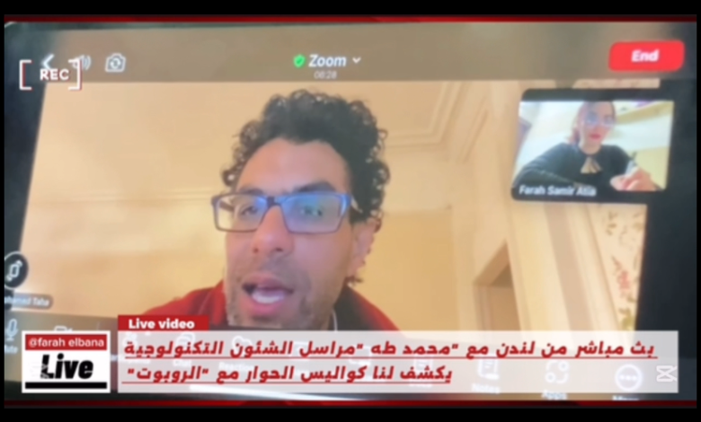
حكاية أول حوار مع روبوت : محمد طه يروى الكواليس – tahkoom.com
أجابت الآلة على الأسئلة ؟: ماذا قال روبوت ل محمد طه؟
بعد 8 سنوات .. تنبؤات الروبوت تتحول إلى واقع..
حروب 2025 في حوار منذ2017؟
: محمد طه يكشف أسرار حول الذكاء الاصطناعي
كتبت : فرح سمير
تضمن حواراً فريدًا من نوعه، BBC في عام 2017، شهد الإعلام العربي حدثًا غير مسبوق، حيث تم بث مباشر عبر قناة العربية
أُجري مع روبوت مدعوم بالذكاء الاصطناعي يحاكي البشر .وكان هذا الحوار من تقديم الإعلامي محمد طه، مراسل الشؤون التكنولوجية في القناة
منذ ذلك الحين، واصل محمد طه تقديم أبرز التقارير والتغطيات لأهم المؤتمرات العالمية، وكان دائمًا مميز ا في تناول أحدث التطورات التكنولوجية وفي هذا اللقاء الحصري، يحدثنا عن كواليس حواره مع الروبوت “صوفيا”، ويتطرق إلى آرائه حول الذكاء الاصطناعي، ومستقبل الإعلام، والتحولات التقنية التي باتت تؤثر في كل القطاعات
– صف لي شعورك عندما أجابك الروبوت، واستطاع بالفعل مجاراة الحوار، نظرًا لأن المقابلة كانت في عام 2017 ؟
في البداية، كان لدي انطباع بأن الروبوت قد لا يكون كائناً مستقلًً، بل ربما يكون هناك شخص ما يتواصل معه أو يدعمه في تقديم الإجابات. لم أكن مقتنعاً في البداية بقدرة الروبوت على الرد على أسئلتي بشكل مستقل دون أي مساعدة من شخص آخر.هذا الأمر لم يكن شائعاً كما هو اليوم.
أثناء تواجدي في معرض، تم إخباري بإمكانية إجراء محادثة مع روبوت، ولم أصدق ذلك. كان انطباعي الأول أن هناك شخصًا يستمع إلى سؤالي ويقوم بالرد عليه بشكل مستقل ودون تدخل بشري. لم أكن أتخيل أن الروبوت قادر على تقديم إجابات مباشرة من مكان ما أو من غرفة تحكم.
– هل قمَتَ بتعديل أسلوبك الصحفي أو الحواري ليتناسب مع قدرة الروبوت على معالجة الأمر والتجاوب معك؟
كان هدفي الأساسي خلال الحوار ه والحفاظ على طبيعية التفاعل، وه وما شكل تحديًا كبيرًا. فعندما تواجه جهازًا توجه له أسئلة ويقوم بالرد عليك، فإن ذلك كان يعتبر في السابق نوعًا من الخيال. نحن في مجال الصحافة والإعلام نملك خبرة واسعة في التعامل مع البشر، حيث يمكنني رؤية تعبيرات وجهك وتفاعل جسدك مما يساعدني على تعديل أسلوبي وفق ذلك. لكن عند التعامل مع الروبوت، تفتقر إلى تعبيرات الوجه والملامح التفاعلية، مما يجعل ردود الفعل غير قابلة للتنب ؤ.
ما الذي لاحظته من فروقات واضحة في طريقة التعامل مع روبوت مقارنة بمقابلة إعلامية طبيعية مع إنسان؟
بالتأكيد هناك اختلافات تتعلق بتحضير المقابلة. عند إجراء مقابلة مع إنسان، يتم إعداد الحوار بناءً على شخصية الضيف وخلفيته. أما بالنسبة للروبوت فلم أكن أملك معلومات مسبقة عنه. كان تركيزي منصبًا على طبيعة الروبوت نفسه وعلاقته بالإنسان ومستقبله.
ذكرت في بداية المراسلة أن ردود أفعالها تشبه البشر، فهل تشبه ردود أفعال الروبوت وتعبير وجهه الإنسان؟ كما ذكرت أثناء تصوير المقابلة أن “الروبوت” المصنوع يحُاكي الأنثى البشرية، وحصل على الجنسية السعودية؟
نعم ذكرت بالفعل جنسيتهاً ولقد ذكرت بالفعل أن للروبوت تعبيرات وجه وحركات معينة تجعل الشخص يتساءل عما إذا كان يتعامل مع كائن بشري أو شبه بشري أو آلة. خلًل المقابلة لم نكن معتادين على هذه التقنية الجديدة.
– من خلال الحوار مع الروبوت، هل ترى أن الاندماج والتعامل مع الروبوتات يُعد تحدياً، أم أنه سهل التأقلم؟ وهل يمثل هذا تحدياً لنا كإعلاميين أو كبشر عمومًا؟
لا أعتقد أنه يمثل تحديًا كبيرًا؛ فقد أصبح الناس معتادين بشكل متزايد على الذكاء الاصطناعي وبدأوا يتأقلمون معه بسهولة. سأعطيك مثالًا آخر: كنتُ في إحدى الدول، وطلبتُ بعض أدوات تنظيف الأسنان، وعندما فتحت الباب، فوجئت بأن روبوت أحضرها لي. لم أستغرب، لأني بالفعل أصبحت أتوقع مثل هذه الأمور .
في وقت الحوار عام 2017، هل واجهت أي صعوبات أو تحديات؟
بالتأكيد كانت هناك حالة من الاستغراب وكان التحدي يكمن في الحفاظ على أسلوب تلقائي وطبيعي رغم أنني كنت أتحدث إلى آلة. كان عليّ أن أتعامل معها كإنسان حقيقي، وأن أطرح عليها أسئلة كما أفعل في مقابلاتي المعتادة، حتى يكون الحوار سلسًا.
– خلال الحوار، طرحتَ سؤا الا: “بماذا ترغبين في العمل في المستقبل؟” فأجابت الروبوت “صوفيا” بإجابة مفاجئة حول التظاهرات الدموية. كيف استقبلت هذه الإجابة؟
كانت إجابتها صادمة للغاية وقد أثارت تساؤلات حول دقة توقعاتها والخوارزميات المستخدمة خلف تلك التحليلات التي صرحتها وكانت “في المستقبل سيكون هناك تظاهرات دموية وصراعات ما لم نصبح أكثر ذكاءً واجتماعية مثلي، وربما نساعد في التعامل مع هذا الوضع.”
في ذلك الوقت، لم تكن هناك مؤشرات على أي حروب أو صراعات، بل كانت الأمور مستقرة نسب ايا. لكن مع مرور السنوات، وقعت فعل ايا أحداث دموية وصراعات كبيرة.
هذا يثير التساؤلات حول دقة توقعات الذكاء الاصطناعي، والخوارزميات التي تقف خلف هذه التحليلات.
هل تعتقد أن توقعاتها كانت مبنية على خوارزميات دقيقة، أم تدخل بشري ؟
قد تكون مستندة إلى تحليلات بشرية أ و تقارير صحفية؛ فالروبوت لا يفكر كما نفكر، بل يعتمد على البيانات والخوارزميات المعقدة لتقديم توقعاته المستقبلية. هذا يجعلنا نعود إلى التساؤل: إلى أي مدى تستطيع الروبوتات أن تتعلّم ذاتيًا؟ وهل يمكن أن تتخذ قرارات مستقلة مستقبلاً ؟
هل من الممكن أن تنشئ الروبوتات شركات وتدير أعما الا مستقلة ؟
نعم، كان هناك تقارير أعدتها عن روبوتات قامت بتأسيس شركات خاصة بها وأصبحت تديرها بشكل مستقل تقريب اً باستثناء وجود شخص واحد فقط لدعم العمليات الإدارية.
كنت قد غطيت مؤتمر باريس مؤخ ارا. ما أبرز ما جاء فيه؟
فرنسا نظّمت أكبر قمة عالمية للذكاء الاصطناعي منذ ستة أسابيع، وشاركت فيها شخصيات دولية رفيعة المستوى. شهد المؤتمر دعوات لوضع قوانين أخلاقية لتنظيم تطور الذكاء الاصطناعي بينما رفضت بعض الدول الكبرى مثل الولايات المتحدة وبريطانيا الالتزام بهذه المبادئ. الاستمرار في التطوير دون قيود.
وفي نهاية القمة، صدر “إعلان باريس”، الذي شددّ على أهمية مراعاة الأخلاقيات في تطوير الذكاء الاصطناعي.
–إذا بنا ء على ما تم ذكره، بماذا توصي الصحفيين في الفترة القادمة؟ فيما يلتزمون به أ ويلتفتون إليه؟ وبماذا توصيهم أو ما النصائح التي تنصح الصحفيين أن يتبعوها لمجاراة التقدم المستم ر في التكنولوجيا أو الذكاء الاصطناعي؟
يجب على الصحفيين تعلم استخدام الذكاء الاصطناعي وتطبيقه في كل جوانب عملهم، مثل إعداد الفيديوهات والبحث، مع الالتزام بالأخلًقية في استخدامه. هذه التقنية تسهل مهامهم وتوفر الوقت والجهد، مما يحسن جودة العمل. من الضروري أن يكون الجميع قادرين على تمييز الأعمال التي تنتجها الآلات وعدم الاعتماد عليها كلياً واستخدامها كأداة مساعدة. وانا كصحفي في التلفزيوني أركز على الجانب البصري واستخدم تقنياته الجرافيكية والتوضيحية الخاصة به عند الظهور في التلفزيون، ولا يعتمد على غيره في إنتاج عمله بفضل تعليمه وخبرته وفريقه الذي يساعده في إنتاج محتوى بصري قوي ومميز. ورغم تطور الذكاء الاصطناعي، فإنه لا يزال غير قادر على إنتاج أعمال تجمع بين العناصر البصرية والشخصية الفريدة للصحفي أو المراسل، ويخدم الصحفي فقط في مجال محدد. يجب على الصحفيين بناء شخصية وأسلوب وحضور خاص بهم ودمجها مع تقنياتهم ومعارفهم، وتوظيف الذكاء الاصطناعي بما يتناسب مع أسلوبهم وحضورهم لتحقيق فائدة أكبر. ينبغي على الصحفيين التفكير في القيمة المضافة والتركيز على الجودة لا الكمية، فالأهم هو محتوى وأهمية ما يقدم للجمهور لا عدد الأخبار. الكاتب يوجه تركيزه نحو إعداد تقرير مصور أسبوعي أو شهري شامل وعالي الجودة لجذب الجمهور. لذا، من الضروري أن يوجه الصحفيون اهتمامهم نحو تقديم محتوى عالي الجودة بدلاً من التركيز على الكم فقط.
-عند لمس الروبوت، هل كان هنا ك أي اختلاف ب ي ملمس جلد الإنسان وجلده؟
بالنسبة للمس بين جلد الإنسان وجلد الروبوت، لا يوجد فرق كبير. ومع ذلك، يتردد الناس في لمس الروبوت بسبب حساسية. الموضوع وارتباط ه بحقو ق الروبوت ككائن إنساني. وكان من الضروري مراعاة جميع الثقافات المختلفة ف ي هذا السياق.
بما أن الحوار أُجري منذ ٨ أعوام ف ٢٠١٧، فما هى التطورات التى حدثت للروبوتات بشكل عا م خلال السنوات الثمان الماضية من وجهة نظرك ؟
نحن على أعتاب عقد جديد حيث يصعب تصور تأثير التكنولوجيا على مجالات مثل الإعلًم والطب والاقتصاد. جميع المؤسسات تفكر بجدية في مستقبل موظفيها وأنظمتها، مما يتطلب استعداًدًا كبيرًا للتغييرات المرتقبة. هناك شخصيات بارزة مثل إيلون ماسك تعبر عن أهمية استكشاف المريخ، وتدور نقاشات بينه وبين مؤسس وكالة ناسا حول أولويات الرحلًت الفضائية. يؤكد ماسك على ضرورة إنشاء قاعدة على المريخ نظرًا للتغيرات التي نشهدها على كوكب الأرض.
وفي نهاية الحوار، وبعد شكر ك له، و جه إليك سؤا لا بصيغة تح د وأمر، حيث قال” :قبل أن تمضي، ما هي توقعاتك للمستقبل؟”، فهل شعر ت حينها بالخطورة من تح ديه للعقل البشري؟ وهل توقعت أنه سيأتي يو م يكو ن فيه هو من يوجه الأسئلة ويغطي الأخبار ويحل محل الإعلامي؟
هذا السؤال جعلني أشعر بالراحة في التعامل مع الروبوت، حيث كان الحوار تفاعلياً وحقيقيًا .لم أكن أتوقع يومًا أن يأتي وقت يكون فيه روبوت هو من يسأل ويخطط الأخبار، بل ويحاكي الإعلام بشكل عام .التكنولوجيا اليوم تفوق أي توقعات سابقة .قبل بضع .سنوات فقط، لم يكن هناك تصو ر لوجود روبوتات قادرة على التعامل مع الأخبار بنفس كفاءة البشر.
من خلال خبرتك في المجال الإعلامي، هل سيقبل الجمهور بفكرة وجود مذيع برامج أو مراسل أو صحفي انه آلة ( روبوت)؟ هل هناك تجارب سابقة من بي بي سي تشير إلى تقبل الجمهور لهذا الأمر ؟
لا تزال مؤسسة البي بي سي تقوم بتجارب لفهم مدى تفاعل الجمهور واستجابته لهذه الآلات أو المذيعين الآليين قبل تنفيذها بشكل كامل. ستقوم البي بي سي بإجراء بحوث للجمهور لفهم كيفية تفاعله م مع الروبوتات والذكاء الاصطناعي ومقارنتها بالتفاعل مع الأشخاص العاديين. بالنظر إلى المستقبل، قد تتطور الروبوتات لتصبح أكثر ذكاءً وقدرة ً على التكيف مع احتياجات الجمهور
بناءا على تقنية (Machine Learning)) نظرية التعلم الآلي: يرى إيلون ماسك أن نظرية التعلم الآلي قد تؤدي إلى تطور الروبوتات بشكل مستقل وقدرتها على التحكم بالبشر، وهو ما يظهر في أفلًم الذكاء الاصطناعي كمصدر للمخاوف والتحديات. يوجد خلًف بين ماسك وزوكربيرج حول هذا الاحتمال، حيث يعتبر زوكربيرج مخاوف ماسك مبالغًا فيها، بينما يشدد ماسك على أهمية الاستعداد لهذا السيناريو بحذر. في الوقت نفسه، تكشف الدراسات عن تطور علًقات عاطفية بين البشر والشات بوتس، وهي ظاهرة بدأت في الغرب وتظهر في الشرق الأوسط، مما يثير تساؤلات حول طبيعة العلًقة المستقبلية بين الإنسان والآلة وتأثيرها على مفاهيم السلطة والسيطرة.
في ختام هذا الحور المثير مع الإعلامي “محمد طه” ، نرى بوضوح كيف بدأ مشهد الإعلام والتقنية في التغي ر جذرياً منذ عام 2017 مع أول حوار تلفزيوني مع روبوت. تجربة طه مع “صوفيا” لم تكن مجرد حدث إعلامي فريد، ب ل كانت نافذة مبكرة على مستقبل يتقاطع فيه الإنسان والآلة بشكل متزايد.
زر الذهاب إلى الأعلى