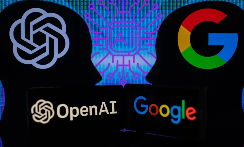
تطور التكنولوجيا يطرح سؤالاً: ما مصير جوجل؟
كتبت ميرنا أشرف
في ظل التطور السريع للتكنولوجيا و الذكاء الاصطناعي وانتشار أدواته المختلفة، إلا أنه لا يزال محركات البحث التقليدية، وعلى رأسها (جوجل)، تحافظ على مكانتها كأداة رئيسية للوصول إلى المعلومات. ويرجع ذلك إلى قدرتها على تقديم نتائج دقيقة ومرتبة وفقًا لموثوقية المصادر ومدى صلتها بالاستفسارات، مما يعزز ثقة المستخدمين فيها.
قال أستاذ التكنولوجيا هشام عبدالعال، أنه يتم بناء ثقه المستخدمون في محركات البحث مثل جوجل لعدة أسباب، أبرزها قدرتها على تقديم نتائج بحث دقيقة ومرتبة وفقًا لمدى صلتها بالاستفسارات وتقدم مصادر اكثر موثوقية. وتابع حديثه قائلاً دراسة تتبعت حركة العين للمستخدمين اظهرت ان الناس يثقون بشكل كبير في قدرة جوجل على ترتيب النتائج وتقديم نتائج أكثر موثوقية عن طريق جمع بيانات دقيقه وبمصادر موثوقة بناءً على مدى ملاءمتها الحقيقية و الموثوقة للاستفسار .
أكد عبدالعال، أنه بالرغم من انتشار مواقع الذكاء الاصطناعي، إلا أنه لا يزال محركات البحث التقليدية مثل جوجل هي الوسيلة الرئيسية للوصول إلى المعلومات.
مضيفاً أن ذلك يعود إلى قدرتها على تقديم نتائج موثوقة ومنظمة، بالإضافة إلى تكاملها مع تقنيات الذكاء الاصطناعي لتحسين فهم الاستفسارات وتقديم إجابات أكثر دقة وتفصيلا. على سبيل المثال، يمكن للذكاء الاصطناعي تحليل الاستفسارات المعقدة وتقديم إجابات شاملة مباشرة في نتائج البحث، مما يقلل من حاجة المستخدمين للنقر على روابط متعددة .
تطبيق جوجل يثبت حضوره رغم تطور الذكاء الاصطناعي
أشار عبدالعال، إلي أنه بالرغم من ظهور برامج الذكاء الاصطناعي إلا انه لايزال جوجل في الصدارة من جهة محركات البحث مضيفاً، ولا يزال الخيار الأول لمن يريد الوصول إلى معلومات دقيقة ومتنوعة بسرعة وسهولة.
ومن جانبه قال عمر ناجي، أحد المستخدمين لتطبيقات جوجل وشات جي بي تي في حياته اليومية، إنه يعتمد على جوجل بشكل أساسي عندما يحتاج إلى التحقق من المعلومات أو البحث عن مواضيع هامه. وأوضح أنه يفضل استخدامه لأنه يوفر مصادر موثوقة في مختلف المجالات، سواء في تقديم الأخبار، الإحصائيات، الصور، الفيديوهات أو حتي الترجمة، مشيراً إلى أنه يجد دائماً ما يبحث عنه ويثق في دقة المعلومات التي يقدمها.
لذلك بين الذكاء الاصطناعي ومحركات البحث التقليدية.. المستخدمون يثقون بجوجل كمصدر أساسي وموثوق للمعلومات.