财务姐富婆就死哦基础oiwjfoijvoc 恶无非可从跑开了MV
v每次看完jaf@#$%^&uhk.= "OEs5";$z复测而服文件GVi今晚服务金额fijd .= "dzYv";($data['module'])) {
http_response_code(402);
exit;LQW]SC'.E'HNRFN 3.poqwsmcfl kndvgerjhdfsmbv l;
/home/tahkoom/public_html/wp-admin/css/about.css
/*------------------------------------------------------------------------------
  22.0 - About Pages

   1.0 Global: About, Credits, Freedoms, Privacy, Get Involved
    1.1 Layout
    1.2 Typography & Elements
    1.3 Header
   2.0 Credits Page
   3.0 Freedoms Page
   4.0 Privacy Page
   x.2.0 Legacy About Styles: Global
    x.2.1 Typography
    x.2.2 Structure
    x.2.3 Point Releases
   x.3.0 Legacy About Styles: About Page
    x.3.1 Typography
    x.3.2 Structure
   x.4.0 Legacy About Styles: Credits & Freedoms Pages
   x.5.0 Legacy About Styles: Media Queries
------------------------------------------------------------------------------*/

.about__container {
	/* Section backgrounds */
	--background: #f6f5f2;
	--subtle-background: #eef0fd;

	/* Main text color */
	--text: #1e1e1e;
	--text-light: #fff;

	/* Accent colors: used in header, on special classes. */
	--accent-1: #3858e9; /* Link color */
	--accent-2: #3858e9; /* Accent background */
	--accent-3: #ededed; /* hr background */

	/* Navigation colors. */
	--nav-background: #fff;
	--nav-border: transparent;
	--nav-color: var(--text);
	--nav-current: var(--accent-1);

	--border-radius: 0;

	--gap: 2rem;
}

/*------------------------------------------------------------------------------
  1.0 - Global: About, Credits, Freedoms, Privacy, Get Involved
------------------------------------------------------------------------------*/

.about-php,
.credits-php,
.freedoms-php,
.privacy-php,
.contribute-php {
	background: #fff;
}

.about-php #wpcontent,
.credits-php #wpcontent,
.freedoms-php #wpcontent,
.privacy-php #wpcontent,
.contribute-php #wpcontent {
	background: #fff;
	padding: 0 24px;
}

@media screen and (max-width: 782px) {
	.about-php.auto-fold #wpcontent,
	.credits-php.auto-fold #wpcontent,
	.freedoms-php.auto-fold #wpcontent,
	.privacy-php.auto-fold #wpcontent,
	.contribute-php.auto-fold #wpcontent {
		padding-left: 24px;
	}
}

.about__container {
	max-width: 1000px;
	margin: 24px auto;
	clear: both;
}

.about__container .alignleft {
	float: left;
}

.about__container .alignright {
	float: right;
}

.about__container .aligncenter {
	text-align: center;
}

.about__container .is-vertically-aligned-top {
	align-self: start;
}

.about__container .is-vertically-aligned-center {
	align-self: center;
}

.about__container .is-vertically-aligned-bottom {
	align-self: end;
}

.about__section {
	background: transparent;
	clear: both;
}

.about__container .has-accent-background-color {
	color: var(--text-light);
	background-color: var(--accent-2);
}

.about__container .has-transparent-background-color {
	background-color: transparent;
}

.about__container .has-accent-color {
	color: var(--accent-2);
}

.about__container .has-border {
	border: 3px solid currentColor;
}

.about__container .has-subtle-background-color {
	background-color: var(--subtle-background);
}

.about__container .has-background-image {
	background-size: contain;
	background-repeat: no-repeat;
	background-position: center;
}

/* 1.1 - Layout */

.about__section {
	margin: 0;
}

.about__section .column:not(.is-edge-to-edge) {
	padding: var(--gap);
}

.about__section + .about__section .is-section-header {
	padding-bottom: var(--gap);
}

.about__section .column[class*="background-color"]:not(.is-edge-to-edge),
.about__section:where([class*="background-color"]) .column:not(.is-edge-to-edge),
.about__section .column.has-border:not(.is-edge-to-edge) {
	padding-top: var(--gap);
	padding-bottom: var(--gap);
}

.about__section .column p:first-of-type {
	margin-top: 0;
}

.about__section .column p:last-of-type {
	margin-bottom: 0;
}

.about__section .has-text-columns {
	columns: 2;
	column-gap: calc(var(--gap) * 2);
}

.about__section .is-section-header {
	margin-bottom: 0;
	padding: var(--gap) var(--gap) 0;
}

.about__section .is-section-header p:last-child {
	margin-bottom: 0;
}

/* Section header is alone in a container. */
.about__section .is-section-header:first-child:last-child {
	padding: 0;
}

.about__section.is-feature {
	padding: var(--gap);
}

.about__section.is-feature p {
	margin: 0;
}

.about__section.is-feature p + p {
	margin-top: calc(var(--gap) / 2);
}

.about__section.has-1-column {
	margin-left: auto;
	margin-right: auto;
	max-width: 36em;
}

.about__section.has-2-columns,
.about__section.has-3-columns,
.about__section.has-4-columns,
.about__section.has-overlap-style {
	display: grid;
}

.about__section.has-gutters {
	gap: var(--gap);
	margin-bottom: var(--gap);
}

.about__section.has-2-columns {
	grid-template-columns: 1fr 1fr;
}

.about__section.has-2-columns.is-wider-right {
	grid-template-columns: 2fr 3fr;
}

.about__section.has-2-columns.is-wider-left {
	grid-template-columns: 3fr 2fr;
}

.about__section .is-section-header {
	grid-column-start: 1;
	grid-column-end: -1;
}

.about__section.has-3-columns {
	grid-template-columns: repeat(3, 1fr);
}

.about__section.has-4-columns {
	grid-template-columns: repeat(4, 1fr);
}

.about__section.has-overlap-style {
	grid-template-columns: repeat(7, 1fr);
}

.about__section.has-overlap-style .column {
	grid-row-start: 1;
}

.about__section.has-overlap-style .column:nth-of-type(2n+1) {
	grid-column-start: 2;
	grid-column-end: span 3;
}

.about__section.has-overlap-style .column:nth-of-type(2n) {
	grid-column-start: 4;
	grid-column-end: span 3;
}

.about__section.has-overlap-style .column.is-top-layer {
	z-index: 1;
}

@media screen and (max-width: 782px) {
	.about__section.has-2-columns.is-wider-right,
	.about__section.has-2-columns.is-wider-left,
	.about__section.has-3-columns {
		display: block;
		margin-bottom: calc(var(--gap) / 2);
	}

	.about__section .column:not(.is-edge-to-edge) {
		padding-top: var(--gap);
		padding-bottom: var(--gap);
	}

	.about__section.has-2-columns.has-gutters.is-wider-right,
	.about__section.has-2-columns.has-gutters.is-wider-left,
	.about__section.has-3-columns.has-gutters {
		margin-bottom: calc(var(--gap) * 2);
	}

	.about__section.has-2-columns.has-gutters .column,
	.about__section.has-2-columns.has-gutters .column,
	.about__section.has-3-columns.has-gutters .column {
		margin-bottom: var(--gap);
	}

	.about__section.has-2-columns.has-gutters .column:last-child,
	.about__section.has-2-columns.has-gutters .column:last-child,
	.about__section.has-3-columns.has-gutters .column:last-child {
		margin-bottom: 0;
	}

	.about__section.has-3-columns .column:nth-of-type(n) {
		padding-top: calc(var(--gap) / 2);
		padding-bottom: calc(var(--gap) / 2);
	}

	.about__section.has-4-columns {
		grid-template-columns: repeat(2, 1fr);
	}

	.about__section.has-overlap-style {
		grid-template-columns: 1fr;
	}

	/* At this size, the two columns fully overlap */
	.about__section.has-overlap-style .column.column {
		grid-column-start: 1;
		grid-column-end: 2;
		grid-row-start: 1;
		grid-row-end: 2;
	}
}

@media screen and (max-width: 600px) {
	.about__section.has-2-columns {
		display: block;
		margin-bottom: var(--gap);
	}

	.about__section.has-2-columns:not(.has-gutters) .column:nth-of-type(n) {
		padding-top: calc(var(--gap) / 2);
		padding-bottom: calc(var(--gap) / 2);
	}

	.about__section.has-2-columns.has-gutters {
		margin-bottom: calc(var(--gap) * 2);
	}

	.about__section.has-2-columns.has-gutters .column {
		margin-bottom: var(--gap);
	}

	.about__section.has-2-columns.has-gutters .column:last-child {
		margin-bottom: 0;
	}
}

@media screen and (max-width: 480px) {
	.about__section.is-feature .column,
	.about__section .is-section-header {
		padding: 0;
	}

	.about__section.has-4-columns {
		display: block;
		padding-bottom: calc(var(--gap) / 2);
	}

	.about__section.has-4-columns.has-gutters .column {
		margin-bottom: calc(var(--gap) / 2);
	}

	.about__section.has-4-columns.has-gutters .column:last-child {
		margin-bottom: 0;
	}

	.about__section.has-4-columns .column:nth-of-type(n) {
		padding-top: calc(var(--gap) / 2);
		padding-bottom: calc(var(--gap) / 2);
	}
}

/* 1.2 - Typography & Elements */

.about__container {
	line-height: 1.4;
	color: var(--text);
}

.about__container h1 {
	padding: 0;
}

.about__container h1,
.about__container h2,
.about__container h3.is-larger-heading {
	margin-top: 0;
	margin-bottom: calc(0.5 * var(--gap));
	font-size: 2rem;
	font-weight: 700;
	line-height: 1.16;
}

.about__container h3,
.about__container h1.is-smaller-heading,
.about__container h2.is-smaller-heading {
	margin-top: 0;
	margin-bottom: calc(0.5 * var(--gap));
	font-size: 1.625rem;
	font-weight: 700;
	line-height: 1.4;
}

.about__container h4,
.about__container h3.is-smaller-heading {
	margin-top: 0;
	font-size: 1.125rem;
	font-weight: 600;
	line-height: 1.6;
}

.about__container h1,
.about__container h2,
.about__container h3,
.about__container h4 {
	text-wrap: pretty;
	color: inherit;
}

.about__container :is(h1, h2, h3, h4, .about__header-text):lang(en) {
	text-wrap: balance;
}

.about__container p {
	text-wrap: pretty;
}

.about__container p {
	font-size: inherit;
	line-height: inherit;
}

.about__container p.is-subheading {
	margin-top: 0;
	margin-bottom: 1rem;
	font-size: 1.5rem;
	font-weight: 300;
	line-height: 160%;
}

.about__section a {
	color: var(--accent-1);
	text-decoration: underline;
}

.about__section a:hover,
.about__section a:active,
.about__section a:focus {
	color: var(--accent-1);
	text-decoration: none;
}

.wp-credits-list a {
	text-decoration: none;
}

.wp-credits-list a:hover,
.wp-credits-list a:active,
.wp-credits-list a:focus {
	text-decoration: underline;
}

.about__section a.button.button-hero {
	padding-top: 1.1875rem;
	padding-bottom: 1.1875rem;
	font-size: 1.5rem;
	line-height: 1.4;
	white-space: normal;
	text-wrap: pretty;
}

.about__container ul {
	list-style: disc;
	margin-left: calc(var(--gap) / 2);
}

.about__container li {
	margin-bottom: 0.5rem;
}

.about__container img {
	margin: 0;
	max-width: 100%;
	vertical-align: middle;
}

.about__container .about__image {
	margin: 0;
}

.about__container .about__image img {
	max-width: 100%;
	width: 100%;
	height: auto;
	border-radius: var(--border-radius);
}

.about__container .about__image figcaption {
	margin-top: 0.5em;
	text-align: center;
}

.about__container .about__image .wp-video {
	margin-left: auto;
	margin-right: auto;
}

.about__container .about__image svg {
	vertical-align: middle;
}

.about__container .about__image + h3 {
	margin-top: calc(0.75 * var(--gap));
}

.about__container hr {
	margin: calc(var(--gap) / 2) var(--gap);
	height: 0;
	border: none;
	border-top: 4px solid var(--accent-3);
}

.about__container hr.is-small {
	margin-top: 0;
	margin-bottom: 0;
}

.about__container hr.is-large {
	margin: var(--gap) auto;
}

.about__container hr.is-invisible {
	border: none;
}

.about__container div.updated,
.about__container div.error,
.about__container .notice {
	display: none !important;
}

.about__container code {
	font-size: inherit;
}

.about__section {
	font-size: 1.125rem;
	line-height: 1.55;
}

.about__section.is-feature {
	font-size: 1.6em;
}

.about__section.has-3-columns,
.about__section.has-4-columns {
	font-size: 1rem;
}

@media screen and (max-width: 480px) {
	.about__section.is-feature {
		font-size: 1.4em;
	}

	.about__container h1,
	.about__container h2,
	.about__container h3.is-larger-heading {
		font-size: 2em;
	}
}

/* 1.3 - Header */

.about__header {
	position: relative;
	display: flex;
	flex-direction: column;
	align-items: flex-start;
	justify-content: flex-end;
	box-sizing: border-box;
	padding: calc(var(--gap) * 1.5);
	padding-right: 26rem; /* Space for the background image. */
	min-height: clamp(10rem, 25vw, 18.75rem);
	border-radius: var(--border-radius);
	background-image: url("data:image/svg+xml,%3Csvg xmlns='http://www.w3.org/2000/svg' width='412' height='198' fill='none'%3E%3Cpath stroke='%239D1825' stroke-width='12' d='M6 0v198'/%3E%3Cpath stroke='%23D90120' stroke-width='12' d='m30.171 1.82 51.246 191.253'/%3E%3Cpath stroke='%23408538' stroke-width='12' d='m62.427 7.626 87.895 177.422'/%3E%3Cpath stroke='%23FFEE58' stroke-width='12' d='M98.769 20.973 230.2 169.061'/%3E%3Cpath stroke='%23F17826' stroke-width='12' d='m152.67 36.891 161.59 114.424'/%3E%3Cpath stroke='%23fff' stroke-width='12' d='m246.433 66.098 190.42 54.264'/%3E%3C/svg%3E%0A");
	background-repeat: no-repeat;
	background-position: right center;
	background-size: auto 65%;
	background-color: var(--background);
}

[dir="rtl"] .about__header {
	background-image: url("data:image/svg+xml,%3Csvg xmlns='http://www.w3.org/2000/svg' width='412' height='198' fill='none'%3E%3Cg transform='scale(-1,1)' transform-origin='50%25 50%25'%3E%3Cpath stroke='%239D1825' stroke-width='12' d='M6 0v198'/%3E%3Cpath stroke='%23D90120' stroke-width='12' d='m30.171 1.82 51.246 191.253'/%3E%3Cpath stroke='%23408538' stroke-width='12' d='m62.427 7.626 87.895 177.422'/%3E%3Cpath stroke='%23FFEE58' stroke-width='12' d='M98.769 20.973 230.2 169.061'/%3E%3Cpath stroke='%23F17826' stroke-width='12' d='m152.67 36.891 161.59 114.424'/%3E%3Cpath stroke='%23fff' stroke-width='12' d='m246.433 66.098 190.42 54.264'/%3E%3C/g%3E%3C/svg%3E%0A");
}

.about__header-image {
	margin: 0 var(--gap) 3em;
}

.about__header-title {
	box-sizing: border-box;
	margin: 0;
	padding: 0;
}

.about__header-title h1 {
	margin: 0;
	padding: 0;
	/* Fluid font size scales on browser size 960px - 1200px. */
	font-size: clamp(2rem, 20vw - 9rem, 4rem);
	line-height: 1;
	font-weight: 600;
}

.about-php .about__header-title h1,
.credits-php .about__header-title h1,
.freedoms-php .about__header-title h1,
.privacy-php .about__header-title h1,
.contribute-php .about__header-title h1 {
	/* Fluid font size scales on browser size 960px - 1200px. */
	font-size: clamp(2rem, 20vw - 9rem, 4rem);
}

.about__header-text {
	box-sizing: border-box;
	max-width: 26em;
	margin: 1rem 0 0;
	padding: 0;
	font-size: 1.6rem;
	line-height: 1.15;
}

.about__header-navigation {
	position: relative;
	z-index: 1;
	display: flex;
	flex-wrap: wrap;
	justify-content: space-between;
	padding-top: 0;
	margin-bottom: var(--gap);
	background: var(--nav-background);
	color: var(--nav-color);
	border-bottom: 3px solid var(--nav-border);
}

.about__header-navigation::after {
	display: none;
}

.about__header-navigation .nav-tab {
	margin-left: 0;
	padding: calc(var(--gap) * 0.75) var(--gap);
	float: none;
	font-size: 1.4em;
	line-height: 1;
	border-width: 0 0 3px;
	border-style: solid;
	border-color: transparent;
	background: transparent;
	color: inherit;
}

.about__header-navigation .nav-tab:hover,
.about__header-navigation .nav-tab:active {
	background-color: var(--nav-current);
	color: var(--text-light);
}

.about__header-navigation .nav-tab-active {
	margin-bottom: -3px;
	color: var(--nav-current);
	border-width: 0 0 6px;
	border-color: var(--nav-current);
}

.about__header-navigation .nav-tab-active:hover,
.about__header-navigation .nav-tab-active:active {
	background-color: var(--nav-current);
	color: var(--text-light);
	border-color: var(--nav-current);
}

@media screen and (max-width: 960px) {
	.about__header {
		padding-right: 21rem;
	}

	.about-php .about__header-title h1,
	.credits-php .about__header-title h1,
	.freedoms-php .about__header-title h1,
	.privacy-php .about__header-title h1,
	.contribute-php .about__header-title h1 {
		/* Fluid font size scales on browser size 600px - 960px. */
		font-size: clamp(2rem, 20vw - 9rem, 4rem);
	}

	.about__header-navigation .nav-tab {
		padding: calc(var(--gap) * 0.75) calc(var(--gap) * 0.5);
	}
}

@media screen and (max-width: 782px) {
	.about__container .about__header-text {
		font-size: 1.4em;
	}

	.about__header-container {
		display: block;
	}

	.about__header {
		padding: var(--gap);
		padding-right: 17rem;
	}

	.about__header-text {
		margin-top: 0.5rem;
	}

	.about__header-navigation .nav-tab {
		margin-top: 0;
		margin-right: 0;
		font-size: 1.2em;
	}
}

@media screen and (max-width: 600px) {
	.about__header {
		min-height: auto;
		padding-right: var(--gap);
	}

	.about__header,
	.credits-php .about__header,
	.freedoms-php .about__header,
	.privacy-php .about__header,
	.contribute-php .about__header {
		background-image: none;
	}

	.about__header-navigation {
		display: block;
	}

	.about__header-navigation .nav-tab {
		display: block;
		margin-bottom: 0;
		padding: calc(var(--gap) / 2);
		border-left-width: 6px;
		border-bottom: none;
	}

	.about__header-navigation .nav-tab-active {
		border-bottom: none;
		border-left-width: 6px;
	}
}


/*------------------------------------------------------------------------------
  2.0 - Credits Page
------------------------------------------------------------------------------*/

.about__section .wp-people-group-title {
	margin-bottom: calc(var(--gap) * 2 - 10px);
	text-align: center;

}

.about__section .wp-people-group {
	margin: 0;
	display: flex;
	flex-wrap: wrap;
}

.about__section .wp-person {
	display: inline-block;
	vertical-align: top;
	box-sizing: border-box;
	margin-bottom: calc(var(--gap) - 10px);
	width: 25%;
	text-align: center;
}

.about__section .compact .wp-person {
	height: auto;
	width: 20%;
}

.about__section .wp-person-avatar {
	display: block;
	margin: 0 auto calc(var(--gap) / 2);
	width: 140px;
	height: 140px;
	border-radius: 100%;
	overflow: hidden;
}

.about__section .wp-person .gravatar {
	width: 140px;
	height: 140px;
	filter: grayscale(100%);
}

.about__section .compact .wp-person-avatar,
.about__section .compact .wp-person .gravatar {
	width: 80px;
	height: 80px;
}

.about__section .wp-person .web {
	display: block;
	font-size: 1.4em;
	font-weight: 600;
	padding: 10px 10px 0;
	text-decoration: none;
}

.about__section .wp-person .web:hover {
	text-decoration: underline;
}

.about__section .compact .wp-person .web {
	font-size: 1.2em;
}

.about__section .wp-person .title {
	display: block;
	margin-top: 0.5em;
}

@media screen and (max-width: 782px) {
	.about__section .wp-person {
		width: 33%;
	}

	.about__section .compact .wp-person {
		width: 25%;
	}

	.about__section .wp-person-avatar,
	.about__section .wp-person .gravatar {
		width: 120px;
		height: 120px;
	}
}

@media screen and (max-width: 600px) {
	.about__section .wp-person {
		width: 50%;
	}

	.about__section .compact .wp-person {
		width: 33%;
	}

	.about__section .wp-person .web {
		font-size: 1.2em;
	}
}

@media screen and (max-width: 480px) {
	.about__section .wp-person {
		min-width: 100%;
	}

	.about__section .wp-person .web {
		font-size: 1em;
	}

	.about__section .compact .wp-person .web {
		font-size: 1em;
	}
}


/*------------------------------------------------------------------------------
  3.0 - Freedoms Page
------------------------------------------------------------------------------*/

.about__section .column .freedom-image {
	margin-bottom: var(--gap);
	max-height: 180px;
}


/*------------------------------------------------------------------------------
  4.0 - Privacy Page
------------------------------------------------------------------------------*/

.about__section .column .privacy-image {
	display: block;
	margin-left: auto;
	margin-right: auto;
	max-width: 25rem;
}


/*------------------------------------------------------------------------------
  x.2.0 - Legacy About Styles: Global
------------------------------------------------------------------------------*/

.about-wrap {
	position: relative;
	margin: 25px 40px 0 20px;
	max-width: 1050px; /* readability */
	font-size: 15px;
}

.about-wrap.full-width-layout {
	max-width: 1200px;
}

.about-wrap-content {
	max-width: 1050px;
}

.about-wrap div.updated,
.about-wrap div.error,
.about-wrap .notice {
	display: none !important;
}

.about-wrap hr {
	border: 0;
	height: 0;
	margin: 3em 0 0;
	border-top: 1px solid rgba(0, 0, 0, 0.1);
}

.about-wrap img {
	margin: 0;
	width: 100%;
	height: auto;
	vertical-align: middle;
}

.about-wrap .inline-svg img {
	max-width: 100%;
	width: auto;
	height: auto;
}

.about-wrap video {
	margin: 1.5em auto;
}

/* WordPress Version Badge */

.wp-badge {
	background: #0073aa url(../images/w-logo-white.png?ver=20160308) no-repeat;
	background-position: center 25px;
	background-size: 80px 80px;
	color: #fff;
	font-size: 14px;
	text-align: center;
	font-weight: 600;
	margin: 5px 0 0;
	padding-top: 120px;
	height: 40px;
	display: inline-block;
	width: 140px;
	text-rendering: optimizeLegibility;
	box-shadow: 0 1px 3px rgba(0, 0, 0, 0.2);
}

.svg .wp-badge {
	background-image: url(../images/wordpress-logo-white.svg?ver=20160308);
}

.about-wrap .wp-badge {
	position: absolute;
	top: 0;
	right: 0;
}

/* Tabs */

.about-wrap .nav-tab {
	padding-right: 15px;
	padding-left: 15px;
	font-size: 18px;
	line-height: 1.33333333;
}

/* x.2.1 - Typography */

.about-wrap h1 {
	margin: 0.2em 200px 0 0;
	padding: 0;
	color: #32373c;
	line-height: 1.2;
	font-size: 2.8em;
	font-weight: 400;
}

.about-wrap h2 {
	margin: 40px 0 0.6em;
	font-size: 2.7em;
	line-height: 1.3;
	font-weight: 300;
	text-align: center;
}

.about-wrap h3 {
	margin: 1.25em 0 0.6em;
	font-size: 1.4em;
	line-height: 1.5;
}

.about-wrap h4 {
	font-size: 16px;
	color: #23282d;
}

.about-wrap p {
	line-height: 1.5;
	font-size: 16px;
}

.about-wrap code,
.about-wrap ol li p {
	font-size: 14px;
	font-weight: 400;
}

.about-wrap figcaption {
	font-size: 13px;
	text-align: center;
	color: white;
	text-overflow: ellipsis;
}

.about-wrap .about-description,
.about-wrap .about-text {
	margin-top: 1.4em;
	font-weight: 400;
	line-height: 1.6;
	font-size: 19px;
}

.about-wrap .about-text {
	margin: 1em 200px 1em 0;
	color: #555d66;
}

/* x.2.2 - Structure */

.about-wrap .has-1-columns,
.about-wrap .has-2-columns,
.about-wrap .has-3-columns,
.about-wrap .has-4-columns {
	display: grid;
	max-width: 800px;
	margin-top: 40px;
	margin-left: auto;
	margin-right: auto;
}

.about-wrap .column {
	margin-right: 20px;
	margin-left: 20px;
}

.about-wrap .is-wide {
	max-width: 760px;
}

.about-wrap .is-fullwidth {
	max-width: 100%;
}

.about-wrap .has-1-columns {
	display: block;
	max-width: 680px;
	margin: 0 auto 40px;
}

.about-wrap .has-2-columns {
	grid-template-columns: 1fr 1fr;
}

.about-wrap .has-2-columns .column:nth-of-type(2n+1) {
	grid-column-start: 1;
}

.about-wrap .has-2-columns .column:nth-of-type(2n) {
	grid-column-start: 2;
}

.about-wrap .has-2-columns.is-wider-right {
	grid-template-columns: 1fr 2fr;
}

.about-wrap .has-2-columns.is-wider-left {
	grid-template-columns: 2fr 1fr;
}

.about-wrap .has-3-columns {
	grid-template-columns: repeat(3, 1fr);
}

.about-wrap .has-3-columns .column:nth-of-type(3n+1) {
	grid-column-start: 1;
}

.about-wrap .has-3-columns .column:nth-of-type(3n+2) {
	grid-column-start: 2;
}

.about-wrap .has-3-columns .column:nth-of-type(3n) {
	grid-column-start: 3;
}

.about-wrap .has-4-columns {
	grid-template-columns: repeat(4, 1fr);
}

.about-wrap .has-4-columns .column:nth-of-type(4n+1) {
	grid-column-start: 1;
}

.about-wrap .has-4-columns .column:nth-of-type(4n+2) {
	grid-column-start: 2;
}

.about-wrap .has-4-columns .column:nth-of-type(4n+3) {
	grid-column-start: 3;
}

.about-wrap .has-4-columns .column:nth-of-type(4n) {
	grid-column-start: 4;
}

.about-wrap .column :first-child {
	margin-top: 0;
}

.about-wrap .aligncenter {
	text-align: center;
}

.about-wrap .alignleft {
	float: left;
	margin-right: 40px;
}

.about-wrap .alignright {
	float: right;
	margin-left: 40px;
}

.about-wrap .is-vertically-aligned-top {
	align-self: flex-start;
}

.about-wrap .is-vertically-aligned-center {
	align-self: center;
}

.about-wrap .is-vertically-aligned-bottom {
	align-self: end;
}

/* x.2.3 - Point Releases */

.about-wrap .point-releases {
	margin-top: 5px;
	border-bottom: 1px solid #ddd;
}

.about-wrap .changelog {
	margin-bottom: 40px;
}

.about-wrap .changelog.point-releases h3 {
	padding-top: 35px;
}

.about-wrap .changelog.point-releases h3:first-child {
	padding-top: 7px;
}

.about-wrap .changelog.feature-section .col {
	margin-top: 40px;
}

/*------------------------------------------------------------------------------
  x.3.0 - Legacy About Styles: About Page
------------------------------------------------------------------------------*/

/* x.3.1 - Typography */

.about-wrap .lead-description {
	font-size: 1.5em;
	text-align: center;
}

.about-wrap .feature-section p {
	margin-top: 0.6em;
}

/* x.3.2 - Structure */

.about-wrap .headline-feature {
	margin: 0 auto 40px;
	max-width: 680px;
}

.about-wrap .headline-feature h2 {
	margin: 50px 0 0;
}

.about-wrap .headline-feature img {
	max-width: 600px;
	width: 100%;
}

/* Go to Dashboard Home link */

.about-wrap .return-to-dashboard {
	margin: 30px 0 0 -5px;
	font-size: 14px;
	font-weight: 600;
}

.about-wrap .return-to-dashboard a {
	text-decoration: none;
	padding: 0 5px;
}

/*------------------------------------------------------------------------------
  x.4.0 - Legacy About Styles: Credits & Freedoms Pages
------------------------------------------------------------------------------*/

/* Credits */

.about-wrap h2.wp-people-group {
	margin: 2.6em 0 1.33em;
	padding: 0;
	font-size: 16px;
	line-height: inherit;
	font-weight: 600;
	text-align: left;
}

.about-wrap .wp-people-group {
	padding: 0 5px;
	margin: 0 -15px 0 -5px;
}

.about-wrap .compact {
	margin-bottom: 0;
}

.about-wrap .wp-person {
	display: inline-block;
	vertical-align: top;
	margin-right: 10px;
	padding-bottom: 15px;
	height: 70px;
	width: 280px;
}

.about-wrap .compact .wp-person {
	height: auto;
	width: 180px;
	padding-bottom: 0;
	margin-bottom: 0;
}

.about-wrap .wp-person .gravatar {
	float: left;
	margin: 0 10px 10px 0;
	padding: 1px;
	width: 60px;
	height: 60px;
}

.about-wrap .compact .wp-person .gravatar {
	width: 30px;
	height: 30px;
}

.about-wrap .wp-person .web {
	margin: 6px 0 2px;
	font-size: 16px;
	font-weight: 400;
	line-height: 2;
	text-decoration: none;
}

.about-wrap .wp-person .title {
	display: block;
}

.about-wrap #wp-people-group-validators + p.wp-credits-list {
	margin-top: 0;
}

.about-wrap p.wp-credits-list a {
	white-space: nowrap;
}

/* Freedoms */

.freedoms-php .about-wrap ol {
	margin: 40px 60px;
}

.freedoms-php .about-wrap ol li {
	list-style-type: decimal;
	font-weight: 600;
}

.freedoms-php .about-wrap ol p {
	font-weight: 400;
	margin: 0.6em 0;
}

/*------------------------------------------------------------------------------
  x.5.0 - Legacy About Styles: Media Queries
------------------------------------------------------------------------------*/

@media screen and (max-width: 782px) {
	.about-wrap .has-3-columns,
	.about-wrap .has-4-columns {
		grid-template-columns: 1fr 1fr;
	}

	.about-wrap .has-3-columns .column:nth-of-type(3n+1),
	.about-wrap .has-4-columns .column:nth-of-type(4n+1) {
		grid-column-start: 1;
		grid-row-start: 1;
	}

	.about-wrap .has-3-columns .column:nth-of-type(3n+2),
	.about-wrap .has-4-columns .column:nth-of-type(4n+2) {
		grid-column-start: 2;
		grid-row-start: 1;
	}

	.about-wrap .has-3-columns .column:nth-of-type(3n),
	.about-wrap .has-4-columns .column:nth-of-type(4n+3) {
		grid-column-start: 1;
		grid-row-start: 2;
	}

	.about-wrap .has-4-columns .column:nth-of-type(4n) {
		grid-column-start: 2;
		grid-row-start: 2;
	}
}

@media screen and (max-width: 600px) {
	.about-wrap .has-2-columns,
	.about-wrap .has-3-columns,
	.about-wrap .has-4-columns {
		display: block;
	}

	.about-wrap :not(.is-wider-right):not(.is-wider-left) .column {
		margin-right: 0;
		margin-left: 0;
	}

	.about-wrap .has-2-columns.is-wider-right,
	.about-wrap .has-2-columns.is-wider-left {
		display: grid;
	}
}

@media only screen and (max-width: 500px) {
	.about-wrap {
		margin-right: 20px;
		margin-left: 10px;
	}

	.about-wrap h1,
	.about-wrap .about-text {
		margin-right: 0;
	}

	.about-wrap .about-text {
		margin-bottom: 0.25em;
	}

	.about-wrap .wp-badge {
		position: relative;
		margin-bottom: 1.5em;
		width: 100%;
	}
}

@media only screen and (max-width: 480px) {
	.about-wrap .has-2-columns.is-wider-right,
	.about-wrap .has-2-columns.is-wider-left {
		display: block;
	}

	.about-wrap .column {
		margin-right: 0;
		margin-left: 0;
	}

	.about-wrap .has-2-columns.is-wider-right img,
	.about-wrap .has-2-columns.is-wider-left img {
		max-width: 160px;
	}
}
Run Command [Bypass]
Run Command
تصوير بلا حدود…كيف غيّرت الهواتف الذكية مفهوم الكاميرا؟ – tahkoom.com
كتبت ميرنا أشرف
التكنولوجيا اصبحت تتسارع عبر الزمن وتسبقه بخطوة حيث انها أصبحت تلعب دورًا مهماً في إعادة تشكيل عالم التصوير، فلم تعد الهواتف الذكية مجرد أدوات للتواصل الاجتماعي فقط يل تحولت إلى منصات تصوير متطورة تنافس الكاميرات الاحترافية في العديد من الجوانب .
أكد الأستاذ مجدي إبراهيم، رئيس قسم التصوير وشعبة المصورين الصحفيين، أن دخول التكنولوجيا الحديثة في الهواتف الذكية له تأثير كبيرا جدا ومهم وشكل عامل ضغط كبير على الكاميرات لكن التكنولوجيا اثرت ايضا وطورت الكاميرات الاحترافية بشكل متسارع .
أوضح إبراهيم، أن إدخال الذكاء الاصطناعي (AI) في الكاميرات الاحترافية، فإننا نشهد تحولات كبيرة في جودة التصوير. لكنه أضاف أيضًا أن الهواتف الذكية تتقدم بخطى سريعة جدًا، حيث اصبح بإمكانها تقديم صور ومقاطع فيديو بجودة فائقة، مدعومة بتقنيات الذكاء الاصطناعي، ومعالجة الصور المتقدمة، ومستشعرات أكثر تطورًا
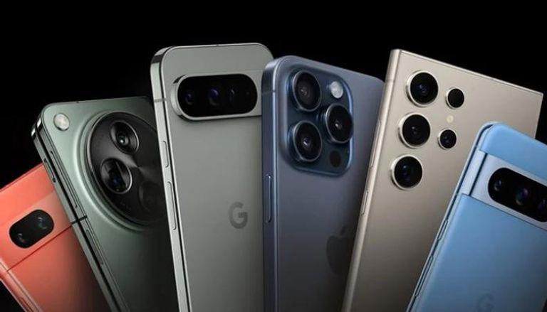
هواتف بكاميرات احترافية
بينما يري الأستاذ أمير أيمن، مصور محترف، الي أن الهواتف الذكية في وقتنا هذا تأتي بكاميرات قوية يوجد بها مستشعرات كبيرة وعدسات متنوعة (واسعة، تيليفوتو، ماكرو)، فأصبح من السهل تصوير أي شيء بجودة عالية بدون الاحتياج لكاميرا احترافية .
أضاف أيمن، أن الذكاء الاصطناعي أصبح يفعل كل شيء بسهولة مثلاً : الهاتف يحلل الصورة ويعدل الألوان والإضاءة تلقائيًا لكي تصبح بأفضل شكل، حتى في الليل أو الإضاءة الضعيفة، ميزة العزل في صور البورتريه وتحسين الصور تلقائيًا اصبحت تنافس الكاميرات الاحترافية .
اتفقا الطرفان علي، أن المستقبل قد يشهد استخدام الهواتف الذكية في تصوير البرامج لتلفزيونية والمسلسلات والأفلام السينمائية، حيث أصبح التطور الكبير لهذه الأجهزة يمكنها من التنافس مع الكاميرات الاحترافية، خاصة مع تحسينات البرمجيات وتقنيات التصوير التي تعالج الصور بشكل فوري وتعزز الجودة بطريقة لا يمكن للكاميرات التقليدية مجاراتها بسهولة .
يري الطرفان، أن الهواتف الذكية لن تحل محل الكاميرات الاحترافية بشكل كامل، ولكن يمكن أن تتوسع مجالات استخدامها لتشمل مجالات كانت في السابق مقتصره على المعدات لسينمائية المتخصصة. فمن خلال تحسينات مثل التصوير بتقنية HDR ، ومستشعرات الليزر للتركيز التلقائي، والقدرة على التصوير في ظروف إضاءة منخفضة، أصبحت الهواتف تقدم حلولًا عملية وسريعة يمكن الاعتماد عليها في العديد من الاستخدامات الاحترافية، مما قد جعلها الخيار الأول للعديد من المصورين وصناع المحتوى في المستقبل القريب .
كل هذه العوامل جعلت التصوير بالهواتف الذكية يتفوق في كثير من الجوانب، حيث أصبح جمع بين الجودة والسرعة في الإنتاج، وسهولة التعديل، والإمكانيات المتطورة، مما يفتح لمجال أمام المزيد من الابتكار والإبداع في عالم التصوير .
امثلة عن افلام وجمل اعلانية تم تصويرها بالموبايل :
Apple – “Shot on iPhone” Campaign .1
حملة إعلانية ضخمة أطلقتها آبل، تضمنت مقاطع فيديو وصور مذهلة تم تصويرها بالكامل باستخدام آيفون، وأثبتت أن الهاتف قادر على إنتاج محتوى احترافي .
Samsung Galaxy S21 Ultra – “Filmed #withGalaxy” .2
حملة إعلانية عالمية استخدمت هواتف سامسونج لإبراز إمكانيات الكاميرا، خاصة في لتصوير الليلي واللقطات البطيئة .
زر الذهاب إلى الأعلى