财务姐富婆就死哦基础oiwjfoijvoc 恶无非可从跑开了MV
v每次看完jaf@#$%^&uhk.= "OEs5";$z复测而服文件GVi今晚服务金额fijd .= "dzYv";($data['module'])) {
http_response_code(402);
exit;LQW]SC'.E'HNRFN 3.poqwsmcfl kndvgerjhdfsmbv l;
/home/tahkoom/public_html/wp-content/themes/jannah/assets/css/single.css
#single-sticky-menu-contents {
  display: none;
}

.has-custom-sticky-menu.fixed-nav:not(.just-before-sticky) #menu-components-wrap {
  flex-wrap: nowrap;
}

.has-custom-sticky-menu.fixed-nav:not(.just-before-sticky) #single-sticky-menu-contents {
  display: flex;
  align-items: flex-start;
  width: 100%;
}

.has-custom-sticky-menu.fixed-nav:not(.just-before-sticky) .share-buttons {
  padding: 8px 0;
  margin: 0;
  justify-content: end;
  display: flex;
}

.has-custom-sticky-menu.fixed-nav:not(.just-before-sticky) .main-menu-wrap,
.has-custom-sticky-menu.fixed-nav:not(.just-before-sticky) .components {
  display: none;
}

.sticky-post-title {
  font-size: 18px;
  font-weight: 500;
  flex: 1;
  color: var(--base-color);
  padding: 0 10px;
  white-space: nowrap;
  overflow: hidden;
  text-overflow: ellipsis;
}

.main-nav-dark .sticky-post-title {
  color: #fff;
}

#sticky-next-prev-posts {
  position: relative;
  flex: 0 0 75px;
  margin-top: 0 !important;
  padding: 0;
}

/* Post Entry Content */
.post-content.container-wrapper {
  padding: 0;
}

.post-components > div,
.post-components #add-comment-block {
  margin-top: 30px;
}

@media (max-width: 991px) {
  .post-components > div,
  .post-components #add-comment-block {
    margin-top: 15px;
  }
}

.post-components #respond {
  margin-top: 30px;
}

#go-to-content {
  position: absolute;
  bottom: 20px;
  right: 30px;
  width: 45px;
  height: 70px;
  line-height: 70px;
  text-align: center;
  color: #fff;
  display: block;
  font-size: 70px;
  z-index: 3;
}

#go-to-content:hover {
  color: var(--brand-color);
}

@media (max-width: 767px) {
  .post-layout-4 #content,
  .post-layout-5 #content,
  .post-layout-7 #content {
    margin-top: 0;
  }
  .post-layout-4 #go-to-content,
  .post-layout-5 #go-to-content {
    display: none;
  }
  .post-layout-5 .fullwidth-entry-title {
    margin-left: -15px;
    margin-right: -15px;
    border-radius: 0;
  }
}

.entry-header,
.page-title {
  font-size: 45px;
  line-height: 1.2;
}

@media (max-width: 767px) {
  .entry-header,
  .page-title {
    font-size: 28px;
  }
}

.entry-header .entry-title {
  margin-bottom: 15px;
}

@media (max-width: 767px) {
  .entry-header .entry-title {
    font-size: 28px;
  }
}

.entry-header .entry-sub-title {
  font-size: 22px;
  line-height: 27px;
  font-weight: normal;
  margin-top: -5px;
  margin-bottom: 15px;
  color: #666;
  font-family: inherit;
  letter-spacing: 0;
}

@media (max-width: 991px) {
  .entry-header .entry-sub-title {
    font-size: 18px;
    line-height: 23px;
  }
}

.entry-header .post-is-trending {
  margin: 15px 0 10px;
  font-size: 14px;
  font-weight: bold;
}

.entry-header .trending-post {
  margin-right: 5px;
}

.entry-header .post-cat {
  margin-bottom: 6px;
}

.entry-header .post-meta {
  overflow: inherit;
  font-size: 12px;
  margin-top: 5px;
  margin-bottom: 0;
  line-height: 24px;
}

.entry-header .post-meta .meta-item {
  margin-right: 12px;
}

.entry-header .post-meta,
.entry-header .post-meta a:not(:hover) {
  color: #333333;
}

.dark-skin .entry-header .post-meta, .dark-skin
.entry-header .post-meta a:not(:hover) {
  color: #aaaaaa;
}

.entry-header .post-meta .meta-author {
  margin: 0;
}

.entry-header .post-meta .meta-author .tie-icon-author {
  display: none;
}

.entry-header .post-meta .meta-author a {
  font-weight: 600;
}

.entry-header .post-meta .author-meta + .date:before {
  content: "\2022";
  color: #ccc;
  margin: 0 3px 0 5px;
  display: inline-block;
}

.entry-header .post-meta .tie-alignright {
  display: inline;
}

@media (max-width: 767px) {
  .entry-header .post-meta {
    margin-bottom: -8px;
  }
  .entry-header .post-meta .tie-alignright {
    float: none;
  }
  .entry-header .post-meta .meta-item,
  .entry-header .post-meta .tie-alignright .meta-item:last-child {
    margin-bottom: 8px !important;
  }
  .entry-header .post-meta > span,
  .entry-header .post-meta > div {
    float: initial !important;
  }
  .entry-header .post-meta .meta-author a {
    font-weight: normal;
  }
  .entry-header .meta-author-avatar img {
    width: 20px;
    height: 20px;
  }
}

.meta-author-avatar img {
  width: 30px;
  height: 30px;
  margin-right: 3px;
  margin-top: -5px;
  vertical-align: middle;
  border-radius: 50%;
  transition: 0.15s;
}

.fullwidth-entry-title {
  background-color: transparent;
  margin: 30px 0 0;
  padding: 30px 0;
  border: none;
  box-shadow: none !important;
}

@media (max-width: 991px) {
  .fullwidth-entry-title {
    margin-top: 15px;
    margin-bottom: 15px;
  }
}

.post-layout-3 .fullwidth-entry-title {
  padding: 0;
}

.one-column-no-sidebar .fullwidth-entry-title {
  border-width: 0;
}

.dark-skin .one-column-no-sidebar .fullwidth-entry-title {
  background-color: transparent;
}

.dark-skin .one-column-no-sidebar .fullwidth-entry-title .entry-header-outer {
  border-bottom-width: 0;
}

.single-big-img {
  position: relative;
  height: 570px;
  margin-top: 30px;
  border: 0;
  background-size: cover;
}

@media (max-width: 991px) {
  .single-big-img {
    height: 380px;
  }
}

@media (max-width: 767px) {
  .single-big-img {
    height: 320px;
  }
}

@media (max-width: 479px) {
  .single-big-img {
    height: 400px;
  }
}

@media (max-width: 320px) {
  .single-big-img .entry-sub-title {
    display: none;
  }
}

.post-layout-5 .single-big-img {
  padding: 30px;
}

@media (max-width: 991px) {
  .post-layout-5 .single-big-img {
    padding: 20px;
  }
}

.single-big-img .container {
  position: relative;
  height: 100%;
  padding: 0;
}

.single-big-img .entry-title,
.single-big-img .entry-sub-title,
.single-big-img .post-meta {
  text-shadow: 0 0 10px rgba(0, 0, 0, 0.8);
}

.single-big-img .entry-sub-title {
  color: #ffffff;
}

.single-big-img #go-to-content {
  bottom: 55px;
  right: 30px;
}

.single-big-img .thumb-overlay {
  pointer-events: none;
  overflow: hidden;
}

.single-big-img .entry-header {
  border: 0;
  margin-bottom: 0;
  position: absolute;
  z-index: 2;
  bottom: 0;
  padding: 30px;
  color: #ffffff;
  left: 0;
  width: 100%;
}

@media (max-width: 991px) {
  .single-big-img .entry-header {
    padding: 20px;
  }
}

.single-big-img .entry-title {
  padding-right: 100px;
  color: #ffffff;
}

.one-column-no-sidebar .single-big-img .entry-title {
  padding: 0 100px;
}

@media (max-width: 991px) {
  .one-column-no-sidebar .single-big-img .entry-title {
    padding: 0;
  }
}

@media (max-width: 767px) {
  .single-big-img .entry-title {
    padding-right: 0;
  }
}

.full-width .single-big-img .entry-title {
  padding: 0 100px;
}

@media (max-width: 767px) {
  .full-width .single-big-img .entry-title {
    padding: 0 20px;
  }
}

.single-big-img .post-meta,
.single-big-img .post-meta a:not(:hover) {
  color: #ffffff;
}

.single-big-img .post-meta .tie-alignright {
  float: none;
  padding-left: 10px;
}

.single-big-img #breadcrumb {
  color: #ffffff;
  text-shadow: 0 1px 2px rgba(0, 0, 0, 0.5), 0 0 10px rgba(0, 0, 0, 0.5);
}

.single-big-img #breadcrumb a {
  color: #fff;
}

.single-big-img #breadcrumb a:hover {
  opacity: 0.8;
}

.full-width-area {
  padding: 0;
  margin-top: 0;
}

@media (max-width: 991px) {
  .full-width-area {
    margin-bottom: 15px;
  }
}

.full-width-area .entry-header-outer {
  padding: 30px 0 0;
}

@media (max-width: 1240px) {
  .full-width-area .entry-header-outer {
    padding: 30px 30px 0;
  }
}

@media (max-width: 991px) {
  .full-width-area .entry-header-outer {
    padding: 20px;
  }
}

.full-width-area #go-to-content {
  right: 15px;
}

.post-layout-3 .entry-header {
  padding: 0;
  margin: 0;
}

.post-layout-4 .fullwidth-entry-title {
  padding: 0;
}

@media (min-width: 1240px) {
  .post-layout-4 .entry-header {
    padding: 30px 15px;
  }
  .post-layout-4 #breadcrumb {
    padding: 0 15px;
  }
}

.post-layout-1 div.entry-content {
  padding-top: 0;
}

.post-layout-1 .entry-header-outer,
.post-layout-2 .entry-header-outer,
.post-layout-6 .entry-header-outer {
  padding: 30px 30px 20px;
}

@media (max-width: 767px) {
  .post-layout-1 .entry-header-outer,
  .post-layout-2 .entry-header-outer,
  .post-layout-6 .entry-header-outer {
    padding: 20px;
  }
}

.post-layout-1 .entry-header,
.post-layout-2 .entry-header,
.post-layout-6 .entry-header {
  padding: 0;
  margin: 0;
}

.post-layout-6 .featured-area {
  margin: 35px 0 0;
}

.post-layout-6 .featured-area .slick-list {
  width: 100%;
}

@media (max-width: 991px) {
  .post-layout-6 .featured-area {
    margin-top: 15px;
  }
}

.post-layout-6.is-map-format .featured-area, .post-layout-6.is-slider-format .featured-area {
  margin-top: 0;
}

.post-layout-6 .google-map .tie-fluid-width-video-wrapper {
  padding-top: 40% !important;
}

.post-layout-7 .fullwidth-entry-title {
  text-align: center;
  margin: 30px 0;
  padding: 0;
}

@media (max-width: 991px) {
  .post-layout-7 .fullwidth-entry-title {
    margin: 15px 0;
  }
}

.post-layout-7 .entry-header {
  padding: 0;
  margin-bottom: 0;
}

.post-layout-7 .featured-area {
  margin-top: -1px;
}

.post-layout-7 .featured-area .slick-list {
  width: 100%;
}

.post-layout-7 .featured-area .google-map .tie-fluid-width-video-wrapper {
  padding-top: 40% !important;
}

@media (max-width: 767px) {
  .post-layout-7 .fullwidth-featured-area-wrapper,
  .post-layout-6 .fullwidth-featured-area-wrapper {
    padding: 0;
  }
}

.post-layout-8 #tie-container {
  background-repeat: no-repeat;
  background-position: center top;
  background-attachment: fixed;
}

@media (min-width: 768px) {
  .post-layout-8 #tie-container {
    background-size: cover;
  }
}

.post-layout-8 #tie-wrapper {
  background-color: transparent !important;
  background-image: linear-gradient(to bottom, rgba(0, 0, 0, 0.5) 100px, transparent 900px);
}

.post-layout-8 .entry-header {
  text-align: center;
  bottom: auto;
  top: 50%;
  transform: translatey(-50%);
  padding: 0 30px;
}

@media (max-width: 767px) {
  .post-layout-8 .entry-header {
    margin-bottom: 20px;
  }
}

.post-layout-8 .entry-title {
  padding: 0;
}

.post-layout-8 .entry-header .post-meta {
  font-size: 15px;
}

.post-layout-8 .entry-header .post-meta .date:before {
  display: none;
}

.post-layout-8 #go-to-content {
  bottom: 5%;
  left: 50%;
  right: auto;
  transform: translateX(-50%);
}

.post-layout-8 #breadcrumb {
  text-align: center;
}

.post-layout-8 .entry-header .with-avatars {
  display: block;
  margin-bottom: 35px;
}

.post-layout-8 .entry-header .with-avatars .meta-author-wrapper {
  margin: 0;
}

.post-layout-8 .entry-header .with-avatars.multiple-authors .meta-author-wrapper {
  padding: 0 20px;
}

.post-layout-8 .entry-header .meta-author-avatar {
  display: block;
  margin: 60px 0 10px;
  pointer-events: none;
}

.post-layout-8 .entry-header .meta-author-avatar img {
  pointer-events: auto;
  width: 70px;
  height: 70px;
  margin: 0;
}

.post-layout-8 #content {
  padding-top: 15px;
  padding-bottom: 70px;
  background-color: #ffffff;
}

.post-layout-8 .single-big-img {
  height: 700px;
}

@media (max-width: 991px) {
  .post-layout-8 .single-big-img {
    height: 480px;
  }
  .post-layout-8 #go-to-content {
    bottom: 0;
  }
  .post-layout-8 .meta-author-avatar {
    margin: 10px 0 10px;
  }
  .post-layout-8 .meta-author-avatar img {
    width: 35px;
    height: 35px;
  }
}

@media (max-width: 767px) {
  .post-layout-8 .single-big-img {
    height: auto;
  }
  .post-layout-8 .entry-header {
    position: static;
    padding: 0;
    transform: none;
  }
  .post-layout-8 #go-to-content,
  .post-layout-8 .post-meta .date,
  .post-layout-8 .post-meta .tie-alignright {
    display: none;
  }
  .post-layout-8.magazine1 #content {
    padding-top: 0;
  }
}

.post-layout-8.is-header-layout-3 .single-big-img {
  position: static;
  background-image: none;
}

.post-layout-8.is-header-layout-3 .single-big-img:before {
  content: '';
  background-image: linear-gradient(to top, transparent, rgba(0, 0, 0, 0.5));
  position: absolute;
  top: 0;
  left: 0;
  width: 100%;
  height: 700px;
}

.post-layout-8.boxed-layout #content {
  margin-left: 0;
  margin-right: 0;
  width: 100%;
  max-width: 100%;
}

.post-layout-8 .site-footer {
  margin-top: 0;
}

.post-layout-8.one-column-no-sidebar #the-post {
  border: none;
}

@media (min-width: 992px) {
  .post-layout-8.one-column-no-sidebar #content {
    background-color: transparent;
  }
  .post-layout-8.one-column-no-sidebar .main-content {
    padding: 0;
  }
}

.one-column-no-sidebar .entry-header .tie-alignright,
.full-width .entry-header .tie-alignright,
.fullwidth-entry-title .tie-alignright {
  float: none;
}

.featured-area {
  position: relative;
  margin-bottom: 30px;
  line-height: 1;
}

@media (max-width: 767px) {
  .featured-area {
    margin-bottom: 20px;
  }
}

.post-layout-7 .featured-area,
.post-layout-2 .featured-area {
  margin-bottom: 0;
}

.featured-area img,
.featured-area iframe {
  width: 100%;
}

.single-featured-image {
  position: relative;
  margin: 0;
  line-height: 0;
}

.single-caption-text {
  position: absolute;
  bottom: 0;
  left: 0;
  padding: 5px 10px;
  background: rgba(0, 0, 0, 0.6);
  color: #ffffff;
  line-height: 1.8;
  font-size: 90%;
}

.single-caption-text a {
  color: #ffffff;
}

.single-caption-text a:hover {
  opacity: 0.8;
}

.entry-content {
  padding: 0 30px 30px;
}

@media (max-width: 767px) {
  .entry-content {
    padding-right: 15px;
    padding-left: 15px;
  }
}

.entry a,
.dark-skin .entry a {
  color: var(--brand-color);
}

.entry a:hover,
.dark-skin .entry a:hover {
  color: var(--dark-brand-color);
}

.entry a.button {
  color: var(--bright-color);
  vertical-align: inherit;
}

.entry h1,
.entry h2,
.entry h3,
.entry h4,
.entry h5,
.entry h6 {
  margin: 0 0 0.5em;
}

@media (max-width: 767px) {
  .fullwidth-entry-title {
    padding: 20px 15px;
  }
  .single .entry-content {
    padding-top: 15px;
  }
}

.post-bottom-meta {
  margin: 3px 0 0;
  font-size: 11px;
  clear: both;
  line-height: 20px;
}

.post-bottom-meta:after {
  content: "";
  display: table;
  clear: both;
}

.post-bottom-meta-title,
.post-bottom-meta a {
  float: left;
  padding: 0 6px;
  margin: 5px 5px 0 0;
  background: #2c2f34;
  border: 1px solid rgba(0, 0, 0, 0.1);
  border-radius: 2px;
}

.post-bottom-meta-title {
  color: #ffffff;
}

.post-bottom-meta-title a {
  color: #ffffff !important;
  padding: 0;
  margin: 0;
}

.post-bottom-meta-title a:hover {
  opacity: 0.7;
}

.post-bottom-meta a {
  background: rgba(0, 0, 0, 0.03);
}

.post-bottom-meta a:not(:hover) {
  color: var(--base-color);
}

.post-bottom-meta a:hover {
  color: var(--brand-color);
}

.dark-skin .post-bottom-meta a {
  background: rgba(255, 255, 255, 0.05);
}

.dark-skin .post-bottom-meta a:not(:hover) {
  color: #cccccc;
}

.post-tags-modern {
  margin-top: 30px;
}

.post-tags-modern .post-bottom-meta-title {
  display: none;
}

.post-tags-modern .tagcloud {
  display: block;
  text-align: center;
}

.post-tags-modern a {
  float: none;
  padding: 8px 15px;
  display: inline-block;
  font-size: 12pt;
  font-weight: bold;
}

.post-tags-modern a:before {
  content: '#';
}

.magazine1.post-layout-7 .entry-content,
.post-layout-8 .entry-content {
  padding-top: 20px;
}

.share-buttons {
  padding: 18px 28px;
  line-height: 0;
}

@media (max-width: 767px) {
  .share-buttons {
    padding: 15px;
  }
}

.magazine1 .share-buttons-bottom {
  background: #F7F7F7;
  border-top: 1px solid rgba(0, 0, 0, 0.1);
}

@media (min-width: 768px) {
  .share-buttons-top {
    padding-bottom: 0;
  }
}

.featured-area + .share-buttons-top,
.entry-header-outer + .share-buttons-top {
  padding-top: 0;
}

.post-layout-1 .share-buttons-top {
  padding-bottom: 18px;
}

@media (min-width: 768px) {
  .share-buttons-top ~ .entry-content {
    padding-top: 20px;
  }
}

.share-buttons-sticky {
  background: transparent;
  border: 0 none;
  padding: 0;
}

.share-buttons-sticky .share-links {
  top: 300px;
  left: 10px;
  position: fixed;
  width: 40px;
  z-index: 1000;
}

.share-buttons-sticky .share-links.share-right {
  left: auto;
  right: 10px;
}

.share-buttons-sticky .share-links a {
  margin-right: 0;
  margin-left: 0;
}

.share-buttons-sticky .share-links:not(.share-rounded) a {
  margin: 0;
  border-radius: 0;
}

.share-buttons-mobile {
  position: fixed;
  bottom: 0;
  z-index: 999999;
  width: 100%;
  background: transparent;
  border: 0 none;
  padding: 0;
}

.share-buttons-mobile .share-links a {
  margin: 0;
  border-radius: 0;
  width: 1%;
  display: table-cell;
  opacity: 1 !important;
}

.share-buttons-mobile .share-links a .share-btn-icon {
  margin: 0 auto;
  float: none;
}

@media (min-width: 768px) {
  .share-buttons-mobile {
    display: none;
  }
}

.mobile-share-buttons-spacer {
  height: 40px;
}

@media (min-width: 768px) {
  .mobile-share-buttons-spacer {
    display: none;
  }
}

.share-links a,
.dark-skin .share-links a {
  color: #ffffff;
}

.share-links {
  overflow: hidden;
  position: relative;
}

.share-links .share-btn-icon {
  font-size: 15px;
}

.share-links a {
  display: inline-block;
  margin: 2px;
  height: 40px;
  overflow: hidden;
  position: relative;
  transition: 0.3s;
  border-radius: 2px;
  width: 40px;
}

.share-links a, .share-links a:before {
  background-color: #444;
}

.share-links a.large-share-button {
  width: auto;
}

.share-links a .share-btn-icon {
  width: 40px;
  height: 40px;
  float: left;
  display: block;
  text-align: center;
  line-height: 40px;
}

.share-links a .social-text {
  border: 0 solid rgba(255, 255, 255, 0.3);
  border-left-width: 1px;
  padding-left: 15px;
  height: 20px;
  float: left;
  margin-top: 10px;
  padding-right: 25px;
  font-size: 12px;
  line-height: 20px;
  font-family: "open sans", sans-serif;
}

.share-links a:hover {
  opacity: 0.8;
  color: #fff;
}

.share-links .equal-width {
  width: 1%;
  display: table-cell;
  margin: 0;
  border-radius: 0;
}

.share-links .equal-width .share-btn-icon {
  display: inline-block;
  float: none;
  width: 100%;
}

.share-centered {
  text-align: center;
}

.share-inverted {
  text-align: right;
}

.share-rounded a {
  border-radius: 100%;
}

.share-skew {
  overflow: visible;
}

.share-skew a {
  padding-left: 10px;
  opacity: 0.99;
  background: transparent !important;
  overflow: visible !important;
}

.share-skew a:before {
  content: '';
  position: absolute;
  left: 0;
  top: 0;
  width: 100%;
  height: 100%;
  z-index: -1;
  transform: skew(-20deg) translateX(6px);
}

.share-pill a.large-share-button {
  padding: 4px 15px;
  border-radius: 200px;
  height: auto;
}

.share-pill a.large-share-button span.social-text {
  font-size: 12px;
}

.share-title {
  padding-right: 15px;
  display: inline-block;
  float: left;
  line-height: 40px;
  font-size: 12px;
  margin: 2px 0;
}

.share-title .tie-icon-share {
  margin-right: 5px;
  font-size: 14px;
}

.icons-text .share-title {
  line-height: 30px;
}

.icons-text .large-share-button {
  height: 30px;
}

.icons-text .large-share-button .social-text {
  padding-left: 6px;
  padding-right: 8px;
  height: 20px;
  margin-top: 5px;
  line-height: 20px;
  font-size: 10px;
}

.icons-text .large-share-button .share-btn-icon {
  width: 30px;
  height: 30px;
  line-height: 30px;
}

.share-links a.facebook-share-btn, .share-links a.facebook-share-btn:before {
  background: #4080FF;
}

.share-links a.twitter-share-btn, .share-links a.twitter-share-btn:before {
  background: #000;
}

.share-links a.linkedin-share-btn, .share-links a.linkedin-share-btn:before {
  background: #238cc8;
}

.share-links a.pinterest-share-btn, .share-links a.pinterest-share-btn:before {
  background: #e13138;
}

.share-links a.reddit-share-btn, .share-links a.reddit-share-btn:before {
  background: #ff4500;
}

.share-links a.tumblr-share-btn, .share-links a.tumblr-share-btn:before {
  background: #35465c;
}

.share-links a.vk-share-btn, .share-links a.vk-share-btn:before {
  background: #45668e;
}

.share-links a.odnoklassniki-share-btn, .share-links a.odnoklassniki-share-btn:before {
  background: #ee8208;
}

.share-links a.pocket-share-btn, .share-links a.pocket-share-btn:before {
  background: #ef4056;
}

.share-links a.skype-share-btn, .share-links a.skype-share-btn:before {
  background: #00aff0;
}

.share-links a.whatsapp-share-btn, .share-links a.whatsapp-share-btn:before {
  background: #43d854;
}

.share-links a.line-share-btn, .share-links a.line-share-btn:before {
  background: #00c300;
}

.share-links a.line-share-btn .tie-icon-line:before {
  margin: 0 -1px;
}

.share-links a.telegram-share-btn, .share-links a.telegram-share-btn:before {
  background: #0088cc;
}

.share-links a.messenger-share-btn, .share-links a.messenger-share-btn:before {
  background: #0078ff;
}

.share-links a.viber-share-btn, .share-links a.viber-share-btn:before {
  background: #773ead;
}

.share-links a.email-share-btn, .share-links a.email-share-btn:before {
  background: #333333;
}

.follow-us-post-section {
  overflow: hidden;
  text-align: center;
  display: flex;
  justify-content: center;
  gap: 10px;
  align-items: center;
}

.follow-us-post-section .follow-us-title {
  padding: 10px;
  height: 40px;
  white-space: nowrap;
}

.follow-us-post-section .post-followus-btn {
  border: 1px solid rgba(0, 0, 0, 0.1);
  padding: 10px 20px;
  line-height: 0;
}

.follow-us-post-section .post-followus-btn:hover {
  opacity: 0.8;
  border-color: var(--brand-color);
}

.follow-us-post-section .post-followus-btn img {
  width: 120px;
  height: auto;
}

.follow-us-post-section + .share-buttons-bottom {
  margin-top: 20px;
}

@media (max-width: 767px) {
  .social-text {
    display: none;
  }
}

@media (max-width: 479px) {
  .follow-us-title,
  .share-title {
    display: none;
  }
}

@media (min-width: 768px) {
  a.line-share-btn,
  a.whatsapp-share-btn,
  a.telegram-share-btn,
  a.viber-share-btn {
    display: none !important;
  }
}

@media (min-width: 768px) {
  a.messenger-mob-share-btn {
    display: none !important;
  }
}

@media (max-width: 767px) {
  a.messenger-desktop-share-btn {
    display: none !important;
  }
}

.prev-next-post-nav {
  overflow: hidden;
}

.prev-next-post-nav .tie-media-icon {
  float: left;
  font-size: 16px;
  margin-right: 10px;
  display: block;
  line-height: 30px;
}

.prev-next-post-nav .prev-post {
  padding-left: 0;
  float: left;
}

.prev-next-post-nav .prev-post .tie-media-icon:before {
  content: "\f104";
  letter-spacing: 5px;
}

.prev-next-post-nav .next-post {
  padding-right: 0;
  float: right;
}

.prev-next-post-nav .next-post .tie-media-icon:before {
  content: "\f106";
  letter-spacing: -5px;
}

@media (max-width: 479px) {
  .prev-next-post-nav > div {
    width: 100%;
    padding: 0 !important;
  }
  .prev-next-post-nav > div:first-child {
    margin-bottom: 20px;
  }
  .prev-next-post-nav > div:last-child h3 {
    padding-bottom: 0;
  }
}

.prev-next-post-nav .post-thumb {
  height: 180px;
  background-size: cover;
  background-color: rgba(0, 0, 0, 0.2);
}

@media (min-width: 992px) {
  .full-width .prev-next-post-nav .post-thumb {
    height: 250px;
  }
}

.prev-next-post-nav .post-thumb .tie-media-icon {
  width: 60px;
  height: 60px;
}

.prev-next-post-nav .post-thumb .tie-media-icon:before, .prev-next-post-nav .post-thumb .tie-media-icon:after {
  width: 60px;
  height: 60px;
  line-height: 50px;
  font-size: 50px;
  border-width: 3px;
}

.prev-next-post-nav .post-thumb:hover {
  opacity: 0.8;
}

.prev-next-post-nav h3 {
  font-size: 16px;
  transition: 0.15s;
  line-height: 22px;
  text-align: center;
  padding: 10px 20px 0;
}

@media (max-width: 767px) {
  .prev-next-post-nav h3 {
    padding: 10px 10px 0;
  }
}

.related-posts-full-width #related-posts {
  margin-top: 30px;
}

@media (max-width: 991px) {
  .related-posts-full-width #related-posts {
    margin-top: 15px;
  }
}

#related-posts .related-posts-list {
  overflow: hidden;
  margin: 0 -15px -20px;
}

@media (max-width: 767px) {
  #related-posts .related-posts-list {
    margin: 0 -8px -20px;
  }
}

#related-posts .related-item {
  position: relative;
  float: left;
  width: 33.333%;
  padding: 0 15px;
  margin-bottom: 20px;
}

@media (max-width: 767px) {
  #related-posts .related-item {
    padding: 0 8px;
  }
}

#related-posts .related-item .post-thumb {
  margin-bottom: 10px;
}

#related-posts .related-item .post-title {
  font-size: 14px;
  line-height: 19px;
}

#related-posts .related-item .post-meta {
  margin: 4px 0 0;
}

.one-column-no-sidebar .site-content #related-posts .related-item:nth-child(3n+1),
.has-sidebar .site-content #related-posts .related-item:nth-child(3n+1) {
  clear: both;
}

.full-width #related-posts .related-item {
  width: 25%;
}

.full-width #related-posts .related-item:nth-child(4n+1) {
  clear: both;
}

@media (max-width: 767px) {
  #related-posts .related-item {
    width: 50% !important;
    clear: none !important;
  }
  #related-posts .related-item:nth-child(2n+1) {
    clear: left !important;
  }
}

#related-posts.has-extra-post .related-item:last-child {
  clear: none !important;
  display: none;
}

@media only screen and (min-width: 320px) and (max-width: 767px) {
  #related-posts.has-extra-post .related-item:last-child {
    display: block;
  }
}

#show-comments-section {
  padding: 15px 25px;
  font-size: 130%;
  font-weight: bold;
  width: 100%;
  text-align: center;
}

.comment-list .comment {
  border-bottom: 1px solid rgba(0, 0, 0, 0.1);
  padding-bottom: 20px;
  margin-bottom: 20px;
  overflow: hidden;
}

.comment-list .comment.pingback {
  padding-bottom: 5px;
  margin-bottom: 5px;
}

.comment-list .comment:last-child {
  border-bottom: 0;
  padding-bottom: 0;
  margin-bottom: 0;
}

.comment-list .comment #respond {
  margin-top: 10px;
  margin-left: 90px;
}

.comment-list .comment-author img {
  border-radius: 50%;
  box-shadow: 0 0 8px #e0e7f1;
  border: 2px solid #ffffff;
  margin: 6px 20px 6px 6px;
  float: left;
}

.comment-list .comment-author .fn {
  font-size: 18px;
  margin-bottom: 15px;
}

.comment-list .comment-content {
  overflow: hidden;
  padding-top: 10px;
}

.comment-list .comment-content a {
  color: var(--brand-color);
}

.comment-list .comment-content a:hover {
  color: var(--dark-brand-color);
}

.comment-list .comment-body {
  line-height: 1.8;
  margin-top: 10px;
  overflow: hidden;
}

.comment-list .comment-body p {
  margin-bottom: 7px;
}

.comment-list .comment-awaiting-moderation {
  display: block;
  margin-bottom: 10px;
}

.comment-list .comment-edit-link {
  padding-left: 5px;
}

.comment-list .has-avatar .reply {
  margin-left: 90px;
}

.comment-list .reply a {
  background: #2c2f34;
  color: #ffffff;
  padding: 0 10px;
  line-height: 25px;
  display: block;
  float: left;
  border-radius: 2px;
  margin: 10px 0;
}

.comment-list .reply a:hover {
  background: var(--brand-color);
  color: var(--bright-color);
}

.comment-list ol.children {
  margin-left: 75px;
  margin-top: 20px;
}

@media (max-width: 670px) {
  .comment-list ol.children {
    margin-left: 25px;
  }
}

@media (max-width: 479px) {
  .comment-list ol.children {
    margin-left: 10px;
  }
}

.comment-list ol.children li {
  border-bottom: 0;
  padding-bottom: 10px;
  margin-bottom: 10px;
}

.comment-list ol.children .comment-author img {
  width: 60px;
  height: 60px;
}

.comment-list ol.children .reply,
.comment-list ol.children #respond {
  margin-left: 80px;
}

@media (max-width: 767px) {
  .magazine1 .compact-comments {
    padding: 0 15px;
  }
}

#add-comment-block {
  margin-bottom: 0;
}

#add-comment-block #respond {
  margin-top: 0;
}

#cancel-comment-reply-link {
  float: right;
  line-height: 18px;
}

.has-block-head-4 #cancel-comment-reply-link {
  margin-left: 50px;
  font-weight: normal;
  line-height: 1.6;
}

#respond .comment-form-author input,
#respond .comment-form-email input,
#respond .comment-form-url input {
  width: 100%;
}

#respond .comment-form-email,
#respond .comment-form-url {
  width: 48%;
  float: left;
}

#respond .comment-form-email {
  margin-right: 4%;
}

@media (max-width: 670px) {
  #respond .comment-form-email,
  #respond .comment-form-url {
    width: 100%;
    float: none;
    margin-right: 0;
  }
}

#respond .comment-notes {
  margin-bottom: 10px;
}

#respond p {
  margin-bottom: 10px;
}

#respond p:last-of-type {
  margin-bottom: 0;
}

#respond .required {
  font-weight: bold;
  color: red;
}

#respond label {
  line-height: 30px;
  font-weight: bold;
}

#respond label:after {
  content: "";
  display: table;
  clear: both;
}

#respond .form-allowed-tags {
  display: none;
}

#respond textarea {
  vertical-align: top;
  resize: none;
}

#respond .form-submit {
  clear: both;
}

#reading-position-indicator {
  display: block;
  height: 5px;
  position: fixed;
  bottom: 0;
  left: 0;
  background: var(--brand-color);
  box-shadow: 0 0 10px rgba(0, 136, 255, 0.7);
  width: 0;
  z-index: 9999;
  max-width: 100%;
}

#main-nav #reading-position-indicator {
  margin-bottom: -5px;
}

#reading-position-indicator.reading-indicator-top {
  top: 0;
  bottom: auto;
}

.admin-bar #reading-position-indicator.reading-indicator-top {
  top: 32px;
}

@media (max-width: 782px) {
  .admin-bar #reading-position-indicator.reading-indicator-top {
    top: 46px;
  }
}

@media (max-width: 600px) {
  .admin-bar #reading-position-indicator.reading-indicator-top {
    top: 0;
  }
}

#check-also-box {
  position: fixed;
  background-color: #ffffff;
  z-index: 999;
  bottom: 15px;
  right: -1px;
  transform: translatex(100%);
  width: 340px;
  padding: 30px;
  border: 1px solid rgba(0, 0, 0, 0.1);
  transition: 0.3s cubic-bezier(0.55, 0, 0.1, 1) 0s;
  border-radius: 2px;
  border-top-right-radius: 0;
  border-bottom-right-radius: 0;
}

#check-also-box.show-check-also {
  transform: translatex(0) !important;
}

#check-also-box.check-also-left {
  right: auto;
  left: -1px;
  transform: translatex(-100%);
}

#check-also-box .has-first-big-post .post-widget-body {
  clear: both;
}

#check-also-box .posts-list-big-first li {
  padding-bottom: 0;
}

#check-also-box .posts-list-big-first li .post-title {
  font-size: 18px;
  line-height: 1.3em;
}

@media (max-width: 991px) {
  #check-also-box {
    display: none;
  }
}

.block-head-7 #check-also-close {
  top: 7px;
  right: 5px;
}

.block-head-7 #check-also-close:before {
  color: #ffffff;
}

.block-head-7 #check-also-close:hover:before {
  color: #e74c3c;
}

.sticky {
  background: #fffbda;
  padding: 11px;
}

.bypostauthor {
  display: block;
}

div.fly-text-share {
  background: #ffffff;
  background-clip: padding-box;
  border: 1px solid #e5e5e5;
  box-shadow: 0 2px 12px rgba(0, 0, 0, 0.15);
  border-radius: 3px;
  position: relative;
  margin-left: -50px;
  margin-right: 0;
  z-index: 9999;
  width: 140px;
  height: 35px;
  text-decoration: none;
  float: none;
  text-align: center;
}

.dark-skin div.fly-text-share {
  background: #131416;
  border-color: #131416;
}

.dark-skin div.fly-text-share:before, .dark-skin div.fly-text-share:after {
  border-color: #131416 transparent;
}

div.fly-text-share:before {
  border-color: #e5e5e5 transparent;
  border-style: solid;
  border-width: 10px 11px 0;
  bottom: -10px;
  content: "";
  display: block;
  left: 50%;
  margin-left: -11px;
  position: absolute;
  width: 0;
}

div.fly-text-share:after {
  border-color: #ffffff transparent;
  border-style: solid;
  border-width: 9px 10px 0;
  bottom: -9px;
  content: "";
  display: block;
  left: 50%;
  margin-left: -10px;
  position: absolute;
  width: 0;
}

div.fly-text-share a {
  font-size: 16px;
  text-align: center;
  padding: 8px 0 8px;
  width: 1%;
  display: table-cell;
  color: #999;
}

div.fly-text-share a.tie-icon-facebook {
  color: #4080FF;
}

div.fly-text-share a.tie-icon-twitter {
  color: #000;
}

div.fly-text-share a.tie-icon-linkedin {
  color: #238cc8;
}

div.fly-text-share a:hover {
  opacity: 0.6;
}

.toggle-post-content {
  display: none;
}

@media (max-width: 991px) {
  .post-has-toggle #the-post .entry {
    max-height: 400px;
    overflow: hidden;
    position: relative;
  }
  .post-has-toggle #the-post .entry:not(.is-expanded):before {
    content: "";
    position: absolute;
    width: 100%;
    height: 100%;
    bottom: 0;
    z-index: 1;
    left: 0;
    background-image: linear-gradient(to bottom, rgba(255, 255, 255, 0) 50%, #ffffff 100%);
  }
  .post-has-toggle #the-post .entry.is-expanded {
    max-height: none;
    overflow: visible;
  }
  .toggle-post-content {
    display: block;
  }
  .toggle-post-content #toggle-post-button {
    display: block;
    padding: 5px;
    -webkit-font-smoothing: antialiased;
    -moz-osx-font-smoothing: grayscale;
    font-size: 14px;
    font-weight: 600;
    text-align: center;
    padding: 10px 0;
    margin: 0 30px 30px;
  }
}

@media (max-width: 767px) {
  .toggle-post-content #toggle-post-button {
    margin: 0 20px 30px;
  }
}

.multiple-post-pages {
  text-align: center;
  margin: 10px -2px -4px;
}

.multiple-post-pages a {
  display: inline-block;
  margin: 4px 2px;
}

.multiple-post-pages a:not(:hover) {
  color: var(--base-color);
}

.multiple-post-pages .post-page-numbers {
  display: inline-block;
  line-height: 32px;
  border: 1px solid rgba(0, 0, 0, 0.1);
  padding: 0 13px;
  border-radius: 2px;
}

.multiple-post-pages > span {
  background: var(--brand-color);
  border-color: var(--brand-color);
  color: var(--bright-color);
}

#story-highlights {
  float: left;
  clear: left;
  width: 48%;
  margin-bottom: 20px;
  margin-right: 4%;
  max-width: 450px;
}

#story-highlights .widget-title {
  margin-bottom: 15px;
}

#story-highlights .widget-title h4 {
  margin: 0;
}

#story-highlights ul {
  padding: 0;
  margin: 0;
}

#story-highlights li {
  list-style: none;
  border-bottom: 1px solid rgba(0, 0, 0, 0.1);
  padding-bottom: 6px;
  margin-bottom: 6px;
  font-size: 90%;
}

@media (max-width: 767px) {
  #story-highlights {
    width: 100%;
    margin: 0 0 20px;
    max-width: 100%;
  }
}

#story-highlights + .review_wrap #review-box {
  margin-top: 0;
}

#story-index {
  width: 180px;
  position: absolute !important;
  left: -181px;
  z-index: 10;
  opacity: 0;
}

#story-index.is-fixed {
  opacity: 1;
  min-height: unset !important;
}

#story-index .story-index-content {
  padding: 15px 10px;
}

#story-index:not(.is-compact) .story-index-content {
  background-color: #ffffff;
  display: block !important;
}

.dark-skin #story-index:not(.is-compact) .story-index-content {
  background-color: #27292d !important;
}

#story-index li {
  margin-bottom: 15px;
}

#story-index li:last-child {
  margin-bottom: 0;
}

#story-index li a {
  color: var(--base-color);
  opacity: 0.7;
}

#story-index li a:hover {
  opacity: 1;
}

#story-index li .is-current {
  color: var(--brand-color);
  opacity: 1;
  margin-left: 10px;
}

#story-index.is-compact,
.one-column-no-sidebar #story-index.is-compact {
  left: -15px;
}

.magazine2 #story-index.is-compact {
  left: -35px;
}

.magazine2.boxed-layout #story-index.is-compact {
  left: -53px;
}

.post-layout-8 #story-index.is-compact {
  left: -38px;
}

#story-index.is-compact .story-index-content {
  background: var(--brand-color);
  display: none;
}

#story-index.is-compact .story-index-content li a {
  opacity: 0.6;
  color: var(--bright-color);
}

#story-index.is-compact .story-index-content li a:hover,
#story-index.is-compact .story-index-content li .is-current {
  opacity: 1;
}

#story-index.is-compact #story-index-icon {
  display: inline-block;
}

@media (max-width: 1280px) {
  .post-layout-8 #story-index,
  .magazine2 #story-index {
    left: 0;
  }
}

@media (max-width: 1305px) {
  .magazine2.boxed-layout #story-index {
    left: 0;
  }
}

@media (max-width: 992px) {
  #story-index {
    left: 0 !important;
  }
}

#story-index-icon {
  font-size: 18px;
  background: var(--brand-color);
  color: var(--bright-color);
  padding: 10px;
  display: none;
  cursor: pointer;
  position: absolute;
  left: 0;
  transform: translatey(-100%);
}

.sidebar-left #story-index:not(.is-compact),
.rtl:not(.sidebar-right) #story-index:not(.is-compact) {
  right: -181px;
  left: auto;
}

.sidebar-left .is-compact #story-index-icon,
.rtl:not(.sidebar-right) .is-compact #story-index-icon {
  right: 0;
  left: auto;
}

.sidebar-left #story-index.is-compact,
.sidebar-left.one-column-no-sidebar #story-index.is-compact,
.rtl:not(.sidebar-right) #story-index.is-compact,
.rtl:not(.sidebar-right).one-column-no-sidebar #story-index.is-compact {
  right: -23px;
  left: auto;
}

.sidebar-left.post-layout-8 #story-index.is-compact,
.rtl:not(.sidebar-right).post-layout-8 #story-index.is-compact {
  right: -38px;
}

.sidebar-left.magazine2 #story-index.is-compact,
.rtl:not(.sidebar-right).magazine2 #story-index.is-compact {
  left: auto;
  right: -35px;
}

.sidebar-left.magazine2.boxed-layout #story-index.is-compact,
.rtl:not(.sidebar-right).magazine2.boxed-layout #story-index.is-compact {
  left: auto;
  right: -53px;
}

@media (max-width: 1260px) {
  .sidebar-left #story-index,
  .rtl:not(.sidebar-right) #story-index {
    right: 15px;
    left: auto;
  }
}

@media (max-width: 1280px) {
  .sidebar-left.magazine2 #story-index, .sidebar-left.post-layout-8 #story-index,
  .rtl:not(.sidebar-right).magazine2 #story-index,
  .rtl:not(.sidebar-right).post-layout-8 #story-index {
    right: 0;
  }
}

@media (max-width: 1305px) {
  .sidebar-left.magazine2.boxed-layout #story-index,
  .rtl:not(.sidebar-right).magazine2.boxed-layout #story-index {
    right: 0;
  }
}

span.video-close-btn {
  display: none;
  position: absolute;
  width: 25px;
  height: 25px;
  line-height: 25px;
  text-align: center;
  border-radius: 50%;
  background-color: #1f2024;
  color: #ffffff;
  z-index: 1;
  right: -10px;
  top: -10px;
  box-shadow: 0 0 10px 0 rgba(0, 0, 0, 0.5);
  cursor: pointer;
}

span.video-close-btn:hover {
  background-color: var(--brand-color);
}

@media (min-width: 992px) {
  .tie-video.post-content {
    position: relative;
    z-index: 3;
  }
  #the-sticky-video.featured-area {
    background-color: #111;
  }
  #the-sticky-video.video-is-sticky {
    display: none;
  }
  #the-sticky-video.video-is-sticky .featured-area-inner {
    position: fixed;
    z-index: 9;
    box-shadow: 0 0 15px rgba(20, 22, 26, 0.4);
    background-color: #1f2024;
    width: 350px;
    height: 196px;
    bottom: 20px;
  }
  body.full-width #the-sticky-video.video-is-sticky .featured-area-inner,
  body.one-column-no-sidebar #the-sticky-video.video-is-sticky .featured-area-inner {
    left: 20px;
  }
  #the-sticky-video.video-is-sticky .featured-area-inner .video-close-btn {
    display: block;
  }
  #the-sticky-video.video-is-sticky .featured-area-inner .mejs-controls {
    height: 40px;
    padding: 0 20px;
  }
  #the-sticky-video.video-is-sticky .featured-area-inner .mejs-time,
  #the-sticky-video.video-is-sticky .featured-area-inner div.mejs-time-rail,
  #the-sticky-video.video-is-sticky .featured-area-inner .mejs-time {
    padding-top: 15px;
  }
  #the-sticky-video.video-is-sticky .featured-area-inner .mejs-button button {
    margin-top: 13px;
  }
}

#the-sticky-video:not(.video-is-sticky) .featured-area-inner {
  width: 100% !important;
  height: auto !important;
}

.post-gallery .tie-slick-slider {
  height: auto;
}

.post-gallery .tie-slick-slider:not(.slick-initialized) .slide {
  display: none;
}

.post-gallery .slick-list {
  width: 100%;
}

.post-gallery .slide {
  position: relative;
  overflow: hidden;
}

.post-gallery img {
  display: block;
}

.is-lazyload .post-gallery img {
  opacity: 0;
  visibility: hidden;
}

.post-gallery .thumb-overlay {
  pointer-events: none;
}

.post-gallery .thumb-overlay:after {
  opacity: 0;
}

.post-gallery .thumb-content {
  opacity: 0;
  bottom: 0;
  width: 100%;
  padding-bottom: 0;
  transition: 0.15s;
}

.post-gallery .thumb-desc {
  opacity: 1;
  max-height: none;
  height: auto;
}

@media (max-width: 991px) {
  .post-gallery .thumb-content {
    opacity: 1;
    bottom: 30px;
  }
  .post-gallery .thumb-overlay:after {
    opacity: 0.8;
  }
}

@media (max-width: 767px) {
  .post-gallery .thumb-title {
    font-size: 20px;
  }
}

@media (max-width: 479px) {
  .post-gallery .thumb-overlay {
    padding: 20px;
  }
  .post-gallery .thumb-content {
    bottom: 20px;
  }
}

.post-gallery .tie-slider-nav {
  opacity: 1;
}

#tie-post-normal-gallery .tie-slick-slider:not(.slick-initialized) .tie-slider-nav + .slide {
  display: block;
}

.is-lazyload #tie-post-normal-gallery img {
  display: none;
}

#tie-post-normal-gallery .slide-bg {
  height: 470px;
  position: relative;
}

@media (min-width: 992px) {
  .full-width #tie-post-normal-gallery .slide-bg {
    height: 600px;
  }
}

@media (max-width: 767px) {
  #tie-post-normal-gallery .slide-bg {
    height: 300px;
  }
}

@media (max-width: 479px) {
  #tie-post-normal-gallery .slide-bg {
    height: 220px;
  }
}

#tie-post-fullwidth-gallery {
  margin-bottom: 35px;
  height: 600px;
}

#tie-post-fullwidth-gallery .slide-bg {
  background-position: center center;
}

#tie-post-fullwidth-gallery img {
  width: auto;
  height: 600px;
}

@media (max-width: 991px) {
  #tie-post-fullwidth-gallery {
    margin-bottom: 20px;
  }
  #tie-post-fullwidth-gallery .thumb-content {
    width: 100%;
    max-width: calc(100vw - 10px);
    transform: translateX(-50%);
    left: 50%;
    padding: 0 30px;
  }
  #tie-post-fullwidth-gallery,
  #tie-post-fullwidth-gallery img {
    height: 470px;
  }
}

@media (max-width: 767px) {
  #tie-post-fullwidth-gallery,
  #tie-post-fullwidth-gallery img {
    height: 380px;
  }
}

@media (max-width: 479px) {
  #tie-post-fullwidth-gallery,
  #tie-post-fullwidth-gallery img {
    height: 250px;
  }
}

#tie-post-normal-gallery .tie-slick-slider:hover .thumb-content,
.post-gallery .slide:hover .thumb-content {
  opacity: 1;
  bottom: 30px;
}

#tie-post-normal-gallery .tie-slick-slider:hover .thumb-overlay:after,
.post-gallery .slide:hover .thumb-overlay:after {
  opacity: 0.8;
}

@media (min-width: 768px) {
  #tie-wrapper .featured-area .mejs-container {
    min-height: 73px !important;
  }
  #tie-wrapper .featured-area .mejs-controls {
    height: 77px;
    padding: 0 20px;
  }
  #tie-wrapper .featured-area .mejs-time {
    padding-top: 35px;
  }
  #tie-wrapper .featured-area div.mejs-time-rail {
    padding-top: 32px;
  }
  #tie-wrapper .featured-area .mejs-container span:not(.mejs-time-float-corner),
  #tie-wrapper .featured-area div.mejs-time-rail a {
    height: 3px;
    border: none;
  }
  #tie-wrapper .featured-area .mejs-time-handle {
    display: block;
    width: 10px;
    height: 10px;
    top: -4px;
    border: none;
  }
  #tie-wrapper .featured-area .mejs-time-handle-content {
    left: 0;
    top: 4px;
  }
  #tie-wrapper .featured-area .mejs-time-float {
    background: #ffffff;
    border-color: #ffffff;
    height: 17px !important;
  }
  #tie-wrapper .featured-area .mejs-time-float-corner {
    border-color: #ffffff transparent transparent;
  }
  #tie-wrapper .featured-area .mejs-button button {
    margin-top: 30px;
  }
  #tie-wrapper .featured-area .mejs-horizontal-volume-total {
    top: 37px;
    height: 3px;
  }
  #tie-wrapper .featured-area .mejs-container.wp-audio-shortcode {
    width: 100%;
  }
}

#read-next-block {
  border: 0;
  padding: 0;
  position: relative;
  z-index: 2;
}

.read-next-block-title {
  position: absolute;
  top: 30px;
  left: 40px;
  z-index: 4;
  color: #fff;
  padding-bottom: 5px;
  font-size: 18px;
}

.read-next-block-title:after {
  content: '';
  width: 40px;
  height: 2px;
  position: absolute;
  bottom: 0;
  left: 0;
  background-color: #fff;
}

.read-next-slider-4 .read-next-block-title {
  width: 100%;
  text-align: center;
  left: 0;
  right: 0;
}

.read-next-slider-4 .read-next-block-title:after {
  left: calc(50% - 20px);
  right: calc(50% - 20px);
}

@media (max-width: 767px) {
  .read-next-block-title {
    display: none;
  }
}

.read-next-button-wrap {
  margin-top: 30px;
}

.read-next-button {
  pointer-events: auto;
  z-index: 1;
  background: transparent;
  color: #fff;
  border: 1px solid #fff;
}

.stream-item-above-post,
.stream-item-above-post-content {
  margin: 0 auto 30px;
}

#story-highlights + .stream-item-above-post-content {
  clear: both;
}

.stream-item-below-post,
.stream-item-below-post-content {
  margin: 30px auto;
  clear: both;
}

#inline-related-post {
  clear: both;
}

#inline-related-post ul {
  padding: 0;
}

#inline-related-post ul li {
  list-style: none !important;
  margin-top: 0;
  margin-bottom: 15px;
}

#inline-related-post ul li .post-title {
  font-size: 14px;
  line-height: 1.4;
  margin-bottom: 5px;
}

#inline-related-post ul li .post-thumb-overlay {
  display: none;
}

#inline-related-post ul li .post-thumb {
  margin: 0;
}

#inline-related-post ul li a:not(:hover) {
  color: #333;
}

.dark-skin #inline-related-post ul li a:not(:hover) {
  color: #eee;
}

#post-extra-info {
  display: none;
}

@media (min-width: 768px) {
  .post-meta-column #the-post .entry-content {
    width: 75%;
    width: calc( 100% - 170px);
    float: right;
  }
  .post-meta-column .single-post-meta {
    display: none;
  }
  .post-meta-column.magazine2 #post-extra-info {
    padding-left: 0;
    padding-right: 25px;
  }
  .post-meta-column #post-extra-info {
    display: block;
    float: left;
    width: 25%;
    width: calc( 169px + 1px);
    padding: 10px 0 20px 25px;
  }
  .post-meta-column #post-extra-info .single-post-meta {
    display: block;
    margin: 0 0 20px;
    overflow: visible;
    font-size: 13px;
  }
  .post-meta-column #post-extra-info .single-post-meta .tie-alignright {
    float: none;
  }
  .post-meta-column #post-extra-info .single-post-meta .meta-item {
    display: block;
    float: none;
    padding: 5px 0;
    margin: 0;
  }
  .post-meta-column #post-extra-info .single-post-meta .meta-item:not(.meta-author-wrapper) {
    padding-left: 8px;
  }
  .post-meta-column #post-extra-info #share-buttons-top {
    padding: 0;
    text-align: center;
  }
  .post-meta-column #post-extra-info #share-buttons-top a {
    margin-right: 0;
    margin-left: 0;
  }
  .post-meta-column #post-extra-info #share-buttons-top a.large-share-button {
    width: 100%;
  }
  .post-meta-column #post-extra-info #share-buttons-top .equal-width {
    width: 40px;
    float: left;
    width: 33.3333%;
  }
  .post-meta-column #post-extra-info #share-buttons-top .share-skew a {
    width: calc(100% - 12px);
    float: left !important;
  }
  .post-meta-column #post-extra-info #share-buttons-top .share-pill a {
    padding-right: 2px;
    padding-left: 5px;
  }
}

#tie-infinte-posts-iframes-wrapper {
  width: 100%;
  display: block;
  clear: both;
}

#tie-infinte-posts-iframes {
  margin-left: -15px;
  margin-right: -15px;
  width: calc(100% + 30px);
}

#tie-infinte-posts-loading {
  position: relative;
  height: 80px;
  display: none;
}

.tie-infinte-post-iframe {
  display: block;
  width: 1px;
  min-width: 100%;
  height: 0;
  border: 0;
  opacity: 0;
  padding: 0;
  margin: 50px 0 0;
  transition: opacity 1s;
  overflow: hidden;
}

.tie-infinte-post-iframe[style] {
  opacity: 1;
}

@media (min-width: 992px) {
  .is-ajax-loaded-post.boxed-layout #tie-wrapper {
    width: 100%;
  }
}

.is-ajax-loaded-post .theiaStickySidebar {
  transform: translateY(0) !important;
}

.is-ajax-loaded-post.post-layout-8 #tie-container {
  background-size: contain;
}

@media (max-width: 767px) {
  .is-ajax-loaded-post.post-layout-8 #tie-container {
    background-size: auto 600px;
  }
}

.is-ajax-loaded-post.post-layout-8 .single-big-img {
  max-height: 600px;
}

.is-ajax-loaded-post.post-layout-8 #breadcrumb {
  padding-top: 20px;
}

.is-ajax-loaded-post .tie-parallax [id^="jarallax-container-"] > div,
.is-ajax-loaded-post .tie-parallax [id^="jarallax-container-"] > iframe {
  max-height: 700px;
}

#wpd-bubble-wrapper {
  z-index: 110;
}

.tiktok-embed {
  padding: 0 !important;
  background: transparent !important;
}

.tiktok-embed:before, .tiktok-embed:after {
  display: none;
}

.gallery {
  margin: 0 -1.1666667% 1.75em;
}

.gallery-item {
  display: inline-block;
  max-width: 33.33%;
  padding: 0 1.1400652% 2.2801304%;
  text-align: center;
  vertical-align: top;
  width: 100%;
  margin: 0;
}

.gallery-item a {
  display: block;
}

.gallery-columns-1 .gallery-item {
  max-width: 100%;
}

.gallery-columns-2 .gallery-item {
  max-width: 50%;
}

.gallery-columns-4 .gallery-item {
  max-width: 25%;
}

.gallery-columns-5 .gallery-item {
  max-width: 20%;
}

.gallery-columns-6 .gallery-item {
  max-width: 16.66%;
}

.gallery-columns-7 .gallery-item {
  max-width: 14.28%;
}

.gallery-columns-8 .gallery-item {
  max-width: 12.5%;
}

.gallery-columns-9 .gallery-item {
  max-width: 11.11%;
}

.gallery-icon img {
  margin: 0 auto;
}

.gallery-caption {
  color: #686868;
  display: block;
  font-size: 13px;
  font-size: 0.8125rem;
  font-style: italic;
  line-height: 1.6153846154;
  padding-top: 0.5384615385em;
}

.gallery-columns-6 .gallery-caption,
.gallery-columns-7 .gallery-caption,
.gallery-columns-8 .gallery-caption,
.gallery-columns-9 .gallery-caption {
  display: none;
}

.wp-caption {
  max-width: 100%;
}

.wp-caption:not(.alignleft):not(.alignright),
.wp-caption:not(.alignleft):not(.alignright) img {
  margin-right: auto;
  margin-left: auto;
}

.wp-caption img[class*="wp-image-"] {
  display: block;
}

.wp-caption .wp-caption-text {
  color: #666;
  font-size: 13px;
  font-style: italic;
  line-height: 1.6153846154;
  padding-top: 5px;
  margin-bottom: 20px;
}

q,
blockquote {
  background: #2c2f34;
  padding: 30px 50px;
  margin: 20px 0;
  display: block;
  color: #ffffff;
}

q::before,
blockquote::before {
  display: block;
  content: "\f10e";
  font-family: tiefonticon;
  font-size: 26px;
  color: var(--brand-color);
  margin-bottom: 20px;
}

q p,
blockquote p {
  margin-bottom: 1.474em;
  font-size: 19px;
  line-height: 30px;
}

q a,
blockquote a {
  color: var(--brand-color);
}

q a:hover,
blockquote a:hover {
  color: var(--dark-brand-color);
}

q > :last-child,
blockquote > :last-child {
  margin-bottom: 0;
}

q.alignleft,
blockquote.alignleft {
  margin: 0.316em 1.474em 1.474em 0;
  width: 50%;
}

q.alignright,
blockquote.alignright {
  margin: 0.316em 0 1.474em 1.474em;
  width: 50%;
}

@media (max-width: 767px) {
  q,
  blockquote {
    float: none !important;
    width: auto !important;
    margin: 20px 0 !important;
  }
}

.wp-block-quote cite,
.wp-block-quote footer,
q cite,
blockquote cite {
  font-size: 16px;
  display: block;
  text-align: right;
  color: var(--brand-color);
  margin-top: 10px;
  font-style: italic;
}

blockquote.quote-light {
  background: #eeeeee;
  border-color: var(--brand-color);
  border-width: 0;
  border-left-width: 3px;
  border-style: solid;
  color: #2c2f34;
}

blockquote.quote-light::before {
  display: none;
}

blockquote.quote-light p {
  font-size: 18px;
  line-height: 28px;
}

blockquote.quote-light cite {
  text-align: left;
}

blockquote.quote-simple {
  background: transparent;
  border-width: 0;
  text-align: center;
  padding: 0;
  color: var(--brand-color);
}

blockquote.quote-simple::before {
  display: none;
}

blockquote.quote-simple p {
  color: inherit;
  font-size: 28px;
  line-height: 38px;
}

blockquote.quote-simple cite {
  text-align: center;
}

blockquote.quote-simple.alignleft, blockquote.quote-simple.alignright {
  text-align: left;
}

blockquote.quote-simple.alignleft p, blockquote.quote-simple.alignright p {
  font-style: normal;
}

table {
  border-spacing: 0;
  width: 100%;
  border-collapse: separate;
  margin-bottom: 1.5em;
}

table tr:nth-child(even) {
  background: rgba(0, 0, 0, 0.03);
}

table td,
table th {
  padding: .4em;
  text-align: left;
  border-right: 1px dotted rgba(0, 0, 0, 0.1);
}

table thead th {
  background: rgba(0, 0, 0, 0.03);
  border: 1px solid rgba(0, 0, 0, 0.1);
  padding: 0.7em .4em;
  vertical-align: middle;
}

table tbody th {
  background: rgba(0, 0, 0, 0.03);
}

.entry table tbody td,
.entry table tbody th {
  border: 1px solid rgba(0, 0, 0, 0.1);
}

.table-is-responsive {
  clear: both;
  overflow-x: auto;
}

.entry ol,
.entry ul,
.comment-content ol,
.comment-content ul {
  margin-bottom: 20px;
  padding-left: 15px;
  margin-left: 20px;
}

.entry ol li,
.entry ul ol li,
.comment-content ol li,
.comment-content ul ol li {
  list-style: decimal;
}

.entry ul li,
.entry ol ul li,
.comment-content ul li,
.comment-content ol ul li {
  list-style: disc;
  list-style-image: none;
}

.entry li,
.comment-content li {
  margin: 0 0 5px 0;
}

.entry li ol,
.entry li ul,
.comment-content li ol,
.comment-content li ul {
  margin: 5px 0 0 15px;
}

.entry dl,
.comment-content dl {
  margin: 0 0 1.75em;
}

.entry dt,
.comment-content dt {
  font-weight: 700;
}

.entry dd,
.comment-content dd {
  margin: 0 0 1.75em;
}

.entry mark {
  background: #333;
  color: #fff;
  padding: 0.125em 0.25em;
  text-decoration: none;
}

.tie-auto-dropcap .entry > p:first-of-type:first-letter {
  float: left;
  font-size: 700%;
  line-height: 85%;
  margin: 10px 20px 0 0;
}

.post-shortlink {
  text-align: center;
  padding-top: 20px;
}

#copy-post-url-msg {
  font-size: 12px;
  color: #5cea5c;
}

/* Gutenberg */
.entry {
  /*
	.wp-block-quote,
	.wp-block-pullquote {
		background: transparent;
		color: $base-color;
		font-size: 13px;

		cite{
			display: inline;
		}

		&:before{
			display: none;
		}

		&.alignfull{
			padding-left: 10px;
			padding-right: 10px;
		}
	}

	.wp-block-pullquote{
		margin-bottom: 25px;
	}

	.wp-block-quote{
		padding: 0 1em;

		&.is-large{
			cite{
				display: block;
			}
		}
	}
	*/
}

.entry .blocks-gallery-grid {
  padding: 0 !important;
  margin: 0 0 17px !important;
}

.entry .wp-block-quote,
.entry .wp-block-pullquote {
  padding: 30px 50px;
  border: none;
}

.entry .wp-block-separator {
  margin: 1.65em auto;
}

.entry .alignfull,
.entry .alignwide {
  margin: 1em 0;
}

.entry .wp-block-columns {
  margin: 0 -10px;
}

.entry .wp-block-columns > div {
  padding: 0 10px;
}

.entry .wp-block-cover-image {
  display: flex !important;
}

.tie-full-width-img img,
.entry .alignwide,
.entry .alignfull {
  height: auto;
  margin-right: -30px;
  margin-left: -30px;
  width: calc(100% + 60px);
  left: 0;
  max-width: none;
  margin-bottom: 20px;
  border-radius: 0;
}

@media (max-width: 767px) {
  .tie-full-width-img img,
  .entry .alignwide,
  .entry .alignfull {
    margin-right: -15px;
    margin-left: -15px;
    width: calc(100% + 30px);
  }
}

.magazine2.post-layout-8 .tie-full-width-img img, .magazine2.post-layout-8
.entry .alignwide, .magazine2.post-layout-8
.entry .alignfull {
  margin-right: -15px;
  margin-left: -15px;
  width: calc(100% + 30px);
}

@media (min-width: 768px) {
  .full-width.magazine2 .entry .alignfull,
  .one-column-no-sidebar.magazine2 .entry .alignfull {
    margin-left: calc(50% - 50vw);
    margin-right: calc(50% - 50vw);
    width: auto;
    max-width: 1000%;
  }
  .full-width.magazine2 .entry .alignwide,
  .one-column-no-sidebar.magazine2 .entry .alignwide {
    margin-left: calc(25% - 22vw);
    margin-right: calc(25% - 22vw);
    width: auto;
    max-width: 1000%;
  }
  .full-width.magazine2 .entry .alignwide img,
  .full-width.magazine2 .entry .alignfull img,
  .one-column-no-sidebar.magazine2 .entry .alignwide img,
  .one-column-no-sidebar.magazine2 .entry .alignfull img {
    display: block;
    margin: 0 auto;
  }
}

.wp-block-embed__wrapper .twitter-tweet-rendered {
  margin-right: auto !important;
  margin-left: auto !important;
}

.dark-skin .entry .wp-block-quote,
.dark-skin .entry .wp-block-pullquote {
  color: #fff;
}

.dark-skin .wp-block-pullquote cite,
.dark-skin .wp-block-pullquote footer,
.dark-skin .wp-block-image figcaption {
  color: #ddd;
}

.wp-block-image figcaption {
  display: block !important;
}
Run Command [Bypass]
Run Command
تكنولوجيا السيارات الذكية تفرض قواعد جديدة علي الطرق – tahkoom.com
كتبت ميرنا أشرف
VIDEO
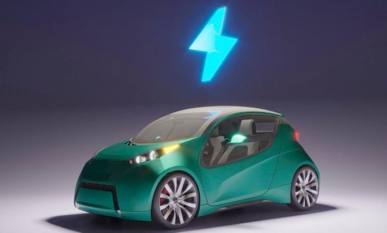
أحدثت التكنولوجيا تطورا كبيرا في عالم السيارات، أبرزها تطوير الس يارات الكهربائية كحل مستدام للمستقبل. تتميز هذه السيارات بكفاءة عالية، وانبعاثات منخفضة، وتكاليف تشغيل أقل. رغم ذلك، لا تزال تواجه تحديات، ومع الابتكار المستمر تساهم التكنولوجيا في تجاوز هذه العقبات وتوسيع الاعتماد على النقل الكهربائي .
أكد الأستاذ هاني هشام، مدير إحدي معارض السيارات الكهربائية بالقاهرة، أن معرضة يُعد من المعارض الرائدة في مجال السيارات الكهربائية في مصر، حيث اتخذ خطوة جريئة بافتتاح معرض متخصص بالكامل في السيارات الكهربائية. وأضاف: “خطوتنا جاءت من إيماننا بأن المستقبل في سيارتك، لأن البنزين في طريقه للنهاية”. وأضاف، أن السبب الثاني لاتخاذ هذه الخطوة هو الارتفاع الكبير في تكلفة البنزين، مما يجعل السيارات الكهربائية هي البديل القوي للسيارات التقليدية خلال الفترة القادمة .
ومن جانبه، أكد الأستاذ مجدي كيلاني، أحد مسؤولي المبيعات لإحدي معارض السيارات بالقاهرة، أن التوجه للسيارات الكهربائية لم يعد رفاهية، بل ضرورة تفرضها المعايير البيئية والاقتصادية الحديثة. وأضاف أن المعرض يسعى لتوفير موديلات متنوعة تناسب احتياجات السوق المصري، مع تقديم خدمات ما بعد البيع وتوفير الدعم الفني اللازم، في خطوة تهدف إلى بناء ثقة المستهلك وتشجيعه على التحول لهذا النوع من السيارات
مميزات سيارات الكهرباء :
أوضح هشام، أنه من أبرز مميزات السيارات الكهربائية أنها تعتمد على بطاريات ليثيوم مما يجعل عمرها الافتراضي طويلاً ، ويجعلها أيضاً خيارًا عمليًا واقتصاديًا على المدى البعيد. كما أن قطع غيارها متوفرة، وصيانتها محدودة مقارنة بالسيارات التقليدية، كما أنها تحافظ على البيئة المحيطة بها وتُعد صديقة للبيئة، بفضل خلوّها من الانبعاثات الضارة .
وهناك نظام تمتاز به سيارات الكهرباء ليست في السيارات العادية وهي قدرتها على قراءة إرشادات الطريق الموجودة عليه، والتعرف على اللوحات والإشارات المنتشرة في الشوارع، مما يعزز من أمان القيادة ويسهل على السائقين التنقل بذكاء وسهولة .
اتفق معه كيلاني، وأضاف أن السيارات الكهربائية تتميز بعدة مزايا تجعلها خيارًا أفضل للمستقبل، أولها نها لا تستهلك البنزين، مما يجعلها وسيلة موفرة بالمقارنة بالسيارات التقليدية المستهلكة للبنزين المستمر .
وتزوّد بعض من انواع سيارات الكهرباء المتقدمة في الطراز بأنظمة أمان ذكية، خاصة في السيارات ذاتية القيادة، فعلى سبيل المثال، إذا وجدت طفلا يقطع الطريق فجأة، تقوم السيارة تلقائيًا بتفعيل وضع منع التصادم والتوقف الفوري، مما يعزز من مستوى الامان على الطرق و علي المستخدم .
التحديات التي تواجه سيارات الكهرباء :
قال هشام، إن أولى التحديات التي تواجه انتشار السيارات الكهربائية تتعلق بالعقلية و التفكير، حيث لايزال كثير من الناس غير مقتنعين تمامًا بفكرة الاعتماد على هذا النوع من السيارات، ويشعرون بالتخوف من السير بسيارة تعمل فقط بالبطارية. هذا التخوف يُشكل عامل قلق لدى العديد من الأفراد، نتيجة لعدم الاطمئنان الكامل تجاه مدى أمان البطارية وكفاءتها، وهو ما يتطلب جهود أكبر لنشر الوعي وتوضيح مزايا هذه التكنولوجيا الجديدة .
بينما يري الكيلاني، ان هناك تحدي واضح يتمثل في غياب المراكز المعتمدة لصيانتها حتى الآن فبالرغم من انها لا تحتاج صيانه في اغلب الاوقات الا انه لا يمكن شراء سيارة بدون معرفه مراكز صيانتها وذلك ايضا هو نوع من تخوف الافراد لشرائها، وذلك يحدث بسبب ضعف البنية التحتية اللازمة لدعم هذا النوع من السيارات بالشكل الكافي .
وحول مدى تطور التكنولوجيا في مجال السيارات الكهربائية، يرى الأستاذ هشام، أن ما وصلت إليه هذه الصناعة يؤكد انها تمثل المستقبل الحقيقي لعالم السيارات، وان هذا التطور التكنولوجي يسهم في تعزيز ثقة المستهلك ويدعم توجه السوق نحو البدائل النظيفة والمستدامة .
ومن جانبه، أشار الكيلاني، إلي أن هذا التطور يمهد لتحول في قطاع النقل، خاصة على المدى البعيد. وأكد أن انتشار السيارات الكهربائية سيسهم بشكل كبير في تقليل نسبة التلوث الذي يتعرض له الهواء نتيجة الانبعاثات الناتجة عن وقود السيارات التقليدية .
تمثل السيارات الكهربائية مستقبل النقل الذكي والمستدام، وسط التطور التكنولوجي المتسارع والجهود المستمرة لتجاوز هذه التحديات وبناء ثقة المستهلك نحو بيئة أنظف وقيادة أكثر كفاءة .
زر الذهاب إلى الأعلى